Tofu 3.1 16 Sep 2025 5:21 AM (6 months ago)
I’ve just released Tofu 3.1, an update to my text reader for the Mac. Its interface controls now use the new Liquid Glass appearance on macOS 26 Tahoe, and the app icon has also been adapted for Tahoe, including dark and clear variants. I’ve also done some code maintenance which prepares Tofu for compatibility with future macOS releases.
Like previous versions, Tofu remains free. If you enjoy it, please consider making a donation to support its development.
To get notified of future releases of Tofu and my other apps, sign up to my mailing list.


Introducing Exercised 16 Apr 2024 12:34 PM (last year)
Like many people, I like to have an idea of whether I’m phsically active enough to maintain my health. I used to rely on my phone’s automatic step counting, with the well-known (and in my case aspirational) goal of 10,000 steps per day in mind.
However, when I went swimming – one of the more conscious efforts I’ve made to stay fit – my phone would never find out, sitting oblivious in a locker while I breathlessly flailed up and down the pool.
A smartwatch can be with you more of the time, but I’d have to remember to start recording a session before I begin, choose the type of activity, etc. Perhaps a watch might detect a swim automatically, but what about when I do archery? My device would think I’m mainly standing around for a couple of hours, when in fact I’m using about 3 times more energy than that. And all of this assumes that I’d even be willing to buy and wear a smartwatch in the first place, which, as it happens, I’m not.
In short, more comprehensive fitness tracking seems to make greater demands on your memory and your patience than I’m sure many of us are able to muster.
Why should we have to remember?
What if tracking your workouts was nearly as easy as having your steps counted automatically? No need to tell your device what you’re going to do before you do it. No need to even remember to enter it afterwards. Your phone just works quietly in the background and tells you what it thinks you did.
That’s the premise of Exercised, my latest app for iOS. You just tell it the places you usually go to exercise and what you do there. It will then detect visits, record the timings and remind you afterwards to add a workout to Apple Health, estimating the calories you burned. That’s it.
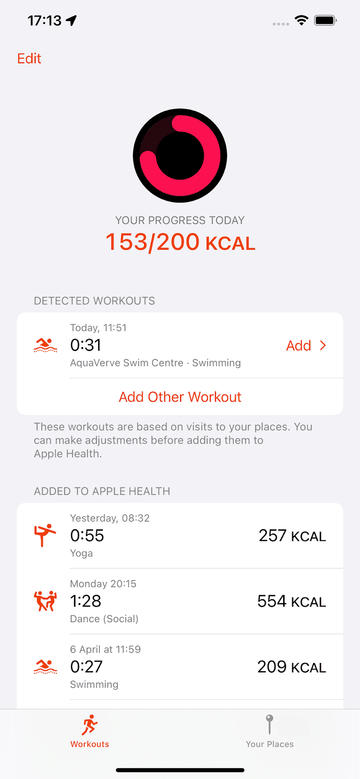
You can make adjustments before adding a workout, for example if the timings aren’t quite right. But Exercised uses many techniques to try and guess the details correctly. For instance, it can check how your device moved during a visit. So if you left your phone in a locker, this stationary period narrows down the possible times you were exercising, allowing a better estimate. The app also remembers any adjustments you make, to try and guess better next time. Everything aims to minimise the boring effort it would otherwise take to record your workouts.
Exercised can estimate calorie usage for 66 different types of exercise. For many of these, you can also choose an intensity level to improve the estimate. Once you’ve added a workout to Apple Health, it also flows through to Apple Fitness (and any other app you’ve allowed access, such as Google Fit) and counts towards any move goal you’ve set there. Your daily progress towards your move goal is also shown right inside Exercised.
Adding workouts manually
Because the app assumes that a visit to a place corresponds to a workout, it can’t automatically detect when you’ve exercised otherwise, for example while at home.
However, even when adding your workout manually for those occasions, Exercised tries to make this as painless as possible. For example, it will remember what type of activity you do on different days of the week and use this to try and save you from specifying it every time.
Privacy
In order to function and to employ all its tricks for minimising effort, Exercised asks for a number of permissions, such as Apple Health, location and device motion. One of the greatest design challenges was to ask for these permissions at the right moments, to explain why it’s asking for them, and to convey that the data is not used for any questionable purposes, only to maximise convenience. In fact, Exercised never even transmits any data off your device, so everything stays fully private. The privacy policy explains it all in more detail – I hope I succeeded in making this clear and easy to understand as well.
Change your tools, not your habits
Ever since I started using early versions of Exercised myself, I’ve had a much clearer picture of how much I move, and getting credit in Apple Fitness has helped keep me motivated. And, just as I’d hoped, I haven’t had to change my habits to track my fitness. Instead, technology is now doing what it’s meant to: getting out of the way and adjusting to me, rather than the other way round.
Exercised is availble on the App Store. Feel free to get in touch with any feedback or questions by emaling contact@amarsagoo.info.
%20goal%20of%2010,000%20steps%20per%20day%20in%20mind.%3C/p%3E%0A%0A%3Cp%3EHowever,%20when%20I%20went%20swimming%20%E2%80%93%20one%20of%20the%20more%20conscious%20efforts%20I%E2%80%99ve%20made%20to%20stay%20fit%20%E2%80%93%20my%20phone%20would%20never%20find%20out,%20sitting%20oblivious%20in%20a%20locker%20while%20I%20breathlessly%20flailed%20up%20and%20down%20the%20pool.%3C/p%3E%0A%0A%3Cp%3EA%20smartwatch%20can%20be%20with%20you%20more%20of%20the%20time,%20but%20I%E2%80%99d%20have%20to%20remember%20to%20start%20recording%20a%20session%20before%20I%20begin,%20choose%20the%20type%20of%20activity,%20etc.%20Perhaps%20a%20watch%20might%20detect%20a%20swim%20automatically,%20but%20what%20about%20when%20I%20do%20archery?%20My%20device%20would%20think%20I%E2%80%99m%20mainly%20standing%20around%20for%20a%20couple%20of%20hours,%20when%20in%20fact%20I%E2%80%99m%20using%20about%203%20times%20more%20energy%20than%20that.%20And%20all%20of%20this%20assumes%20that%20I%E2%80%99d%20even%20be%20willing%20to%20buy%20and%20wear%20a%20smartwatch%20in%20the%20first%20place,%20which,%20as%20it%20happens,%20I%E2%80%99m%20not.%3C/p%3E%0A%0A%3Cp%3EIn%20short,%20more%20comprehensive%20fitness%20tracking%20seems%20to%20make%20greater%20demands%20on%20your%20memory%20and%20your%20patience%20than%20I%E2%80%99m%20sure%20many%20of%20us%20are%20able%20to%20muster.%3C/p%3E%0A%0A%3Ca%20name%3D'more'%3E%3C/a%3E%0A%0A%3Ch4%3EWhy%20should%20we%20have%20to%20remember?%3C/h4%3E%0A%0A%3Cp%3EWhat%20if%20tracking%20your%20workouts%20was%20nearly%20as%20easy%20as%20having%20your%20steps%20counted%20automatically?%20No%20need%20to%20tell%20your%20device%20what%20you%E2%80%99re%20going%20to%20do%20before%20you%20do%20it.%20No%20need%20to%20even%20remember%20to%20enter%20it%20afterwards.%20Your%20phone%20just%20works%20quietly%20in%20the%20background%20and%20tells%20you%20what%20it%20thinks%20you%20did.%3C/p%3E%0A%0A%3Cp%3EThat%E2%80%99s%20the%20premise%20of%20%3Ca%20href%3D%22https://apps.apple.com/app/exercised/id6476978247%22%3EExercised%3C/a%3E,%20my%20latest%20app%20for%20iOS.%20You%20just%20tell%20it%20the%20places%20you%20usually%20go%20to%20exercise%20and%20what%20you%20do%20there.%20It%20will%20then%20detect%20visits,%20record%20the%20timings%20and%20remind%20you%20afterwards%20to%20add%20a%20workout%20to%20Apple%20Health,%20estimating%20the%20calories%20you%20burned.%20That%E2%80%99s%20it.%3C/p%3E%0A%0A%3Cdiv%3E%3Cimg%20src%3D%22https://blogger.googleusercontent.com/img/b/R29vZ2xl/AVvXsEi2a2Rx9EpXtx1XFv-UD2mpW58ugR2b320lYR4witY7kO5pOEh2Sc14rxIu3oZi4Ard3wWCUPIRL5-R0W0dt3A00XqnzntGVrXPljSIx26rjF-vkb0tI9YGRIJSGIjGcnscXyDpR6a2i7RWssISRDNxNaWnQn9XrgrtqMGWIoc69UjMqqjQ7lrirg/s1600/exercised-screenshot-blog.png%22%20alt%3D%22Exercised%20screenshot%22%20width%3D%22320%22%20height%3D%22692%22%20/%3E%3C/div%3E%0A%0A%3Cp%3EYou%20can%20make%20adjustments%20before%20adding%20a%20workout,%20for%20example%20if%20the%20timings%20aren%E2%80%99t%20quite%20right.%20But%20Exercised%20uses%20many%20techniques%20to%20try%20and%20guess%20the%20details%20correctly.%20For%20instance,%20it%20can%20check%20how%20your%20device%20moved%20during%20a%20visit.%20So%20if%20you%20left%20your%20phone%20in%20a%20locker,%20this%20stationary%20period%20narrows%20down%20the%20possible%20times%20you%20were%20exercising,%20allowing%20a%20better%20estimate.%20The%20app%20also%20remembers%20any%20adjustments%20you%20make,%20to%20try%20and%20guess%20better%20next%20time.%20Everything%20aims%20to%20minimise%20the%20boring%20effort%20it%20would%20otherwise%20take%20to%20record%20your%20workouts.%3C/p%3E%0A%0A%3Cp%3EExercised%20can%20estimate%20calorie%20usage%20for%2066%20different%20types%20of%20exercise.%20For%20many%20of%20these,%20you%20can%20also%20choose%20an%20intensity%20level%20to%20improve%20the%20estimate.%20Once%20you%E2%80%99ve%20added%20a%20workout%20to%20Apple%20Health,%20it%20also%20flows%20through%20to%20Apple%20Fitness%20%20(and%20any%20other%20app%20you%E2%80%99ve%20allowed%20access,%20such%20as%20Google%20Fit)%20and%20counts%20towards%20any%20move%20goal%20you%E2%80%99ve%20set%20there.%20Your%20daily%20progress%20towards%20your%20move%20goal%20is%20also%20shown%20right%20inside%20Exercised.%3C/p%3E%0A%0A%3Ch4%3EAdding%20workouts%20manually%3C/h4%3E%0A%0A%3Cp%3EBecause%20the%20app%20assumes%20that%20a%20visit%20to%20a%20place%20corresponds%20to%20a%20workout,%20it%20can%E2%80%99t%20automatically%20detect%20when%20you%E2%80%99ve%20exercised%20otherwise,%20for%20example%20while%20at%20home.%3C/p%3E%0A%0A%3Cp%3EHowever,%20even%20when%20adding%20your%20workout%20manually%20for%20those%20occasions,%20Exercised%20tries%20to%20make%20this%20as%20painless%20as%20possible.%20For%20example,%20it%20will%20remember%20what%20type%20of%20activity%20you%20do%20on%20different%20days%20of%20the%20week%20and%20use%20this%20to%20try%20and%20save%20you%20from%20specifying%20it%20every%20time.%3C/p%3E%0A%0A%3Ch4%3EPrivacy%3C/h4%3E%0A%0A%3Cp%3EIn%20order%20to%20function%20and%20to%20employ%20all%20its%20tricks%20for%20minimising%20effort,%20Exercised%20asks%20for%20a%20number%20of%20permissions,%20such%20as%20Apple%20Health,%20location%20and%20device%20motion.%20One%20of%20the%20greatest%20design%20challenges%20was%20to%20ask%20for%20these%20permissions%20at%20the%20right%20moments,%20to%20explain%20why%20it%E2%80%99s%20asking%20for%20them,%20and%20to%20convey%20that%20the%20data%20is%20not%20used%20for%20any%20questionable%20purposes,%20only%20to%20maximise%20convenience.%20In%20fact,%20Exercised%20never%20even%20transmits%20any%20data%20off%20your%20device,%20so%20everything%20stays%20fully%20private.%20The%20%3Ca%20href%3D%22https://amarsagoo.info/exercised/privacy/en/%22%3Eprivacy%20policy%3C/a%3E%20explains%20it%20all%20in%20more%20detail%20%E2%80%93%20I%20hope%20I%20succeeded%20in%20making%20this%20clear%20and%20easy%20to%20understand%20as%20well.%3C/p%3E%0A%0A%3Ch4%3EChange%20your%20tools,%20not%20your%20habits%3C/h4%3E%0A%0A%3Cp%3EEver%20since%20I%20started%20using%20early%20versions%20of%20Exercised%20myself,%20I%E2%80%99ve%20had%20a%20much%20clearer%20picture%20of%20how%20much%20I%20move,%20and%20getting%20credit%20in%20Apple%20Fitness%20has%20helped%20keep%20me%20motivated.%20And,%20just%20as%20I%E2%80%99d%20hoped,%20I%20haven%E2%80%99t%20had%20to%20change%20my%20habits%20to%20track%20my%20fitness.%20Instead,%20technology%20is%20now%20doing%20what%20it%E2%80%99s%20meant%20to:%20getting%20out%20of%20the%20way%20and%20adjusting%20to%20me,%20rather%20than%20the%20other%20way%20round.%3C/p%3E%0A%0A%3Cp%3E%3Ca%20href%3D%22https://apps.apple.com/app/exercised/id6476978247%22%3EExercised%20is%20availble%20on%20the%20App%20Store%3C/a%3E.%20Feel%20free%20to%20get%20in%20touch%20with%20any%20feedback%20or%20questions%20by%20emaling%20%3Ca%20href%3D%22mailto:contact@amarsagoo.info%22%3Econtact@amarsagoo.info%3C/a%3E.%3C/p%3E)
Designing Tachyo 13 Mar 2024 6:50 AM (2 years ago)
There is no shortage of software metronomes in this world. I imagine that many people pick it as an exercise when learning to design or program, believing it to be a nice and simple task.
Yet despite this abundance of options, I didn’t find one that I was satisfied with. They all somehow missed the mark, not so much in terms of functionality, but in terms of usability and quality.
So I set out to create Tachyo, a new metronome for iOS. But getting there turned out to be an even deeper design and implementation challenge than I had anticipated.
The forgotten art of…non-functional requirements?
An important step in designing a product is to identify the requirements. Here, it’s useful to distinguish between functional requirements – what the product should do – and non-functional requirements – how the product should be. From a design perspective, this latter category includes the general themes of usability, accessibility and any emotional quality you want to impart. Sadly, these non-functional requirements often don’t seem to be seriously considered, beyond perhaps a superficial notion of “it should look cool.”
For a metronome, I had these non-functional requirements in mind:
- Setting a speed must be quick but also precise.
- You should be able to use it with the sound off, but also without directly looking at it (for instance when you’re reading music).
- You must be able to anticipate the next beat.
- You need to hear it clearly over the sound of your instrument.
- Sounds should be pleasant so you don’t mind listening to them for extended periods of time.
There’s also the more obvious usability requirement of task completion: you need to be able to figure out how to start the metronome and set the speed. Unbelievably, some designs fail even at this more basic hurdle, leaving you stumped as to how to operate them at all. So let’s begin with that.
Starting and stopping
How many people should succeed in starting a metronome? Surely the answer is 100%. So Tachyo’s play button is large and prominently placed. However, although it appears near the centre of the screen, it’s actually pinned a fixed distance from the bottom, so that you can comfortably reach it with your thumb when using your phone with one hand.
Sometimes you may want your metronome app running in the background, for example while you’re reading music in another app. Or you may run it with the screen off. To make it easy to control playback without having to switch to Tachyo or unlock your screen, it integrates with the iOS media player controls, so you can stop and restart it from your lock screen or Control Centre.

Choosing a speed
The most substantial design challenge was how to make setting the tempo (in beats per minute) quick but also precise. The problem with a standard control like a slider is that, while it puts all 200 or so values directly on the screen, each one is tiny – less than 2 pixels wide on a small iPhone. On a touchscreen, this makes precise selection very hard (this is captured by a theory called FFitts’s law, a variation of Fitts’s law that accounts for finger size). But giving each bpm value more space wouldn’t allow fitting all of them on the screen. A keypad would be one solution, but this would be slow when making smaller changes to the tempo. A scrollable strip or cylinder of values would also allow making each option larger, but you’d pay the price in having to scroll further. Maybe we can do better.
A wheel (or disc, to be precise) offers an elegant solution to this apparent dichotomy between speed and precision. Grabbing it near its centre allows you to turn it by a large angle with only a small movement; turning it near the edge allows more precise adjustments.
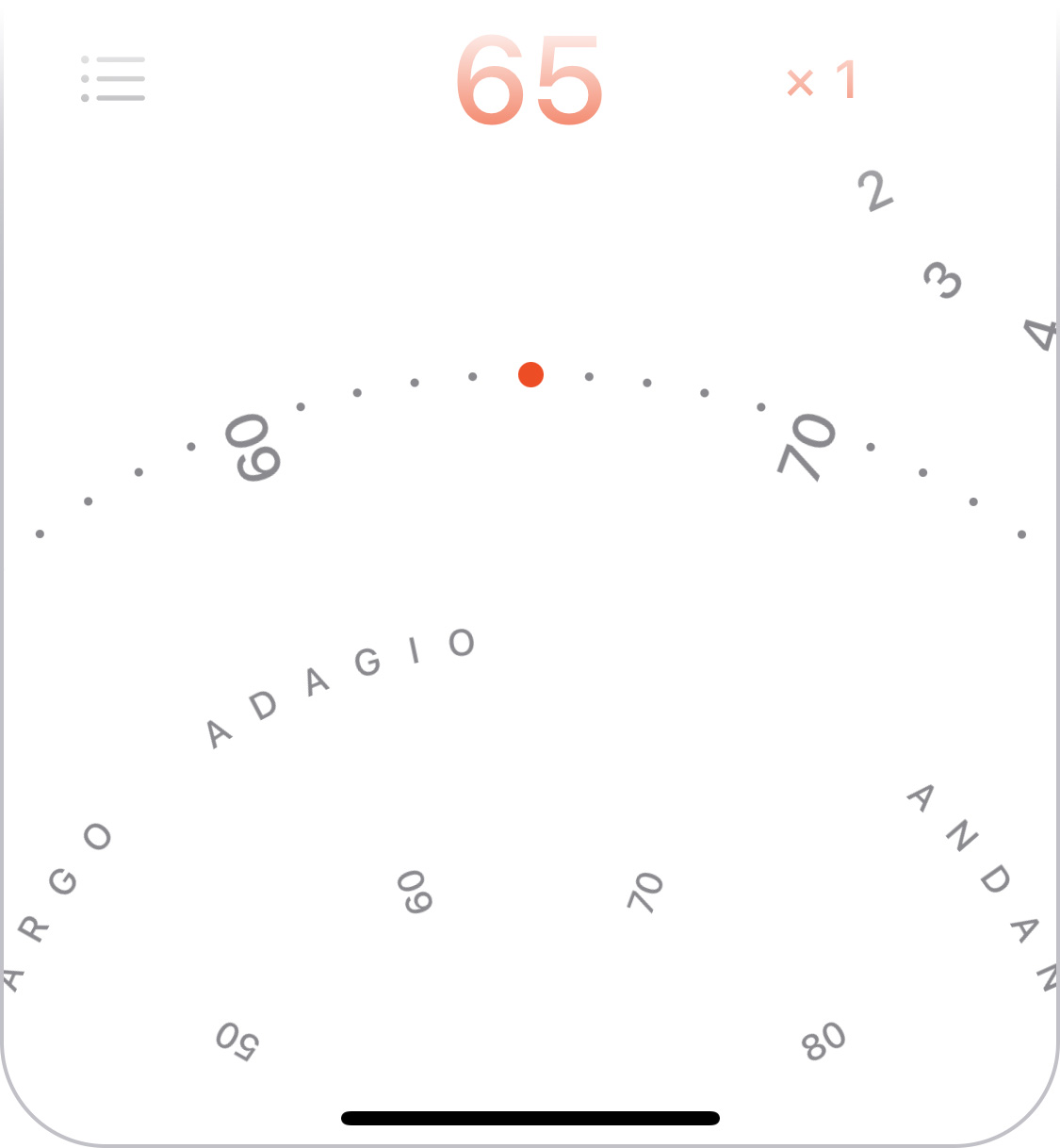
We can take further advantage of the wheel by showing a ring of numbers near the centre, which allows you to see further forwards and backwards than on the outer ring so you can grab further-away values to target. The inner ring is also meant to hint at the fact that you can turn the wheel not just on the outer edge.
To make very small tempo adjustments even easier, the wheel also allows tapping on its left and right half to move by 1 bpm.
The idea of using a wheel was a key insight, but the job was far from over. Many interaction details remained to be solved.
Rotation behaviour
The first was how the wheel should actually respond to finger movements. There’s a simple calculation used in many implementations, but it can produce some unnatural and unhelpful behaviour.
However, a challenge in finding a better solution was that you can’t really define “natural” in this context: users can and will perform gestures on a virtual wheel that have no meaningful physical equivalent. I explored many different approaches before finding a set of formulas that produced the right feel across all the different possible gestures. It also meant I finally found a use for all that trigonometry they taught us in school.

Looking to real-world controls still offered useful inspiration. For instance, a physical dial with notches, like you might find on a camera, helps you select specific values by snapping to discrete positions. I wanted to emulate this, so on Tachyo’s wheel you get “pulled” towards the round bpm values. This makes it clearer when you’ve turned it close enough to your target position. The selected dot also gets bigger to make it more visible, but only subtly so as not to distract.
Although a notched dial was the right model for making fine adjustments, the analogy stops there, because Tachyo’s speed wheel should also allow flicking, to make larger changes more quickly. The momentum is fine-tuned to feel natural, and the deceleration formula matches how real-world friction works. It differs from iOS’s native scrolling deceleration, which uses a more abstract function.
Sticking too closely to a simulation of a physical wheel would have one other limitation: you’d only have 360° to work with. This in turn would dictate how far apart the bpm values could be for a given diameter, limiting the precision of the interaction. Tachyo breaks free from this limitation, prioritising a large-enough gap between values, and as a result using much more than 360° for the total range.
Haptic feedback
Vibration can be another key element in supporting precise selection. But it’s worth thinking about exactly how this should behave. First, what is its purpose? Surely it’s to give additional, real-time feedback about your progress: you can feel as you’re passing each value and eventually when you’ve reached the target position. But what does “reaching” actually mean? In fact, letting go will always snap to the nearest round number, so being near your target position is enough. So if you’re trying to select, for example, 72 bpm, you can let go whenever the position corresponds to ≥71.5 and <72.5 bpm. The haptic feedback should therefore tell you if you’ve successfully reached the vicinity of a value, and so you should feel the vibration when you cross the midway point between numbers, e.g., 71.5.

If that sounds obvious to you, consider that, for some reason, iOS’s native revolving pickers don’t do this. They vibrate when you cross round values, for instance when you’ve moved from 71.9 to 72.1, crossing 72.0. This doesn’t make any sense as far as I can see. If you’ve inadvertently overshot, say to 72.6, letting go will make it land on 73, and you won’t have received any haptic feedback to warn you.
Tempo markings
Choosing a bpm value isn’t the only way to use a metronome. Classical music usually doesn’t specify bpm but instead uses traditional tempo markings such as “allegro” to indicate the rough speed. Although Tachyo’s speed wheel shows the most common markings, this is not the ideal way to find a tempo. If you only know the name and nothing about the speed, you’d have to keep turning the wheel until you come across the desired one. You’re scanning through an effectively randomly ordered list, which is slow: the average time required is proportional to the number of options – O(n) in computer science speak. Instead, you want an alphabetical list, where the time required increases less steeply with the number of options – O(log n). Tachyo offers such a list in a menu. Its density also means that it can offer a more comprehensive set of tempo markings than will fit on the wheel.
Setting accents
I also chose a wheel for setting whether and how often you want to hear an accented beat. However, the rotational behaviour is completely different because the wheel is much smaller and creates different expectations. But you can still tap in the top/bottom half to change its value by one stop at a time.
Seeing the beat
One of the requirements I mentioned at the outset was being able to use the metronome with the sound off. Many metronome apps use a flashing or pulsating effect to visualise beats, but this has two significant limitations. First, when playing music you want to know when a beat will happen, not when it did happen, and at slow tempos, it can be hard to anticipate the next beat if it appears suddenly, with no lead-in. Second, at fast tempos, around 200 bpm, it turns out your brain can’t actually discern the beat if it’s shown as a series of simple flashes or as movements in one direction. So even though I considered more “innovative” designs for Tachyo, a relatively traditional pendulum proved to work the best, because you can anticipate when it will next strike, and its back-and-forth movement effectively divides in half the speed your brain needs to follow. Tachyo still shows a radial pulse across the screen as a secondary signal, to help you see the beat when it’s in your periphery.
To give a realistic impression of movement, the virtual length of the pendulum is related to the speed chosen, just like in a real pendulum. But to make sure it stays visible, the distance it swings sideways is also adjusted based on the screen width.
Hearing the beat
Most interaction designers don’t often have to think about sound as a medium, but obviously for a metronome it’s central. Two goals in choosing sounds were that they should be pleasant to listen to and offer enough variety to cover a range of musical styles and personal tastes. However, a few other requirements transpired:
- You need to be able to hear the sound over your instrument.
- You need to distinguish between accented and non-accented beats, so although the two should sound related, they need to be different enough.
- Both of the above need to be achieved not just when using high-quality headphones but also though a tinny phone speaker.
Achieving all of the above involved many hours listening to hundreds of options, shortlisting candidates, then combining, testing and tweaking them repeatedly until I had a set that seemed just right.
Hidden complexity
I’m guessing that most people, even designers and engineers, would expect a metronome to represent quite a simple design challenge. Judging by just how many have been produced, it certainly seems that way. And yes, meeting the basic functional requirements is pretty easy. But once you go beyond these and try to address all the relevant non-functional requirements, it’s actually a surprisingly rich and nuanced problem, and solving it involves a diverse set of design tasks covering graphics, sound and detailed interaction design. But it’s exactly this multidisciplinary challenge that I found most enjoyable about this project.
You can get Tachyo on the App Store.
Introducing Tachyo 3 Nov 2023 12:52 AM (2 years ago)
Tachyo is a new metronome for iOS. It’s my first new app in 15 years, and also my first project after going fully independent earlier this year.

Now, you may ask if there aren’t already enough other metronome apps out there. There certainly are many. But, as is so often the case when I look for software, I haven’t found any of them to be quite satisfactory.
Beyond the obvious functional requirements (and my personal ones are actually quite basic), there are a number of usability and quality requirements that I think tend to get ignored.
The main one of these is being able to set the speed quickly but also precisely. This turned out to be the central design problem for Tachyo. When choosing from 200 possible bpm values on a touchscreen, efficiency and precision are seemingly conflicting requirements: fast selection would require having all options close together, but then they’d be very small, making it hard to target a precise value. Any apps that address this usually offer multiple mechanisms, each optimised for either speed or precision. The nice thing about a wheel is that it offers a natural way to choose how you want to make that trade-off, in a single control: near its centre you can turn it quickly, or you can fine-tune its rotation near the edge.
However, this insight was only the start of overcoming the challenge. Creating a digital wheel that behaves in a sensible way is actually rather difficult. On the one hand, you want it to feel “natural”. On the other hand, there is no such thing: people will perform gestures in a virtual UI which have no meaningful equivalent on a physical wheel. Tachyo’s speed wheel required a completely custom implementation, and I explored seven distinct approaches before finding a set of calculations that produced what I felt was the right behaviour. I hope you like the result.
Some tips: try flicking the wheel from near its centre to spin it very fast. You can also tap on the left/right half to decrease/increase the speed by 1 bpm at a time.
Here are some other features you may enjoy:
- A quick way to set an accent every 2–12 beats.
- A varied set of 16 pleasant, high-quality sounds.
- A comprehensive menu of traditional tempo markings.
- When running Tachyo in the background, you can pause and restart it from the lock screen or Control Centre.
- A choice of colour schemes so you can personalise the UI to your taste.
Tachyo is available for iOS 16.4 or newer in the App Store. Please consider leaving a rating to let me know how you like it and to help others make a decision. Also feel free to email me if you have any questions or feedback.
,%20there%20are%20a%20number%20of%20usability%20and%20quality%20requirements%20that%20I%20think%20tend%20to%20get%20ignored.%3C/p%3E%0A%0A%3Ca%20name%3D'more'%3E%3C/a%3E%0A%0A%3Cp%3EThe%20main%20one%20of%20these%20is%20being%20able%20to%20set%20the%20speed%20quickly%20but%20also%20precisely.%20This%20turned%20out%20to%20be%20the%20central%20design%20problem%20for%20Tachyo.%20When%20choosing%20from%20200%20possible%20bpm%20values%20on%20a%20touchscreen,%20efficiency%20and%20precision%20are%20seemingly%20conflicting%20requirements:%20fast%20selection%20would%20require%20having%20all%20options%20close%20together,%20but%20then%20they%E2%80%99d%20be%20very%20small,%20making%20it%20hard%20to%20target%20a%20precise%20value.%20Any%20apps%20that%20address%20this%20usually%20offer%20multiple%20mechanisms,%20each%20optimised%20for%20either%20speed%20or%20precision.%20The%20nice%20thing%20about%20a%20wheel%20is%20that%20it%20offers%20a%20natural%20way%20to%20choose%20how%20you%20want%20to%20make%20that%20trade-off,%20in%20a%20single%20control:%20near%20its%20centre%20you%20can%20turn%20it%20quickly,%20or%20you%20can%20fine-tune%20its%20rotation%20near%20the%20edge.%3C/p%3E%0A%0A%3Cp%3EHowever,%20this%20insight%20was%20only%20the%20start%20of%20overcoming%20the%20challenge.%20Creating%20a%20digital%20wheel%20that%20behaves%20in%20a%20sensible%20way%20is%20actually%20rather%20difficult.%20On%20the%20one%20hand,%20you%20want%20it%20to%20feel%20%E2%80%9Cnatural%E2%80%9D.%20On%20the%20other%20hand,%20there%20is%20no%20such%20thing:%20people%20will%20perform%20gestures%20in%20a%20virtual%20UI%20which%20have%20no%20meaningful%20equivalent%20on%20a%20physical%20wheel.%20Tachyo%E2%80%99s%20speed%20wheel%20required%20a%20completely%20custom%20implementation,%20and%20I%20explored%20seven%20distinct%20approaches%20before%20finding%20a%20set%20of%20calculations%20that%20produced%20what%20I%20felt%20was%20the%20right%20behaviour.%20I%20hope%20you%20like%20the%20result.%3C/p%3E%0A%0A%3Cp%3ESome%20tips:%20try%20flicking%20the%20wheel%20from%20near%20its%20centre%20to%20spin%20it%20very%20fast.%20You%20can%20also%20tap%20on%20the%20left/right%20half%20to%20decrease/increase%20the%20speed%20by%201%20bpm%20at%20a%20time.%3C/p%3E%0A%0A%3Cp%3EHere%20are%20some%20other%20features%20you%20may%20enjoy:%3C/p%3E%0A%0A%3Cul%3E%0A%20%20%3Cli%3EA%20quick%20way%20to%20set%20an%20accent%20every%202%E2%80%9312%20beats.%3C/li%3E%0A%20%20%3Cli%3EA%20varied%20set%20of%2016%20pleasant,%20high-quality%20sounds.%3C/li%3E%0A%20%20%3Cli%3EA%20comprehensive%20menu%20of%20traditional%20tempo%20markings.%3C/li%3E%0A%20%20%3Cli%3EWhen%20running%20Tachyo%20in%20the%20background,%20you%20can%20pause%20and%20restart%20it%20from%20the%20lock%20screen%20or%20Control%20Centre.%3C/li%3E%0A%20%20%3Cli%3EA%20choice%20of%20colour%20schemes%20so%20you%20can%20personalise%20the%20UI%20to%20your%20taste.%3C/li%3E%0A%3C/ul%3E%0A%0A%3Cp%3ETachyo%20is%20available%20for%20iOS%2016.4%20or%20newer%20%3Ca%20href%3D%22https://apps.apple.com/app/apple-store/id6470743910?pt%253D108818%2526ct%253Dblog%2526mt%253D8%22%3Ein%20the%20App%20Store%3C/a%3E.%20Please%20consider%20leaving%20a%20rating%20to%20let%20me%20know%20how%20you%20like%20it%20and%20to%20help%20others%20make%20a%20decision.%20Also%20feel%20free%20to%20%3Ca%20href%3D%22mailto:contact@amarsagoo.info%22%3Eemail%20me%3C/a%3E%20if%20you%20have%20any%20questions%20or%20feedback.%3C/p%3E)
Goodbye, Google. Hello, World! 1 Aug 2023 1:26 AM (2 years ago)
When I joined Google in 2011, it felt like I was realising a dream. I had been working primarily as a software engineer, with my design activities limited to an unofficial portion of my job and to personal projects in my spare time. Google provided an opportunity to be a full-time interaction designer working with very clever people on widely used products, in a fairytale-like work environment.
But time changes things, including your perspective. In the last 12 years, Google got a lot bigger, making it a very different place to operate in. Also, not everything may turn out like in your dream – for instance, my field (UX) hasn’t developed into the rigorous, science-based discipline I had hoped it would. And, perhaps most significantly, I got to know myself better, learning what I enjoy and what frustrates or stresses me. So a new dream began to form.
Last year I started tinkering on some of my old apps again – Tofu and Licensed. It was partly this which made me realise just how much I enjoy being more in control of how I spend my time, which problems to work on and how to solve them.
So I’ve decided to quit my job, with the goal of being independent and focusing on my own projects as much as possible. I’m also interested in helping others achieve better design, for example through writing and consulting. In any case, over the coming months and years, I want to create new apps that you will hopefully love. (Sign up to my mailing list to find out when I release something new, and follow me on Twitter/X for more frequent updates.)
As part of becoming an independent software maker, my future releases will include paid products. However, I fully intend to carry on offering some of my software for free. If you enjoy my free apps and would like to support me, I now accept donations.
For most of the things I learned about myself in recent years, I’ve come to realise they were actually in plain sight all along. I absolutely loved making my own software when I started out 25 years ago (anyone remember people book?). I think it’s time to act on what my 18-year-old self apparently already knew.
Licensed 1.5.1 1 Aug 2023 12:55 AM (2 years ago)
I’ve just published a minor update to Licensed, my free app for storing software licenses. It fixes a bug where the contents of the Notes field were not legible when using macOS’s dark mode. Download the latest version here. You can read more about the previous update to version 1.5 in this blog post.
Also, I now gratefully accept donations, in case you enjoy my free apps and would like to support me in developing more in the future (more news on that soon).
Tofu 3.0 1 Jul 2023 8:48 AM (2 years ago)
Tofu started as an experiment 20 years ago. It was based on a hypothesis that long lines of text and vertical scrolling made it challenging to read on your computer. Arranging text in columns seemed like an elegant way to address both the movement and the line length.
I was amazed at how well the solution was received. Of all the apps I’ve made, Tofu has been the most popular. It’s also the one people missed the most after I announced in 2014 that I wasn’t planning to update it again, especially when the last version became incompatible with macOS releases beyond 10.14.
As requests for an update kept continuing even into 2023, I finally decided to update Tofu to run on modern Macs. I also took the opportunity to make many improvements to usability and layout, increase performance and fix bugs. The result is Tofu 3.0.
This version was built for maximum compatibility: it runs on macOS 10.13 (High Sierra) through 13 (Ventura). For any major future updates, I’ll probably support a smaller set of the most recent macOS versions, as this could allow taking advantage of newer technologies. In any case, there should now be no Mac since Tofu’s initial release that can’t run it.
Beyond compatibility, here are some highlights of what else is new (you can see a full list of changes in the Read me file):
- Content is laid out faster and requires less memory.
- Scrolling has been improved, as well as how the scroll position is remembered and restored.
- In fullscreen mode, columns adjust to the width of the screen.
- Display of PDF contents has been improved.
- Tofu now uses modern app and window behaviour, such as autosave and automatic termination.
- Empty windows show actions and instructions for getting started.
- The Settings/Preferences panel was redesigned.
You can download Tofu 3.0 here. Feel free to send any feedback to contact@amarsagoo.info. And sign up to my mailing list to make sure you don’t miss future releases.
Here’s to another 20 years.
Licensed 1.5 (and Tofu news) 27 Nov 2022 12:38 AM (3 years ago)
In 2014, I announced that I was not planning further development of my Mac and iOS apps. I have a couple of updates on that.
Licensed 1.5 now available
One thing I still intended to do was update Licensed, my Mac app for managing software licenses. That update is finally here. I’m sorry it took so long.
My main motivation was to add an export function, so that you could get your data into other tools such as a spreadsheet, and finally say goodbye to Licensed if you were still relying on it.
But it also turns out that technology moves on in 14 years (yes, that’s how long it’s been!), and the app couldn’t even run at all on recent versions of macOS. So that became the first problem to address. Licensed is now built to run on macOS 10.13 (High Sierra) through 13 (Ventura). This update also increases the chances that Licensed will work with future macOS versions.
Achieving this compatibility did involve a small compromise. Licensed 1.0 had the ability to auto-fill your name and email address from your Address Book app (now Contacts). Modern versions of macOS have additional privacy controls around that data, which would require rewriting the auto-fill functionality. I decided this wasn’t worth it, given that the main goal of this update is to help you stop using Licensed.
On the other hand, I couldn’t resist making some visual tweaks to make Licensed look a bit more at home on a modern Mac, for instance using standard, macOS-provided icons in the toolbar. I also fixed a couple of bugs and made minor usability improvements.
Here are the full release notes:
- Now runs on macOS versions up to at least 13.0 (Ventura), and requires version 10.13 (High Sierra) or later.
- Added ability to export data in comma-separated format, via the File menu.
- Added ability to reveal data file in Finder, to help with manual backups.
- Using standard macOS toolbar icons, and the toolbar is no longer customisable.
- Sorting by product now also accounts for the version number.
- The date column is now resizable.
- Combo box menus will now grow as tall as they need to.
- Fixed bugs that stopped auto-completion from working in the maker field.
- Your name and email addresses will no longer be pre-filled from Address Book/Contacts.
- No longer supports extracting information from apps with resource forks, only from application bundles.
You can download Licensed 1.5 here.
Work begins on Tofu 3.0
The 2014 announcement suggested the end of the line for Tofu, my reading app for the Mac. However, I've been surprised and moved by how, even 14 years after its last update, people have continued to express their love for Tofu, lamented its extinguishing by recent macOS versions, and even offered to help maintain it if it was open source.
Your persistence has been effective, and I'm excited to announce that I plan to update Tofu in the next few months. 2023 will mark the 20th anniversary of its first release, and it will be nice to revive it for hopefully another 20 years. The primary goal is to have it run on modern versions of macOS, but I'm also looking to speed up layout, fix bugs and make other quality improvements.
Sign up here to get notified when Tofu 3.0 is ready (and for any other product updates I might have in the future). I'll also post updates on my Twitter account as development progresses.
The quest for the perfect movie rating 4 Oct 2015 4:51 AM (10 years ago)
For the last 15 years or so, I’ve been using IMDb to look up how good movies are supposed to be. I also try to do my bit by submitting ratings for those I’ve watched. So far, I’ve rated nearly 700 films. In recent years, I’ve noticed more and more people referring to Rotten Tomatoes as their trusted source. Also, IMDb has started listing Metacritic’s score alongside their own, and Google can show all three in their search results for a film. Naturally, I had to go and look at the data to figure out which site I should be using.
To make sense of my analysis, it will be helpful for you to know how I think of my scores (on a 10-point scale):
- 5 or lower: Not enjoyable/a waste of time.
- 6: Just about watchable, but not really worth it.
- 7: OK – fine to watch if you fancy the particular film, but also fine to miss.
- 8: Good – worth the time.
- 9: Excellent – as good as most films can hope to get.
- 10: One of my few all-time favourites. The films I would take with me on a desert island.
Most of the time, I try to watch films that I hope to be able to score 8 or higher. For more indulgent choices like romantic comedies, a prospective 7 will do.
The data set
First, I took all the films I’ve rated 10 – there are only ten of those. Then I looked up my recent ratings of 6, 7, 8 and 9, and took ten films for each of those. Lastly, I included all the films I’d rated 5 or lower – there were only eight of those.
For those 58 films, I looked up the IMDb average rating, Metacritic’s Metascore, and the six different numbers Rotten Tomatoes publishes: the percentage of favourable reviews by all approved critics and by top critics (these two are called the Tomatometer, and the first is the main number they promote), the percentage of favourable audience ratings (the “audience score”), as well as the average rating given by each of those three groups.
The analysis
I created scatter plots to see how each of the eight numbers correlates with my own rating. The different scores use different scales and have different ranges of typical values. For example, the Metascores ranged from 18 to 94; the IMDb ones from 4.4 to 9.0. To make sure they’re all visually comparable, I made the vertical axis of each graph cover the full range of scores. This way, they all have a similar steepness and level of detail. The dots are transparent black, so the darker areas of the graphs are where multiple dots overlap.
First, here’s how IMDb’s rating compares to my own scores:

You can see that films I rated more highly tend to have a higher average rating on IMDb. If you look more closely, you can also see that almost all films I scored 10 have higher IMDb ratings than most I scored 9, and those in turn have higher ratings than most I scored 8. Another thing to note is that all my 9s and 10s are deemed better by IMDb than those I rated 6 or lower.
Next, here’s how Metacritic and Rotten Tomatoes’ main rating relate to my scores, alongside IMDb:


On Metacritic and Rotten Tomatoes, the range of scores for films I rated at least 7 is noticeably higher than for those I rated 6 or lower – the distinction is actually remarkably pronounced with the Tomatometer. However, they say nothing about whether something will be a 7 (just about worth watching) or a 10 (all-time favourite). It’s also disappointing that they have some of my 10s overlapping with my 6s, and even a 5 in the case of Metacritic. Sticking to high ratings on these sites would have caused me to miss some of my most cherished film experiences, while still wasting my time on some occasions.
Let’s look at the other metrics Rotten Tomatoes publishes. Here’s how the percentage of favourable reviews from top critics and from the audience relate to my ratings, compared to all critics:

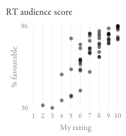
The top-critics Tomatometer seems like a worse predictor of my scores than the general one is. The audience score shows some correlation with my scores, although not as strongly as IMDb did; there are still a lot of films I rated 7–10 where it gives the same range of scores.
Finally, here are the average ratings from those three groups of people on Rotten Tomatoes (as opposed to the percentage of favourable reviews):

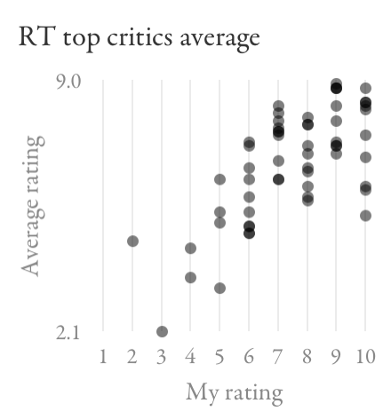

Again, there’s a lot of overlap between the scores for films I rated between 6 and 10, so these metrics wouldn’t do a good job helping me decide what to watch.
Making decisions
For me, IMDb looks like the most promising signal overall, especially for distinguishing among the top end of films. The data tells me that if something is rated at least about 7.8, I probably shouldn’t miss it and am unlikely to be disappointed:

One tricky distinction is between 7 (OK) and 8 (good), but IMDb does no worse here than the other sites.
The biggest challenge is avoiding things that aren’t really worth watching (6 and below). On IMDb, there’s quite significant overlap between my 6s and 7s. The Tomatometer looks like it might do a better job of keeping those sets of films apart:

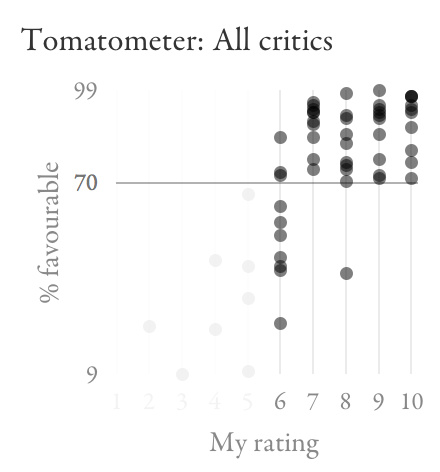
In this set of films, an IMDb score between 6.6 and 7.3 (that’s a lot of films in general) won’t help me decide if something’s worth watching. The Tomatometer, on the other hand, seems to have a magic threshold at 70%.
Based on all of this, I’m going to adopt the following strategy: check IMDb to see how much I’m likely to enjoy a film; if I’m interested in one that looks borderline (around 7.0), check Rotten Tomatoes to see if it scores more than 70%. I recently tried this for A Most Wanted Man (IMDb: 6.8, Tomatometer: 88%), with success.
What’s going on with the Tomatometer?
I’ve been puzzling over why Rotten Tomatoes seems so remarkably good at identifying films worth watching, while being so remarkably poor at telling me just how good they are. Above what I call a 6, there’s just no correlation at all.
Recall that the Tomatometer doesn’t tell you an average rating like IMDb does, but rather what percentage of critics’ reviews were favourable. Whether a review is favourable is apparently determined by Rotten Tomatoes staff looking at its content, at least for reviews that have no numeric score or when the score is close to the middle.
Using this binary signal means that a lukewarm review will count the same as a stellar one. In essence, the Tomatometer only tells you what portion of critics thought a film was at least fine. That number might be the same for a film people tend to think is just OK (e.g. Wanted – IMDb: 6.7, Rotten Tomatoes: 72%) and for one people tend to love (e.g. Léon – IMDb: 8.6, Rotten Tomatoes: 71%), so the Tomatometer won’t be able to tell these apart. (In fact, in a hypothetical world where everyone agrees how much they like a film, the Tomatometer would only ever show 0% or 100%: its granular 100-point scale relies on people being in disagreement.) Depending on how much this actually happens, this could explain at least in part why the Tomatometer doesn’t tell me how good a film is as long as it’s good enough.
Final thoughts
Here are some ways one might be tempted to interpret my findings:
- IMDb is the best movie rating.
- IMDb is the best movie rating for me.
- IMDb represents a sub-population that reflects my taste better than other communities do.
- By seeing the IMDb rating before watching a film, I’ve been predisposed to agreeing with the average, through a kind of confirmation bias or peer pressure.
- The crowd is wiser than the critics.
- I should be a critic.
- My taste in films is really average.
The first conclusion would obviously be the most useful to you as a reader. However, it’s possible that different sites work well for different people, in which case you’d need to test them against your own ratings. I don’t necessarily recommend repeating what I did (it was a very lengthy, manual process). But simply looking up the different ratings for some of the films you’ve seen, or just paying attention to them in the future, should give you a feel for whether one of them works better than the others.
Now tweeting 4 Sep 2014 6:53 AM (11 years ago)
I have a very high threshold for joining social networks, but I recently overcame this in a rare instance and finally started posting on Twitter. If you don't use an RSS reader, this may be the best way to find out when I publish new articles. I also share briefer thoughts there which I wouldn't put on this blog (this post is already exceptionally short).
Here I am: @amar_designer
Demystifying colour management 22 Jan 2014 11:27 AM (12 years ago)
Colour management is a pretty arcane subject to most people, even if it’s relevant to their work. I recently spent some time trying to understand it, and encountered two challenges. First, I didn’t find any really clear explanation of the concepts involved. Some are thorough but difficult to follow. Others give practical advice without elucidating the fundamentals. The second problem is that there’s conflicting advice about best practices when designing for the web.
I’d like to take on the challenge of addressing both of these issues. I will first explain some of the basic concepts behind colour management, using illustrations that hopefully make it easier to understand. I will then talk about practical implications for web-oriented design.
How it works
Colours can be described in different ways, for example as a mix of red, green and blue light, or in terms of their hue, saturation and lightness. In each of these colour models, you can think of the dimensions as forming a "space". One such colour space is called CIE xyY, and I’ll use it for my illustrations here. It contains all the colours visible to the average human eye, and has the convenient property that, although it’s three-dimensional, you can look at it "from above" and get a nice, two-dimensional map of chromaticities at maximum brightness:

When you’re working on a particular display, it’ll only be able to show a subset of all visible colours. This range is called its gamut and will have a triangular footprint in the CIE xyY space (as will any other RGB space):

If a colour profile describes a sub-space like this which exactly corresponds to the range of colours your display can actually show, it’s said to be perfectly calibrated.
Now, let’s pick a particular colour, for example this yellow:

This colour’s position in relation to our display’s space (not to the entire xyY space) will be represented by an RGB colour value, say, #FFFF00. This device-dependence may become clearer if we "take out" the triangle and show it on its own, with the colour marked at the corresponding point (remember, though, that this is a two-dimensional simplification):

In isolation from a colour profile, this is all a colour value is: a position within an abstract space that doesn’t intrinsically map to any particular, real colour. This is why the same value can represent different colours on different displays or when using different profiles. These values are what gets saved in an image file. However, you can choose whether to include a profile describing the space the colour value is meant to be relative to:
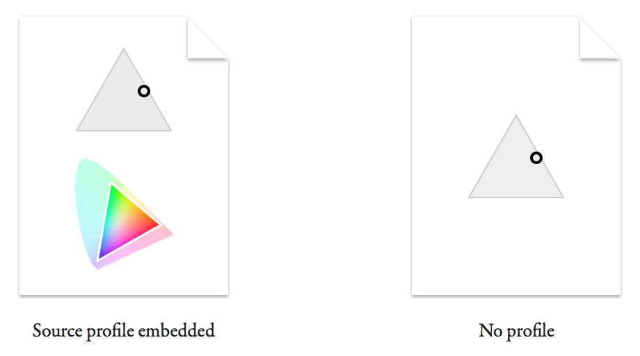
You can imagine how a viewer of the file with no profile will struggle to know the real colour originally intended. I'll explain in a minute what happens in this case.
First, let’s see what a colour-management-enabled app does with the first file. If it honours the embedded source profile, it can map the colour value back onto a real colour in the xyY space:

Now we need to figure out how to get the viewer’s display to show this colour. The value #FFFF00 was a representation specific to the source space, and may not mean the same thing on this display. Let’s say it has a smaller gamut:

In case it’s not clear, the larger triangle outline represents the original display’s gamut (our source space) and the smaller one the target display’s. The circle representing the colour is in the same spot within the xyY space as before.
(For simplicity, I’ve made the colour fall within the gamut of both displays, and am assuming that we don’t want to intentionally shift the colour on the target display. In real life, these assumptions often aren’t true. The original colour may not be reproducible on the target display, or you may want to sacrifice colour accuracy in order to preserve the relationships between colours. This is where rendering intents come in.)
The value we use to represent the colour in the target monitor’s space is related to its position within this new triangle:

What we’ve just done is to convert the colour value #FFFF00 from its source space into a different target space, giving #77FF00. This is the value we need to send to the viewer’s display to reproduce the real-life colour we chose at the start.
In other words, converting is to express a colour relative to a different colour space.
What about the file with no profile? All it tells us is a colour value. The best we can do is to make an assumption about what space it is intended to be in relation to. What often happens is that the colour value gets sent to the display as it is, without any conversion. This is equivalent to assuming that it was intended in the target display’s space. (Note that this is also what happens in applications that don’t colour-manage, even if your file includes a profile.) Let’s see where the colour value falls if we do this (I’ve marked the original, intended colour for comparison):

Because the target display’s gamut doesn’t extend as far into the green region, the value #FFFF00 maps to a colour that’s more orange than what we originally picked. This difference can be much worse if the source and target profile are even more dissimilar.
A common way of trying to minimise colour shifts in non-colour-managed contexts (or for files without profiles) is to express your saved colour values in relation to a space that’s close to that of most displays. This is what the sRGB space is intended for. Most modern displays have a gamut similar to sRGB, so in most cases sRGB values should not look completely off when sent straight through without conversion. It’s often advised that you use sRGB while working on images for the web in Photoshop, rather than specifying colour values relative to your display’s profile. (While you’re working, Photoshop will convert the sRGB values to your display’s profile. To preview how they would look unconverted on your display, turn on Photoshop’s Soft Proof feature and set it to Monitor RGB.)
Web design
As I implied at the beginning, user interface and web designers looking for colour management advice may feel like they are caught between two warring factions. One advocates setups that enable accurate colour management according to the principles I explained above. The other will encourage you to circumvent colour management as much as possible. What’s going on here?
Designers working on the web often seem to think of colour in terms of colour values, rather than in terms of “real”, perceived colours. They get stressed out if the colour value they measure when their graphic is displayed in a browser doesn’t match the value they originally typed in. To someone who works in photography or publishing and is used to a colour management workflow, this must appear like pure ignorance, given what we learned above.
However, there are valid reasons why these designers care about colour values: on a web page, images often represent parts of the design that need to match other elements on the page exactly. The colour of these other parts is often specified in CSS and rendered by the browser. In 2015, most browsers don’t convert CSS colour values, instead sending them to your display unchanged. This means that there’s no way to guarantee that a CSS colour and a colour in an image with a profile will match, and so you’ll often see slight differences.
So the reason the two groups of people cannot agree is that they care about different things. One cares about reproducing colours as faithfully as possible on as many devices as possible – consistency between contexts. The other cares about colours in an image matching colours elsewhere on a web page – consistency within a context.
There is a hypothetical solution that would satisfy both use cases, which is for all browsers to colour-manage CSS colours by assuming they are expressed in sRGB rather than the monitor’s profile. That’s how the W3C would like it to work. In fact, Safari 7 and 8 do exactly this, as well as assuming sRGB for images without profiles (although there’s still a slight mismatch between CSS and images, presumably because of different rendering intents being used – perhaps a bug). However, until this behaviour becomes standard across browsers, embedding profiles in certain web graphics will for most users produce inconsistent colours within a page.
What to do
When producing images for display on the web, there are essentially two different use cases, each calling for its own strategy.
When faithful reproduction matters more than consistency with surrounding elements (for example in a photo), it makes sense to aim for full colour management. I’d use sRGB as the working space/document profile if the software allows it (or a wider-gamut standard like Adobe RGB if you want to maintain a broader range of colours until you export), and view a real-time conversion to your monitor’s profile while working. You’ll want to minimise colour shifts when your image is viewed in non-colour-managed contexts, so if it’s not already in sRGB, this means converting to sRGB when exporting. To encourage apps to colour-manage it whenever possible, embed the colour profile in the exported file.
When designing web page elements that need to be consistent with other colours on the page (for example, a logo, icon or button), you probably care about preserving colour values as you specified them. Here you can dismiss colour management while designing, either by working in your monitor’s colour space (as Sketch does, for instance) or by working in sRGB and ignoring any conversion to your display (or, if in Photoshop, turning on Soft Proof to Monitor RGB). When saving, you don’t want any conversion to happen. Lastly, you shouldn’t embed a profile, so that even colour-managed apps are encouraged to send your colour values straight to the viewer’s display. In a browser like Safari which assumes sRGB, the colours in your graphic will get converted to the viewer’s display profile, but so will CSS colours, so the design will still look internally consistent.
Final thoughts
I imagine that one day Chrome, Firefox and Internet Explorer will colour-manage CSS like Safari does (Firefox already has a hidden mode for this). When that day comes, sRGB will become the standard space for defining colour values on the web. At that point, designers could use it as their working space, and have colour management applied both while they work and in their exported files. This would let them have confidence that colours will match CSS, but would also give them a more accurate preview of what their users will see.
In essence, the anti-colour-management behaviour we’re sometimes having to adopt today is caused by a technical aberration, which will hopefully prove to have been temporary.
[This article was updated in August 2015.]
5 years later… 11 Jan 2014 9:27 AM (12 years ago)
UPDATE – 1 July 2023: Tofu is still alive, with version 3.0 now available, and Licensed got an update too.
Wow, that was longer between posts than I had intended.
Seriously, though, I'm sorry for the long silence, and for the lack of updates to my software. I'm going to tell you a bit about what's happening with my apps, my life and this blog.
So what’s been going on?
After many years of working mainly as a software engineer with a passion for design, I managed to fulfil my dream of becoming a full-time interaction designer in 2011 by joining Google. I moved from London to Switzerland to join their office in Zurich, where I live today.
Previously, my creative energy needed an outlet outside my job, which my free Mac and iOS apps provided. Since becoming a full-time designer, I feel that much less of my capacity has been available to put into extra-curricular projects.
Let me tell you my plan for each of my apps. There is a general theme of retirement, but I think these are the right decisions to make, and, as I explain at the end, I intend to direct my energy into efforts that I hope will be of more benefit.
Namely
As I mentioned in a previous post, I suspected that the writing was on the wall for Namely (my app launcher for Macs) after Apple introduced application search as part of Spotlight. At some point I thought I'd give Spotlight a fair shot, and started using it instead of Namely. The truth is I haven't gone back to Namely since. I think Spotlight's personalised ranking works very well; I feel just as efficient as I did with Namely. It also has the advantage that system preference panes are included, which is a feature I had planned to add.
The only advantage I can still see to Namely is that it is more focused: in Spotlight, the other results appearing below the list of applications can be distracting. However, this minor advantage does not seem worth the effort of updating Namely with some much-needed improvements (making it a faceless app and including preference panes). I think Spotlight is now good enough that my help is no longer needed in this particular area.
Cambio
If you are a user of Cambio, my iOS unit converter, you may already have noticed that it is no longer available on the App Store. This is mainly due to the fact that, to avoid a conflict of interest with Google, I would have to create an Android version if I wanted to keep supporting the iOS version. I haven't been able to make that time investment. Also, I believe that the most efficient way to do conversions nowadays is using speech in Google Now or Siri. So I'm not sure I would use my own software much anymore, which is usually a bad sign to me.
Tofu
Tofu is probably my most popular app. It arranges text in a horizontal array of columns, which is intended to make it easier to read long texts, by avoiding vertical scrolling.
However, more and more reading happens on tablets rather than on Macs, and here, plenty of solutions exist that offer some of the same strengths as Tofu.
I still sometimes receive emails from enthusiastic users. (I'm sorry to those I haven't replied to individually.) Many have suggested open-sourcing Tofu to allow the community to improve it further. However, in light of what I said, I'm not sure a need still exists for it. Feel free to let me know your thoughts in the comments if you disagree. (Note that even if there's strong support from you, I cannot guarantee that I'll maintain it further, since other constraints may limit my ability to do so.)
Licensed
Although I myself still use Licensed to manage my software licenses, I think it's becoming less and less relevant as fewer and fewer apps require license codes, instead using mechanisms like the Mac App Store. I'm therefore not planning any significant improvements to it. However, before I completely stop supporting it, I would like to add an export function, so that users can get their data out and into other tools such as a spreadsheet.
Deep Notes
Deep Notes is a tool for making hierarchical lists that I created about 10 years ago, when to-do lists were flat and outliners too heavy. Maybe this is still the case, but I think the different use cases for Deep Notes are now well served (and often better served) by other tools. Plenty of apps and web sites exist for creating to-do lists, and they offer features Deep Notes doesn't, such as reminders. For more complex needs, creating a text document with a multi-level list or with headings is a more powerful solution, and doesn't require you to learn special shortcuts like Deep Notes does. Also, many of these alternatives offer cloud-based syncing and multi-platform support, something I would not be able to offer. I therefore consider Deep Notes "archived".
This blog
One of the things that moved me to finally resurface is that I've been thinking a lot about design in the last couple of years, and there are a lot of things I'd like to write about. I therefore plan to start publishing articles again. (Update: here's the first one.)
For more frequent and shorter thoughts and updates, you can also follow me on Twitter.
Cambio 10 Dec 2008 1:36 PM (17 years ago)
I never used to be particularly interested in designing mobile applications. I just thought it was a hopeless platform, plagued by tiny screens and keys that were designed for inputting numbers (how often do you actually type numbers into your phone?) I also had never thought of my phone as something that I want to use for various applications. This scepticism had become so ingrained that I initially didn't even see much point in Apple opening up the iPhone for third-party developers. I thought it might destroy the purity of this well-designed platform if developers were suddenly given reign over users' mobile screens.
However, two months ago or so, a certain curiosity, a thirst for a new challenge and a feeling that I was missing a boat (to where I did not know) combined to make me go out and buy an iPod touch (I don't want to buy an iPhone because my current phone deal is too good to give up). I almost immediately appreciated both what a well-designed platform it is and what a compelling playground the third-party application market represents, for users and developers alike.
You see, what I had not realised before was that:
- My preconception that mobile apps are pointless was based on the fact that previous platforms were so unsuitable for them. I had simply not witnessed how good it can be.
- I had forgotten how good Apple are at framework design. The SDK allows you to make rich, highly interactive and very consistent user interfaces rather easily.
I obviously wasn't the first person to think that a unit converter would be an ideal iPhone application. It seemed like the perfect programming exercise, but I didn't want to produce something that was redundant. I had a look at a selection of what seemed like popular unit converters, but none of them worked quite the way I thought they ought to. Like so many times in the past, that was motivation enough for me to sit down and roll my own.
The result is Cambio:

Get it at the App Store. It's free.
I am planning a separate article on the design of Cambio. For now, please give it a spin and let me know what you think. Do you find anything unclear, confusing or annoying about the interaction? Are you missing any units or quantities? Feel free to comment here or drop me an email at contact@amarsagoo.info.
%20I%20also%20had%20never%20thought%20of%20my%20phone%20as%20something%20that%20I%20want%20to%20use%20for%20various%20applications.%20This%20scepticism%20had%20become%20so%20ingrained%20that%20I%20initially%20didn't%20even%20see%20much%20point%20in%20Apple%20opening%20up%20the%20iPhone%20for%20third-party%20developers.%20I%20thought%20it%20might%20destroy%20the%20purity%20of%20this%20well-designed%20platform%20if%20developers%20were%20suddenly%20given%20reign%20over%20users'%20mobile%20screens.%3C/p%3E%0A%3Cp%3EHowever,%20two%20months%20ago%20or%20so,%20a%20certain%20curiosity,%20a%20thirst%20for%20a%20new%20challenge%20and%20a%20feeling%20that%20I%20was%20missing%20a%20boat%20(to%20where%20I%20did%20not%20know)%20combined%20to%20make%20me%20go%20out%20and%20buy%20an%20iPod%20touch%20(I%20don't%20want%20to%20buy%20an%20iPhone%20because%20my%20current%20phone%20deal%20is%20too%20good%20to%20give%20up).%20I%20almost%20immediately%20appreciated%20both%20what%20a%20well-designed%20platform%20it%20is%20and%20what%20a%20compelling%20playground%20the%20third-party%20application%20market%20represents,%20for%20users%20and%20developers%20alike.%3C/p%3E%0A%3Ca%20name%3D'more'%3E%3C/a%3E%0A%3Cp%3EYou%20see,%20what%20I%20had%20not%20realised%20before%20was%20that:%3C/p%3E%3Col%3E%3Cli%3EMy%20preconception%20that%20mobile%20apps%20are%20pointless%20was%20based%20on%20the%20fact%20that%20previous%20platforms%20were%20so%20unsuitable%20for%20them.%20I%20had%20simply%20not%20witnessed%20how%20good%20it%20can%20be.%3C/li%3E%0A%3Cli%3EI%20had%20forgotten%20how%20good%20Apple%20are%20at%20framework%20design.%20The%20SDK%20allows%20you%20to%20make%20rich,%20highly%20interactive%20and%20very%20consistent%20user%20interfaces%20rather%20easily.%3C/li%3E%0A%3C/ol%3E%3Cp%3EI%20obviously%20wasn't%20the%20first%20person%20to%20think%20that%20a%20unit%20converter%20would%20be%20an%20ideal%20iPhone%20application.%20It%20seemed%20like%20the%20perfect%20programming%20exercise,%20but%20I%20didn't%20want%20to%20produce%20something%20that%20was%20redundant.%20I%20had%20a%20look%20at%20a%20selection%20of%20what%20seemed%20like%20popular%20unit%20converters,%20but%20none%20of%20them%20worked%20quite%20the%20way%20I%20thought%20they%20ought%20to.%20Like%20so%20many%20times%20in%20the%20past,%20that%20was%20motivation%20enough%20for%20me%20to%20sit%20down%20and%20roll%20my%20own.%3C/p%3E%3Cp%3EThe%20result%20is%20%3Ca%20href%3D%22http://amarsagoo.info/cambio/%22%3ECambio%3C/a%3E:%3C/p%3E%3Cdiv%3E%3Cimg%20src%3D%22https://blogger.googleusercontent.com/img/b/R29vZ2xl/AVvXsEjQCwd6H1TQtpjeATJAzR1QVayH6rZnj9RKXdU-Z829o7EqqWOQzesCHSWZ25tdUggEDNr9-74NmePaKPSpYo-ejH_-7Eqk8dxE6uileQR7XQvJ6BMYoJDbsDWAhtvnr63xmd6hHQ/s400/Cambio.gif%22%20alt%3D%22%22%20/%3E%3C/div%3E%3Cp%3E%3Ca%20href%3D%22http://itunes.apple.com/WebObjects/MZStore.woa/wa/viewSoftware?id%253D299477229%22%3EGet%20it%20at%20the%20App%20Store%3C/a%3E.%20It's%20free.%3C/p%3E%3Cp%3EI%20am%20planning%20a%20separate%20article%20on%20the%20design%20of%20Cambio.%20For%20now,%20please%20give%20it%20a%20spin%20and%20let%20me%20know%20what%20you%20think.%20Do%20you%20find%20anything%20unclear,%20confusing%20or%20annoying%20about%20the%20interaction?%20Are%20you%20missing%20any%20units%20or%20quantities?%20Feel%20free%20to%20comment%20here%20or%20drop%20me%20an%20email%20at%20%3Ca%20href%3D%22mailto:Amar%2520Sagoo%2520%253Ccontact@amarsagoo.info%253E?Subject%253DCambio%22%3Econtact@amarsagoo.info%3C/a%3E.)
Tofu 2.0.1 9 Sep 2008 1:47 PM (17 years ago)
Tofu 2.0 was released yesterday, which allows reading simple PDF documents, has a less obtrusive full-screen mode, supports scrolling on MacBook trackpads and is a Universal Binary (that is, it includes a native build for Intel Macs). An alpha version with most of these features had been available for quite some time, but it had some bugs, and it only recently dawned on me how to solve the trackpad problem.
I have since released revision 2.0.1, which fixes some bugs in yesterday's release.
In case you don't know what Tofu is: it tries to make reading text on the screen more pleasant by wrapping it into columns, which you navigate from left to right without ever scrolling vertically.
Go and get it here.
The science of keyboard design 7 May 2008 1:21 PM (17 years ago)
The Handbook of Human–Computer Interaction, edited by Martin Helander, Thomas Landauer and Prasad Prabhu, is a book published in 1997 that attempts to summarise research relevant to the design of interactive software and hardware. Its 62 chapters fill 1500 pages and provide advice on a multitude of topics, covering analysis, design and evaluation of interactive systems, as well as the psychological and ergonomic underpinnings of human–computer interaction. One of those chapters is titled Keys and Keyboards and was written by James Lewis, Kathleen Potosnak and Regis Magyar. It considers virtually every imaginable factor involved in designing keyboards, and, by drawing from experimental studies, provides recommendations for each of them. Ever since I read this chapter a couple of years ago, I've been meaning to summarise some of their conclusions and to consider them in the context of modern keyboard design. The recent string of keyboard-related links on Daring Fireball (e.g. here, here, here, here, here and here) moved me to finally sit down and do it, so here it is.
Clickiness
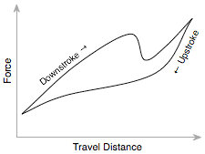
One of the most-cited criteria for keyboard aficionados to prefer a certain keyboard over another is “clickiness”. The idea behind this is that a good keyboard should give you some tactile feedback when you've successfully “actuated” a key, and that you shouldn't have to depress the key all the way to the bottom to be sure, as this would not allow you to type very fast. Some keyboards don't click at all, some give a softer and others a sharper click. The exact behaviour can be described by a graph plotting how the physical force required to push the key varies along its way down and its way up. The sudden dip in force on the downstroke is where you will feel the “click”.
I have to agree with many others that the Apple Extended Keyboard II is the finest keyboard I have used in terms of key feel. I used it for a couple of years in the late 90s, and it was the first to even make me aware of how good a keyboard could feel. I have not found a match since. In 2004 I bought a Matias TactilePro, which supposedly uses the exact same mechanical switches as the Apple Extended Keyboard II. However, it seemed to require more force, wasn't as smooth and seemed more noisy. Keys also kept failing, so I eventually gave up on it and now use a Macally icekey, which uses scissor-switch keys like those found on a laptop, but feels a bit firmer. I have also been quite impressed with a standard HP keyboard that I use at work. It uses rubber dome switches, which usually have a much inferior feel to mechanical or scissor switches, but they are square rather than round, which seems to give it an acute but soft clickiness and a very pleasant overall feel.
Hysteresis
I already mentioned that the key actuates when the click happens, but when should it deactuate? The obvious choice would be to make it the same as the actuation point:

However, this behaviour leads to an unexpected problem: any tiny amount of vibration around the actuation point can mean that the switch briefly fluctuates between the open and closed states, causing, for example, a letter to be inserted twice on one key press. To avoid this happening, keys should have to return some way (0.25–1.5 mm) before deactuating. This distance is called hysteresis:

Astonishingly, plenty of modern keyboards seem to have no hysteresis built into their switches. I get duplicated letters more than occasionally when typing on my Macally icekey or on my G4 iBook. The MacBooks don't seem to use hysteresis either. I haven't had a chance to test one of the new aluminium Apple keyboards or a MacBook Pro for this.
Travel and force
Another common factor mentioned when assessing keyboards is the distance the keys travel. Laptop keyboards and laptop-like keyboards tend to have shorter travel than most desktop keyboards. Related to travel is the amount of force required to depress a key. The Handbook of HCI recommends key travel to be between 1.3 and 6.4 mm, and the key force to be between 28 and 142 g. These are rather wide ranges, and in fact experiments showed that users are not too fussed about these two variables and will simply adapt their typing behaviour accordingly.
Keyboard profile
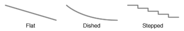
The book chapter summarises the results of two studies looking into keyboard profiles. The dished profile seemed to narrowly come out on top, with higher throughput than the stepped profile in one study. The flat profile performed worst (ahem), with more errors going undetected by typists and with lower throughput.
Key shape
The vast majority of keyboards have key caps that are either concave or dished. Apple however, has started giving their keyboards flat keys. Unfortunately, the book doesn't give any recommendations in this regard. However, I have my own little theory about this. I think that key shape matters because the direction at which you strike a key is rarely perfectly parallel with the key's travel path. Most of the force you apply may go into moving the key down, but the rest will go into pushing the key sideways and into pushing your finger along the surface. The less force goes into moving your finger sideways, the more force goes into the key. A concave key cap directs more of the force into the key when you strike it an angle, which effectively increases the area that you can comfortably use to depress the key.
As I said, this is purely a theory, and I have no evidence that the key cap shape actually makes any difference. I haven't spent enough time on one of the newer Apple keyboards to really form an opinion about them.
Other factors
Some of the other factors to consider in keyboard design are tilt, key size and key spacing.
All users in the studies referred to preferred having some tilt rather than a completely horizontal keyboard. 50% preferred an angle between 15˚ and 25˚. Not surprisingly, the preferred angle correlates with the seat height and with the user's stature.
Keys should be no less than 19 mm apart, as more tightly spaced keys tend to slow users down. There were no conclusive results on key size, but the ANSI standard recommends a size of 12 mm × 12 mm.
Final thoughts
Clearly, a fair amount of work, time and research funding went into this topic, especially during the years when computers were less of a commodity and still more of a research topic. The work successfully produced empirical evidence that led to very concrete and specific recommendations for the design of keyboards. Even so, today's keyboard makers seem either oblivious or ignorant of all this latent wisdom. Given that we're talking about a device that millions of people have to physically interact with on a daily basis – in many cases for several solid hours – it is sad that we've kept repeating the same mistakes that we've had the potential to avoid for more than twenty years.
Hyphens, dashes, et cetera 5 May 2008 3:08 AM (17 years ago)
I have a thing about correct punctuation, and although I'm aware that most people would find me over-zealous in this regard, I would bring to my defence that it's not just a pointless obsession or a purely aesthetic matter. A bit of poor punctuation will in the best case distract those from the text who notice it and affect their impression of the author, and in the worst case actually give the reader trouble understanding a sentence. Having said that, what I'm going to write about today is more on the aesthetic side, but could nevertheless help you make a good impression on a reader who notices these things.
I have noticed what seems to be a recent trend, especially on the web, to put unnecessary hyphens between adverbs and adjectives when they modify a noun, as in a brightly-lit street (which should be simply a brightly lit street). This habit seems to originate in the hyphenation of compound modifiers, as in real-estate agent or an out-of-date book. But those examples are hyphenated to avoid ambiguity or because the words in that order would not make a valid sentence structure without hyphens. Adverbs that end in -ly are always modifying an adjective or another adverb, so there is no ambiguity. Only adverbs that don't end in -ly, such as well, most or fast should get a hyphen, as in fast-running man.
Here are some examples from sites that I read regularly, including BBC News:
newly-elected councillors
reasonably-sized buttons
poorly-served areas
the highly-anticipated device
These should just be:
newly elected councillors
reasonably sized buttons
poorly served areas
the highly anticipated device
After all, you wouldn't write a really-good movie either.
Another trend I've noticed is around the use of dashes in what are called strong interruptions. When you have the right symbols available, there are two ways to punctuate such an interruption:
You can use en-dashes – Option-Minus on a Mac keyboard – surrounded by spaces.
Or you can use the longer em-dashes—Shift-Option-Minus on a Mac keyboard—without spaces.
Using an en-dash with spaces is common in Britain, while using the em-dash is more common in America. Personally I prefer the British style, because it visually offsets the interruption from the rest of the sentence more. What some people tend to use on the web, however, is an em-dash with spaces — like this — which I think looks odd because it creates a huge gap between words. If you prefer the look with spaces, just use an en-dash.
While we're on the topic of dashes, I'll briefly mention two common cases where an en-dash should be used rather than a hyphen. One is for ranges, such as 1980–2008. Another is when combining two nouns in a way that implies a to- or and-relationship, as in the London–Paris Eurostar or parent–child relationship.
My sources for most of this are The Penguin Guide to Punctuation by R. L. Trask and Type and Typography by Phil Baines and Andrew Haslam.
Surface computing, move over! 27 Dec 2007 8:08 AM (18 years ago)
For a few weeks now, my two team-mates at work and I have been using a “horizontal” whiteboard, lying across the desk surface between us. I had been wanting to try this for a while, but it wasn’t possible because of our previous desk arrangement. Now that we have this large area of space between us and no partitions, this small whiteboard fits perfectly without getting in the way.

We’ve found ourselves using it virtually every day, illustrating explanations, walking through calculations and brainstorming design ideas. Visitors will intuitively pick up a pen and start using the whiteboard when explaining things. It somehow seems to invite people to use it more than most whiteboards. However, it’s not only a collaborative tool: it also makes a great scratch-pad when you’re brainstorming on your own. To ensure that it stays useful, we make an effort to keep the board clean; nothing tends to stay on there for longer than a day or so.
Overall, it’s being used far more than any wall-mounted whiteboards we’ve had near us, and I think this is due to two key differences to wall-mounted boards. Firstly, each one of us can reach the board very easily without having to get up. You just turn your chair slightly and there it is. Secondly, the whiteboard is between us, so it feels less like a presentation aid and more like a collaborative work surface, accessible equally well from all sides.
If your work involves collaborative problem-solving, and if your desk arrangement allows it, I highly recommend setting up a whiteboard like this. Don’t make it too big, because you won’t be able to reach all corners and it will also eat into your desk real-estate. I think ours is 90×60 cm, which is just right. I also recommend investing in some pens with a finer tip than the standard ones you tend to get. Those are designed to be visible from a few meters away, but you’ll find them too thick for handwriting at a comfortable size for close-up work. Edding do quite a range of dry-erase board markers.

Neutech desktop background redux 15 Nov 2007 8:10 AM (18 years ago)

There was once an appearance theme for Mac OS 8 and 9 called Neutech, by Flanksteak Design. I don't think I particular liked the theme as a whole, but it included a desktop background that has been my favourite background for the last eight years or so since I discovered it:

Here's a detail:

I have made sure I that I always have a copy, which has survived across all the different Macs I've used since. However, the image is only 1024 × 768 pixels, which wasn't small at the time, but makes the image look rather pixelated and blurry on modern displays. I have made several attempts in the past to reproduce it in Photoshop, but never got very far. Today, I sat down again with renewed determination and finally found the secret recipe to emulate the look of the original:


One thing that really helped here was Photoshop CS3's Smart Filters, because I could experiment and keep tweaking the many effects I had to apply. This also means that I can easily produce updated versions in the future as screen resolutions increase.
For the time being, here's a 2560 × 1600 version.
Update: I've changed the grid to look more like dried earth and less like reptile skin, and made minor changes to shading.

Namely 2.5 4 Nov 2007 11:11 AM (18 years ago)
Sorry to be late by a week or so, but there are several reasons why I didn't get a Leopard-compatible update to Namely out sooner.
First of all, I didn't have Leopard any earlier than most of you; I bought it on Friday the 26th of October at the Apple Store on Regent Street. That's because unlike many Mac developers who dedicate a lot more time to this stuff and who have an income from it, I don't have a Select membership with the Apple Developer Connection.
Secondly, I decided to try out Leopard's improved support for application launching through Spotlight before putting any effort into updating Namely. Ever since Scott Forstall had hinted at this feature at the World-Wide Developers' Conference in 2006, I had been feeling a bit anxious about Leopard rendering Namely redundant. (I generally think it's a good thing when Apple fills a gap that was identified and addressed by third-party developers, but nevertheless, we do tend to fall in love with our applications.) My verdict: Spotlight is not bad, but it didn't win me over. I didn't spend enough time with it to figure out how clever it is about choosing between candidate matches (it seems to at least take into account which app you chose last time), but long enough to find a few things that I didn't like about it:
- A lot of stuff happens visually in the Spotlight menu, which distracts from your main task: quickly identifying the application you want to launch.
- The icons of listed apps don't always appear straightaway.
- It only shows three matches, so it's effectively a bit less tolerant.
I guess these things shouldn't be an issue if you only occasionally need an application that's not in your Dock. Finding it through Spotlight will still be much faster than navigating to it in the Finder. But I think that if you use Namely (or, for that matter, any other keyboard-based launcher) for most of your application launching, anything that isn't super-fast isn't fast enough. When I launch an application, I don't want to think much, and I don't want to see much. I just want to launch it. Although Namely's sorting isn't perfectly predictable because it adapts over time, it stabilises quickly enough so you can be pretty confident about what it will suggest when you type something.
The third reason for the delay is that I just wasn't sure what to release. I have been (slowly) working on Namely 3.0, which is controlled through a preference pane and doesn't show up in the Dock. So I was considering finishing that off rather than releasing another update to Namely 2.x. However, I wasn't confident that I could get Namely 3 finished and stable within a few days, so I decided to push out a minor update in the meantime.
Here it is. Annoyingly, I couldn't find a way to make it work on both 10.3.9/10.4 and 10.5 (I link against the 10.5 libraries in order to support Spaces, but this seems to stop Apple's secret application-listing function from working on 10.4), so I had to leave version 2.1 available as a separate download.
Coupland and Helvetica 10 Oct 2007 2:34 PM (18 years ago)
Douglas Coupland last night at the Bloomsbury theatre in London (at what he said was probably his last ever book reading):
...and someone said making a film about Helvetica is like making a film about off-white paint.
I think in Helvetica. I love Helvetica.
For more of his thoughts on the typeface, also see this piece in the New York Times.
Making sense of standard deviation 1 Sep 2007 3:47 AM (18 years ago)
I love the feeling of getting to understand a seemingly abstract concept in intuitive, real-world terms. It means you can comfortably and freely use it in your head to analyse and understand things and to make predictions. No formulas, no paper, no Greek letters. It’s the basis for effective analytical thinking. The best measure of whether you’ve “got it” is how easily you can explain it to someone and have them understand it to the same extent. I think I recently reached that point with understanding standard deviation, so I thought I’d share those insights with you.
Standard deviation is one of those very useful and actually rather simple mathematical concepts that most people tend to sort-of know about, but probably don’t understand to a level where they can explain why it is used and why it is calculated the way it is. This is hardly surprising, given that good explanations are rare. The Wikipedia entry, for instance, like all entries on mathematics and statistics, is absolutely impenetrable.
First of all, what is deviation? Deviation is simply the “distance” of a value from the mean of the population that it’s part of:

Now, it would be great to be able to summarise all these deviations with a single number. That’s exactly what standard deviation is for. But why don’t we simply use the average of all the deviations, ignoring their sign (the mean absolute deviation or, simply, mean deviation)? That would be quite easy to calculate. However, consider the following two variables (for simplicity, I will use data sets with a mean of zero in all my examples):

There’s obviously more variation in the second data set than in the first, but the mean deviation won’t capture this; it’s 2 for both variables. The standard deviation, however, will be higher for the second variable: 2.24. This is the crux of why standard deviation is used. In finance, it’s called volatility, which I think is a great, descriptive name: the second variable is more volatile than the first. [Update: It turns out I wasn't being accurate here. Volatility is the standard deviation of the changes between values – a simple but significant difference.] Dispersion is another good word, but unfortunately it already has a more general meaning in statistics.
Next, let’s try to understand why this works; that is, how does the calculation of standard deviation capture this extra dispersion on top of the mean deviation?
Standard deviation is calculated by squaring all the deviations, taking the mean of those squares and finally taking the square root of that mean. It’s the root-mean-square (RMS) deviation (N below is the size of the sample):
RMS Deviation = √(Sum of Squared Deviations / N)
Intuitively, this may sound like a redundant process. (In fact, some people will tell you that this is done purely to eliminate the sign on the negative numbers, which is nonsense.) But let’s have a look at what happens. The green dots in the first graph below are the absolute deviations of the grey dots, and the blue dots in the second graph are the squared deviations:
The dotted blue line at 5 is the mean of the squared deviations (this is known as the variance). The square root of that is the RMS deviation, lying just above 2. Here you can see why the calculation works: the larger values get amplified compared to the smaller ones when squared, “pulling up” the resulting root-mean-square.
That’s mostly all there’s to it, really. However, there’s one more twist to calculating standard deviation that is worth understanding.
The problem is that, usually, you don’t have data on a complete population, but only on a limited sample. For example, you may do a survey of 100 people and try to infer something about the population of a whole city. From your data, you can’t determine the true mean and the true standard deviation of the population, only the sample mean and an estimate of the standard deviation. The sample values will tend to deviate less from the sample mean than from the true mean, because the sample mean itself is derived from, and therefore “optimised” for, the sample. As a consequence, the RMS deviation of a sample tends to be smaller than the true standard deviation of the population. This means that even if you take more and more samples and average their RMS deviations, you will not eventually reach the true standard deviation.
It turns out that to get rid of this so-called bias, you need to multiply your estimate of the variance by N/(N-1). (This can be mathematically proven, but unfortunately I have not been able to find a nice, intuitive explanation for why this is the correct adjustment.)
For the final formula, this means that instead of taking a straightforward mean of the squared deviations, we sum them and divide by the sample size minus 1:
Estimated SD = √(Sum of Squared Deviations / (N - 1))
You can see how this will give you a slightly higher estimate than a straight root-mean-square, and how the larger the sample size, the less significant this adjustment becomes.
Update: Some readers have pointed out that using the square to "amplify" larger deviations seems arbitrary: why not use the cube or even higher powers? I'm looking into this, and will update this article once I've figured it out or if my explanation turns out to be incorrect. If anybody who understands this better than me can clarify, please leave a comment.
On pie charts etc. 8 Aug 2007 1:29 PM (18 years ago)
On the subject of pie charts, information design god Edward Tufte has the following to say in The Visual Display of Quantitative Information:
A table is nearly always better than a dumb pie chart […]. Given their low data-density and failure to order numbers along a visual dimension, pie charts should never be used.Although I tried for some time to convince myself and others that this is true, I have failed to come up with a really convincing argument against using pie charts. In fact, I have decided that they aren’t useless at all. Consider the following data, shown as a table, a pie chart, a bar chart and a stacked bar:

One basic feature of all the graphical representations is that they give an immediate impression about which are large and which are small contributors. The table, on the other hand, has no physical attribute that is analogous to quantity. Instead, you need to read and interpret the arbitrary symbols we use for numbers, form a more conceptual representation of the quantities in your head and compare them. You can get around this by ordering the table by value, but you’ll lose the original ordering of the items.
With regards to precision, the table obviously wins. The bar chart also offers pretty good precision as long as you don’t make it too small. The stacked bar may seem to have the upper hand over the pie chart because it has a scale, but reading values isn’t as easy as you may think. Only the first and last section are reliably easy to read. For all the sections in between, the grid lines are of little help. For example, can you confidently say at a glance whether the red section represents more or less than 50%? In the pie chart, you can at least tell straightaway that A contributes slightly over a quarter, B more than half and C around one eighth. And often that’s all you want to know. Do you really care whether an item contributes 27% or 29%? (I’m not saying that you don’t, only that that’s a question to ask when deciding what representation to use).
The stacked bar is also pretty impossible to label (no, legends are not a satisfactory solution). However, this can also be true for pie charts, especially if there are many segments and/or if they have long titles.
A further restriction of pie charts is that they don’t allow adding a further dimension to provide comparisons between different sets of data. Multiple pie charts shown side by side aren’t really comparable, because the whole structure of each pie will be different. This is where tables or bar charts can do much better.
In summary, I’d like to suggest the following guidelines for using pie charts:
- Use them if you want to give a high-level impression of the distribution of proportions.
- Don’t use them if precision is important, or include numbers if you have space.
- Don’t use them if order is important.
- Don’t use them if you need to show multiple data sets, e.g., changes over time.
- Keep labels short. Legends suck.
- If the context allows, use colours that are familiar to the viewer, and use them consistently.
Lastly, I’d like to briefly address the recently fashionable “pixel charts”. Although it’s a terrible waste of time, really. I mean, come on:
In case you still have doubts: the four areas in the following chart are all the same size:
Or are they different sizes? I’m not sure, and I can’t be bothered to count right now.
.%3C/p%3E%3Cp%3EThe%20stacked%20bar%20is%20also%20pretty%20impossible%20to%20label%20(no,%20legends%20are%20not%20a%20satisfactory%20solution).%20However,%20this%20can%20also%20be%20true%20for%20pie%20charts,%20especially%20if%20there%20are%20many%20segments%20and/or%20if%20they%20have%20long%20titles.%3C/p%3E%3Cp%3EA%20further%20restriction%20of%20pie%20charts%20is%20that%20they%20don%26%238217;t%20allow%20adding%20a%20further%20dimension%20to%20provide%20comparisons%20between%20different%20sets%20of%20data.%20Multiple%20pie%20charts%20shown%20side%20by%20side%20aren%26%238217;t%20really%20comparable,%20because%20the%20whole%20structure%20of%20each%20pie%20will%20be%20different.%20This%20is%20where%20tables%20or%20bar%20charts%20can%20do%20much%20better.%3C/p%3E%3Cp%3EIn%20summary,%20I%26%238217;d%20like%20to%20suggest%20the%20following%20guidelines%20for%20using%20pie%20charts:%20%3Col%3E%3Cli%3EUse%20them%20if%20you%20want%20to%20give%20a%20high-level%20impression%20of%20the%20distribution%20of%20proportions.%3C/li%3E%0A%3Cli%3EDon%26%238217;t%20use%20them%20if%20precision%20is%20important,%20or%20include%20numbers%20if%20you%20have%20space.%3C/li%3E%0A%3Cli%3EDon%26%238217;t%20use%20them%20if%20order%20is%20important.%3C/li%3E%0A%3Cli%3EDon%26%238217;t%20use%20them%20if%20you%20need%20to%20show%20multiple%20data%20sets,%20e.g.,%20changes%20over%20time.%3C/li%3E%0A%3Cli%3EKeep%20labels%20short.%20Legends%20suck.%3C/li%3E%0A%3Cli%3EIf%20the%20context%20allows,%20use%20colours%20that%20are%20familiar%20to%20the%20viewer,%20and%20use%20them%20consistently.%3C/li%3E%0A%3C/ol%3E%3Cp%3ELastly,%20I%26%238217;d%20like%20to%20briefly%20address%20the%20%3Ca%20href%3D%22http://www.dashes.com/anil/2007/07/pixels-are-the-new-pies.html%22%3Erecently%20fashionable%20%26%238220;pixel%20charts%26%238221;%3C/a%3E.%20Although%20it%26%238217;s%20a%20terrible%20waste%20of%20time,%20really.%20I%20mean,%20come%20on:%3C/p%3E%3Cdiv%3E%3Cimg%20src%3D%22https://blogger.googleusercontent.com/img/b/R29vZ2xl/AVvXsEi9zsSpCCvZCpIB9Z_vpQ5Dl3Jkf3Hg0LkxL73N1w-n9_uxgcWg1fxp5Gyd52pemASNJDjAlxtVI6-Kg78wTRm0UJlDAICFIcMdKB7JvJQsUudcY-G0nmmJVh2HulZdX_bUzyMvgw/s400/pixel-charts-1.gif%22%20border%3D%220%22%20alt%3D%22%22%20/%3E%3C/div%3E%3Cp%3EIn%20case%20you%20still%20have%20doubts:%20the%20four%20areas%20in%20the%20following%20chart%20are%20all%20the%20same%20size:%3C/p%3E%3Cdiv%3E%3Cimg%20src%3D%22https://blogger.googleusercontent.com/img/b/R29vZ2xl/AVvXsEhRgNLIY7AzaY12AY5gvX_FzfcYtc4IlBC0SiKpru5pEKep3MsAgSCfcUSBiJsRchd-GDaxtHXPtd60ISxXnScbOrTuMM48EDBnfyIO48zsnj2JPIWMrBb_886SRqiNx1kmzTfhsA/s400/pixel-charts-2.gif%22%20border%3D%220%22%20alt%3D%22%22%20/%3E%3C/div%3E%3Cp%3EOr%20are%20they%20different%20sizes?%20I%26%238217;m%20not%20sure,%20and%20I%20can%26%238217;t%20be%20bothered%20to%20count%20right%20now.%3C/p%3E)
Clickable control labels for the web 16 Jul 2007 9:17 AM (18 years ago)
One of my pet peeves in web interfaces has always been that on radio buttons and checkboxes, only the small button itself is clickable. In native Mac and Windows interfaces, you can usually click on the text labels of these controls as well, giving you a much larger target, which, in accordance with Fitts' Law, makes them faster to hit.
Many, or perhaps most, people would probably never notice this difference in behaviour because they have only ever tried clicking on the button proper; the text doesn't visually suggest that it's clickable. But for those of us who are used to this shortcut, the standard web behaviour will catch us out every time. (Actually, I've started to wonder whether I'm the only person on the planet to click on the text labels, since I've never heard anyone else complain about this issue.)
Until a few months ago, I thought this was all just an unfortunate but inevitable limitation of HTML, and that developers found it too much hassle to implement a workaround in JavaScript. Then, I discovered HTML's label element. If you mark up a piece of text as a label and set its for attribute to be the ID of a form control, it becomes the "official" label for that control. The practical effect of this is that in most browsers, clicking the label will actually do something useful. For checkboxes and radio buttons, it will toggle their state, while for text fields, it will put the focus on the field. This works in Internet Explorer 6(!) and 7, Safari (I only checked version 3.0.2), Firefox and Camino. OmniWeb will do it in the upcoming 5.6 release.
So code like the following:
<input
 type="radio"
 name="os"
 id="mac"
 value="mac">
<label
 for="mac">Mac user</label>

<input
 type="radio"
 name="os"
 id="windows"
 value="windows">
<label
 for="windows">Windows user</label>

<input
 type="checkbox"
 name="loving_it"
 id="loving_it">
<label
 for="loving_it">And loving it</label>
results in nice, fully clickable controls like this:
There's also an alternative, simpler syntax that doesn't require using the for and id attributes. Instead, you can just make the label element a parent of the control:
<label>
  <input
   type="radio"
   name="os"
   value="mac">Mac user
</label>
However, this does not work in Internet Explorer 6, so if you want to be inclusive, stick with the more explicit syntax.
Web site redesign 29 May 2007 10:05 AM (18 years ago)
I've just launched a redesign of my web site, which makes it the fifth version, if I recall correctly.
It's based on a simple grid with six columns of 100 pixels width and 20 pixels in between. Those are pretty much the same dimensions as I used for UIScape.com, and I've found them to work quite well: narrow enough to allow some flexibility and wide enough for most content. However, it only works if you have a very narrow sidebar. (With UIScape, I had to cheat by adding another 20 pixels on the right.)
I used to have a strange aversion to using non-white backgrounds, but this time I had a very particular look in mind, so I decided to just go for it. I was going to at least use PNGs with transparency for all the graphics, but too many people still use bloody Internet Explorer 6, so the background colour is fixed in the images.
This new site includes Google Analytics code for tracking statistics. I think this may be causing a delay when loading pages. I hope this is not too noticeable or at least not too bothersome for people. (Basically, I load and run the Google Analytics JavaScript at the start of the page, because I make in-page calls to it for tracking downloads and outbound links. If you know of a way around this, please let me know.)
UIScape 14 Mar 2007 10:37 AM (19 years ago)
When I spent three months at Microsoft Research last year, I came across a lot of fascinating work related to interaction design. Colleagues would talk about their projects, people would report back from conferences, visitors came in to present their work, and I found things during literature reviews. Some of the designs I saw and read about were so cool that I couldn't believe they weren't more well known. Even my friends and I, who were supposed to be into design and human-computer interaction, hadn't heard about them. There was an obvious problem here.
I think the reason for this lack of dissemination is that the main way for researchers to make their ideas known is through conferences, journal articles and coffee-break chats. All three of these channels have only other researchers at the receiving end.
Most of the published literature is available online, but very often not free of charge. Researchers usually have access to relevant digital libraries through their employers, but designers and other potentially interested people are unlikely to be willing to pay.
Of course, many papers are available for free. However, a further barrier is that the format and language of scientific papers is not what non-researchers would consider an easy and engaging read. Given this "language barrier", as well as the prerequisite knowledge required for a lot of the material, you won't find many people casually reading the latest CHI conference proceedings on the train or flipping through a 20-page research study during their lunch break.
There is one web site which has addressed this same problem, albeit not for interaction design-related research. Ars Technica's Nobel Intent journal supplies those who have a casual interest in science with digests of interesting studies. These are written in a fairly casual style, usually include any necessary background knowledge, and only take a few minutes to read.
It didn't take much ingenuity to realise that such a model may be exactly what is needed to break the barrier that I had witnessed in human-computer interaction research. I got a few friends from university to join me in the effort to get something rolling. Well, after a few months of planning, designing, building and writing, the result is finally here:
http://uiscape.com
I sincerely hope you find it interesting and that it will help get many more people excited about the work that's going on out there.
If you have any questions about the concept or design of the site, you can comment here or email me.