Christian Louboutin Loubichrome Collection 10 Jun 2017 1:23 PM (7 years ago)
 The Loubichrome collection from Christian Louboutin came out at the very end of 2016/very beginning of 2017. Three lacquers in beautiful heavy glass bottles with rainbow colored handles in stiletto shaped points. These are smaller than normal Christian Louboutin lacquers, at only 0.2 oz while other Christian Louboutin polishes are 0.4 oz. This also changes the price point, so each of these lacquers are only $30US instead of the regular price point of $50US a bottle.

 |
| no base coat, 3 coats of Loubichrome I, no top coat |
 |
| no base coat, 2 coats of Loubichrome II, no top coat |
 |
| no base coat, 2 coats of Loubichrome III, no top coat |
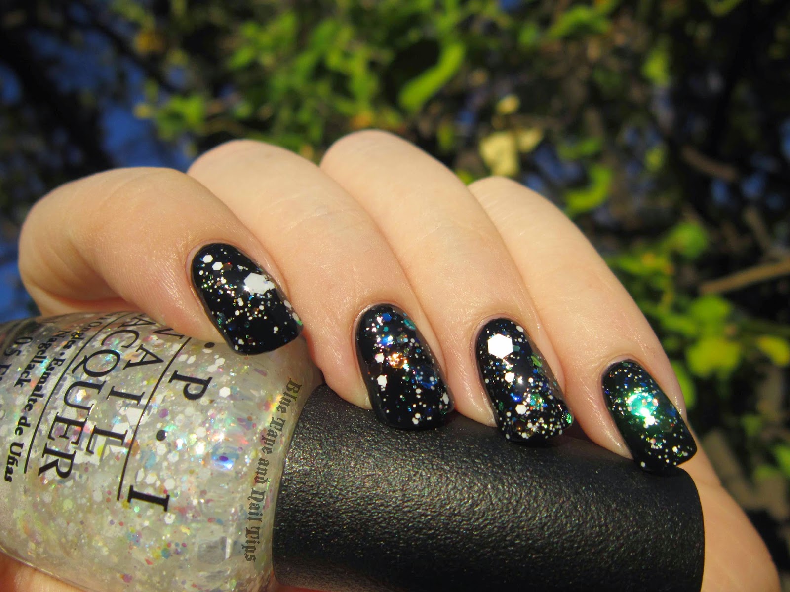
The last in the Loubichrome collection is Loubichrome III. This purple hue is such a nice, vibrant color. The finish of this polish is very similar to Loubichrome II, where the foil finish shines through to create a metallic purple polish that consists of silver microparticles in a purple base. The final effect when this polish dries is a sparkling purple lacquer with a high silver shine.
One word of advice I will give with this lacquer is that you definitely need to wear a base coat with it. When swatching I tend to try out most colors without using a base coat to see how they work by themselves without some type of smoothing base underneath. After swatching this polish, I wore it for three days straight, and when I took it off my nails were stained yellow-orange wherever the polish had been. This is why a base coat is vital. You don't have to buy Christian Louboutin's base coat to use with these polishes, but I do recommend using your own favorite base coat to prevent staining.
As I've found with other Christian Louboutin polishes, these lacquers were very easy to apply, helped on by the long handle of the bottle. Furthermore, I found these to be the easiest handles to wield because of the smaller handle/bottle size. This makes me wish that more Christian Louboutin lacquers were available in these 0.2 oz sizes!
As of posting, on 10 June 2017, these polishes are still available to buy on the Saks Fifth Avenue website! No need to pay scalpers on eBay for exorbitant prices, when these are still available from an official retailer! Yay!


Christian Louboutin Scarabee Collection 6 Jun 2017 1:30 PM (7 years ago)
 The Scarabée collection from Christian Louboutin contains three nail lacquers in duochrome shades. From 2015, the lacquers - Scarabée I, Scarabée II, and Scarabée III - were designed to be reminiscent of the relics of ancient Egypt, featuring jewel-toned colors and gold-toned lids in heavy-weight glass bottles.

 |
| no base coat, 3 coats Scarabée I, no top coat |
In low lighting, this polish really shines. The strongest multichrome shift out of the three lacquers in this collection, in the shade of midday, the yellow-gold, orange, and red of this polish are all clearly visible. In the photo below, the only changes that were made to color were to color-correct the white background. That is the actual multichrome color shift you can see in real life!
 |
| no base coat, 3 coats Scarabée I, no top coat |
 |
| no base coat, 3 coats Scarabée III, no top coat |
 |
| no base coat, 2 coats Scarabée II, no top coat |
There is something about the bottle design that not only makes these lovely lacquers to have in any collection, but the longer handle makes wielding the brush easier, thus making nail polish application easier. The quality of these polishes is good and tends to be consistent throughout the whole collection. Scarabée II only needed 2 coats to be opaque, while Scarabée I and III needed 3 coats, but none of the polishes need a dark base color for any of the duochrome/multichrome color shift to be visible.

Unfortunately, these colors are no longer available through regular retailers like Nordstrom, Neiman Marcus, Saks Fifth Avenue, and Christian Louboutin stores. You can still find them on eBay and other online resale avenues, so check there if you're interested!
Rouge Louboutin by Christian Louboutin 9 Jan 2017 12:29 AM (8 years ago)
 Hello! It's been a while, so let's dive right into a beautiful, classic red polish released by a company known for its iconic fashion line (and now its iconic beauty line):
 |

The tallest of the nail lacquers available from Christian Louboutin, at 8 inches tall with a unique stiletto handle that speaks to the origins of this nail polish line. For what is Christian Louboutin most famous for, if not the red sole of their high heels?
 |
| base coat, 2 coats Rouge Louboutin, no top coat |
This lacquer is made to be opaque in one coat, and by wearable standards it is exactly that. Only with a macro camera lens is the nail line/edge visible at 1 coat of polish.
 |
| base coat, 2 coats Rouge Louboutin, no top coat |
This polish features a high gloss shine, so no top coat is necessary if you'd prefer to forgo one. Each swatch shown here is without top coat.
 |
| base coat, 2 coats Rouge Louboutin, no top coat |
One of the best things about Rouge Louboutin may be the stilleto handle and how easy it is to paint with. Neither the width nor the length of the handle are unwieldy, and are in fact, easier to polish with than the short handles found on most modern day nail polish bottles.
 |
| base coat, 2 coats Rouge Louboutin, no top coat |
As packaging goes, this is one of the most beautiful nail polish bottles around. The hard cardboard box has a significant weight to it, and snugly hugs the bottle. The top black lid lifts off around the polish bottle's handle, while the red and black bottom slides off the bottom of the bottle. The glass bottle itself has a fascinating color gradation from clear at the top to black at the bottle's base. The stiletto handle - "inspired by the tallest heel Christian Louboutin ever created- the Ballerina Ultima" - feels like it's made out of a solid resin/plastic that will retain its sheen and stand up to constant use.
Overall, even though the price is currently one of the most expensive single polishes available at $50US a bottle, it is well worth it to invest in a classic red that will always make a statement on any dressing table or vanity.
Upcoming Chanel and Christian Louboutin Nail Polish Collections 12 Jun 2015 12:46 AM (9 years ago)


A post shared by Cyan (@bluetapenails) on
A photo posted by Christian Louboutin (@louboutinworld) on
A photo posted by Christian Louboutin (@louboutinworld) on

Aren't they beautiful?!
Three duochrome/multichrome lacquers are the focus of this nail polish collection. As with each polish collection Louboutin has released, these spiked lids seem to be a specific, unique color all their own to distinguish them from all of your other Christian Louboutin lacquers. As an added touch, this collection features boxes with a scarab beetle cut-out (a nod to the namesake of the collection).
Chanel nail polishes retail for $27US and Christian Louboutin polishes retail for $50US.
Will you be picking any of these up? Anyone own any of these yet?
OPI Gwen Stefani Holiday 2014 Nail Effects 6 Sep 2014 2:22 AM (10 years ago)


Are you ready for Holiday collections yet? For the Winter of 2014, OPI is releasing 3 separate collections in collaboration with Gwen Stefani. The collection I have to show you today is the glitter collection.
Let's begin with a look at the solid color polishes that come with the collection for you to layer the glitter over:
 |
| no base coat, 2 coats Rollin' in Cashmere, no top coat |
First up is Rollin' in Cashmere. A frosty yellow-gold. To me, this looks exactly like I though 50 Years of Style from the recent Ford Mustang collection would look. I don't have them to compare, so you'll have to tell me if you agree or disagree.
 |
| no base coat, 2 coats Rollin' in Cashmere, no top coat |
Next up is Unfrost My Heart. Made up of dense, tiny silver particles to give you a chrome finish. Like Rollin' in Cashmere, I think this polish looks very similar to a previous OPI polish. What do you think: could this be a dupe to My Signature is DC from the Coca-Cola collection?
 |
| no base coat, 2 coats Unfrost My Heart, no top coat |
How about another photo to help you decide:
 |
| no base coat, 2 coats Unfrost My Heart, no top coat |
Ok, now on to the part you (probably) came here to see: the glitters.
 |
| no base coat, 1 coat of So Elegant over 3 coats of My Boyfriend Scales Walls by OPI, no top coat |
This is So Elegant. Large gunmetal hexagonal glitters, medium gunmetal hexagonal glitters, small matte black hexagons, and micro matte black dots are all suspended in a clear base.
 |
| no base coat, 1 coat of So Elegant over 3 coats of My Boyfriend Scales Walls by OPI, no top coat |
Next up is I'll Tinsel You In. Yay! An easy-to-apply black and white glitter-topper from a mainstream brand.
 |
| base coat, 1 coat of I'll Tinsel You In over 2 coats of My Turn by Sinful Colors, no top coat |
Honestly, I thought this was just a black and white glitter. Upon closer inspection, this polish seems to fit its name perfectly. There are large matte white glitter pieces, matte white bar glitter, small matte black hexagons, micro matte black dots, and… what appears to be silver chrome bar glitter, thus making it look like this polish has actual tinsel in it!
 |
| base coat, 1 coat of I'll Tinsel You In over 2 coats of My Turn by Sinful Colors, no top coat |
Snow Globetrotter was the polish I was most interested in when I heard about this collection, and it doesn't disappoint!
 |
| base coat, 1 coat of Snow Globetrotter over 2 coats of Whipped by Sinful Colors, top coat |
Layered over black, this polish looks like a mix of crushed jewels and galaxies on your nails! A combination of opalescent hexagons in large, medium, small, and micro, along with matte white hexagonal glitter in sizes large, medium, small, and micro all in a clear base.
 |
| base coat, 1 coat of Snow Globetrotter over 2 coats of Whipped by Sinful Colors, top coat |
In the sun, the opalescent glitter pieces really catch the light!
 |
| base coat, 1 coat of Snow Globetrotter over 2 coats of Whipped by Sinful Colors, top coat |
Last but certainly not least, here is Comet in the Sky. I tried to save the best for last, and I think you may agree.
 |
| no base coat, 1 coat of Comet in the Sky over 2 coats of You Got Me Started by Deborah Lippmann, no top coat |
Comet in the Sky is the twin to Snow Globetrotter in that it features multiple sizes of matte glitter and multiple sizes of opalescent glitter in a clear base.
 |
| no base coat, 1 coat of Comet in the Sky over 2 coats of You Got Me Started by Deborah Lippmann, no top coat |
The matte black hexagonal glitter comes in size large, small, and micro, while the opalescent glitter comes in large, medium, small, and micro, all in a clear base.
 |
| no base coat, 1 coat of Comet in the Sky over 2 coats of You Got Me Started by Deborah Lippmann, top coat |
The strong opalescent colors are most prominent in regular indoor (tungsten) lighting, unless you want flashes of sparkle, which you can get by wearing this glitter in the sun. If you see below, you'll notice that the opalescent glitter on the bottom of my ring finger which looked clear-tinted yellow two photos above now glows a purplish-blue.
 |
| no base coat, 1 coat of Comet in the Sky over 2 coats of You Got Me Started by Deborah Lippmann, no top coat |
Chanel Sweet Star for FNO 2014 3 Sep 2014 7:42 PM (10 years ago)


?%20%26nbsp;If%20you%20were%20in%20debate%20about%20it,%20here's%20the%20reason%20you%20should%20go:%3C/div%3E%0A%3Cdiv%3E%0A%3Cbr%20/%3E%3C/div%3E%0A%3Cdiv%3E%0A%3Ca%20href%3D%22https://blogger.googleusercontent.com/img/b/R29vZ2xl/AVvXsEiBLkgVdu-emTB2SnKFvoipr86eTn8EqYUf7v_LrHEgKAY6-PURpMkI75QizlAAmqm9_UilvVqdfov1X9FeQWSdV8LMjwpz11iImqp6wgGMPNdDNlxFbs4h6ihcA3KjAZ1_squz209m3pZm/s1600/Screen+Shot+2014-08-27+at+12.47.56+PM.png%22%20imageanchor%3D%221%22%3E%3Cimg%20border%3D%220%22%20src%3D%22https://blogger.googleusercontent.com/img/b/R29vZ2xl/AVvXsEiBLkgVdu-emTB2SnKFvoipr86eTn8EqYUf7v_LrHEgKAY6-PURpMkI75QizlAAmqm9_UilvVqdfov1X9FeQWSdV8LMjwpz11iImqp6wgGMPNdDNlxFbs4h6ihcA3KjAZ1_squz209m3pZm/s1600/Screen+Shot+2014-08-27+at+12.47.56+PM.png%22%20height%3D%22400%22%20width%3D%22270%22%20/%3E%3C/a%3E%3C/div%3E%0A%3Cdiv%3E%0A%3Cspan%3E%3Ci%3Eimage%20from%20Vogue.com.au%3C/i%3E%3C/span%3E%3C/div%3E%0A%3Cdiv%3E%0A%3Cbr%20/%3E%3C/div%3E%0AYes,%20that%20is%20a%20new%20Chanel%20Le%20Vernis.%20%26nbsp;And%20it's%20exclusive%20to%20FNO%202014.%20%26nbsp;If%20you're%20lucky%20enough%20to%20live%20in%20Australia%20(Sydney%20to%20be%20precise,%20since%20Australia's%20pretty%20big,%20it's%20not%20going%20to%20do%20you%20any%20good%20if%20you're%20sitting%20at%20home%20in%20Perth%20or%20somewhere%20across%20the%20continent),%20then%20run%20to%26nbsp;Myer%20Sydney%20City%20Makeup%20Studio!%3Cbr%20/%3E%0A%3Cdiv%3E%0A%3Cbr%20/%3E%3C/div%3E%0A%3Cdiv%3E%0AAccording%20to%20Vogue%20Australia,%20this%20polish%20will%20be%20at%20the%20(below)%20Chanel%20location%20for%20FNO.%20%26nbsp;And%20you%20can%20only%20get%20it%20if%20you%20go%20in%20person.%20%26nbsp;Tonight.%20%26nbsp;In%20Australia.%3C/div%3E%0A%3Cdiv%3E%0A%3Cbr%20/%3E%3C/div%3E%0A%3Cdiv%3E%0A%3Ca%20href%3D%22https://blogger.googleusercontent.com/img/b/R29vZ2xl/AVvXsEhyAc7Fxl1oRRNhJYG5RI0AV8ppSWJUHayXdDeDRZDA4I_6lqzYfPsdhwe-f7leNPKWoSt-JrREpNPYn-NlEQtVwiGhvGAbQKenudm-r7LcGLeyJco7KT17x-rZef1xxVj313IPHA4MPoRA/s1600/Screen+Shot+2014-09-03+at+8.00.25+PM.png%22%20imageanchor%3D%221%22%3E%3Cimg%20border%3D%220%22%20src%3D%22https://blogger.googleusercontent.com/img/b/R29vZ2xl/AVvXsEhyAc7Fxl1oRRNhJYG5RI0AV8ppSWJUHayXdDeDRZDA4I_6lqzYfPsdhwe-f7leNPKWoSt-JrREpNPYn-NlEQtVwiGhvGAbQKenudm-r7LcGLeyJco7KT17x-rZef1xxVj313IPHA4MPoRA/s1600/Screen+Shot+2014-09-03+at+8.00.25+PM.png%22%20height%3D%22132%22%20width%3D%22400%22%20/%3E%3C/a%3E%3C/div%3E%0A%3Cdiv%3E%0A%3Cbr%20/%3E%3C/div%3E%0A%3Cdiv%3E%0AFor%20more%20information,%20follow%20this%20link%20to%20visit%20Vogue%20Australia's%20info%20on%20the%20FNO%20exclusive:%20%3Ca%20href%3D%22http://www.vogue.com.au/fno/retailers/chanel,693%22%20target%3D%22_blank%22%3EChanel%20at%20Vogue%20Fashion's%20Night%20Out%3C/a%3E%3C/div%3E%0A%3Cdiv%3E%0A%3Cbr%20/%3E%3C/div%3E%0A%3Cdiv%3E%0ANow,%20if%20you're%20like%20me%20and%20do%20not%20live%20in%20Sydney,%20then%20we%20just%20have%20to%20wait%20until%20November%20for%20the%20Chanel%20Delights%20collection%20to%20become%20available%20(according%20to%20%3Ca%20href%3D%22http://www.vogue.com.au/beauty/news/get+in+line+chanel+is+releasing+a+new+nail+polish+exclusively+at+vfno,32401%22%20target%3D%22_blank%22%3Ethis%20article%3C/a%3E%20from%20Vogue%20Australia).%20%26nbsp;%3C/div%3E%0A%3Cdiv%3E%0A%3Cbr%20/%3E%3C/div%3E%0A%3Cdiv%3E%0AUnfortunately,%20I%20called%20my%20local%20Chanel%20boutique%20to%20confirm,%20and%20they%20said%20that%20the%20United%20States%20will%20not%20be%20getting%20in%20any%20of%20the%20FNO%20products.%20%26nbsp;I'm%20going%20to%20make%20a%20wild%20assumption%20here%20and%20state%20that%20I%20think%20Sweet%20Star%20will%20become%20available%20the%20way%20Cosmic%20and%20Magic%20did%20from%20last%20year's%20FNO%20exclusives.%20%26nbsp;So%20this%20polish%20may%20be%20available%20to%20you%20later%20this%20month.%20%26nbsp;At%20this%20time,%20I%20do%20not%20know%20if%20any%20other%20countries%20participating%20in%20FNO%20will%20be%20able%20to%20get%20Chanel%20Sweet%20Star%20on%20their%20FNO%20date/time%20(for%20example,%20FNO%20for%20the%20UK%20is%20occurring%20on%20September%2023),%20but%20I'll%20keep%20you%20updated%20if%20I%20hear%20any%20more%20news%20about%20where%20you%20can%20find%20Chanel%20Sweet%20Star.%3C/div%3E%0A%3Cdiv%3E%0A%3Cbr%20/%3E%3C/div%3E%0A%3Cdiv%3E%0ANote,%20at%20the%20time%20of%20this%20posting,%20FNO%20in%20Australia%20is%20set%20to%20start%20in%20a%20little%20over%203%20hours.%20%26nbsp;So,%20you%20know,%20if%20you're%20on%20the%20opposite%20side%20of%20Australia,%20you%20can%20still%20run%20to%20the%20airport%20and%20fly%20out%20to%20Sydney.%20%26nbsp;%3C/div%3E%0A%3Cdiv%3E%0A%3Cbr%20/%3E%3C/div%3E%0A%3Cdiv%3E%0AIf%20you're%20one%20of%20the%20lucky%20ones%20to%20have%20gotten%20a%20bottle,%20please%20share%20some%20pictures!%20%26nbsp;Comment%20below,%20or%20tag%20me%20on%20Twitter%20and/or%20Instagram%20and%20I'll%20try%20to%20update%20this%20post%20so%20everyone%20can%20share%20in%20the%20nail%20polish%20exclusivity!%20%26nbsp;%3C/div%3E)
Nails Inc NailKale and Illuminator Review 27 Aug 2014 12:55 AM (10 years ago)


Kale and nail polish. Who would have thought they would come together in one bottle? Nails Inc. has jumped on the kale bandwagon and created a line of nail polish that are enriched with kale extract. So now you can get the benefits of nail polish and kale all in one bottle!
Lets look at one of the colored polishes in the line and then we will look at the Illuminator polish that is meant to work as a nail brightener.

Ok, first off, look at that shine! This is without top coat. That's right, this is dry to the touch and is more shiny than it would be with a top coat.

Now indoors, and in most lighting, this nail polish is a green-leaning black. Like a creme version of Nars Zulu, lighting brings out the green, so the more light, the more green that shows up in the polish.

You can see in the above picture, in direct mid-day sun, this polish is a true forest green creme. And it is still very reflective and shiny. Now on to the Illuminator.

Nails Inc. has a few new products besides colored polishes in the NailKale line. The NailKale Illuminator is one of those polishes. I consider it separate from the colored polishes because: (1) it has an extra word on the front of the bottle denoting it is an "Illuminator," (2) it has it's own tab on the Sephora website separate from the other polish color options and separate from the NailKale base coat, and (3) you're supposed to wear it like a colored polish (so, by itself) but I think it's great for layering as well (see below for what it looks like layered).

This is a gem of a polish just for the blue "glow" alone. Unfortunately sizing down the file size of each photo takes away from some of the awesome shine power, but click on any photo to enlarge it to see the great blue shimmer that streaks through this milky white polish.

In direct sunlight the shimmer is amazing!

And now to see it layered!

The blue shimmer in the Illuminator really comes out over a dark polish, and layering it over Bruton Mews really makes the blue shimmer sparkle as the whole nail looks blue.

And there you have it! This is what you get when you mix kale with nail polish.
Both polishes were beautiful. While Bruton Mews isn't a unique color, it is still a beautiful color and is worth purchasing for the glossy shine alone. The Illuminator Bright Street is supposed to be "a nail polish with iridescent pearls that brighten the pink nail bed, leaving the appearance of whiter tips and healthier nails" (according to the Sephora website). It certainly does whiten my nails, as it is a glossy white in color. The blue shimmer adds to the appeal, rather than distract or detract. The only downside to the Illuminator is the slightly slow dry time, but a quick-dry top coat will solve that problem in an instant.
Nails Inc. touts the NailKale polishes as being "formulated with kale extract known for its high levels of vitamins A, C and K which stimulate advanced keratin production. Making the nails stronger, brighter and more nourished. The entire Nailkale range also features Nails inc.’s patented Regenerating Complex (a two-fold Aldehyde, Zinc and Calcium blend) that boosts the production of keratin for harder, stronger and healthier nails" (from the Nails Inc. website).
I did a trial run of the NailKale Illuminator and wore it for three days. It had good staying power (no chips), and I can say that even a week later I don't see any peeling or splits in my nails, but that could also be because I recently filed down my nails, so I can't connect the health of my nails to the use of NailKale specifically.
Personally, I'm interested in trying the NailKale Superfood Base Coat that's supposed to be keratin-enriched and have other healthy stuff in it. While many people say that adding nutrients to nail polish is useless because your nail plate is dead the way hair is considered dead, I find that any little thing can help keep up the health of nails, so if it works for you, why not try it?
A quick note on the redesigned Nails Inc. bottles:
If you examine the bottles in the above photos, you'll notice that in the first picture the bottles have silver lids, and then in the subsequent photographs, I have taken off the silver lids, which left me with the smaller black handle. So now Nails Inc. bottles are like many other companies (Chanel, Nars, etc.) where the bulky outside lid removes to reveal a smaller and easier to manage lid/brush. The brush itself has been redesigned as well. It now fits with the wider, curved-edge brushes that all the companies seem to be favoring.
Overall, the redesign of the bottles really seems to work. Each bottle feels like its made out of thick glass, giving it a heavy, weighted feel. The weighted feel makes it seem higher quality than if the packaging was thin and easily breakable. The curve of the glass also makes it easier to hold, and more comfortable in the palm of the hand.
Awesome Mix Vol. 1 (Or, Guardians Of The Galaxy Nail Art) 16 Aug 2014 7:17 PM (10 years ago)


Have you seen Guardians of the Galaxy yet? If you haven't, you should go now. Today.
In fact, if you still have your safe-for-work beige polish on, skip to Step 2 (and then while you're waiting for Step 3 to dry, you can buy your tickets online), and you'll have some awesome nail art to go along with the awesome soundtrack that you'll soon be hearing!

Here's a list of the Things You'll Need for this nail art:
- ScotchBlue Painter's Tape
- Beige Nail Polish (that matches the look of aged parchment) - Used here is You're So Vain-illa by OPI
- Red Nail Polish (or an orangish-red to be more precise) - Race Red by OPI from the new Ford Mustang Collection matches perfectly for this occasion
- Sharpie fine point Permanent Marker in Navy
- Guardians of the Galaxy: Awesome Mix Vol. 1 Original Motion Picture Soundtrack (but an image of said soundtrack will suffice if you have not yet purchased this great collection of music)
- Groot - You will need to buy a Groot. No, really, you will need him later…. Ok, not really. But he is adorable. So having a Groot handy is fun
- (Not pictured) Scissors
- (Not pictured/optional) Cardstock - to stick the painter's tape on once it has been used
- (Not pictured/optional) Tweezers - to pull the painter's tape off your nails (see Step 3 below for a better understanding)


Step 1 comprises of the base color. Above is pictured 1 coat of base coat + 3 coats of You're So Vain-illa by OPI + 1 coat of quick-drying top coat. Wait for this to completely dry before moving on to Step 2.


Here is where you will need to have your painter's tape handy. Start by cutting 3 different sizes of strips of painter's tape. You will have 3 different "categories" of thickness, where each category should have 10 strips of tape that are all roughly the same thickness. After all the cutting you will have a total of 30 strips of painter's tape (provided you have 10 fingers which you are painting).
- Category 1: Will be placed at the bottom/free-edge of the nail. Also, these strips of tape are the thinnest out of the 3 categories.
- Category 2: Similarly thin compared to the width of the tape strips in Category 1. Consider these the "middle strips" as they will go between Categories 1 and 3 on the nail.
- Category 3: The thickest strips of painter's tape you are cutting. These pieces of tape will be used to mark the highest point on your nail where the second color will reach.
Now to place the painter's tape:
Start by placing a Category 1 strip of tape at the bottom/free edge of your nail, but far enough up your nail so the bottom stripe of nail polish you will be layering on in Step 3 is thickest at the bottom of your nail than it will be for the other two stripes that will be painted (scroll down to Step 3 for image reference).
Move on to placing the strips of painter's tape from Categories 2 and 3 on your nail. Category 2 will go above Category 1, and Category 3 will be the top-most strip of tape, being placed a sliver above Category 2. The end result will be 3 strips of tape for each nail.
The easiest way to make sure the gaps/lines will line up evenly between all of your nails is to go nail by nail, starting at the bottom/free-edge of your nail and working your way up your nail. Repeat on the next nail, making sure that each strip of tape for each Category lines up with the same Category strip on the other nails.


Step 3 consists of layering on your red polish.
The faster you pull off the strips of tape after painting, the less likely you are to have "strings" of polish, where the polish has become tacky and sticks to both the nail and the tape, and leaves a tiny string of polish in the gap where the the tape once was. For this reason, only paint one nail at a time. After painting one nail (up to the bottom edge of the Category 3 strip of painter's tape as mentioned in Step 2), quickly pull off each strip of tape on the nail.
Pull the strip of tape off the nail in the same horizontal direction it is laying on the nail.
Repeat the painting and pulling-off process for each nail until all 10 nails have been painted.


Step 4 is the simplest step, but you need to wait the longest amount of time before starting. You will be painting a top coat on top of your newly-created stripes. If your stripes are not dry, you will get streaking…and then you'll have to start all over at Step 1 (after taking off your almost-completed nail art creation), so wait a while before painting on the top coat!


Adding the text is the last step!
Grab your Sharpie (in Navy, because the regular Blue hue comes across a bit too vibrant for the aged parchment look). As "Awesome Mix Vol. 1" is the name of the album/mixtape/soundtrack (and a very important part of the movie) split the title across all of your nails to get your art spread out along a larger canvas!
Don't add top coat after writing! Yes, this makes the overall manicure more temporary, but unless you are sure your top coat will not cause streaking of the lettering, skip the top coat and wear this art tonight!

There you have it! You're ready to go see Marvel's Guardians of the Galaxy! Or watch it again! And again!

Extra picture of Nail Art + Groot!
Can you guess what's written on my right hand? If you've seen the movie you should have some idea.
Have you created nail art for a movie recently?
Making Piet Mondrian Patriotic 5 Jul 2014 12:44 AM (10 years ago)


Maybe you don't know of Piet Mondrian by name, but the artwork below will likely look familiar. Mondrian's "Composition II in Red, Blue, and Yellow" is a well loved artwork and has been reproduced as patterns in fabric, handbags, and yes, nail art.

For this national holiday, I decided replacing the yellow with blue in recreations of Mondrian's most famous works would turn the designs into red, white, and blue compositions perfect for the patriotic feel of the 4th of July.

Nail lacquers used for this design (from left to right as shown above) are Coca-Cola Red by OPI, Regal by Illamasqua, Pacific Blue by Sally Hansen, While On by Sally Hansen, and Raven by Zoya. You will also need painter's tape, scissors, tweezers, a black permanent marker, and a piece of card stock or scrap paper.


Begin by layering a smooth white polish on your nails. I chose While On by Sally Hansen, but any white will do. Finish with a quick drying top coat because you will be using painter's tape on top of the polish and need it to be completely dry in a short time to move on to Step 2. (I waited a whopping two hours before moving on. Just to be sure.)


Whip out the Scotch blue painter's tape for Step 2!
Remember that there will be black lines that "box off" each square of color in the final nail art, so for Step 2 the blue painter's tape will work in place of where those black lines will be.
Cut slim strips of blue painter's tape and begin by sectioning off each nail into geometric patterns with different sizes of rectangles that will be filled in with different colors. Since the goal for this nail art is to make it look like a work by Piet Mondrian while keeping with the patriotic color scheme, each nail should have both red and blue on it.
Regal by Illamasqua dried quicker than the OPI and Sally Hansen colors, so I painted that on last. Since three different lacquers are being used at one time per each nail, you must work quickly to fill in the squares before the nail polish gets too tacky and attaches to the painter's tape, then coming off when you pull off the painter's tape.
When moving on to Step 3, you can either choose to put a top coat on, or forgo top coat keeping in mind that you cannot add top coat after Step 3 (you'll see why in a minute).


For Step 3, you will still need the painter's tape, but now you will also need the permanent marker, tweezers, and card stock. Rather than waiting for the nail polish you used in Step 2 to dry completely, you will be cutting the blue painter's tape into strips that are as wide or as narrow as needed to use as the black lines for the Mondrian nail art compositions you are creating.
After cutting a strip of blue painter's tape, place it on the piece of card stock leaving one edge of the tape free so you can easily peel off the tape later. Color the tape in with your black permanent marker so that the strip of painter's tape is completely covered in black ink. (While you may want to try painting the painter's tape with black nail polish - and that would work - remember that you will have to place the strips of tape on your nails and if you are waiting for the black nail polish to dry, it may smudge during placement, thus the reason for using a quick-drying permanent ink.)
For each black line you will be adding to your nail by way of the colored painter's tape, match one free edge of the painter's tape to the end/beginning on your nail of where that line will be. Then you can easily see how long of a piece of painter's tape you will need, and you can cut off any excess colored painter's tape with your scissors.
Use your tweezers to pick up the small strips of painter's tape and place them on your nail. You can also used the tweezers to push down on the colored strips of painter's tape so that it adheres securely to your nails.
Note: because you are not using black nail polish for the strips, you cannot add top coat after putting the colored strips of tape on your nails without the colored ink from the strips bleeding onto your nails. (Believe me on this - I tried it out just to check. You'll end up with a gray mess.)

And now you have your final look! Because we've used black tape instead of black nail polish, this nail art look is only temporary and will start to peel off a few hours later, but the adhesive from the tape does help this look last through dinner and a fireworks show!
So, what do you think of this look? Have you tried coloring in tape that was not originally meant as nail art tape before? Would you be willing to try using painter's tape for this purpose, or would you rather just buy nail striping tape?
Hope everyone in the States had a good 4th of July and that those of you that are international readers are enjoying your weekend! (And don't forget - red, white, and blue are common flag colors - this look could work for many different national holidays across the globe!)
MAC Alluring Aquatic Nail Polishes 22 May 2014 11:38 AM (10 years ago)


The MAC Alluring Aquatic Collection was released today in stores. For those of you that tried to buy some of the collection online, I hope you were able to get what you were looking for. I heard that the lipsticks sold out in 15 minutes. Good to know when a collection from MAC goes live online, it's like Ticketmaster - you have to be ready at the exact time stated and keep refreshing the page.
Luckily, there are other places you can buy products from this collection. Macy's and Nordstrom have this collection listed online, and if you go in to buy the collection, you might get lucky and snag a bottle of something that is no longer available online. Like the polish on the far right, Submerged, which is no longer available online at MAC, Nordstrom, or Macy's.

First we have Neptune, which is described as a frost finish polish by MAC. Luckily, the usual problem of brushstrokes that appear with frost finish polishes is minimal here. The photo above showcases the color(s) of this polish at its best. On my index finger (far left) you can see the polish looks like a tarnished gold that almost leans green, while on my pinkie nail (far right), the polish has transformed into a warm copper/bronze color.

And above you can see more of the almost-green flash that is always on the edge of visibility with this polish. This green flash is visible in person in certain lighting and at certain angles.
This next polish is called Shimmerfish. Shimmerfish is described as a pearl finish polish. This polish looks like it's made up of mostly silver flecks with copper flecks of color spread throughout.
While Shimmerfish looks unique, it also appears to be quite similar to at least one polish we've seen from OPI. Designer, de Better from the OPI Muppets Holiday Collection 2011 has a very similar look. I do not have Designer, de Better to compare, but if you have that polish, you might not want to buy this polish unless you just want it for the packaging.

Now for the last polish in this collection. Submerged is described as a frost finish polish. Unfortunately, Submerged tends to have more brushstrokes that show up than were visible with Neptune. While brushstrokes are visible, this is still a beautiful polish.

The main color visible is a strong teal shimmer that leans blue. While the polish in the bottle looks like it has a strong duochrome that is teal-to-purple, the purple flash is very hard to see in person (and even harder to photograph).

Above you can see that the purple is barely visible at the top angle of each nail that is thrown into shadow. The purple is more visible in real life, but is still hard to see in most lighting.
If you are interested in any of these polishes, head down to your nearest MAC counter. Submerged is no longer available online, but at the time of writing this post, both Neptune and Shimmerfish are still available on the MAC website.
On the packaging: the water droplets on the boxes and bottles are all part of this amazing packaging that houses these polishes. The packaging is really, in my opinion, what makes these polishes unique. These three polishes, while being special in that they are not straight cremes or repromotes of previous colors, do look like other polishes out there. If you are not willing to pay the $17.50US for each polish just for the amazing packaging, you can probably hunt down a close match.
Nails Inc. Floral Collection Swatches 15 May 2014 9:47 PM (10 years ago)


The Floral collection by Nails Inc. is one of the new Nails Inc. collections that just released this Spring. There are 4 polishes in this collection that each consist of flower shaped glitter in various color combinations. At the time of typing this post, these polishes are now available in store and online at Sephora. If you are not in the United States, the Nails Inc. website has these polishes listed, although it says they are currently unavailable.


Because Floral Street Mews has so many different sizes of glitter and in differing color combinations, this one looks a bit more "exciting" to the eyes, when painted on top of a bland black or white (or gray, as done below), even though all the glitter within this polish is pastel in tone.

Below is the last polish I picked up from this collection: Richmond Gardens. Upon first inspection, the glitter colors in this polish appear to be a turquoise-blue, a light green, and a white, but that isn't completely correct.

The smallest glitter (the "micro" glitter) is yellow/chartreuse in color (it looks very much like a green-leaning yellow). The larger sized glitter (which I will again refer to as "small" to differentiate from the other sizes of glitter), is either a turquoise-blue or light pink. The hexagonal medium sized glitter comes in a plethora of colors, including that same yellow/chartreuse color seen with the micro glitter, light green, turquoise-blue, and light pink. The medium sized glitter is the largest glitter in this polish besides the flower glitter (which is giant by comparison). There is, in fact, no white glitter in this polish (the photos make the pink glitter look white).

I would consider the glitter in all of these polishes to be matte glitter, even though it almost has a pearlized finish (as seen especially in Daisy Lane with the white glitter particles), but I attribute that to the clear, shiny base that the glitter sits in.
Instructions on how to apply (or how to not have to fish the flower shaped glitter pieces out with an orange stick or tweezers):
1) After you apply your requisite base color (or no color if that may be the case), have a piece of scrap paper near you.
2) When you first open the polish bottle, dip the brush into the center of the opening (without brushing it against the sides of the bottle, taking off excess glitter), and begin brushing the glitter on the brush onto the scrap paper. It is likely that all of this glitter will be of the micro, small, medium, large, or extra large variety, and will not be a flower. The flower pieces are heavier and so they tend to sink just a bit in the clear base.
3) Repeat the process in step 2, continuing to dip the brush into the center of the opening, working to not scrape off the excess glitter that would just cling to your brush the next time you put it back into the bottle.
4) After repeating step 2 (and 3) a few times, you should eventually get a flower glitter piece to appear. Warning: once you have had one flower-shaped glitter piece cling to your brush, your are likely to have a bunch of flowers cling to the brush at the same time. This is when you can dab those flowers from the brush on multiple fingernails, without having to reinsert the brush into the bottle to get more flowers.
5) If you have come to the part where each time you pull out the brush you get multiple flowers, now you just have to work at getting the right amount of other glitter pieces you want on to your nails!
And there you have it!
If you think the flower shaped glitter looks familiar, you may be thinking of the newly released Formula X for Sephora Cherry Blossom Top Coat. I am almost certain that the flower glitter in the Cherry Blossom Top Coat is the same shape as the flower glitter in these Nails Inc. polishes. The only differences I see between the two are the price (the Nails Inc. are $11US and the Formula X is $12.50US), and the color variations that are available in the Nails Inc. polishes (that are not available in the Formula X, which is only pink in color).
So, what do you think of these polishes?
Nails Inc. Latex Effect Swatches 14 May 2014 6:41 PM (10 years ago)


The first polish I will show you is Portobello Road. A beautiful light pink in the bottle, and on the nails the color is the same. Unfortunately, the color is where the prettiness stops, since this polish was the problem child of the two I picked up (although you can see below that the other polish also has some issues).

So as you may have guessed, the term "latex" used in the name of this polish collection means that these polishes have a matte finish. I assumed the finish would be rubbery looking (half matte and half shiny), like the Illamasqua Rubber Finish polishes or the Wax That... top coat by Cult Nails. I might describe this as a little less chalky than regular matte finishes, but it is still a matte finish polish at the end of the day.

The second polish I have to share with all of you is Bermondsey Street. This is a light but bright turquoise-leaning blue. If you look on Wikipedia, it looks exactly like the color they call Celeste. I think the photos make this polish look a little bit brighter than it appears in person.
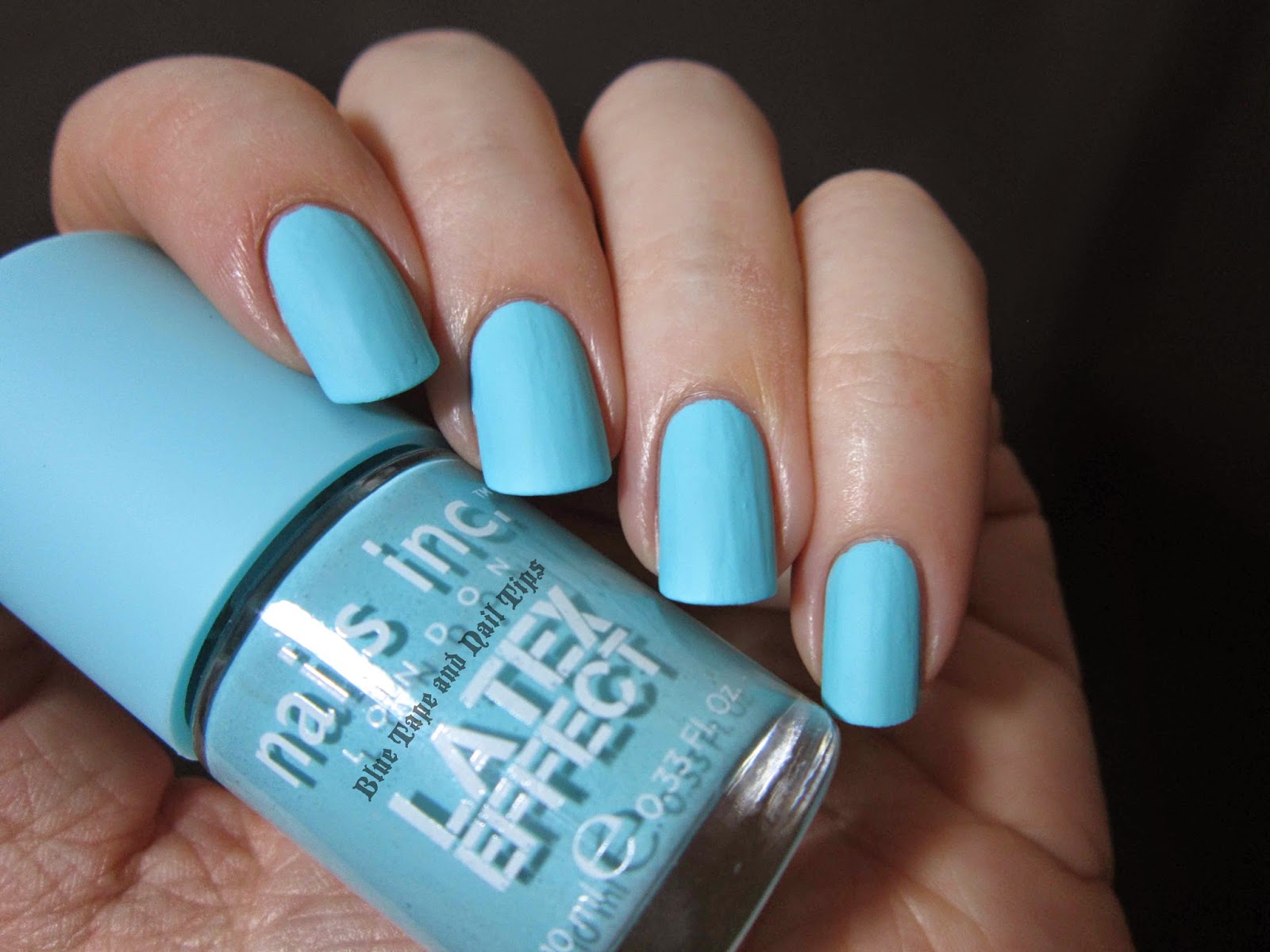
As you can see with Bermondsey Street, the polish goes on a lot smoother than with Portobello Road. There are less ridges and the polish consistency is much easier to work with. Out of these 2 polishes, if you are tempted by them both but unsure of which one to get, I would suggest just getting Bermondsey Street.
The other 2 polishes in this collection are Shoreditch High Street (which is described on the Sephora website as a hot pink polish) and Camden Passage (which is described as a nude polish, although the photograph of the polish makes it appear to look like a gray-beige hybrid).
If you have picked up any of these polishes in this collection I would love to hear about your experiences with them. Was the consistency hard to work with? Does Camden Passage appear to have the same formula issues that Portobello Road has? I actually swatched Portobello Road 2 times before giving up since the results looked exactly the same. This makes me wonder if it is just user error, and I have gotten so used to just putting a matte top coat on top of a polish I want to be matte, that I no longer have the careful touch needed when working with mattes. So please, let me know how your experience working with any of these polishes from this collection goes!
Nails Inc Garden Party Swatches 18 Mar 2014 4:36 PM (11 years ago)


New for Spring 2014 in Sephora stores: the Nails Inc. Garden Party Special Effects Collection! I was so excited when I found an empty display spot for these three polishes at my local Sephora. Unfortunately, they were not currently available online, so I had to be patient and wait for them to show up. Luckily when they did show up on the Sephora website I was able to see they were at the Sephora inside JCPenny store nearest me. On that note, I have found that this pattern is often true for new Nails Inc. products. They are first available at the Sephora inside JCPenny stores before the standalone Sephora stores (and sometimes even before being available online), so check there first when looking!

This collection consists of three multi-hued and multi-sized glitter toppers all in a clear base. The first I have to share is Westbourne Gardens. This polish is mostly pink, featuring small hexagonal glitter in metallic pink, matte pink, and matte white colors. Smaller white matte hexes are strewn throughout, along with micro matte pink hexagonal glitter. All of the pink glitter with the white glitter thrown in creates an overall soft pink hue making this glitter polish beautiful for any spring event!

Next up we'll look at Portobello Gardens. This mostly blue glitter topper features small hexagonal glitter in a cobalt metallic blue, a matte turquoise-blue, and a matte white interspersed with smaller matte white and matte light green hexagonal glitter. Filling up the rest of the clear base is micro turquoise-blue hexagonal-shaped glitter.

The white glitter mixed in with the bright blue glitters along with a touch of green make this the perfect winter-to-spring shade!

The last lacquer in this collection is Princes Gardens (which I either always want to add an apostrophe to or call "Princess Gardens").

This glitter is the most multi-hued of the three, featuring small metallic lilac/lavender, matte light blue, and matte light green hexagonal glitter. There is smaller matte white hexagonal glitter throughout, along with micro light green hexagonal glitter.

All three of these glitter polishes are now available on the Sephora website or in stores if you are in the United States. Retail price is $11US each. If you live in another country, have you seen this collection?
If you think you've heard of the Garden Party collection before, you have. About a year ago there was a four polish collection available on QVC's UK website that contained only one glitter polish called Grosvenor Gardens. These two collections don't seem to be connected except by name.
What do you think of this collection? If you want to see photos of what the display looks like so you can keep an eye out for it at your local Sephora, check out my pictures on Twitter or Instagram!
OPI Muppets Most Wanted Collection Spring 2014 9 Mar 2014 12:43 AM (11 years ago)


In conjunction with the new Muppets movie, Muppets Most Wanted, OPI has released an eight polish collection for Spring 2014. Here are six of the eight shades for your perusal.


Now when I was at my local beauty supply store scoping out this collection, I kept picking up and putting back this beauty, Miss Piggy's Big Number, because I knew it looked like a polish I had, I just couldn't remember what polish that was. And then I got home, and discovered I found a perfect dupe for Chanel's Bel-Argus.

Just like Bel-Argus, Miss Piggy's Big Number is a pearly blue that has a hint of purple at its edges. This is almost a frost, but does not feature enough brush strokes to be a strict frost-finish. The pearl/chrome-like finish means that this polish is highly reflective and has a beautiful blue shine that is stronger in direct lighting like direct sunlight.

Kermit Me to Speak may have looked like Next Stop…The Bikini Zone from the recent OPI Brazil collection, or Peace & Love & OPI (which in turn looked similar to Not Like the Movies), in the promotional photos, but this polish is unique in color and duochrome shift. The base color appears to be gold with a rose colored shift. By itself, the rose-hued aspect overwhelms the gold, or any other color in the polish, making it look less like a duochrome, and more like a shimmer.


One of the three glitters in this collection is Let's Do Anything We Want! which features small rose-pink hexagonal glitter and medium-large matte white square glitter in a clear base. Although the prominent glitter is the rose-pink glitter, there are enough white squares that you don't have to fish out the squares from the bottle in order to try and get a few on each nail. The different shapes and sizes of this glitter polish make it an adventurous combination, with soft pink and white coloring to tone down the extreme differences in the glitter.

Gaining Mole-Mentum is made up of interesting shaped shard-like glitter pieces in a clear base. The glitter pieces are mostly medium sized and are gold and copper/rose-pink in color. One coat gives great distribution across the whole nail bed - no need for dabbling it on in bald spots because there are none to cover up!

The last glitter polish in this collection is Muppets World Tour. Featuring micro silver glitter with larger silver hexes and even larger pink, rose, and blue hexes (which are still relatively small in size) in a clear base. One coat gives even coverage, but this polish is still not so glitter-packed as to be able to be worn alone as a full-coverage glitter polish.
The other two polishes in this collection that I did not pick up were I Love Applause, a slightly sheer pink creme, and Chillin' Like a Villain, a slightly sheer peach creme. When I tested both of these on tape inside the store, both were streaky at one coat so I passed on them. If you don't have a peach creme or a pink creme, you might want to take a look at these two.
The glitter polishes in this collection were quite unique and the other non-creme polishes pictured above all feature at least a slight shift of color that make them interesting and fun to wear. Do you think you'll pick any of these lacquers up? Have you already seen them in person? Which is your favorite?
Nails Inc Pop Art Collection for Spring 2014 1 Mar 2014 10:32 PM (11 years ago)


Nails Inc. Upper Street, the second polish in this collection, is made up of four colors of hexagonal glitter in a clear base. Three are matte glitter: the white, light pink, and light blue. The fourth color of glitter is a shiny gold, which adds a different dimension from Knightsbridge Place.

Like Knightsbridge Place, Upper Street does not work very well as a full coverage polish because of how chunky the glitter is, creating the same problems of balding and bumpiness that Knightsbridge Place has.

Where Knightsbridge Place and Upper Street really shine are as glitter toppers. Both Knightsbridge Place and Upper Street are layered over Sally Hansen's Complete Salon Manicure in Thinking of Blue.
First let's see Knightsbridge Place as a topper.


If you think you've seen these polishes before, you may have. A few blogs have shared photos of these glitters in double ended bottles. There appear to be three double ended polish duos where on one side of the duo, there is a creme polish, and the other end has one of the pop art glitters. The third glitter topper, Cavendish Place, has turquoise, black, silver, and white glitter in it. This was not at Sephora. I'm not sure if this means that Cavendish Place will not be showing up at Sephora, or whether it was just not in stock at the particular Sephora store I frequent. Please let me know if you see it around!
So what do you think of these polishes? Which is your favorite? Have you seen or tried any polishes from the Nails Inc. Pop Art collection?
Scotch Naturals A/W 2013/2014 Collection 26 Jan 2014 2:16 AM (11 years ago)


Have you ever tried water-based nail polish before? Well if so, forget your previous experience(s) because you haven't tried Scotch Naturals.
Personally, I've tried the paint-and-peel and a few other water-based nail polishes. And they were terrible. They chipped less than an hour after putting them on, and then because they were peel-off, you couldn't take them off with nail polish remover, so I was stuck picking off a layer of my nail while trying to scrape off the nail polish that looked like I had been wearing it for a month.
Then I heard about Scotch Naturals. What appealed to me was their vast range of colors. Other water-based brands that are made for adults don't seem to stray from the usual reds, pinks, and beige-like colors. But obviously, Scotch Naturals does. This is their Autumn/Winter 2013/2014 Collection:


Man of the Moment is described by Scotch Naturals as a "vintage denim creme" shade. It does have a bit of teal in it, so it is not a straight blue, but blue seems to be the predominant color in this polish.

This is a nice twist on the classic winter blue, because the slight hint of green makes this color feel like it could definitely be worn into spring. It's reminiscent of that time and landscape color change when the grass first starts popping up after a frosty winter and a splash of green starts peaking through the frozen ground.


And now for the most interesting color of the bunch! This is Amber's Revenge. Described as a "muted mustard creme," this leans too green to be described strictly as a mustard color. With the slight gray-green thrown in to tone down the yellow, this almost feels like a dark chartreuse.

Like many yellow hued polishes, this one was just a tad thinner than the other shades, so to compare the difference between two to three coats for you, the photo above shows 2 coats of Amber's Revenge, while the photo below shows it at 3 coats.


In terms of color consistency, all of these polishes are straight creme shades. All four also seem to have a hint of gray mixed in that is not apparent in the color of the polish, but does seem to tone down what would have been a brighter shade (such as with Amber's Revenge) making these perfect shades for the winter into the spring. They all do perfectly well at 2 coats of polish, though Bannockburn really only needs one coat of polish for complete coverage.
Dry time for me was the same with regular polish. Base coat + 2 coats of polish + top coat = same dry time as regular polish. It was only marginally slower than when I use a quick drying top coat on regular lacquer. The only major difference was that I painted my nails right before bed when I was going to wear Mamie Gilroy, so as to not get the polish wet right away. Because these are water-based, the polish softens in water when it is still fresh and has not completely hardened/solidified on the nail. That could be a downside for people that paint their nails in the morning or before an evening out if a shower is involved in that.
A major plus for water-based nail polish is that it has little-to-no smell. While other water-based nail polishes I have tried seemed to smell like glue, this doesn't smell like glue, rather it smells a bit like plastic. Yet keep in mind that while these polishes do still give off an odor, it is insignificant in comparison to the smell of regular polishes. I've gotten headaches from the smell of regular nail polish, but I had no problems with these polishes, nor did the person I was sitting next to while painting my nails.
Also, instead of using acetone-based nail polish remover, these come off with rubbing alcohol. A home staple that is easy to find at your local drugstore or grocery store.
Well I am certainly a convert. While I'm not ready to toss out all of my old "3-free" polishes until water-based polishes start coming in matte glitter shades and multi-chrome versions, I have been wearing these a lot this past year. My first Scotch Naturals were the 2012 Fall polishes, so I have had previous experience with this brand of water-based polishes in particular, and I still find them to be the best of its kind.
Scotch Naturals weigh in at the median level of polish pricing, costing $14.99US each. If you buy from their website, you can purchase a starter pack of 3 polishes of your choosing plus top coat all for $48.00US. If you buy the starter pack, called the Cocktail Trio, any additional polish purchase made at that time is 20% off! And like many beauty websites, shipping is free if you spend $50US or more. It's a great way to try out more than one color at a time and see what you think!
Have you ever tried Scotch Naturals water-based nail polish? Have you ever tried another brand of water-based nail polish?
CoverGirl Catching Fire Nail Stickers in Flamed Out and Seared Bronze 10 Nov 2013 3:24 PM (11 years ago)


WooHoo! The Hunger Games: Catching Fire is coming out on November 22, 2013 and it's already the 10th! Less than 2 weeks left! So to get ready for the movie you have to decide on your nail art, right? How about wearing some of the CoverGirl Catching Fire Collection made specifically for the movie?
There were 9 nail polishes made to go along with the collection, and today I have one to share with you. I found the CoverGirl Catching Fire Collection at my local CVS, and the first time I saw it, they only had the glosstinis (the nail polishes) and the other makeup products, but it wasn't until last week that I spotted a larger display at my same CVS (while they still had the smaller display up) that had the nail stickers as well.


Next is Flamed Out:


In terms of ease of use, the stickers are plastic so they are more malleable than the paper nail stickers some companies have, but you can still easily end up with ridges if you have very rounded nails. I would say if you use nail stickers often, these are easier to use than the Revlon stickers, but harder to smooth out than the ones from Sally Hansen.
If you are looking for the nail stickers, they do seem to be slowly showing up, but I haven't heard anyone else say they have found the stickers. I've seen the nail polishes at Walgreens, but the only display with the stickers was at CVS, and while it seems like there are supposed to be 6 different sticker selections, the display at CVS only had these two. If you wanted to see what this display looks like, you can look at my pic on twitter. It is a full stand display, so if you haven't found the nail stickers yet, keep looking for bigger displays to come in to your local drugstores.
To see the full makeup collections and full looks created by CoverGirl for The Hunger Games: Catching Fire, you can visit the CoverGirl website HERE.
Are you going to see The Hunger Games: Catching Fire, and if so, do you already have your nail art planned?
%20and%20the%20other%20makeup%20products,%20but%20it%20wasn't%20until%20last%20week%20that%20I%20spotted%20a%20larger%20display%20at%20my%20same%20CVS%20(while%20they%20still%20had%20the%20smaller%20display%20up)%20that%20had%20the%20nail%20stickers%20as%20well.%20%3Cbr%20/%3E%0A%3Cbr%20/%3E%0A%3Cbr%20/%3E%0A%3Cdiv%3E%0A%3Ca%20href%3D%22https://blogger.googleusercontent.com/img/b/R29vZ2xl/AVvXsEjL9Nk5GJZ2_kt5ZYge3I9NynT2EcBxuDdNlOTtWjFkF7zbtklo23Pkx85XqS5wHtUthwxZVIMEUycHX7Q4rJLTUVhLSRFgY99jmWpNQubdPbZHOyZXdXD6gyRa7RI53roxDVDShwevAzeG/s1600/Covergirl+RogueRed+Sun.jpg%22%20imageanchor%3D%221%22%3E%3Cimg%20border%3D%220%22%20src%3D%22https://blogger.googleusercontent.com/img/b/R29vZ2xl/AVvXsEjL9Nk5GJZ2_kt5ZYge3I9NynT2EcBxuDdNlOTtWjFkF7zbtklo23Pkx85XqS5wHtUthwxZVIMEUycHX7Q4rJLTUVhLSRFgY99jmWpNQubdPbZHOyZXdXD6gyRa7RI53roxDVDShwevAzeG/s1600/Covergirl+RogueRed+Sun.jpg%22%20height%3D%22300%22%20width%3D%22400%22%20/%3E%3C/a%3E%3C/div%3E%0A%3Cdiv%3E%0A%3Cbr%20/%3E%3C/div%3E%0A%3Cdiv%3E%0A%3Cbr%20/%3E%3C/div%3E%0A%3Cdiv%3E%0AThe%20first%20time%20around%20I%20was%20only%20interested%20in%20the%20nail%20stickers%20so%20I%20bypassed%20the%20nail%20polishes,%20but%20the%20second%20time,%20after%20seeing%20the%20nail%20stickers%20I%20was%20drawn%20to%20this%20glowing%20red%20polish%20that%20I%20thought%20would%20look%20great%20under%20the%20nail%20stickers.%20%26nbsp;%20This%20is%202%20coats%20of%20%3Ci%3ERogue%20Red%3C/i%3E%20with%20top%20coat%20in%20direct%20afternoon%20sunlight.%3C/div%3E%0A%3Cdiv%3E%0A%3Cbr%20/%3E%3C/div%3E%0A%3Cdiv%3E%0ANow%20for%20the%20nail%20stickers.%20%26nbsp;First%20up,%20%3Ci%3ESeared%20Bronze%3C/i%3E:%3C/div%3E%0A%3Cbr%20/%3E%0A%3Cdiv%3E%0A%3Ca%20href%3D%22https://blogger.googleusercontent.com/img/b/R29vZ2xl/AVvXsEg2wprkB7WDq7qnrKw4WkWBzuJugziM3nxvmPc999Rt2qpl7pWQncjCTbITlHxWPJ9lobBPWJG8FM-aAJN6SQ0cmjb1SvHp3yGMEbMcg9ib9a_tj_izogRzgrL6VdG3k2MyTKtrJ9GqiTh0/s1600/Covergirl+SearedBronze+light.jpg%22%20imageanchor%3D%221%22%3E%3Cimg%20border%3D%220%22%20src%3D%22https://blogger.googleusercontent.com/img/b/R29vZ2xl/AVvXsEg2wprkB7WDq7qnrKw4WkWBzuJugziM3nxvmPc999Rt2qpl7pWQncjCTbITlHxWPJ9lobBPWJG8FM-aAJN6SQ0cmjb1SvHp3yGMEbMcg9ib9a_tj_izogRzgrL6VdG3k2MyTKtrJ9GqiTh0/s1600/Covergirl+SearedBronze+light.jpg%22%20height%3D%22300%22%20width%3D%22400%22%20/%3E%3C/a%3E%3C/div%3E%0A%3Cbr%20/%3E%0A%3Cbr%20/%3E%0A%3Cbr%20/%3E%0A%3Cdiv%3E%0A%3Ca%20href%3D%22https://blogger.googleusercontent.com/img/b/R29vZ2xl/AVvXsEiABGytAQQ4VGPcpr_awfELFEvGUQaC7tpVpVhPGNVTRQxKfFjw4-qwt2zVULqcMV5nYJfGT7ehsP95jUG9V5OnGUp-JMtMe-nJs-5KyOpn4taFykOxYAw1-Tfp57sTCCK7L2VUiMhSlfzJ/s1600/Covergirl+SearedBronze+dark.jpg%22%20imageanchor%3D%221%22%3E%3Cimg%20border%3D%220%22%20src%3D%22https://blogger.googleusercontent.com/img/b/R29vZ2xl/AVvXsEiABGytAQQ4VGPcpr_awfELFEvGUQaC7tpVpVhPGNVTRQxKfFjw4-qwt2zVULqcMV5nYJfGT7ehsP95jUG9V5OnGUp-JMtMe-nJs-5KyOpn4taFykOxYAw1-Tfp57sTCCK7L2VUiMhSlfzJ/s1600/Covergirl+SearedBronze+dark.jpg%22%20height%3D%22300%22%20width%3D%22400%22%20/%3E%3C/a%3E%3C/div%3E%0A%3Cbr%20/%3E%0A%3Cbr%20/%3E%0ANext%20is%20%3Ci%3EFlamed%20Out%3C/i%3E:%3Cbr%20/%3E%0A%3Cbr%20/%3E%0A%3Cbr%20/%3E%0A%3Cdiv%3E%0A%3Ca%20href%3D%22https://blogger.googleusercontent.com/img/b/R29vZ2xl/AVvXsEh7wzLu8IwemUet7EBCHP2M5Ylaa271L-6PMwLB7HrzE_jDDLoDKZBEsvkzC9Ih7iWKU97Rzuu6kFMx1mnSqux3j4bo645ePYZu8tML2C9hb35jO9nGYf3nc1khzrYJ1AOgVNYAAJqeX2zI/s1600/Covergirl+FlamedOut+light.jpg%22%20imageanchor%3D%221%22%3E%3Cimg%20border%3D%220%22%20src%3D%22https://blogger.googleusercontent.com/img/b/R29vZ2xl/AVvXsEh7wzLu8IwemUet7EBCHP2M5Ylaa271L-6PMwLB7HrzE_jDDLoDKZBEsvkzC9Ih7iWKU97Rzuu6kFMx1mnSqux3j4bo645ePYZu8tML2C9hb35jO9nGYf3nc1khzrYJ1AOgVNYAAJqeX2zI/s1600/Covergirl+FlamedOut+light.jpg%22%20height%3D%22300%22%20width%3D%22400%22%20/%3E%3C/a%3E%3C/div%3E%0A%3Cbr%20/%3E%0A%3Cbr%20/%3E%0A%3Cbr%20/%3E%0A%3Cdiv%3E%0A%3Ca%20href%3D%22https://blogger.googleusercontent.com/img/b/R29vZ2xl/AVvXsEjTCQcbWzW4jKIvKYX4uz9YM4Y81oxvBcFMZzAd8x5OrHJ5wU3LsuPxmAOcA8ffIeD-Vh4BxOvT8yLkZvJIkua3f_0BhkVQ9-gvf6NGgsS0AzryMCuUgvc34CahiwDLly9rWiFbalnvCk1N/s1600/Covergirl+FlamedOut+dark.jpg%22%20imageanchor%3D%221%22%3E%3Cimg%20border%3D%220%22%20src%3D%22https://blogger.googleusercontent.com/img/b/R29vZ2xl/AVvXsEjTCQcbWzW4jKIvKYX4uz9YM4Y81oxvBcFMZzAd8x5OrHJ5wU3LsuPxmAOcA8ffIeD-Vh4BxOvT8yLkZvJIkua3f_0BhkVQ9-gvf6NGgsS0AzryMCuUgvc34CahiwDLly9rWiFbalnvCk1N/s1600/Covergirl+FlamedOut+dark.jpg%22%20height%3D%22300%22%20width%3D%22400%22%20/%3E%3C/a%3E%3C/div%3E%0A%3Cbr%20/%3E%0A%3Cbr%20/%3E%0AIn%20terms%20of%20ease%20of%20use,%20the%20stickers%20are%20plastic%20so%20they%20are%20more%20malleable%20than%20the%20paper%20nail%20stickers%20some%20companies%20have,%20but%20you%20can%20still%20easily%20end%20up%20with%20ridges%20if%20you%20have%20very%20rounded%20nails.%20%26nbsp;I%20would%20say%20if%20you%20use%20nail%20stickers%20often,%20these%20are%20easier%20to%20use%20than%20the%20Revlon%20stickers,%20but%20harder%20to%20smooth%20out%20than%20the%20ones%20from%20Sally%20Hansen.%3Cbr%20/%3E%0A%3Cbr%20/%3E%0AIf%20you%20are%20looking%20for%20the%20nail%20stickers,%20they%20do%20seem%20to%20be%20slowly%20showing%20up,%20but%20I%20haven't%20heard%20anyone%20else%20say%20they%20have%20found%20the%20stickers.%20%26nbsp;I've%20seen%20the%20nail%20polishes%20at%20Walgreens,%20but%20the%20only%20display%20with%20the%20stickers%20was%20at%20CVS,%20and%20while%20it%20seems%20like%20there%20are%20supposed%20to%20be%206%20different%20sticker%20selections,%20the%20display%20at%20CVS%20only%20had%20these%20two.%20%26nbsp;If%20you%20wanted%20to%20see%20what%20this%20display%20looks%20like,%20you%20can%20look%20at%20my%20pic%20on%20twitter.%20%26nbsp;It%20is%20a%20full%20stand%20display,%20so%20if%20you%20haven't%20found%20the%20nail%20stickers%20yet,%20keep%20looking%20for%20bigger%20displays%20to%20come%20in%20to%20your%20local%20drugstores.%20%3Cbr%20/%3E%0A%3Cbr%20/%3E%0ATo%20see%20the%20full%20makeup%20collections%20and%20full%20looks%20created%20by%20CoverGirl%20for%20%3Ci%3EThe%20Hunger%20Games:%20Catching%20Fire%3C/i%3E,%20you%20can%20visit%20the%20CoverGirl%20website%20%3Ca%20href%3D%22http://www.covergirl.com/capitolbeautystudio/catching-fire%22%20target%3D%22_blank%22%3EHERE%3C/a%3E.%20%3Cbr%20/%3E%0A%3Cbr%20/%3E%0AAre%20you%20going%20to%20see%20%3Ci%3EThe%20Hunger%20Games:%20Catching%20Fire%3C/i%3E,%20and%20if%20so,%20do%20you%20already%20have%20your%20nail%20art%20planned?)
Easy Tombstone Halloween Nail Art 31 Oct 2013 2:49 PM (11 years ago)


Did you ever notice how technically, your nails are all ready shaped like mini tombstones? Especially if you have square nails? So all you have to do to begin painting your tombstones is grab some gray polish.

Unless you have some nice gray polish like NARS Storm Bird laying around, why not try mixing your own gray nail polish? I picked up the recent release of Wet 'n Wild's Fantasy Makers Tombstone shaped polishes in Darkest Hour, the black creme of their collection. For each bottle, I just dumped out at least half of the black polish to almost all of the black polish that was in the bottle, and then I poured in some white polish. I used a nail wheel to swatch the color changes as I mixed the grays to make sure I had a light, medium, and dark gray, keeping in mind that the dark gray had to be light enough that text could be read on top of the color (so a color like NARS Galion may be too dark).


Step 2 is where the nail art takes place. For this easy nail art, I used Rub-on transfers. The brand I bought was called Grafix Rub-Onz and comes in packs of 4 or more sheets.
To begin, with rub-on transfers, the way they work is that you will print your nail art on one side of a transfer sheet, and then you use a self-adhesive sticky sheet to separate the ink from the original sheet. Keeping this in mind, with words you need to print them mirrored, so you will need to have some type of photo-editing software such as Photoshop. I used Adobe InDesign to first create the epitaphs, and then flip each of them to their reverse image. Also be aware, in the image below you can see that the writing is on a light gray background. The reason for that is because when you transfer the image and then have it separate to rub it onto your nail, the ink separates from the background, so if you don't have a single background color your text is on, each of the letters will separate and you will have a separate nail transfer for each letter. Note: that is not a good thing to have when the font is smaller than 12pt font to fit onto the nail bed. And because the nail transfers are going on a gray background, the gray used on the nail transfers becomes less obvious.

Below you can see what it looks like when you separate the nail transfers and begin to cut them out. For this brand of transfers, you need to cut on the boarder of the color (another reason for having a gray square background for the text), so that the image becomes separated from the original transfer material. This step does not make much sense in words, but this transfer package I bought - as most of them do - comes with step-by-step instructions that you can follow that will explain each part of the process.


The step above may take a little time, but if you go slowly and patiently, you'll eventually have the beginnings of your tombstones. Now that you've utilized your transfers, you need to seal them in with top coat. There is no dry time to wait for, so just start painting on the clear polish.


Formula X for Sephora in Demolition, Thunder, and TNT 4 Oct 2013 11:32 PM (11 years ago)


Hello! Have you heard about the new collection of polishes Sephora has released? Now that Sephora is no longer carrying the Sephora by OPI colors, they have reformulated their small release of the Sephora X line. Read on and you'll see why you need these in your life (and your helmer).

Let's just pause for a minute and consider how momentous these new polishes by Sephora are.
The line of "Xplosive Top Coats" are all mixed shape matte glitter polishes in a clear base. They range from a single color of glitter in a clear base (like TNT shown above and below), to multi-colored glitter in a clear base (like Demolition and Thunder seen further down). They even have a number of polishes that are a mix of black glitter with other colors, besides the ubiquitous black and white matte glitter in a clear base.

TNT is a bright cobalt blue glitter topper made up of large, medium, and small hexagonal shaped glitter in a clear base.

And now on to the multi-hued polishes! The fact that Sephora has released a line of permanent polishes that all contain various sizes and colors of matte glitter really shows they are up on the trends.
Thunder is described on the Sephora website as containing "turquoise, lime, periwinkle, and white confetti" in a clear base. I'm not quite sure what color they are calling the extra-large hexagonal pieces of glitter, but they appeared light pink to me.

Last of the three I picked up with glitter is Demolition. This was the first of the three I tried on when I was swatching, and I instantly fell in love with this one. What do you think?

Demolition is described on the Sephora website as "blue, turquoise, lime, and orange confetti" in a clear base.

And for one last photo, I have put both Thunder and Demolition over a white polish so you can see the comparison of the two and the overall color output these two each give off. Thunder definitely leans more blue, while the orange micro-glitter in Demolition contrasts against the larger white glitter as well as the even larger blue and green glitter pieces giving it a general feeling of a mixture of pastel colors.

From my experience swatching these three, each glitter topper has an amazing payoff of glitter, and you don't have to go digging in the bottle to get the larger chunks of glitter. I would recommend doing both a dabbling and brushing method to jointly push the larger glitter pieces to where you want them on your nails.
The Formula X line contains 62 creme/metallic polishes that are packaged with a white cap and are under the label "New Classics," as well as the glitter polishes mentioned above, along with other black capped polishes such as a small line of holographic polishes (called "Holograms," there are 5 of those in total), and the usual foil/metallic glitter polishes.
Along with the change up in bottle shape and name from the Sephora X line, these lacquers also cost an additional dollar (so the "regular" polishes with the white caps are $10.50US instead of $9.50US, while the black capped bottles that include the glitters and other "special effects" are $12.50US instead of $11.50US). Now while price increases in nail polish annoy me and I tend to buy way less of a brand when they've increased their price more than 50 cents in less than a one year period, these polishes are definitely worth the price. Not only are there special glitter lacquers that are unique colors that you will be hard pressed to find somewhere else, but the bottles themselves are made of nice weighted glass and feel larger than the Sephora X bottles (at least giving the illusion of containing more polish).
I bought these three lacquers along with two others that I will hopefully be sharing sometime soon this past Thursday. The first Sephora I went to was just stocking them at 11:15 in the morning, so I got a pretty good view of half of the collection, but the store I went to in the evening to look for the holographic polishes said they were setting up their display that night to be ready for Friday. So what that means for you is that you can hopefully find these in stock at your local Sephora this weekend. Do call ahead as it seems that different stores have different arrival times for their packages, and some stores may not have their display up yet.
At this point I would just like to mention one extra thing: customer service. I have almost always had great customer service at Sephora, but Thursday the people working at both stores I went to were exceptionally wonderful and went above and beyond what is probably normal protocol. At the first store where the display was in the process of being set up, the sales associate there began opening boxes and pulling out one lacquer from each box that was still unopened for my individual examination (and I didn't even ask her to do this)! At the second store I went to the sales associate warned me that the boxes were piled together in their storage rooms but went to dig out a mixed bag so I could at least get a look at some of the polishes. I only mention this because I find great customer service is worth the cost. I like spending only a dollar on Wet-n-Wild polishes at my local Walgreens or Rite Aid, and where I live the sales personnel at those stores are both friendly and helpful, but I definitely feel that it makes it a lot easier parting with $50 for 4 polishes when I have been treated like a customer rather than an interloper that no one wants to deal with. So I would just like to say "kudos" to Sephora (and their employees) for making me feel like a valued customer. If you've never been into a Sephora, I definitely recommend it. Even if you just want to try on nail polish, the experience and service there is top notch.
Nails Inc Galaxy in Trafalgar Crescent 25 Sep 2013 9:48 PM (11 years ago)


New at Sephora from Nails Inc. are three polishes from the Galaxy collection. Today I have one of those three polishes to share with you: Trafalgar Crescent.
First up, let's examine Trafalgar Crescent on its own.


The other two colors in the collection are Knightsbridge Road and Buckingham Court, a mostly gold glitter and a mostly red glitter. Unlike Trafalgar Crescent, the other two do not have iridescent shimmer in the base (or at least from what I could see when I tried them on in store).
Deborah Lippmann 99 Luftballons 8 Aug 2013 7:32 PM (11 years ago)


Have you heard the news? Deborah Lippmann is now at Sephora! And to celebrate the monumentous occasion, Deborah Lippmann is releasing a 4 polish collection just for Sephora. There are 3 cremes and 1 glitter polish in this new collection.
When I first heard about this collection, I rushed onto Sephora.com to order the glitter. Meet 99 Luftballons.
I may have taken a few hundred photos of this polish, but I have narrowed it down to 8 shots to show you how this polish looks first without top coat, and then with top coat.

The above photograph was taken in indirect sunlight.

The above and below photos were taken using an Ott-lite.

The photo below was taken in direct sunlight. Can you see that great glow from the glitter?


In the above photo, you can see how the top coat helps the glitter pop from the jelly red base of the polish.


So what do you think?
Now I have to mention, something that first drew me to this polish was the name. I love it! That used to be a song I listened to a lot when I was younger and just wearing this polish gives me a nostalgic feeling.
99 Luftballons is what we've come to expect from Deborah Lippmann: a supremely glitter-packed polish. The red jelly base is that shade of red that almost borders on pink in certain lighting. To get a better idea of the type of glitter and the colors held within, think of Happy Birthday with a sheer red base.
I really like this polish - it's sparkly and shiny even in low light, and the red base will make it perfect for any time (including the upcoming Holiday season).
If you want to add this polish to your collection, head over to Sephora.com and add this to your basket! And if you're a Beauty Insider, for only 100 points you can get a mini version of Happy Birthday. If you have never tried Deborah Lippmann before, now is the time! You can pick up any Deborah Lippmann shade, and for only 100 points you can snag her most beloved glitter! The mini size is .27 fl. oz./8 mL, which is the same size as the mini DL's you can buy on HSN.com. The great thing about these minis are the fact that the bottle is just a smaller version of the beautiful DL bottle, and each bottle is labeled on the bottom just like the regular sized bottles - something that I greatly appreciate!
Now if that isn't incentive to go buy this polish, I don't know what is!
Deborah Lippmann Va Va Voom and Rolling in the Deep 8 Aug 2013 12:18 AM (11 years ago)


Today I have two lacquers from Deborah Lippmann's Jewel Heist collection to share with you: Va Va Voom and Rolling in the Deep!

So first let's take a look at the creme part of this duo. The Jewel Heist collection features 6 polishes in total. There are 3 chunky glitter polishes, 2 cremes, and 1 micro-glitter polish. There are 2 golden shades, 2 green shades, and 2 blue shades, where each shade has a chunky glitter polish and a corresponding creme or micro glitter polish in a similar color.
The photograph above is Rolling in the Deep against a white background with an Ott-lite lightbulb.

To give you a better idea of how blackened this polish is while still remaining blue in color, I also wanted to show it to you against a black background. At first glance this polish does look black in most lighting conditions, so don't be surprised if people assume you are wearing a black polish when you have this on!
The lighting in the above photo is an Ott-lite.

A very interesting aspect to this deep blue creme is the fact that it has a very faint silver micro-shimmer to it. I have tried to capture the illusive sparkle, but it is only visible around where the light reflections on each nail are. In the photo above, on the nail second from the left (my middle finger), you can faintly see two silver specks. This is the sparkle. In real life you can see the sparkle better, but for the most part it is swallowed up by the deep blue creme finish.
For a better view, click the photo to make it bigger.

With the above picture, you can get a better understanding for how well these two colors pair up!
This is Va Va Voom layered over Rolling in the Deep.

Against the black background the contrast between the glitter and the creme background really pops out at you.

And one last look at the pair in indirect sunlight to see the sparkle and color contrast.

Va Va Voom is the show stopper part of this duo! This polish contains large silver hexagonal glitter and smaller (almost micro hexagonal glitter) - both of which is holographic! All of the glitter floats in a lovely blue base. The blue jelly finish of the base leans slightly purple, giving it a look of a dark periwinkle blue/cornflower blue.

Because this polish is packed with glitter, at two coats the glitter is built up to almost complete opacity. If you enlarge the photos by clicking on them, you can still see some spots on some of the nails where you can see through the blue jelly finish to the nail bed below.

This was such a beautiful color to wear that I didn't want to take it off after swatching it, so I wore it on my left hand for the rest of the evening....
Which led me to the reminder of how hard glitter polishes are to get off. If you have used a Deborah Lippmann polish like Happy Birthday or another glitter-packed polish, you know how hard it is to get the glitter to come off your nails. On the bright side, what that means for wear time is that this polish really lasts, so you won't have to worry about re-doing your manicure the very next day!
Another side note I'd like to add is the fact that even though I did put on a base coat (Deborah Lippmann's Turn Back Time), I still had a few patches of staining, so I would suggest doubling up your base coat before painting your nails with Rolling in the Deep.
These polishes are both beautiful additions to the Deborah Lippmann line. Rolling in the Deep has that extra secret shimmer that is often associated with Chanel polishes, making it an extra special midnight blue hue, while Va Va Voom is a seriously sparkly blue glitter polish that is truly unique and covetable.
I purchased these two polishes as a pair on HSN.com, but you can buy these individually on Deborah Lippmann's website, or at your local Nordstrom and Sephora.
OPI Pink of Hearts 2013 Swatches and Review 29 Jul 2013 4:40 PM (11 years ago)


In the photograph above, you can see that one of the major differences between Pink-ing of You and I Think in Pink is the fact that I Think in Pink is sheer compared to the creme finish of Pink-ing of You. I turned off the fan to switch to I Think in Pink, so I used 2 regular coats of polish to create the same thickness of polish comparable to the 3 thin coats of Pink-ing of You, and if you look at the above photo, the nail line is visible on my middle and pinky nails through I Think in Pink.


If you are looking to buy the set online, look for the above package that lists this as the 2013 Pink of Hearts set. The set also comes with 10 pink ribbon decals and 10 micro nail crystals that you can add to top off your new polished look.
Overall I'd say the matte glitter polish is a great creation by OPI, something unique that will definitely appeal to the nail polish aficionado. The pink is a nice neutral creme polish but is nothing unique, so if you have light pink creme polishes in your collection it is likely you will already have a similar shade of polish in your stash.
Hearts for the 4th 4 Jul 2013 11:48 AM (11 years ago)
 Instead of stars and stripes, how about some hearts on your nails for the fourth of July?


Technically, Step 2 has a part A and a part B. For the first part, part A, cut medium strips of painters tape and stick on a piece of thick cardstock, like an index card (shown here). It makes it easier to remove and hole punch if you place each piece of tape close to an edge of the card where the hole punch can reach, and then if you leave about a quarter of an inch of tape off the side of the card, then you can easily peel it up after you have punched your hearts.
Also, since you are going to need ten hearts, it is likely you will need two index cards (or other piece of cardstock) unless you want to try to overlap a new piece of tape on an area of the cardstock you already punched a heart on.


Once you have painted a heart on all of your nails, you will have reached Step 3.
I'm Still Here! 30 Jun 2013 8:37 PM (11 years ago)
 As a blogger, I post less often than most of the blogs I follow do. But I'm not stopping. You'll just have to find me through a different means than Google Reader (if you used it). I, like many others, have switched over to Bloglovin'.
This link should help you find me there if that is your preferred blog reading method:
Follow my blog with Bloglovin
I am also now on Twitter.
And I think I'm in love.
(With Twitter, FYI. Sadly, no human person of interest right now. But alas, at least I have nail polish!)
So you'll find me there now for any quick little post or update that will not be a full blog post.
You can find me on Twitter:
Cyan @BlueTapeNails
Speaking of Twitter, have you seen this little link from Zoya?

Happy Nail Polishing with Blue Tape!
.%20%26nbsp;I,%20like%20many%20others,%20have%20switched%20over%20to%20Bloglovin'.%3Cbr%20/%3E%0A%3Cbr%20/%3E%0AThis%20link%20should%20help%20you%20find%20me%20there%20if%20that%20is%20your%20preferred%20blog%20reading%20method:%3Cbr%20/%3E%0A%3Ca%20href%3D%22http://www.bloglovin.com/blog/1674018/?claim%253D27etc8ncb25%22%3EFollow%20my%20blog%20with%20Bloglovin%3C/a%3E%3Cbr%20/%3E%0A%3Cbr%20/%3E%0AI%20am%20also%20now%20on%20Twitter.%20%3Cbr%20/%3E%0A%3Cbr%20/%3E%0AAnd%20I%20think%20I'm%20in%20love.%20%3Cbr%20/%3E%0A%3Cbr%20/%3E%0A(With%20Twitter,%20FYI.%20%26nbsp;Sadly,%20no%20human%20person%20of%20interest%20right%20now.%20%26nbsp;But%20alas,%20at%20least%20I%20have%20nail%20polish!)%3Cbr%20/%3E%0A%3Cbr%20/%3E%0ASo%20you'll%20find%20me%20there%20now%20for%20any%20quick%20little%20post%20or%20update%20that%20will%20not%20be%20a%20full%20blog%20post.%20%3Cbr%20/%3E%0A%3Cbr%20/%3E%0AYou%20can%20find%20me%20on%20Twitter:%3Cbr%20/%3E%0ACyan%20@BlueTapeNails%3Cbr%20/%3E%0A%3Cbr%20/%3E%0ASpeaking%20of%20Twitter,%20have%20you%20seen%20this%20little%20link%20from%20Zoya?%20%3Cbr%20/%3E%0A%3Cbr%20/%3E%0A%3Cdiv%3E%0A%3Ca%20href%3D%22https://blogger.googleusercontent.com/img/b/R29vZ2xl/AVvXsEjWPzDwA-b-Ksnj1fq6ikpqSJ0314UjH_t6Fi9sS2Lf2GDgpGDK1NqJ7cioHc_P3HlSjoDQ1TFjnIxsc8k5bWUdQJwNVmMEebIAnMORU4DoqkMfjWQNJuGGRGpCjPVNQbtvPc_-cKPimajw/s594/Screen+Shot+2013-06-30+at+9.11.54+PM.png%22%20imageanchor%3D%221%22%3E%3Cimg%20border%3D%220%22%20src%3D%22https://blogger.googleusercontent.com/img/b/R29vZ2xl/AVvXsEjWPzDwA-b-Ksnj1fq6ikpqSJ0314UjH_t6Fi9sS2Lf2GDgpGDK1NqJ7cioHc_P3HlSjoDQ1TFjnIxsc8k5bWUdQJwNVmMEebIAnMORU4DoqkMfjWQNJuGGRGpCjPVNQbtvPc_-cKPimajw/s594/Screen+Shot+2013-06-30+at+9.11.54+PM.png%22%20height%3D%22128%22%20width%3D%22320%22%20/%3E%3C/a%3E%3C/div%3E%0A%3Cdiv%3E%0A%3Cspan%3E%3Ci%3E(image%20taken%20from%26nbsp;http://zoyanailpolish.blogspot.com)%3C/i%3E%3C/span%3E%3C/div%3E%0A%3Cdiv%3E%0A%3Cbr%20/%3E%3C/div%3E%0AGrab%20yours%20while%20you%20can%20still%20get%20one!%3Cbr%20/%3E%0A%3Cbr%20/%3E%0AHappy%20Nail%20Polishing%20with%20Blue%20Tape!)