Choosing Effective Search Icons for Better User Interaction 15 May 2024 7:30 AM (10 months ago)
Search icons are pivotal in enhancing user interaction within apps, serving as primary gateways to functionality. This article provides insights into selecting search icons that fit aesthetically and optimize user engagement and app usability.
Role of Search Icons in User Experience
Search icons streamline access to app functionalities, significantly impacting how users interact with the interface. An effective icon can dramatically reduce users’ time searching for functions, leading to a smoother and more satisfying user experience. The right icon can act as a silent guide, helping users navigate through the app effortlessly.
Key Factors in Choosing Search Icons
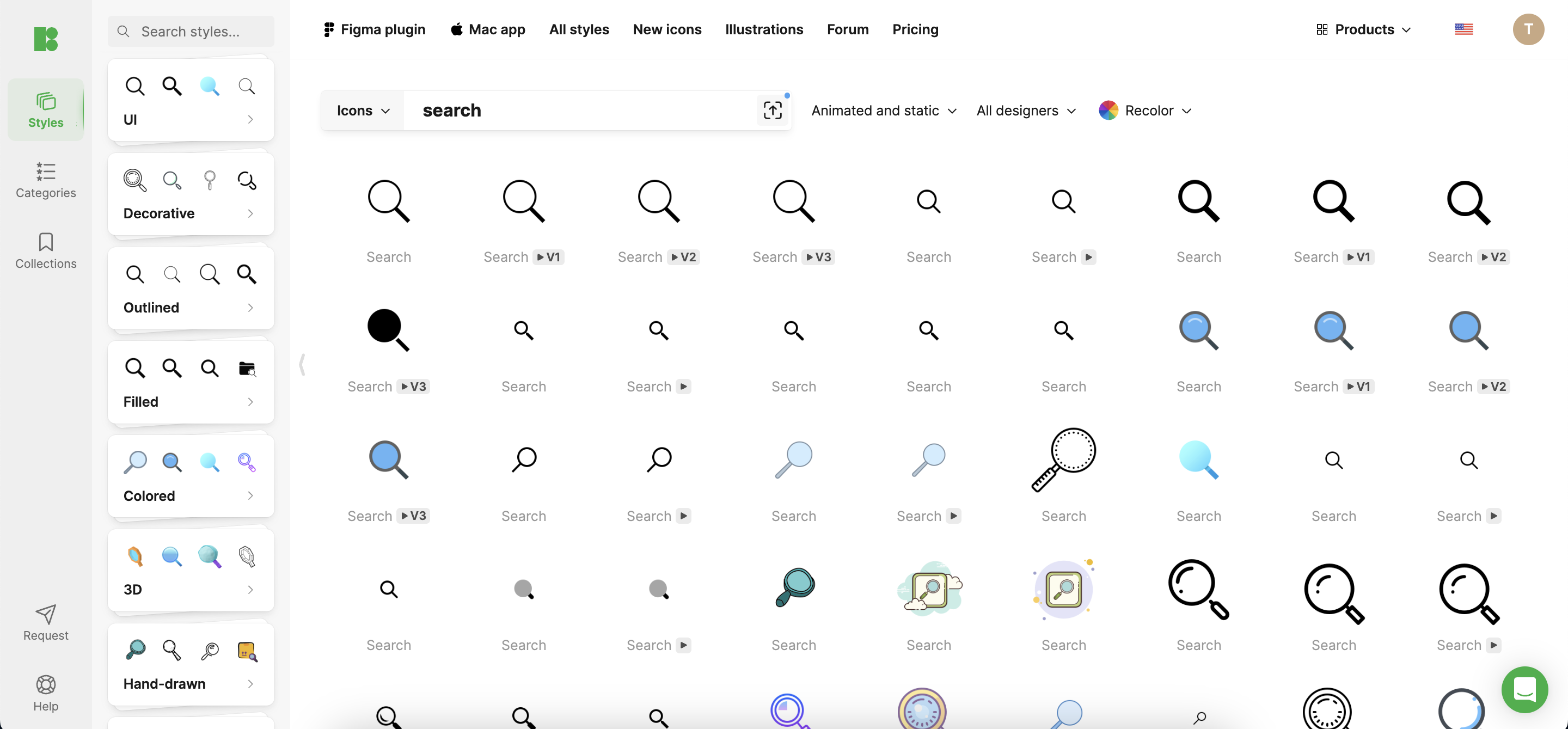
- Visibility: Icons must be prominent enough to be immediately noticeable upon app launch. Optimal placement and contrasting design are crucial to ensure that they stand out.
- Recognition: Icons should be easily recognizable, using universal symbols like the magnifying glass to ensure instant understanding across diverse user bases.
- Intuitiveness: The icon’s design should clearly suggest its function, allowing users to understand its use without second-guessing it.
Exploring Different Icon Styles
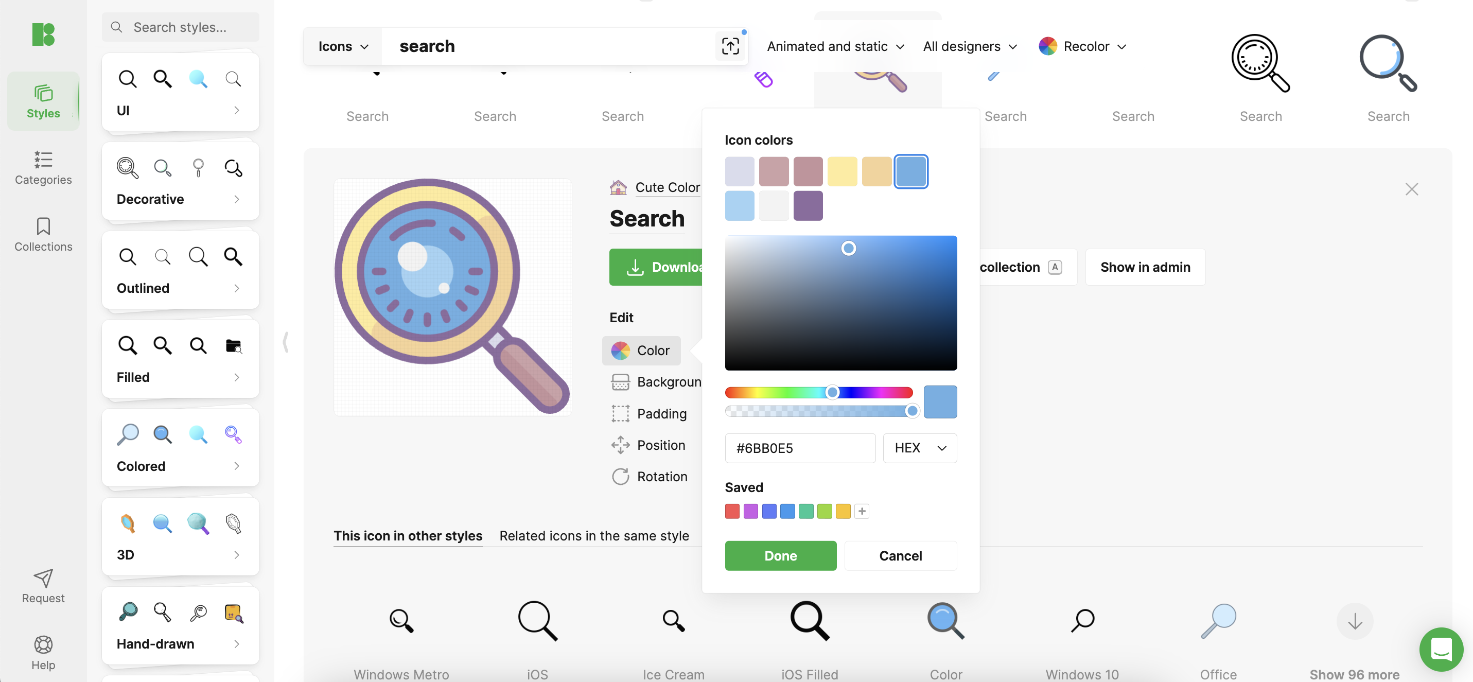
- Standard Icons: Employing widely recognized icons, such as the magnifying glass, offers the benefit of instant user recognition and familiarity.
- Custom Icons: Custom icons can reflect unique brand personality while maintaining clarity. Icons8 provides a range of customizable icons that can be tailored to fit any brand’s identity.
- Dynamic Icons: Interactive or animated icons can make the user experience more engaging. These icons can provide visual feedback or morph based on user interaction, enhancing the interactive feel of the app.
Technical Considerations
Designing effective search icons involves considering technical specifics like resolution, scalability, and adaptability across various devices and platforms. Icons must be versatile enough to maintain their integrity, whether displayed on a small mobile device or a large desktop screen.
Design Process and User Testing
The icon design process should start with conceptual sketches, followed by digital iterations that are tested through user feedback. Implementing A/B testing and soliciting direct user feedback is crucial for understanding how icons perform in real-world scenarios. Icons8 offers tools to facilitate rapid prototyping and testing, allowing designers to refine their icons based on user data.
Case Studies
Successful search icons from popular apps often share common traits such as high visibility, intuitive design, and a seamless fit within the app’s overall interface. Analyzing these can provide valuable insights into what makes an icon effective in engaging users and enhancing their app interactions.
Best Practices for Implementing Search Icons
Integrate icons that are scalable and consistent with the app’s design language. Regular updates and refinements based on user interaction data are essential to keeping the icons relevant and effective.
Conclusion
Effective search icons are integral to creating a user-friendly app environment. Thoughtful consideration of design, functionality, and user feedback can lead to icons significantly enhancing user interaction.
Call to Action
Leverage these guidelines and explore Icons8 for a comprehensive suite of design tools and resources to elevate your app’s design. Engage with the design community to share insights and discuss best practices in search icon implementation. Your feedback and experiences can help shape future design strategies and innovations.
From Basic to Bold: Innovating Close Icon Designs for Apps 8 May 2024 5:27 AM (11 months ago)
Close icons are a staple in app design, serving as navigational aids that allow users to exit views or dismiss dialogues efficiently. Yet, as user interfaces evolve, there’s a growing need to move from basic close icon designs to more bold and innovative ones. This transition can enhance user engagement and elevate the overall aesthetic of an app, with tools like Icons8 offering a plethora of resources to inspire and implement these designs.
The Basics of Close Icon Design
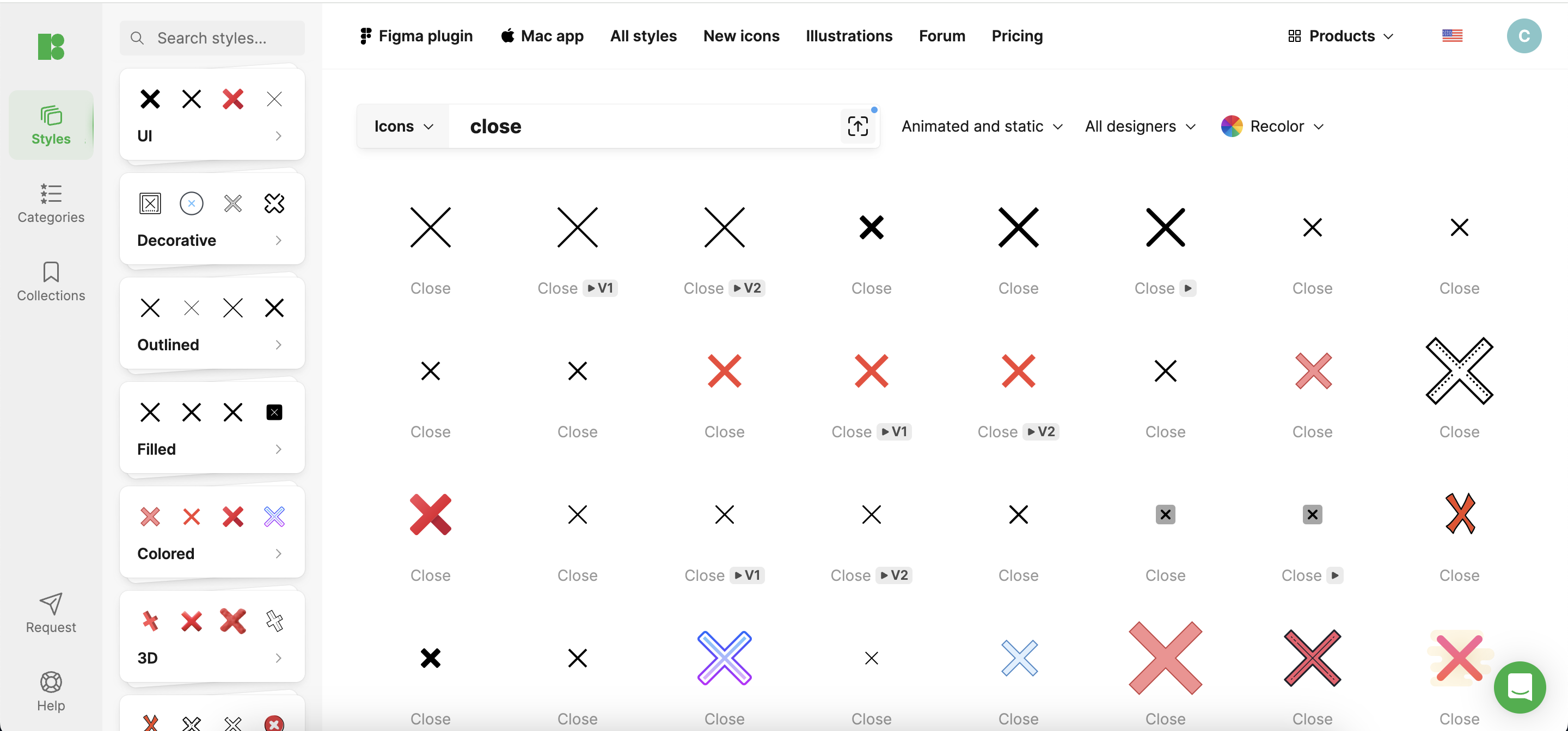
At its core, a close icon must be visible, accessible, and functional. Traditionally, these icons have been simple, often represented by a cross (‘X’) or a minus sign. While effective, these standard symbols can sometimes blend into the background, particularly in complex app interfaces. Icons8 provides a variety of icon styles that can serve as a starting point for more dynamic designs.
Challenges with Standard Close Icons
Standard close icons, while reliable, often fail to capture the user’s attention, potentially leading to a mundane user experience. Furthermore, typical pitfalls include icons that are too small, poorly contrasted against their background, or ambiguously designed, which can confuse users and detract from usability. Icons8 offers high-contrast, clearly distinguishable icons that can help overcome these challenges.
Innovative Design Techniques
To break away from the norm, consider these innovative approaches:
- Creative Shapes and Symbols: Look beyond the traditional ‘X’ to arrows or thematic symbols aligning with your app’s content. Icons8 features an extensive library of unique symbols that can be adapted for close icons.
- Color and Size: Use bold colors and larger sizes to make the close icon stand out. Icons8 provides customizable icons in various colors and sizes, allowing easy integration into any app design.
- Dynamic Elements: Adding animation or interactivity, such as hover effects or a change in color when touched, can make closing an engaging action rather than a purely functional task. Icons8’s animated icons can add this layer of interaction to your design.
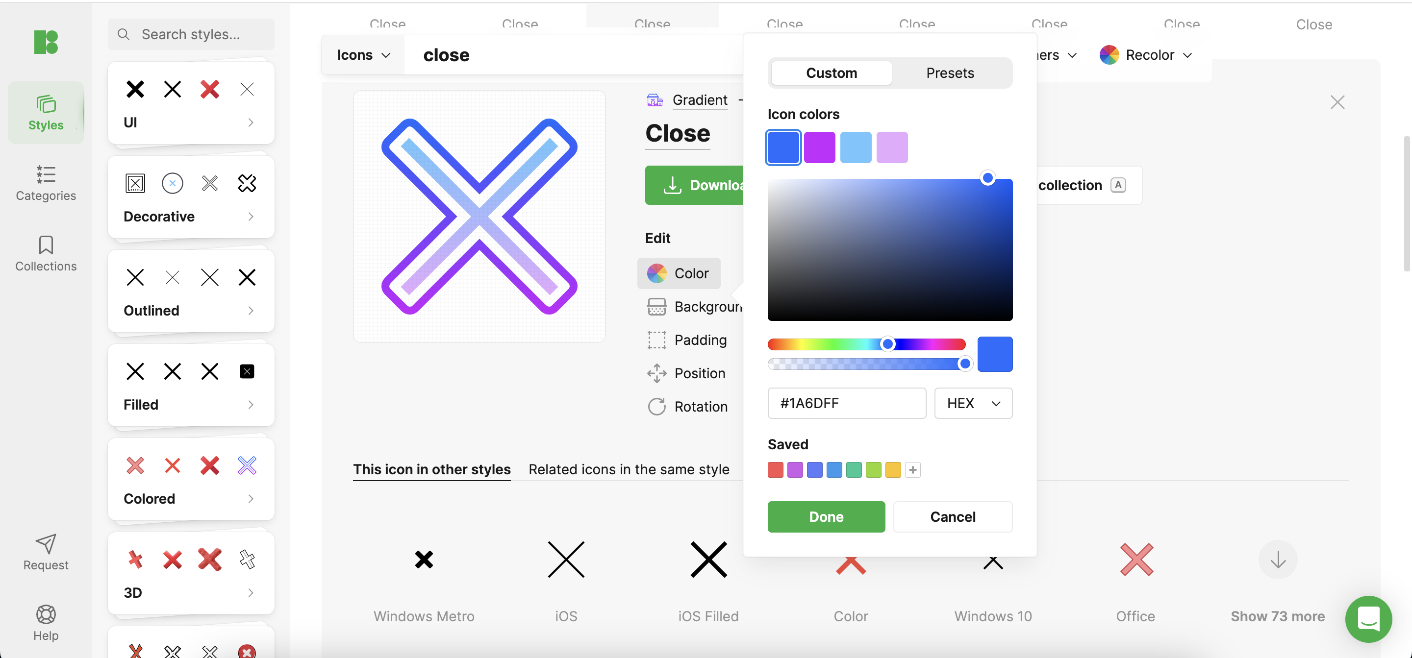
Case Studies: Bold Close Icon Implementations
Innovative close icons have been successfully integrated into various apps. For example, a music app might use a dynamic equalizer symbol from Icons8 for its close icon. This symbol animates when hovered over, adding an element of fun and maintaining the app’s creative feel. Such designs enhance the interface and improve user engagement by providing a memorable interaction.
Designing for Different Platforms
When designing close icons, it’s crucial to consider the platform. Icons8 offers platform-specific icon designs optimized for mobile, tablet, and desktop use, ensuring that the icon functions well within each device’s user interface and user habits.
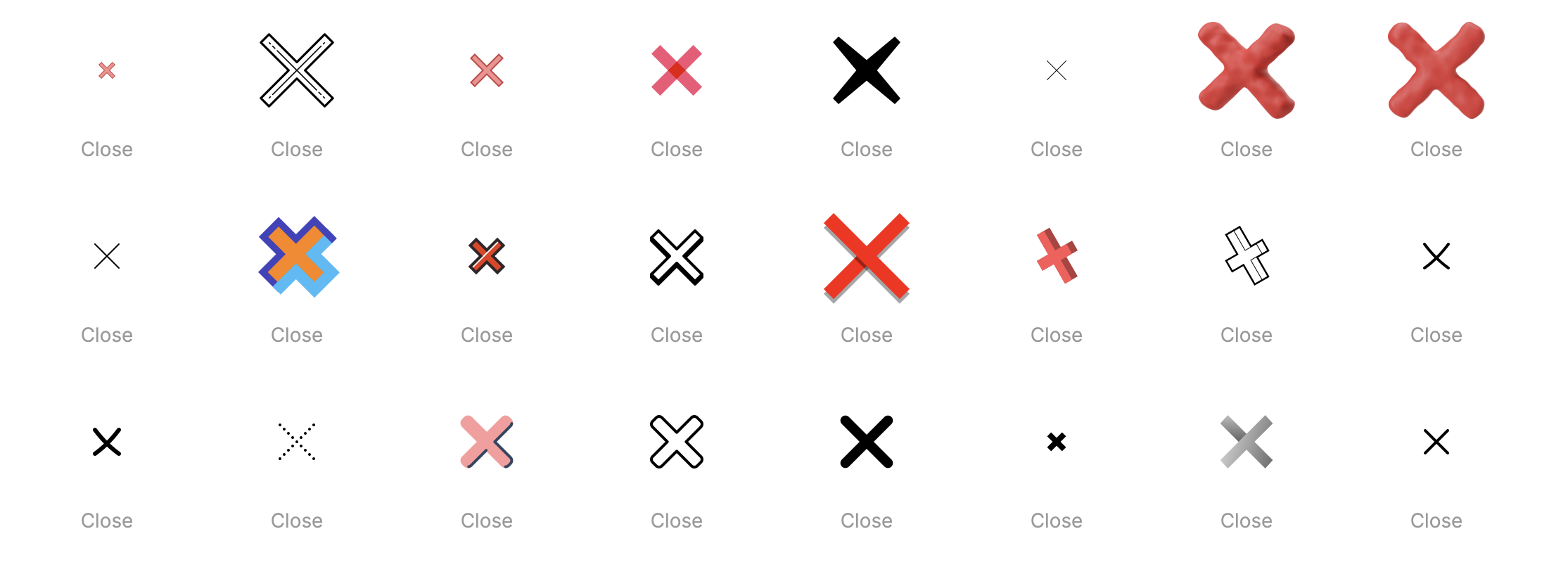
User Testing and Feedback
Bold designs should be user-tested extensively to gauge their effectiveness. Icons8’s tools allow for rapid prototyping and testing, enabling designers to iterate based on user feedback quickly, refining the design to ensure it looks good and enhances the user experience. Techniques like A/B testing can reveal which designs perform better in terms of usability and user satisfaction.
Best Practices for Bold Close Icon Design
When venturing into bold designs, maintain a balance between creativity and functionality. Ensure that the icon is still recognizable as a close button and that it complements the app’s overall design. Icons8 can help maintain this balance with its wide range of design options that emphasize style and functionality.
Conclusion
Evolving from basic to bold close icon designs offers an opportunity to inject creativity into your app’s user interface. Icons8 provides the tools and resources necessary to explore and implement these innovative designs, enhancing not just the look but also the functionality of your app.
Call to Action
App designers, challenge yourselves to rethink and rejuvenate your close icons. Utilize resources like Icons8 to explore a variety of designs and user feedback tools. Remember, the goal is to create icons that are not only visually appealing but also improve the overall user experience.
Designing Effective Menu Icons: Best Practices 6 May 2024 12:27 PM (11 months ago)
Menu icons are a staple in user interface design. They serve as both navigational aids and elements enhancing the visual appeal of digital products. Their role in guiding users and enriching the overall user experience cannot be understated.
Understanding Icon Functionality
Menu icons are graphical elements that facilitate user interaction with app functionalities without cluttering the interface with text. They are especially crucial in mobile environments where space is limited, making efficient use of visuals imperative for usability.
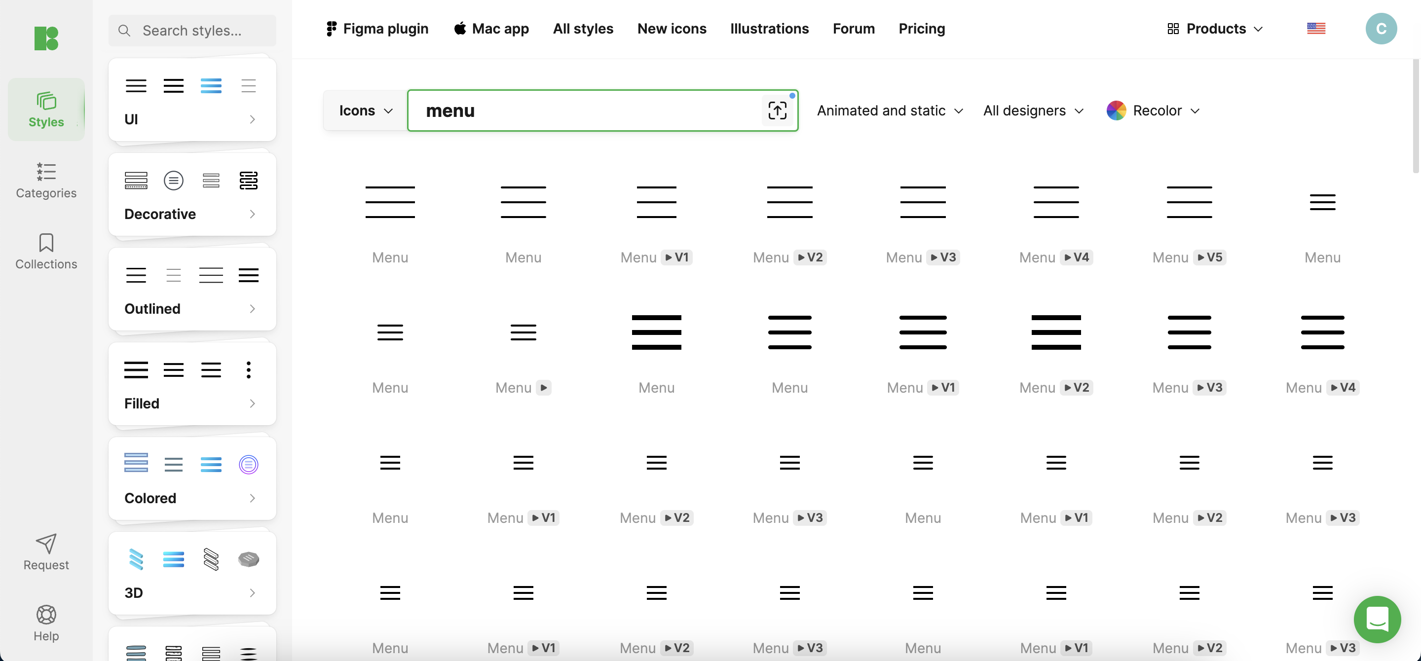
Best Practices in Menu Icon Design
- Clarity and Simplicity: The primary goal of a menu icon is immediate recognition. Icons should be simple and iconic enough that their meaning is unmistakable, even at a glance. Overly complex icons can lead to confusion, detracting from user experience. For instance, a ‘hamburger’ icon effectively communicates “menu” and is widely understood due to its simplicity and frequent use.
- Consistency: Uniformity in style, size, and color of icons ensures that users can navigate your interface intuitively. Consistent icons function predictably, enhancing user trust and reducing cognitive load. This means once a user learns what one icon does, they can infer the functionality of others if they are consistently designed.
- Cultural Considerations: When designing menu icons, consider the diverse cultural interpretations of imagery. An icon that is clear in one culture may be ambiguous or offensive in another. Aim for universal symbols and test them across different demographic groups to ensure broad comprehensibility.
Technical Aspects of Creating Menu Icons
- Size and Scaling: Icons must be legible in different sizes and resolutions, especially with the proliferation of devices with varying screen densities. Typical sizes vary, but maintaining a consistent aspect ratio and resolution independence ensures usability across all platforms.
- Color and Contrast: Color choices should complement the overall design palette, standing out enough to draw attention. High contrast between icons and their backgrounds is critical, not just for aesthetics but also for accessibility, ensuring that users with visual impairments can navigate easily.
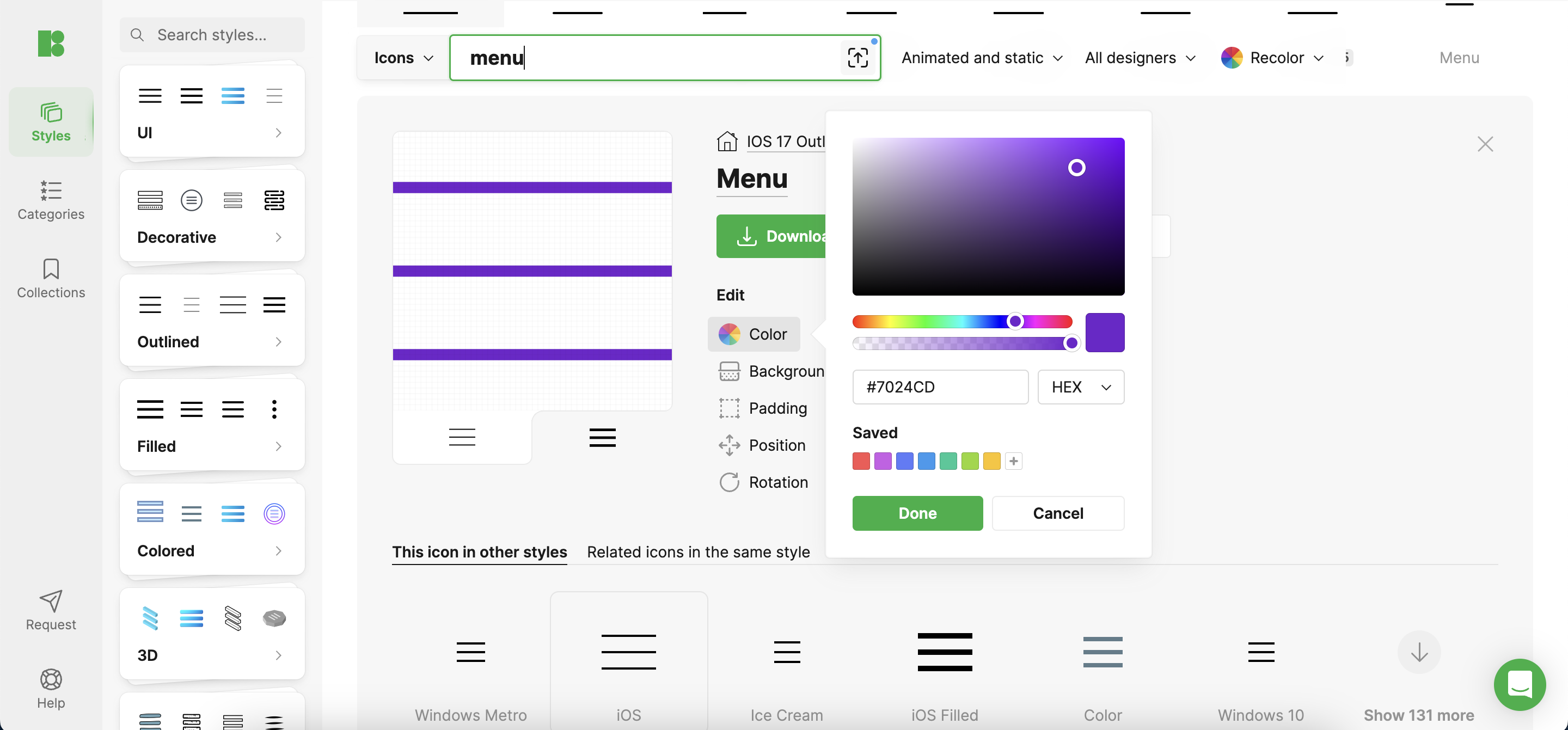
Testing and Feedback
Iterative testing with real users is crucial. Observe how users interact with your icons and gather feedback to refine their design. This could involve A/B testing different icon designs to determine which are most effective in real-world applications.
Case Studies
Consider Instagram’s evolution of its camera icon, which has become simpler over the years while remaining recognizable. This refinement process illustrates the importance of adapting icon designs to maintain user familiarity and improve visual harmony as design trends evolve.
Conclusion
Designing effective menu icons is a blend of art and science. By adhering to best practices in clarity, consistency, and technical execution and by continually iterating based on user feedback, designers can create intuitive and attractive icons that enhance the navigation experience.
Additional Resources
For a comprehensive collection of icons designed with these best practices in mind, check out Icons8, which offers a wide array of ready-to-use icons and design tools suitable for enhancing any project.
The post Designing Effective Menu Icons: Best Practices first appeared on Creative Bits.Crafting Memorable Profile Icons: Techniques and Trends 2 May 2024 8:12 AM (11 months ago)
In the digital world, profile icons are more than mere decorations; they are crucial for user recognition and engagement. As design trends evolve, so does the approach to creating impactful icons.
Understanding the Basics of Profile Icon Design
Profile icons serve as a visual representation of a user’s identity across various digital platforms. Key elements to master include simplicity for quick recognition, recognizability to ensure immediate user connection, and consistency to maintain brand coherence across platforms.
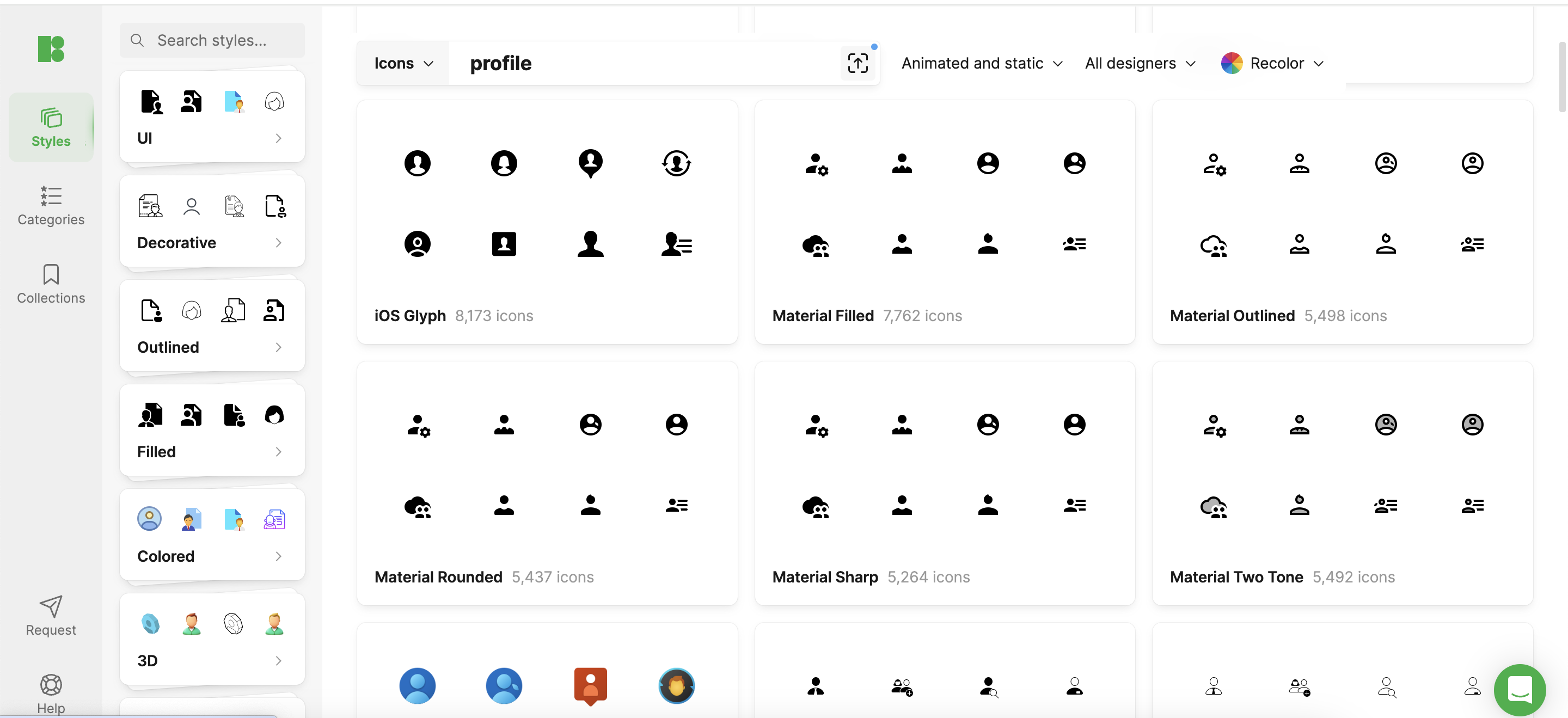
Current Trends in Profile Icon Design
- Minimalism: Simplicity reigns supreme, stripping designs into basic geometric shapes and essential elements.
- Bold Colors and Gradients: Modern icons often feature striking colors and gradients to catch the eye and stand out in a crowded digital space.
- Dynamic Icons: Some platforms have begun using icons that change based on user interaction, enhancing personalization and user experience.
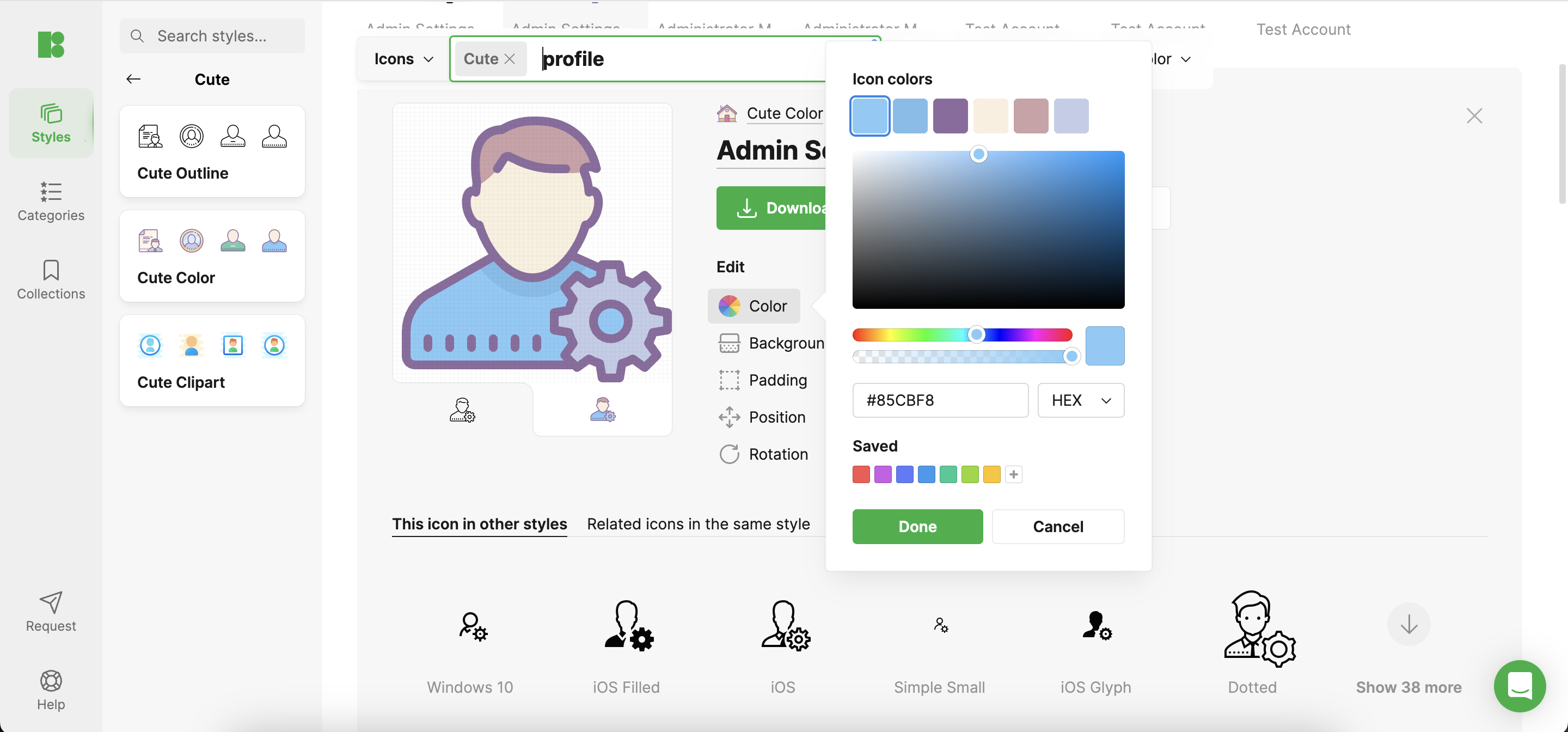
Technical Considerations
Designing an icon that looks great on all devices means focusing on optimal dimensions and resolution, typically 48×48 pixels for basic profiles, scalable for larger displays. Ensuring compatibility and maintaining detail at various sizes are paramount.
Design Techniques for Memorable Icons
- Branding: Integrate logo elements subtly but distinctly to reinforce brand identity.
- Uniqueness and Clarity: Aim for a design that stands out while remaining clear and unambiguous.
- Psychological Impact: Choose shapes and colors that resonate emotionally with the target audience, utilizing psychology to enhance connection and recognition.
Case Studies
For instance, a popular social media platform redesigned its icons using a bolder color palette to increase visibility and user interaction, reflecting its energetic and youthful demographic. Another example involves a professional networking site that refined its icons to sleek, simple lines to echo its professional tone.
Icons8 Tools and Resources
At Icons8, designers can find a wide range of tools and resources to help create effective and appealing profile icons. From icon editors to a library of ready-made icons that can be customized for any project, Icons8 provides practical solutions for designers at every skill level.
Future Directions
The future might see more adaptive and responsive icons, with designs that incorporate user-generated content or change dynamically. Advances in AI could also lead to automated design processes that personalize icons based on user behavior and preferences.
Conclusion
Profile icons are a potent tool in the digital design arsenal. By embracing current trends and technologies, designers can create memorable icons that enhance user experience and strengthen brand identity. Experimentation and innovation are key as we move forward into the ever-evolving landscape of digital design.
The post Crafting Memorable Profile Icons: Techniques and Trends first appeared on Creative Bits.Designing Effective Person Icons: Best Practices and Tips 30 Apr 2024 10:16 AM (11 months ago)
Person icons are pivotal in user interfaces, serving as clear visual symbols that guide user interaction. Crafting effective person icons enhances usability and contributes to the design’s overall cohesion. This guide delves into the best practices for creating compelling person icons, with insights from industry resources, including Icons8.
Understanding the Basics
Person icons symbolize human presence in digital interfaces, vital for features like user profiles, social interactions, and authentication processes. These icons facilitate immediate user recognition and action, underpinning their ubiquity across platforms.
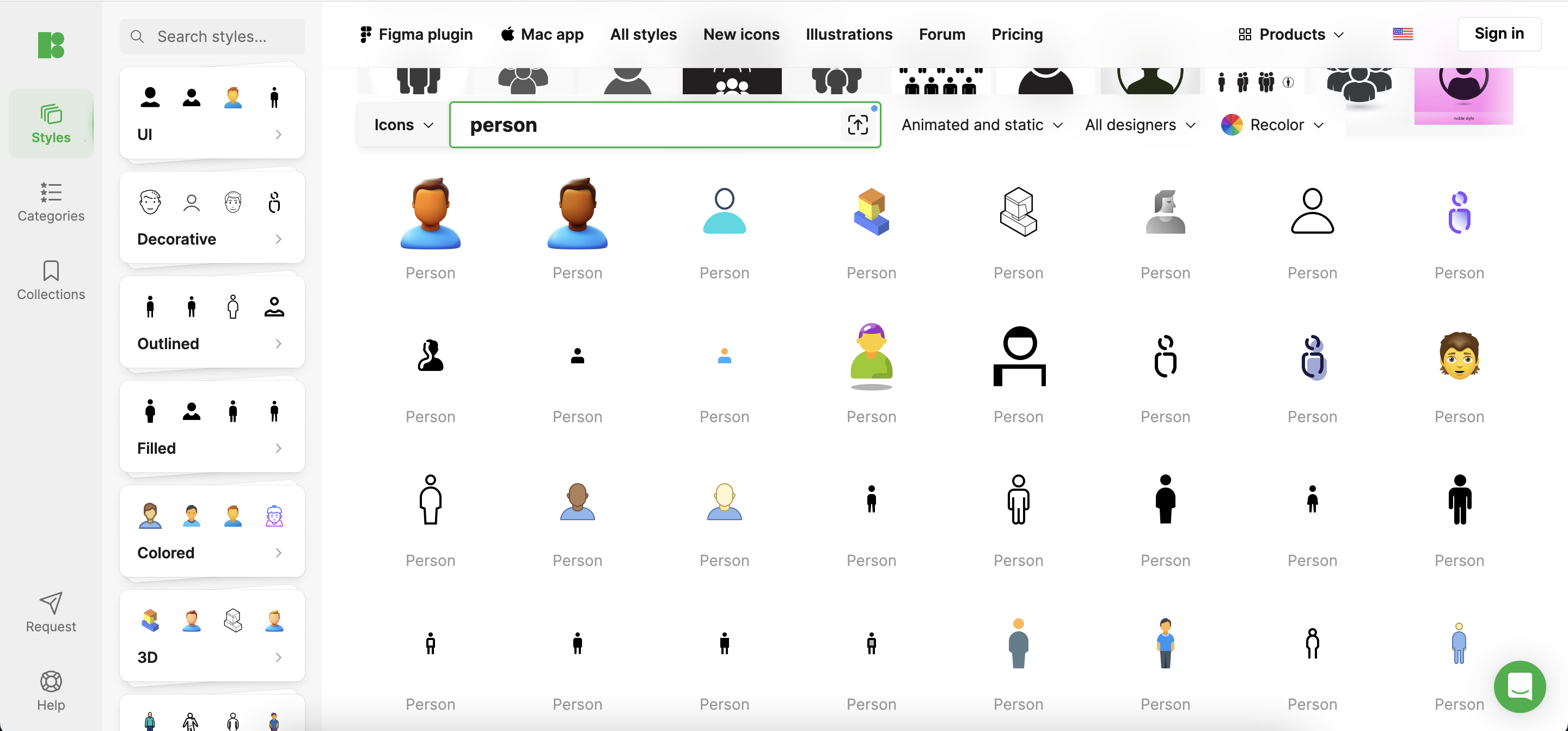
Design Principles for Person Icons
- Simplicity: Maintain simplicity by removing extraneous details to ensure the icon remains recognizable across various resolutions.
- Consistency: Ensure icons align with the application’s visual style and integrate seamlessly into the overall design language.
- Scalability: Design icons that are clear and recognizable regardless of display size, from tiny mobile screens to expansive desktop monitors.
Best Practices in Person Icon Design
- Color Usage: Choose colors that stand out yet are harmonious within the app’s color scheme and function well under various conditions.
- Shape and Form: Opt for simple, rounded shapes that are universally appealing and easy to identify.
- Avoiding Common Mistakes: Avoid overly detailed or ambiguous icons that can diminish functionality, especially on smaller screens or in different cultural contexts.
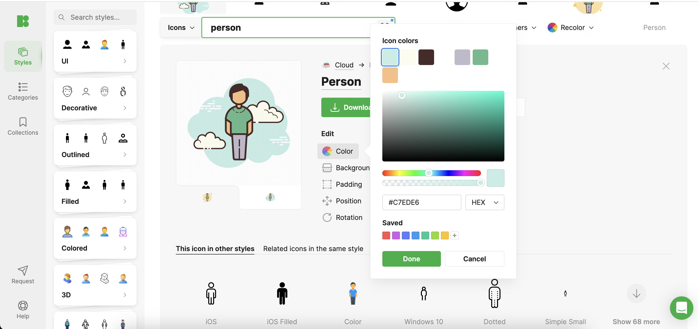
Cultural Considerations
Designing for a global audience means incorporating diverse cultural elements into icons, ensuring inclusivity. Icons8 offers a range of customizable person icons that can be adapted to reflect different cultures, promoting diversity and inclusivity.
Tools and Resources
Adobe Illustrator and Sketch are the top choices among designers for creating scalable vector icons. Icons8 also provides a variety of design tools and resources that can be particularly helpful, including templates and customizable icons, facilitating the design process and sparking creativity.
Case Studies
Review how platforms like LinkedIn and Instagram utilize person icons to align with their brand and audience expectations. LinkedIn’s professional, simplistic icons contrast with Instagram’s more casual, approachable imagery. Icons8’s blog often features case studies and breakdowns of successful icon implementations, offering further insights and inspiration.
Conclusion
Effective person icons are more than aesthetic elements; they are fundamental to intuitive user interface design. Regularly refining your designs based on user feedback and changing trends is crucial for maintaining their effectiveness.
Further Reading and Resources
Icons8’s blog and resources section provides additional guides and articles that are invaluable for both novice and seasoned designers who want to enhance their skills.
By embracing best practices and utilizing comprehensive resources like Icons8, designers can create person icons that significantly improve user interaction and satisfaction.
The post Designing Effective Person Icons: Best Practices and Tips first appeared on Creative Bits.Creating Effective User Icons for Enhanced Web Interfaces 27 Apr 2024 7:00 AM (11 months ago)
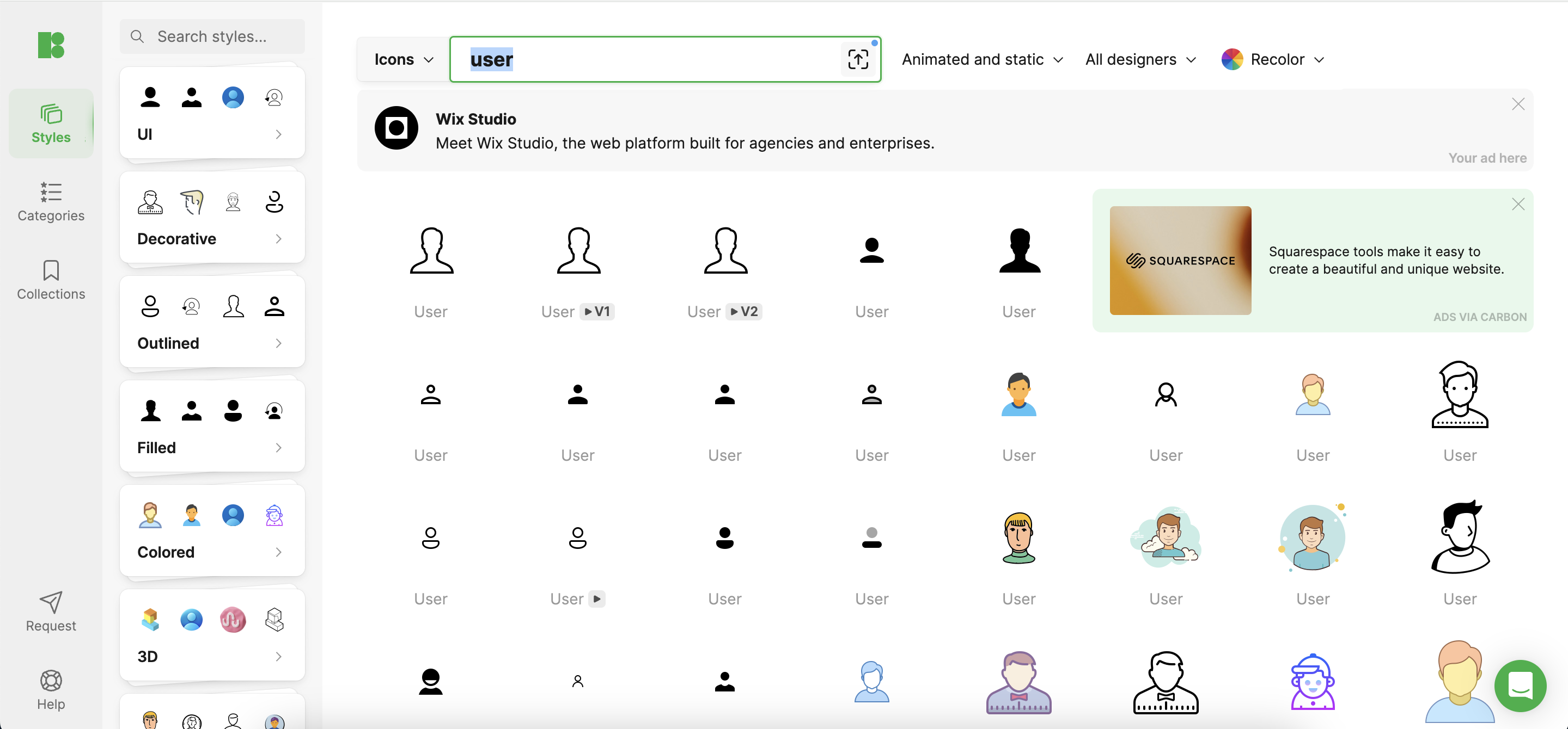
User icons are more than decorative elements; they are vital tools that enhance both the user experience and the functionality of custom websites. By guiding users intuitively through interfaces, well-designed icons facilitate smoother interactions and promote a visually appealing, cohesive digital environment.
The Role of User Icons in Web Design
User icons act as essential navigational aids, allowing users to move seamlessly across different sections of a website. An effective icon instantly communicates its function, reducing cognitive load and making the interface more intuitive. For example, a magnifying glass universally suggests search functionality, while a cart icon is synonymous with purchasing. Properly utilized, these icons can significantly enhance the usability and aesthetic of a digital space.
Design Principles for User Icons
- Simplicity and Clarity: Icons should be designed to convey their message or function clearly and without unnecessary complexity. This means avoiding intricate details that can be lost at smaller sizes.
- Consistency: The style of icons should align with the website’s overall design. This includes using a consistent palette, style, and visual weight across all icons to maintain a harmonious look.
- Scalability: Icons must be legible and effective at any size, from large desktop displays to small mobile screens. This ensures that the icons perform their function effectively across all platforms.
Tools and Resources for Icon Design
- Vector Graphics Software: Tools like Adobe Illustrator or Sketch are essential for designing high-quality, scalable vector graphics that stay crisp and clear at any resolution.
- Icons8: This tool provides a comprehensive library of icons that designers can customize and integrate into their projects. Icons8 ensures that you have access to professionally designed icons that are consistent in quality and style, which can be a huge time-saver.
Best Practices for Custom Icon Creation
- Color Usage: Select colors that not only align with the overall design but also consider the emotional impact of different hues. For instance, green can evoke feelings of growth and comfort, which might be suitable for financial services icons.
- Branding Elements: Incorporating key elements of the brand into icon designs can reinforce the brand identity across the website. This might involve using specific shapes or curves that echo the brand’s logo.
- Accessibility: Make sure that icons are accessible to all users, including those with visual impairments. This involves using adequate contrast, simple shapes, and possibly even text labels for clarity.
Testing and Iteration
- User Feedback: Directly engaging with users to obtain their feedback on icon usability can provide invaluable insights into how these icons perform in real-world scenarios.
- A/B Testing: Experimenting with different versions of an icon on the website can help identify which designs maximize user engagement and ease of use.
- Analytics and Feedback: Regularly reviewing website analytics to understand how changes in iconography affect user behavior allows for data-driven decisions that refine and optimize the user experience.
Conclusion
User icons are a critical component of effective web design, merging aesthetic appeal with functional clarity to foster better user engagement and satisfaction. By utilizing resources like Icons8, designers can access a range of high-quality icons that can be tailored to meet specific needs, ensuring a consistent and professional look across the website. A thoughtful approach to icon design, combined with ongoing testing and refinement, will lead to a more intuitive and attractive digital interface.
The post Creating Effective User Icons for Enhanced Web Interfaces first appeared on Creative Bits.Integrating Visual Design in Notion: Using Aesthetic Icons to Enhance Your Note-Taking and Planning 16 Apr 2024 11:15 AM (11 months ago)
Introduction
Notion is a powerhouse tool for everything from note-taking to complex project management, blending functionality with flexibility. But beyond its robust features, the aesthetic aspect of Notion can play a crucial role in enhancing user experience. This article delves into the significance of integrating aesthetic icons into your Notion workspaces to not only beautify your digital environment but also to streamline your workflows and boost productivity.
Importance of Aesthetic Icons in Notion
Visuals are more than just decoration; they enhance our ability to process information and remember it. In Notion, icons serve as both navigational aids and stylistic enhancements, making your pages easier to navigate and less monotonous. Aesthetic icons can transform a cluttered workspace into an organized, visually appealing interface, making you more inclined to use and benefit from the platform.
Types of Icons Suitable for Notion
Choosing the right icon style is key to creating a cohesive look. Here are a few popular styles:
- Minimalist: Simple, monochrome icons that blend seamlessly into any layout.
- Colorful: Vibrant icons that stand out and help categorize information visually.
- Line Art: Elegant and understated, perfect for a professional or artistic workspace. Select a style that resonates with your personal taste or aligns with your brand identity.
How to Integrate Aesthetic Icons into Notion
Choosing Icons
Select icons based on clarity, consistency, and relevance to the content. Opt for icons that complement the overall design of your workspace. You can find icons on platforms like Icons8, or through Notion’s own integration with these services.
Adding Icons to Notion
- Upload Your Icon: Drag and drop your chosen icons into the Notion page or use the insert option to upload them.
- Customize Your Layout: Place icons next to headers, titles, or within databases to categorize and accentuate specific sections.
- Adjust Size and Alignment: Ensure your icons are uniformly sized and aligned for a tidy appearance.
Best Practices for Using Icons in Notion
- Functionality Over Form: While aesthetics are important, the primary function of icons should be to facilitate quicker navigation and comprehension.
- Avoid Clutter: Using too many icons can lead to visual overload. Keep it simple and intuitive.
- Refresh Regularly: Update icons periodically to maintain interest and relevancy in your workspace.
Case Studies
Let’s look at a couple of examples:
- A freelance graphic designer uses custom line art icons to segment her project list by client type, enhancing her workflow.
- A student utilizes colorful icons to differentiate between course notes, making study sessions more engaging and organized.
Tools and Resources
For those interested in customizing further, tools like Adobe Illustrator and websites like The Noun Project offer extensive libraries of icons. Notion’s integration with these platforms makes adding them to your workspace straightforward.
Conclusion
The thoughtful integration of aesthetic icons in Notion isn’t just about making your pages look good. It’s about creating a more dynamic and inviting workspace that encourages regular use and helps you stay organized. By following these guidelines, you can transform your Notion setup into an environment that not only looks great but also enhances your productivity.
Call to Action
Experiment with different icons and layouts, and share your customized Notion workspaces online. Seeing how others utilize icons can inspire your own designs and help you make the most of this versatile tool.
The post Integrating Visual Design in Notion: Using Aesthetic Icons to Enhance Your Note-Taking and Planning first appeared on Creative Bits.Elevate Your Projects with Creative Use of Notion Icons 15 Apr 2024 11:10 AM (11 months ago)
Transform your digital workspace with custom Notion covers! Here, we’ll guide you through the steps and share expert tips to help you personalize your workspace with style and functionality. Get ready to inject your unique flair into your Notion pages.
Why Personalize Your Notion Workspace?
If you’ve been using Notion, you know it’s more than just a tool; it’s a canvas. Customizing your workspace with unique covers can enhance its aesthetics while making it feel more personal. Imagine a workspace that’s not only functional but also a direct reflection of your style and creativity.
Key Considerations for Notion Covers
- Dimensions and Quality: For optimal display across devices, your covers should be wider than 1500 pixels and under 5 MB in size. Preferred formats include PNG, JPEG, GIF, and WEBP.
Creative Inspiration for Your Notion Covers
Our graphic designer whipped up several examples to ignite your creativity. Whether you prefer minimalist designs or colorful displays, these samples demonstrate how an imaginative cover can transform your workspace.
- Welcome Book: A serene, Cole-inspired cover.
- App Development Process: A vibrant, Handy-inspired cover with a 3D fluency icon.
- Investment Tracker: A dynamic, Techny-style 3D cover with emoji icons.
- Accounting Department: A professional, Weekday-style cover with Windows 11 color schemes and SF Regular icons.
- Household Expenses: An Experimental-style cover with playful icons and bold colors.

Step-by-Step Guide to Designing Your Notion Cover
Step 1: Start Your Design Begin on a platform like Mega Creator by selecting ‘Start from scratch’. This is where your creativity comes to life.
Step 2: Set Your Dimensions Maintain a dimension of 1500 x 600 pixels to ensure your cover fits perfectly without being stretched or cropped.
Step 3: Create Your Design Add a scene or craft a unique composition. For instance, combining a record player image with colorful background elements can create a chic yet personal cover.
Pro Tip: Keep the left side of your cover simple since it will contain your icon or document title.
Step 4: Export Your Design Once satisfied, export your design in a medium file size for clarity and efficiency.
Step 5: Final Touch Add icons that match your cover’s style and theme, enhancing its functionality and aesthetic appeal.
Conclusion: Your Personalized Notion Space
Creating custom covers for Notion isn’t just about aesthetics; it’s about making a space where you can be your most productive and creative self. It only takes a few minutes to transform any Notion page from plain to personalized. Don’t hesitate to express your individuality through your digital workspace!
With these steps and tips, you’re well on your way to creating a Notion space that looks great, resonates with your personal style, and enhances your productivity.
The post Elevate Your Projects with Creative Use of Notion Icons first appeared on Creative Bits.Notion Icons Unleashed: Tips for Transforming Your Workspace Aesthetics 9 Apr 2024 4:12 AM (12 months ago)
In today’s digital era, where over 35 million users embrace Notion as their go-to workspace, personalization is a key factor in boosting productivity and creating a space that truly reflects your personal style. With their ability to provide clarity and character, icons play a pivotal role in transforming your workspace from merely functional to distinctly personal.
Why Personalize with Icons?
Icons in Notion are visual cues that help you swiftly navigate and organize your workspace. They mark project statuses, categorize content, and add a touch of personal flair. Here’s how you can make the most of icons to enhance your Notion setup:
- Minimalist Icons: Just like a classic wardrobe staple, minimalist icons are sleek, chic, and versatile. They blend seamlessly into your workspace, ensuring that the focus remains on your content while subtly enhancing the aesthetic.
- Colorful Icons: Think of these as the statement pieces in your wardrobe. Colorful icons add vibrancy and energy to your workspace, making it more engaging and lively.
- Thematic Icons: Tailor your workspace like you would dress for a special occasion. Thematic icons set the mood and context, making your digital environment more immersive and aligned with your current projects or interests.
- Hand-drawn Icons: For those who appreciate a personal touch, hand-drawn icons are like custom-tailored outfits. They offer uniqueness and a sense of intimacy, making your workspace truly one-of-a-kind.
How to Add Icons in Notion
Customizing your Notion with icons is simple and can have a significant impact on your workspace’s look and functionality. Here’s a quick guide:
- Step 1: Open or create a Notion page and click on the default icon at the top next to the title.
- Step 2: Explore the variety of default icons or opt for a custom touch by clicking “Upload file” to add your own image (recommended size: 280 x 280 pixels; max file size: 5MB; acceptable file types: JPEG, PNG, SVG, GIF).
Finding the Right Icons
To find icons that resonate with your style, consider exploring various online platforms that offer a range of icon styles, from minimalistic to thematic. Choose icons that not only look appealing but also complement the function of each Notion page or section.
Conclusion
Personalizing your digital workspace with icons not only enhances its appearance but also improves navigation and organization. By selecting icons that align with your personal style and the nature of your work, you can create a Notion setup that is both productive and pleasing to the eye. Dive into the world of icons and watch your digital workspace transform!
The post Notion Icons Unleashed: Tips for Transforming Your Workspace Aesthetics first appeared on Creative Bits.How to Create Search Icons: A Comprehensive Guide 10 Mar 2024 10:39 AM (last year)
Introduction: In today’s digital landscape, search icons play a vital role in enhancing user experience and guiding individuals through various interfaces. Whether it’s a website, application, or software, search icons provide users with a familiar and intuitive way to navigate and find relevant information efficiently. In this comprehensive guide, we will delve into the art of creating search icons, exploring design principles, techniques, and best practices to help you craft effective and visually appealing search icons for your projects.
Understanding the Importance of Search Icons: Before delving into the intricacies of creating search icons, it’s crucial to understand their significance in user interface (UI) design. Search icons serve as visual cues that signify the presence of a search functionality within an interface. They provide users with a quick and convenient method to access search features, enabling them to locate specific content, products, or information within seconds. Additionally, search icons contribute to the overall aesthetics of a design, enhancing visual appeal and cohesiveness.
Design Principles for Search Icons: Creating visually appealing search icons requires a solid understanding of design principles and aesthetics. Here are some key principles to consider:
- Simplicity: Keep search icons simple and easy to recognize. Avoid cluttering the icon with unnecessary details that may confuse users.
- Clarity: Ensure that search icons are clear and distinct, making them easily distinguishable from other elements within the interface.
- Consistency: Maintain consistency in the design style and visual language of search icons across different platforms and devices to create a cohesive user experience.
- Scalability: Design search icons in vector formats to ensure scalability across various screen sizes and resolutions without compromising visual quality.
- Contrast: Use appropriate contrast to make search icons stand out against the background and surrounding elements, enhancing visibility and usability.
![]()
Techniques for Creating Search Icons: Now that we’ve covered the fundamental principles of search icon design, let’s explore some techniques to create captivating and functional search icons:
- Sketching and Ideation: Begin the design process by sketching out rough ideas and concepts for your search icons. Experiment with different shapes, styles, and compositions to find the most suitable design direction.
- Iconography: Leverage established iconography conventions and symbols to create recognizable search icons. Common symbols include magnifying glasses, magnifying lenses, and search bars.
- Typography: Incorporate typography elements such as letters, words, or abbreviations to complement search icons and convey their purpose effectively.
- Color Palette: Choose a cohesive color palette that aligns with your brand identity and interface design. Opt for colors that enhance visibility and create contrast while maintaining visual harmony.
- Iterative Design Process: Embrace an iterative design process that involves continuous refinement and feedback gathering. Solicit feedback from users and stakeholders to identify areas for improvement and optimization.
Best Practices for Implementing Search Icons: Implementing search icons effectively requires careful consideration of placement, functionality, and accessibility. Here are some best practices to follow:
- Placement: Position search icons prominently within the interface where they are easily accessible and visible to users. Consider placing search icons in the header, navigation bar, or prominent sections of the page.
- Functionality: Ensure that search icons are functional and responsive across different devices and screen sizes. Test search functionality rigorously to identify and address any usability issues or bugs.
- Accessibility: Make search icons accessible to all users, including those with disabilities or impairments. Use descriptive alt text and aria labels to provide context and improve screen reader compatibility.
- Feedback Mechanisms: Incorporate visual feedback mechanisms such as hover effects or animation to indicate user interaction with search icons. Provide feedback messages or loading indicators to signify search progress and completion.
Conclusion: Creating search icons is both an art and a science that requires careful attention to design principles, techniques, and best practices. By following the guidelines outlined in this comprehensive guide, you can create search icons that enhance user experience, improve usability, and contribute to the overall aesthetics of your interface. Remember to stay innovative, iterate frequently, and solicit feedback to refine your search icon designs and ensure optimal performance across diverse digital platforms and devices.
Exploring Advanced Techniques for Search Icon Design:
As you delve deeper into the world of search icon design, you may encounter more advanced techniques and strategies to elevate your creations further. Let’s explore some of these advanced approaches:
![]()
- Icon Animation: Consider incorporating subtle animations into your search icons to enhance interactivity and engagement. Animation can draw users’ attention to the search functionality and provide visual feedback upon interaction. For example, you can animate the magnifying glass icon to expand slightly when hovered over, simulating the act of zooming in and indicating that the search feature is active.
- Customization Options: Offer users the ability to customize the appearance of search icons to align with their preferences and visual style. Provide options for selecting different icon shapes, colors, and animations within your application or website settings. Customization enhances user personalization and allows individuals to tailor their experience according to their unique preferences.
- Microinteractions: Implement microinteractions within search icons to provide subtle cues and feedback throughout the user interaction journey. Microinteractions can include sounds, haptic feedback, or visual changes that occur in response to user actions. For instance, you can incorporate a gentle sound effect when users click on the search icon, reinforcing the action and creating a more immersive user experience.
- Contextual Adaptation: Design search icons that adapt dynamically to different contexts and scenarios within the interface. For example, you can modify the appearance of the search icon based on the user’s browsing behavior, the current page content, or the device being used. Contextual adaptation enhances relevance and usability, ensuring that search icons remain intuitive and effective across various usage scenarios.
- Gestural Interaction: Explore innovative gestural interaction techniques to augment the usability of search icons, particularly in touch-based interfaces. Integrate swipe gestures, pinch-to-zoom actions, or voice commands to enable users to interact with search icons in more intuitive and natural ways. Gestural interaction fosters a seamless user experience and accommodates diverse user preferences and abilities.
- A/B Testing and Optimization: Leverage A/B testing methodologies to evaluate the effectiveness of different search icon designs and variations. Conduct experiments to compare user engagement, conversion rates, and satisfaction levels across various iterations of search icons. Analyze the data collected from A/B tests to identify trends, patterns, and insights that inform future design decisions and optimization strategies.
- Cross-Platform Compatibility: Ensure that search icons maintain consistency and functionality across different platforms, operating systems, and devices. Adopt responsive design principles to adapt search icons seamlessly to varying screen sizes, resolutions, and interaction paradigms. Test search icon performance across multiple platforms and devices to identify compatibility issues and ensure a consistent user experience across the board.
Incorporating these advanced techniques into your search icon design process can significantly enhance the usability, engagement, and effectiveness of your interfaces. Remember to prioritize user feedback, iterate iteratively, and stay abreast of emerging trends and technologies in the field of UI/UX design. By embracing innovation and experimentation, you can create search icons that not only meet users’ needs but also delight and inspire them on their digital journey.
