Illustrator Groups are DIVs 17 Aug 2015 8:47 AM (10 years ago)
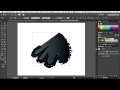 If you're a web designer or a web developer, you're probably familiar with core concepts like the difference between HTML (structure), and CSS (presentation). You're probably also familiar with the DIV tag -- a way to clearly indicate intent for different kinds of content on a page.
DIVs are like containers. And what's cool about them is that you can also apply attributes to them. For example, a DIV may have its own background color, so as you add more text within the DIV, the background grows to enclose all of the text.
This is basic web 101 stuff.
But when it comes to using Adobe Illustrator, I am finding more and more people who don't truly understand that structure and presentation -- and essentially DIVs -- play an essential role in the world of vector graphics.
Back in 2011, I created a series of courses on lynda.com called Illustrator Insider Training -- where I went deep into revealing how Illustrator works under the hood. How vectors REALLY work, and providing a true understanding of what paths, anchor points, fills, strokes, effects, groups, and layers all are. In that course, I ultimately teach you how to "read" an Illustrator file (similar to using View Source to understand how a web page is built).
In this movie below, I talk about just how similar Illustrator and basic web design concepts are:
Recently, Von Glitschka asked a question about how to achieve a certain effect. The solution was to use groups to advantage... but only if you really understand the power of groups does the simple solution make sense.
Here's the video that I recorded that discusses Von's initial question (how he could apply a gradient to a brush stroke) and my solution and explanation:
If you want to truly master the art of using Adobe Illustrator, don't try silly tutorials that claim to teach you how to use Gradient Mesh or how to make a 3D logo. Spend time on truly understanding what makes every Illustrator file tick. You'll thank me for it.


Adobe Illustrator CC 2015: Best Upgrade Ever? 29 Jun 2015 5:44 AM (10 years ago)
We're all familiar with software upgrades. Back in the day, upgrades were packed with numerous features and were launched with fanfare and huge marketing events. I still recall attending the PageMaker 5 launch event, where, to a packed theater in NYC, Aldus proudly unveiled the new toolbox featuring a Rotate tool.
Today's business model has changed, and huge feature-laden releases every couple of years have been replaced with more frequent releases that are smaller and more focused. Perhaps more importantly, with the rich toolset that we already have in place, companies like Adobe have turned towards modernizing their software code and improving upon their existing tools and features to make them better.
A good example of the above is the JDI initiative that was started by the Photoshop team a few years back. Normally, new features are carefully planned and agreed upon by various team members. Engineers are then assigned to implement those features, systematically completing one and moving to the next. The Photoshop team undertook an initiative to specify certain days in the software development schedule called JDI days or "Just Do It" days. On those days, engineers were free to go back and modify or improve existing features in the product. These changes were based on things that either the engineer didn't have time to do initially, or things that members requested, etc. Now, almost all teams at Adobe have JDI days. These are valuable, because sometimes, a small modification or improvement can translate to hours of work saved or a huge reduction in frustration on the side of the user.
But sometimes there is work that goes beyond a small feature... beyond a modification... beyond something "big" like a new tool or feature. And sometimes, that work is invisible until far into the future when it is finally realized. In the case of Adobe Illustrator, the future has (finally) arrived.
Years back (in 2012), the Illustrator team made a serious investment in rewriting the application from the ground up. Illustrator CS6 was touted as being 64bit (I wrote about it here). That groundwork enabled the Illustrator engineers to do significant work under the hood. Just making it 64bit didn't make the difference, but without getting there first, additional work wasn't possible. The exciting work began in earnest AFTER the release of Illustrator CS6.
Fast forward to last week, when Adobe released the 2015 version of Adobe Illustrator CC. In my humble opinion, it is probably the best upgrade in Adobe Illustrator history.
It contains numerous small enhancements that make every-day work better, such as an improved Shape Builder Tool, a significantly higher zoom limit, as well as preferences for using the rubber-band effect when using the Pen tool.
It contains incredible under-the-hood functionality that translate to a reliable platform, such as GPU support for the vast majority of today's computers (Mac included), significantly faster performance, and crash protection (similar to what InDesign has had since the beginning of time).
It contains a glimpse at what the future can bring with the new CC Charts feature. Granted, this is a preview and is (extremely) limited in scope. But as we saw with Illustrator CS6, you can't look at the CC Charts feature now... but rather what it enables for the future.
If you haven't had a chance to explore this new version, I'd highly recommend giving it a spin. And if you've been holding out on moving to Adobe Creative Cloud, this is probably the time to go all-in and take advantage of what is the best Illustrator upgrade ever.
Illustrator Gets a Performance Boost (for some folks, anyway) 3 Aug 2014 11:12 AM (11 years ago)

In past years, you've certainly heard that great strides have been made in speeding up performance in applications like Photoshop, Premiere Pro, and After Effects. The pixel-driven apps have seen these great performance gains because of how they rely on specific hardware found on modern graphics cards installed on your computer. A computer uses a CPU (Central Processing Unit) to function. When you hear of "multicore" or "multiprocessor" machines, it refers to a computer that has more than one CPU (and software distributes tasks to multiple processors when possible to reduce computation time). Graphics cards, however, may also feature something called a GPU (Graphics Processing Unit). This GPU, which contains its own memory, is optimized to draw graphics on your computer screen. If software (like Photoshop for example) is programmed to send tasks to both the CPU and the GPU, you can see tremendous gains in performance.
Sadly, while all of its friends (Photoshop, After Effects, etc) zip by in fancy sports cars, Illustrator has struggled to use its legs and feet to keep its Flintstones car on the road. Why? Primarily because as a vector-based application, Illustrator can't take advantage of the GPU which is primarily optimized for processing pixel-based information.
But that's changing.
NVIDIA, a company that makes high-performance video cards has been working closely with the Illustrator development team at Adobe to bring GPU support to Illustrator. In the latest update to Illustrator (the 2014 edition of Illustrator CC), Adobe has added support for some of the newer NVIDIA video cards (primarily in their Quadro and GeForce series). The GPU on these cards are able to take advantage of something called NV Path Rendering, which is a technology built into OpenGL that supports vector-based artwork and rendering. Using these NVIDIA cards with Adobe Illustrator can translate into screen redraws, panning, and zooming that averages 10x faster in performance (in many cases far exceeding that number).
At the time I'm writing this, GPU support is available only using certain NVIDIA cards, and only on Windows computers. Why not Mac? Because the NV Path Rendering technology uses parts of OpenGL that are not supported by Apple (yet). Both Adobe and NVIDIA are still working very closely together to find ways to bring GPU support to the Mac platform, and have both committed to doing what they can to support their Mac user base (I have spoken to folks on both side who are very much aware of how welcome the Mac support would be).
That being said, if you regularly work with incredibly complex Illustrator files and suffer from performance issues, and you are only able to work on a Mac, you might think about this: Subscribers to Creative Cloud are able to install and run two copies of software at any given time. And one can be running on Mac while the other on Windows. Assuming you have a supported NVIDIA graphics card on your Mac, you can install Apple's Bootcamp, Microsoft Windows, and Illustrator for Windows, at which point you'll be able to take advantage of GPU performance.
Of course, if you're in the market for building the fastest possible machine for working with Illustrator, the good news is that you now have an option. Hopefully, these options will only continue to improve for all of us, but for now, Papa's got a brand new ride.
For more detailed technical information from NVIDIA, check out their FAQ.
%26bodytext%3D%3Cdiv%3E%0A%3Ca%20href%3D%22https://blogger.googleusercontent.com/img/b/R29vZ2xl/AVvXsEiLbqmmVVbEgW-bbLdjbP0tPUQIlL9Pk0a6fORrZJDV71U2hy-frJCgJO10Nf3xTlnuXSkLGZ_SCBy9JaKZ2DRU-ciI51E0JCw9KrJblF5BQz9TcxXpGyea8e1hX65zMqdYd2poiQ/s1600/MV5BNzU0MzM4NDEwMl5BMl5BanBnXkFtZTYwMTQxMTY5._V1_SX640_SY720_.jpg%22%20imageanchor%3D%221%22%3E%3Cimg%20border%3D%220%22%20src%3D%22https://blogger.googleusercontent.com/img/b/R29vZ2xl/AVvXsEiLbqmmVVbEgW-bbLdjbP0tPUQIlL9Pk0a6fORrZJDV71U2hy-frJCgJO10Nf3xTlnuXSkLGZ_SCBy9JaKZ2DRU-ciI51E0JCw9KrJblF5BQz9TcxXpGyea8e1hX65zMqdYd2poiQ/s1600/MV5BNzU0MzM4NDEwMl5BMl5BanBnXkFtZTYwMTQxMTY5._V1_SX640_SY720_.jpg%22%20height%3D%22200%22%20width%3D%22140%22%20/%3E%3C/a%3E%3C/div%3E%0AEveryone%20wants%20to%20go%20fast.%20Speed%20is%20everything.%20A%20while%20back,%20I%20posted%20an%20article%20with%20a%20collection%20of%20tips%20to%20help%20make%20Adobe%20Illustrator%20(and%20those%20who%20use%20it)%20%3Ca%20href%3D%22http://rwillustrator.blogspot.com/2009/08/learn-to-make-illustrator-go-faster.html%22%20target%3D%22_blank%22%3E%3Cb%3Eperform%20at%20faster%20speeds%3C/b%3E%3C/a%3E.%20Continuing%20my%20use%20of%20totally%20awesome%20movies%20(I%20used%20Top%20Gun%20for%20the%20previous%20blog%20post),%20I'm%20relying%20on%20Keanu%20Reaves%20and%20Sandra%20Bullock%20to%20kick%20this%20blog%20post%20into%20an%20explosion%20of%20Illustrator%20goodness.%20OK,%20I%20think%20I'm%20reaching%20too%20far%20here...%20let%20me%20spare%20you%20and%20get%20to%20the%20details.%3Cbr%20/%3E%0A%3Cbr%20/%3E%0AIn%20past%20years,%20you've%20certainly%20heard%20that%20great%20strides%20have%20been%20made%20in%20speeding%20up%20performance%20in%20applications%20like%20Photoshop,%20Premiere%20Pro,%20and%20After%20Effects.%20The%20pixel-driven%20apps%20have%20seen%20these%20great%20performance%20gains%20because%20of%20how%20they%20rely%20on%20specific%20hardware%20found%20on%20modern%20graphics%20cards%20installed%20on%20your%20computer.%20A%20computer%20uses%20a%20CPU%20(Central%20Processing%20Unit)%20to%20function.%20When%20you%20hear%20of%20%22multicore%22%20or%20%22multiprocessor%22%20machines,%20it%20refers%20to%20a%20computer%20that%20has%20more%20than%20one%20CPU%20(and%20software%20distributes%20tasks%20to%20multiple%20processors%20when%20possible%20to%20reduce%20computation%20time).%20Graphics%20cards,%20however,%20may%20also%20feature%20something%20called%20a%20GPU%20(Graphics%20Processing%20Unit).%20This%20GPU,%20which%20contains%20its%20own%20memory,%20is%20optimized%20to%20draw%20graphics%20on%20your%20computer%20screen.%20If%20software%20(like%20Photoshop%20for%20example)%20is%20programmed%20to%20send%20tasks%20to%20both%20the%20CPU%20and%20the%20GPU,%20you%20can%20see%20tremendous%20gains%20in%20performance.%3Cbr%20/%3E%0A%3Cbr%20/%3E%0ASadly,%20while%20all%20of%20its%20friends%20(Photoshop,%20After%20Effects,%20etc)%20zip%20by%20in%20fancy%20sports%20cars,%20Illustrator%20has%20struggled%20to%20use%20its%20legs%20and%20feet%20to%20keep%20its%20Flintstones%20car%20on%20the%20road.%20Why?%20Primarily%20because%20as%20a%20vector-based%20application,%20Illustrator%20can't%20take%20advantage%20of%20the%20GPU%20which%20is%20primarily%20optimized%20for%20processing%20pixel-based%20information.%3Cbr%20/%3E%0A%3Cbr%20/%3E%0ABut%20that's%20changing.%3Cbr%20/%3E%0A%3Cbr%20/%3E%0A%3Ca%20href%3D%22http://www.nvidia.com/page/home.html%22%20target%3D%22_blank%22%3E%3Cb%3ENVIDIA%3C/b%3E%3C/a%3E,%20a%20company%20that%20makes%20high-performance%20video%20cards%20has%20been%20working%20closely%20with%20the%20Illustrator%20development%20team%20at%20Adobe%20to%20bring%20GPU%20support%20to%20Illustrator.%20In%20the%20latest%20update%20to%20Illustrator%20(the%202014%20edition%20of%20Illustrator%20CC),%20Adobe%20has%20added%20support%20for%20some%20of%20the%20newer%20NVIDIA%20video%20cards%20(primarily%20in%20their%20Quadro%20and%20GeForce%20series).%20The%20GPU%20on%20these%20cards%20are%20able%20to%20take%20advantage%20of%20something%20called%20NV%20Path%20Rendering,%20which%20is%20a%20technology%20built%20into%20OpenGL%20that%20supports%20vector-based%20artwork%20and%20rendering.%20Using%20these%20NVIDIA%20cards%20with%20Adobe%20Illustrator%20can%20translate%20into%20screen%20redraws,%20panning,%20and%20zooming%20that%20averages%2010x%20faster%20in%20performance%20(in%20many%20cases%20far%20exceeding%20that%20number).%3Cbr%20/%3E%0A%3Cbr%20/%3E%0AAt%20the%20time%20I'm%20writing%20this,%20GPU%20support%20is%20available%20only%20using%20certain%20NVIDIA%20cards,%20and%20only%20on%20Windows%20computers.%20Why%20not%20Mac?%20Because%20the%20NV%20Path%20Rendering%20technology%20uses%20parts%20of%20OpenGL%20that%20are%20not%20supported%20by%20Apple%20(yet).%20Both%20Adobe%20and%20NVIDIA%20are%20still%20working%20very%20closely%20together%20to%20find%20ways%20to%20bring%20GPU%20support%20to%20the%20Mac%20platform,%20and%20have%20both%20committed%20to%20doing%20what%20they%20can%20to%20support%20their%20Mac%20user%20base%20(I%20have%20spoken%20to%20folks%20on%20both%20side%20who%20are%20very%20much%20aware%20of%20how%20welcome%20the%20Mac%20support%20would%20be).%3Cbr%20/%3E%0A%3Cbr%20/%3E%0AThat%20being%20said,%20if%20you%20regularly%20work%20with%20incredibly%20complex%20Illustrator%20files%20and%20suffer%20from%20performance%20issues,%20and%20you%20are%20only%20able%20to%20work%20on%20a%20Mac,%20you%20might%20think%20about%20this:%20Subscribers%20to%20Creative%20Cloud%20are%20able%20to%20install%20and%20run%20two%20copies%20of%20software%20at%20any%20given%20time.%20And%20one%20can%20be%20running%20on%20Mac%20while%20the%20other%20on%20Windows.%20Assuming%20you%20have%20a%20supported%20NVIDIA%20graphics%20card%20on%20your%20Mac,%20you%20can%20install%20Apple's%20Bootcamp,%20Microsoft%20Windows,%20and%20Illustrator%20for%20Windows,%20at%20which%20point%20you'll%20be%20able%20to%20take%20advantage%20of%20GPU%20performance.%3Cbr%20/%3E%0A%3Cbr%20/%3E%0AOf%20course,%20if%20you're%20in%20the%20market%20for%20building%20the%20fastest%20possible%20machine%20for%20working%20with%20Illustrator,%20the%20good%20news%20is%20that%20you%20now%20have%20an%20option.%20Hopefully,%20these%20options%20will%20only%20continue%20to%20improve%20for%20all%20of%20us,%20but%20for%20now,%20Papa's%20got%20a%20brand%20new%20ride.%3Cbr%20/%3E%0A%3Cbr%20/%3E%0AFor%20more%20detailed%20technical%20information%20from%20NVIDIA,%20%3Ca%20href%3D%22http://international.download.nvidia.com/adobe/pdf/AdobeIllustratorCC-FAQ.pdf%22%20target%3D%22_blank%22%3E%3Cb%3Echeck%20out%20their%20FAQ%3C/b%3E%3C/a%3E.)
Unboxing and First Impressions: Adobe Ink and Slide 19 Jun 2014 8:15 AM (11 years ago)


 The event was streamed live over the internet, but was
presented live in NYC, and I was lucky enough to be in the live audience. After
the event was over (and the live stream ended), David Wadhwani told the NY audience
that there would be “One More Thing” – everyone would be going home with their
own Ink and Slide hardware. A woman sitting near me literally flipped out. You
know those clips you see when the Beatles or Elvis performed on the Ed Sullivan
show? Yeah, it was like that.
The event was streamed live over the internet, but was
presented live in NYC, and I was lucky enough to be in the live audience. After
the event was over (and the live stream ended), David Wadhwani told the NY audience
that there would be “One More Thing” – everyone would be going home with their
own Ink and Slide hardware. A woman sitting near me literally flipped out. You
know those clips you see when the Beatles or Elvis performed on the Ed Sullivan
show? Yeah, it was like that.


The Adobe Illustrator Story 30 May 2014 6:58 AM (12 years ago)
Adobe recently released a short video (about 20 min) entitled The Adobe Illustrator Story, featuring interviews and insights with John Warnock and influential personalities throughout the years, including Ron Chan, Bert Monroy, Russell Brown, and Luanne Seymour. I am lucky to count them among my friends (although I have yet to actually meet John Warnock).
I am honored to have had the opportunity to be a part of the Adobe Illustrator team and to have helped work on making that application do what John so eloquently stated in the video, "I think what we've been able to do is just release the creativity in people and allow them to think anything they want and to be able to create it."
Here's the full video:
The Adobe Illustrator Story from Terry Hemphill on Vimeo.
How to Recolor Complex Artwork in Illustrator 7 Apr 2014 6:59 AM (12 years ago)
Back in version CS3, the fine folks at Adobe breathed new life into Illustrator -- the ability to choose and modify color like never before. Originally labeled "Live Color" (which made zero sense), these new color capabilities were handicapped by an incredibly complicated user interface.
"I am having a hard time recoloring a complex piece of artwork that I purchased on iStock. Need recoloring advice!"
Adobe sneaks new infographics tool for Illustrator 27 Mar 2014 7:50 AM (12 years ago)
 Most people are familiar with the creative side of Adobe's business, now known as Adobe Creative Cloud. Others aren't as familiar with Adobe's other side of the business -- focused on marketing -- and known as Adobe Marketing Cloud. Each of these powerhouse "clouds" if you will, meet annually at a big conference. For the creative folks, it's Adobe MAX. For the marketing folks, it's Adobe SUMMIT. A popular segment at each of these conferences is called "sneaks" where Adobe engineers will show some of the cool things they've been working on.

.%20From%20the%20screenshot%20above,%20you%20can%20clearly%20see%20it%20running%20in%20Illustrator.%20And%20it%20looks%20AWESOME.%3C/div%3E%0A%3Cdiv%3E%0A%3Cbr%20/%3E%3C/div%3E%0A%3Cdiv%3E%0AWANT!%3C/div%3E)
White lines and fat lines in PDF files 22 Jan 2014 7:24 AM (12 years ago)
 My good friend Von Glitschka posted the following tweet the other day:
Hey @Adobe will you ever fix this preview bug? It's nearly a decade old now. My client: "Your pdfs make the “l” (el) look bold."
— Von Glitschka (@Vonster) January 21, 2014
Many people experience this issue, along with another good one -- seeing white lines within PDF files. Both of these screen artifacts (and they are just that -- screen artifacts -- they don't show up in print) are caused by the same culprit -- antialiasing. As I explained in this previous post, antialiasing is a double-edged sword. It solves some problems (gets rid of the jaggies), but it can also introduce other issues (on-screen artifacts). It's like any medication -- it aims to solve one thing, but often can introduce side effects.
You can easily get rid of the side effects (the white lines and the fat lines) by disabling the specific antialiasing settings that introduce them -- directly in Adobe Acrobat Preferences. The two culprits in this case are Smooth Line Art and Enhance Thin Lines.

For a more in-depth understanding of when these issues occur, why they occur, and how to adjust your settings to get rid of them, I recorded this 12-minute clip for your viewing pleasure:
If you have additional questions about either of these issues, don't hesitate to drop a comment into this post or the YouTube link.
ADDED:
By the way, I didn't mention this in the video clip above, but it's POSSIBLE that you could see these white lines appear in print. How? OK, let's assume this scenario -- you create an ad in InDesign or Illustrator and create a PDF/X-1a file. This is a GOOD move on your part. Sending a validated PDF/X-1a file is the best way to submit files to someone else when they are going to print it.
The assumption is that the person who receives your file will open the PDF in Acrobat (or place it into InDesign) and then print it from there. If that's the case, all is right in the world and your clients will sing your praises (although they will surely still only want to pay you barely minimum wage).
HOWEVER, there are those (evil people) who will choose to open your PDF file in Photoshop. Perhaps because they think this is better. In that case, depending on how the file is saved from Photoshop, those white lines could get baked into the file itself (as once the file is in Photoshop, it's all converted to pixels). I've seen "smart" prepress operators think that due to the white lines they see in Acrobat, it's better to open the file in PS instead and then apply blurs or other effects to try and "get rid" of the white lines. This is silly behavior and can cause numerous other problems in the PDF (i.e. loss of spot colors, font hinting, etc).
Bottom line -- if you have a PDF, print it from Acrobat or InDesign (or Illustrator). NOT from Photoshop. Your designers (and clients) will thank you.
%20look%20bold.%22%3Cbr%20/%3E%0A%E2%80%94%20Von%20Glitschka%20(@Vonster)%20%3Ca%20href%3D%22https://twitter.com/Vonster/statuses/425709670372605952%22%3EJanuary%2021,%202014%3C/a%3E%3C/blockquote%3E%0A%3Cbr%20/%3E%0A%3Cbr%20/%3E%0AMany%20people%20experience%20this%20issue,%20along%20with%20another%20good%20one%20--%20seeing%20white%20lines%20within%20PDF%20files.%20Both%20of%20these%20screen%20artifacts%20(and%20they%20are%20just%20that%20--%20screen%20artifacts%20--%20they%20don't%20show%20up%20in%20print)%20are%20caused%20by%20the%20same%20culprit%20--%20antialiasing.%20As%20I%20explained%20in%20%3Ca%20href%3D%22http://rwillustrator.blogspot.com/2010/08/when-pixels-snap-antialiasing-in.html%22%20target%3D%22_blank%22%3Ethis%20previous%20post%3C/a%3E,%20antialiasing%20is%20a%20double-edged%20sword.%20It%20solves%20some%20problems%20(gets%20rid%20of%20the%20jaggies),%20but%20it%20can%20also%20introduce%20other%20issues%20(on-screen%20artifacts).%20It's%20like%20any%20medication%20--%20it%20aims%20to%20solve%20one%20thing,%20but%20often%20can%20introduce%20side%20effects.%3Cbr%20/%3E%0A%3Cbr%20/%3E%0AYou%20can%20easily%20get%20rid%20of%20the%20side%20effects%20(the%20white%20lines%20and%20the%20fat%20lines)%20by%20disabling%20the%20specific%20antialiasing%20settings%20that%20introduce%20them%20--%20directly%20in%20Adobe%20Acrobat%20Preferences.%20The%20two%20culprits%20in%20this%20case%20are%20Smooth%20Line%20Art%20and%20Enhance%20Thin%20Lines.%3Cbr%20/%3E%0A%3Cbr%20/%3E%0A%3Cdiv%3E%0A%3Ca%20href%3D%22https://blogger.googleusercontent.com/img/b/R29vZ2xl/AVvXsEgFPXkA0gBixRuRM2p3umN2C7RNKkaJ2ytFdY5Aan-0Jt1uceaa_lJ1lWQZ9EHJFYQB55ZUcB-M4Yip_UeBtizAR3FM9lOL5oifAutAfrXdes0lYsZLtII0pov_FNyL0Q0b8EqIAQ/s1600/acrobat_prefs.jpg%22%20imageanchor%3D%221%22%3E%3Cimg%20border%3D%220%22%20src%3D%22https://blogger.googleusercontent.com/img/b/R29vZ2xl/AVvXsEgFPXkA0gBixRuRM2p3umN2C7RNKkaJ2ytFdY5Aan-0Jt1uceaa_lJ1lWQZ9EHJFYQB55ZUcB-M4Yip_UeBtizAR3FM9lOL5oifAutAfrXdes0lYsZLtII0pov_FNyL0Q0b8EqIAQ/s1600/acrobat_prefs.jpg%22%20height%3D%22257%22%20width%3D%22400%22%20/%3E%3C/a%3E%3C/div%3E%0A%3Cbr%20/%3E%0A%3Cbr%20/%3E%0AFor%20a%20more%20in-depth%20understanding%20of%20when%20these%20issues%20occur,%20why%20they%20occur,%20and%20how%20to%20adjust%20your%20settings%20to%20get%20rid%20of%20them,%20I%20recorded%20this%2012-minute%20clip%20for%20your%20viewing%20pleasure:%3Cbr%20/%3E%0A%3Cbr%20/%3E%0A%3Cbr%20/%3E%0A%3Cbr%20/%3E%0AIf%20you%20have%20additional%20questions%20about%20either%20of%20these%20issues,%20don't%20hesitate%20to%20drop%20a%20comment%20into%20this%20post%20or%20the%20YouTube%20link.%3Cbr%20/%3E%0A%3Cbr%20/%3E%0AADDED:%3Cbr%20/%3E%0A%3Cbr%20/%3E%0ABy%20the%20way,%20I%20didn't%20mention%20this%20in%20the%20video%20clip%20above,%20but%20it's%20POSSIBLE%20that%20you%20could%20see%20these%20white%20lines%20appear%20in%20print.%20How?%20OK,%20let's%20assume%20this%20scenario%20--%20you%20create%20an%20ad%20in%20InDesign%20or%20Illustrator%20and%20create%20a%20PDF/X-1a%20file.%20This%20is%20a%20GOOD%20move%20on%20your%20part.%20Sending%20a%20validated%20PDF/X-1a%20file%20is%20the%20best%20way%20to%20submit%20files%20to%20someone%20else%20when%20they%20are%20going%20to%20print%20it.%3Cbr%20/%3E%0A%3Cbr%20/%3E%0AThe%20assumption%20is%20that%20the%20person%20who%20receives%20your%20file%20will%20open%20the%20PDF%20in%20Acrobat%20(or%20place%20it%20into%20InDesign)%20and%20then%20print%20it%20from%20there.%20If%20that's%20the%20case,%20all%20is%20right%20in%20the%20world%20and%20your%20clients%20will%20sing%20your%20praises%20(although%20they%20will%20surely%20still%20only%20want%20to%20pay%20you%20barely%20minimum%20wage).%3Cbr%20/%3E%0A%3Cbr%20/%3E%0AHOWEVER,%20there%20are%20those%20(evil%20people)%20who%20will%20choose%20to%20open%20your%20PDF%20file%20in%20Photoshop.%20Perhaps%20because%20they%20think%20this%20is%20better.%20In%20that%20case,%20depending%20on%20how%20the%20file%20is%20saved%20from%20Photoshop,%20those%20white%20lines%20could%20get%20baked%20into%20the%20file%20itself%20(as%20once%20the%20file%20is%20in%20Photoshop,%20it's%20all%20converted%20to%20pixels).%20I've%20seen%20%22smart%22%20prepress%20operators%20think%20that%20due%20to%20the%20white%20lines%20they%20see%20in%20Acrobat,%20it's%20better%20to%20open%20the%20file%20in%20PS%20instead%20and%20then%20apply%20blurs%20or%20other%20effects%20to%20try%20and%20%22get%20rid%22%20of%20the%20white%20lines.%20This%20is%20silly%20behavior%20and%20can%20cause%20numerous%20other%20problems%20in%20the%20PDF%20(i.e.%20loss%20of%20spot%20colors,%20font%20hinting,%20etc).%3Cbr%20/%3E%0A%3Cbr%20/%3E%0ABottom%20line%20--%20if%20you%20have%20a%20PDF,%20print%20it%20from%20Acrobat%20or%20InDesign%20(or%20Illustrator).%20NOT%20from%20Photoshop.%20Your%20designers%20(and%20clients)%20will%20thank%20you.)
My DIY iPhone Studio 7 Jan 2014 7:42 AM (12 years ago)
 Every so often, I need to take photos of products or objects -- be it for documentation, something I want to post or sell online, or otherwise. I also wanted to experiment with stop-motion techniques. I was able to assemble a mini photo studio for almost zero cost.

1. I have an old iPhone 4 lying around. It's actually broken -- something with the speaker and the microphone. So it's useless for making phone calls. But it's fully functional as a camera.
2. I purchased a cheap tripod for the iPhone. Gorrilapod sells one for about $20. Amazon has some as cheap as $5.
3. You can use the Apple earbuds with the remote as a cable release. I learned of this from this great buzzfeed article. Pressing the "+" button on the remote activates the camera shutter. This makes it really easy to avoid camera shake/blur as well as take multiple stop-motion photos where the camera remains stationary.
4. An ordinary sheet of white paper. I had some lying around the house, but you can easily pick up a large sheet for less than $1 at any office supply store. I taped it down to my desk and to the wall behind it, allowing for a subtle sloped curve, which mimics the setups you'd find in a professional photo studio. It results in photos that seem to have no background.
5. I took my desk lamp and used it as a light source. I can easily position the object and the light to get just the right shot.

2014 Illustrator Tool of the Year: Graph 20 Dec 2013 10:12 AM (12 years ago)


The Width Tool (Shift-W), who fought through thick and thin and who was the popular favorite, was not available for comment.
On a more serious note, today's designers live in a world filled with data. More often than not, the challenge is trying to discover what data NOT to include in a design, rather than figure out how to present data in the first place.
We live in the age of the infographic. Not because they are trendy. Rather, they solve real problems. There is so much data out there, and designers have the ability to translate the right data into the right visuals to help people make the right decisions.
While the Illustrator Graph tools are basic in nature, they offer a powerful way to translate data into visual form. The sheer fact that they only create basic grayscale shapes forces the designer to interpret the data, and to decide how to best present the story. It's not up to Illustrator's toolset to create trendy infographics. It's up to the designer to tell a powerful story that others can understand.
Here's a video from my Creating Infographics with Illustrator course that offer five tips on creating great infographics:
If you aren't familiar with using the Graph tools in Illustrator, here's a movie from that same course that shows it in action. This example is interesting because I'm using the Graph tool to help build an illustration -- not necessarily to build a standard chart (i.e. Excel):
Don't get me wrong -- the Graph tools in Illustrator are in dire need of repair. They could be modernized and built to work far more efficiently. But even in their current state, they get the job done. And with the tremendous amounts of data that designers are going to be working with in 2014, the Graph tool will become a designer's best friend.
,%20who%20fought%20through%20thick%20and%20thin%20and%20who%20was%20the%20popular%20favorite,%20was%20not%20available%20for%20comment.%3Cbr%20/%3E%0A%3Cbr%20/%3E%0AOn%20a%20more%20serious%20note,%20today's%20designers%20live%20in%20a%20world%20filled%20with%20data.%20More%20often%20than%20not,%20the%20challenge%20is%20trying%20to%20discover%20what%20data%20NOT%20to%20include%20in%20a%20design,%20rather%20than%20figure%20out%20how%20to%20present%20data%20in%20the%20first%20place.%3Cbr%20/%3E%0A%3Cbr%20/%3E%0AWe%20live%20in%20the%20age%20of%20the%20infographic.%20Not%20because%20they%20are%20trendy.%20Rather,%20they%20solve%20real%20problems.%20There%20is%20so%20much%20data%20out%20there,%20and%20designers%20have%20the%20ability%20to%20translate%20the%20right%20data%20into%20the%20right%20visuals%20to%20help%20people%20make%20the%20right%20decisions.%3Cbr%20/%3E%0A%3Cbr%20/%3E%0AWhile%20the%20Illustrator%20Graph%20tools%20are%20basic%20in%20nature,%20they%20offer%20a%20powerful%20way%20to%20translate%20data%20into%20visual%20form.%20The%20sheer%20fact%20that%20they%20only%20create%20basic%20grayscale%20shapes%20forces%20the%20designer%20to%20interpret%20the%20data,%20and%20to%20decide%20how%20to%20best%20present%20the%20story.%20It's%20not%20up%20to%20Illustrator's%20toolset%20to%20create%20trendy%20infographics.%20It's%20up%20to%20the%20designer%20to%20tell%20a%20powerful%20story%20that%20others%20can%20understand.%3Cbr%20/%3E%0A%3Cbr%20/%3E%0AHere's%20a%20video%20from%20my%20%3Ca%20href%3D%22http://www.lynda.com/Illustrator-tutorials/Creating-Infographics-Illustrator/119011-2.html%22%20target%3D%22_blank%22%3ECreating%20Infographics%20with%20Illustrator%3C/a%3E%20course%20that%20offer%20five%20tips%20on%20creating%20great%20infographics:%3Cbr%20/%3E%0A%3Cbr%20/%3E%0A%0A%0AIf%20you%20aren't%20familiar%20with%20using%20the%20Graph%20tools%20in%20Illustrator,%20here's%20a%20movie%20from%20that%20same%20course%20that%20shows%20it%20in%20action.%20This%20example%20is%20interesting%20because%20I'm%20using%20the%20Graph%20tool%20to%20help%20build%20an%20illustration%20--%20not%20necessarily%20to%20build%20a%20standard%20chart%20(i.e.%20Excel):%3Cbr%20/%3E%0A%3Cbr%20/%3E%0A%3Cbr%20/%3E%0A%3Cbr%20/%3E%0ADon't%20get%20me%20wrong%20--%20the%20Graph%20tools%20in%20Illustrator%20are%20in%20dire%20need%20of%20repair.%20They%20could%20be%20modernized%20and%20built%20to%20work%20far%20more%20efficiently.%20But%20even%20in%20their%20current%20state,%20they%20get%20the%20job%20done.%20And%20with%20the%20tremendous%20amounts%20of%20data%20that%20designers%20are%20going%20to%20be%20working%20with%20in%202014,%20the%20Graph%20tool%20will%20become%20a%20designer's%20best%20friend.)
Paper and Pencil 13 Dec 2013 8:30 AM (12 years ago)
 Last year I received a holiday gift - an iPad Mini (thanks Lynda and Bruce! - working at lynda.com is awesome). At around the same time, I made a decision to sketch and visualize my ideas more often. (Just as a point of reference, it had previously been my habit to do ALL my creative thinking in Illustrator directly -- I credit Sunni Brown and Von Glitschka for inspiring me to think with my pencil.)
I'd never been committed (disciplined?) enough to carry around a sketchbook with me at all times, and I'd also amassed a rather large collection of moleskins and notebooks of all shapes and sizes, and never had all my ideas in one place.
I was hoping that the smaller form factor of the iPad mini would help -- and I was actually surprised how much of my work could be done on the mini, especially when traveling or running around the office, etc.
With my background, I was also already quite familiar with many different mobile apps - like Adobe's Ideas and Photoshop Touch, like AutoDesk's SketchBook Pro, and various other apps. I tried most of them. They were "ok". These apps were also sophisticated (layers, vectors, tools, commands, multi-finger gestures, etc), and as such, required thought. What I was really looking for was a tool to quickly capture ideas.
I stumbled upon an app called Paper, by a company called FiftyThree. And I fell in love with it.
The things I love most about Paper are:
It's simple. No layers, no complexity. No technical tools -- just plain tools I'd find on my desktop -- a pencil, a pen, a marker, a watercolor brush, etc. There's a very basic zooming feature, but ultimately, you have just the screen to work with. What you see is what you get. No zooming in and out, no panning. Just capturing ideas quickly.
The tools feel right. The Pencil draws like a pencil should. It works as I would expect. Light lines, that get darker as I work with them. There's no pressure sensitivity, but line weight is adjusted based on speed, which feels very natural.
It organizes my thoughts. This is bigger than I can express. I juggle multiple ideas -- constantly. All other apps work with the same traditional computer-based file system. I can save my files, and if I wanted to, I could create folders. But in reality, it's a mess. There are no files with Paper. You create notebooks -- little moleskins -- and you can have unlimited pages in each notebook. I create a dedicated notebook for each project I'm working on, and it's easy iterate on ideas within a project, or to move from one project to the next.
So I love Paper. It's fantastic. But I was getting tired of using my finger. And thus, I began the search for a stylus to use with my iPad mini. I've tried many. Most disappointed me. I finally settled on the Pogo Connect. I wasn't happy with it, but it was the best I could seem to find.
About a month ago, FiftyThree announced Pencil - a stylus that had some pretty cool features built into it. Since I loved Paper so much, I decided to order Pencil.
Today, Pencil arrived, and I'd like to share my experience with it.
IT'S FREAKIN AWESOME!
Ok, here's some more detail:
Pencil comes in a lovely package.

I ordered the Walnut finish. It feels REALLY nice in your hand. The shape is flat, not round. Weighted a bit more towards the front, it's a bit heavier than the pogo connect. You cannot compare the feel to the connect. It's not even in the same vicinity.

To activate Pencil, you tap on the Pencil icon in the Paper app. It's easy. FiftyThree also recommends that you turn off the multitasking gestures features on the iPad (I highly recommend you follow their recommendation). When you're using Pencil within the Paper app, you get some pretty rad functionality. Palm rejection is by far the best. I can finally rest my hand against the screen and draw at the same time. It's comfortable and sooo nice. When using Pencil, you can set your finger to "blur" which in effect is like smudging with pastels. Also a really cool feature. Of course, Pencil also has an eraser - just flip it over. After doing that so long with my Wacom pen and tablet, it's nice to see that here as well.

I'm pretty picky about the tip of a stylus. For the life of me, I can't understand why the tips of a stylus always need to be soft mushy rubbery blob. It's one of the things I really didn't like about the pogo. Pencil's nib is more contoured, although it still has the mushy thing happening. That being said, there's a point within the rubbery mass that gives you some nice feedback as you draw. If I had any criticism for Pencil, it's the nib. Don't get me wrong -- it's still far better than anything else I've tried to date. My Wacom Art Pen on my Intuos tablet though (with the different nibs) still reigns supreme as a digital pen goes.

Speaking of other pens, in case you're curious, here's how Pencil looks compared to the other tools I use on a daily basis.

Finally, Pencil has a magnetic contact in it, which snaps to the magnetic contacts on Apple's smart covers. I never have to worry about carrying Pencil around -- it's always there.

While it's true that some of Pencil's features (i.e. palm rejection) only work when using the Paper app, I still find that with the magnet and the superior feel it offers, Pencil is still my preferred stylus no matter what app I decide to use.
Adobe is working pretty hard on a stylus too -- called Mighty. Adobe previewed it at the last Adobe MAX conference, and it promises to have some pretty cool features. But after playing with Pencil, what impresses me most is how much it mimics a real pencil. Simplicity and feel. For now, Pencil is my new best friend.
Desktop fonts come to Typekit and Creative Cloud 8 Aug 2013 1:37 PM (12 years ago)
 Back in 2011, at their Adobe MAX conference, Adobe announced the idea of a new offering, dubbed "Adobe Creative Cloud". Very few people (even, dare I say, within Adobe) really had a good understanding of what that new offering was or would be. At that same conference, Adobe also announced that they had acquired Typekit.


A Typography Documentary 8 Aug 2013 12:44 PM (12 years ago)
I remember spending hours (and precious allowance $$) looking through and buying Letraset rub-down sheets.
My first [paying] job was as a typesetter.
I used to have a sign on my wall that read "Whoever dies with the most fonts wins"
I despised those $25 "font explosion" CDs when I was a young designer -- knowing they were filled with cheap knockoff low-quality fonts, yet I still secretly wished I had such a large collection of fonts to choose from.
I remember having meetings with our creative director specifically to discuss what paper and fonts we were going to use for annual report projects.
If type and typography mean just as much to you as it does to me, then I know you'll find the following documentary about the late Doyald Young to be a gem. The entire documentary -- embedded below -- is free, courtesy of lynda.com -- and please feel free to share the link (there's a button at the bottom right if you want to share it).
My [Fleeting] Digital Life 2 Aug 2013 6:49 AM (12 years ago)
 Tell me if you can relate to this...

ADDENDUM: My buddy Jim Heid found this link from the Library of Congress, which is worth looking at.
.%26nbsp;%3C/div%3E%0A%3Cdiv%3E%0A%3Cbr%20/%3E%3C/div%3E%0A%3Cdiv%3E%0A%3Ca%20href%3D%22https://blogger.googleusercontent.com/img/b/R29vZ2xl/AVvXsEjYFW_uDDToMCAyt3rb-Zu8FStT1-jKexsG7s0tcWTnDmY3Uuq2EB-qFVFmOf8TIpXSu5mD6cJ7FR21RlqNQbZAGreQTgzNluG0gMCNixuZfaG_1z1UPpE1FtOfVgH_br1XRWXQ0A/s1600/dad.jpg%22%20imageanchor%3D%221%22%3E%3Cimg%20border%3D%220%22%20src%3D%22https://blogger.googleusercontent.com/img/b/R29vZ2xl/AVvXsEjYFW_uDDToMCAyt3rb-Zu8FStT1-jKexsG7s0tcWTnDmY3Uuq2EB-qFVFmOf8TIpXSu5mD6cJ7FR21RlqNQbZAGreQTgzNluG0gMCNixuZfaG_1z1UPpE1FtOfVgH_br1XRWXQ0A/s1600/dad.jpg%22%20/%3E%3C/a%3E%3C/div%3E%0A%3Cdiv%3E%0A%3Cbr%20/%3E%3C/div%3E%0A%3Cdiv%3E%0AThere%20were%20stories%20shared%20over%20a%20long%20afternoon%20--%20stories%20I'd%20never%20heard%20before.%20The%20photos%20and%20the%20stories%20they%20told%20were%20especially%20meaningful%20because%20they%20weren't%20MY%20past%20experiences,%20they%20were%20those%20of%20previous%20generations.%20In%20other%20words,%20they%20weren't%20sentimental%20to%20me%20because%20they%20reminded%20me%20of%20past%20experiences%20that%20I%20had%20in%20my%20own%20life.%20They%20were%20precious%20to%20me%20because%20they%20allowed%20me%20to%20experience%20something%20that%20was%20a%20part%20of%20my%20past%20--%20that%20I%20had%20never%20experienced%20before.%20It%20provided%20a%20glimpse%20of%20what%20preceded%20me.%20Perhaps%20this%20feeling%20is%20also%20amplified%20by%20the%20fact%20that%20photos%20weren't%20taken%20as%20often%20in%20previous%20generations,%20so%20finding%20a%20good%20one%20that%20captured%20the%20moment%20is%20something%20to%20appreciate%20and%20cherish.%3C/div%3E%0A%3Cdiv%3E%0A%3Cbr%20/%3E%3C/div%3E%0A%3Ca%20name%3D'more'%3E%3C/a%3E%3Cdiv%3E%0AToday,%20we%20snap%20photos%20without%20a%20second%20thought.%20Those%20photos%20are%20stored%20on%20phones,%20memory%20cards,%20hard%20drives,%20and%20the%20like.%20Looking%20ahead%2040%20years%20from%20now,%20how%20will%20I%20be%20able%20to%20share%20images%20and%20stories%20from%20my%20generation%20with%20my%20own%20children,%20grandchildren,%20and%20great%20grandchildren?%20I%20have%20movies%20and%20slideshows%20that%20I've%20painfully%20edited%20which%20are%20burned%20into%20a%20slim%20silver%20disc%20called%20a%20DVD,%20that%20is%20currently%20collecting%20dust%20on%20a%20shelf%20because%20alas,%20I%20have%20no%20computers%20with%20DVD%20drives%20anymore,%20nor%20does%20my%20AppleTV-equipped%20TiVo-enabled%20flatscreen%20TV.%3C/div%3E%0A%3Cdiv%3E%0A%3Cbr%20/%3E%3C/div%3E%0A%3Cdiv%3E%0AI'm%20sure%20I'm%20not%20the%20first%20one%20to%20lose%20sleep%20over%20losing%20family%20photos%20Yes,%20I've%20spent%20many%20weekends%20backing%20up%20photos%20to%20the%20numerous%20online%20options,%20which%20isn't%20a%20solution%20because%20who%20knows%20what%20company%20will%20be%20around,%20and%20who%20knows%20if%20there%20will%20be%20an%20internet%20in%2040%20years?%20I%20could%20print%20photo%20books,%20and%20perhaps%20I%20should%20spend%20more%20time%20with%20that%20as%20well.%3C/div%3E%0A%3Cdiv%3E%0A%3Cbr%20/%3E%3C/div%3E%0A%3Cdiv%3E%0ABut%20what%20REALLY%20got%20me%20thinking%20about%20this%20wasn't%20the%20photos.%26nbsp;%3C/div%3E%0A%3Cdiv%3E%0A%3Cbr%20/%3E%3C/div%3E%0A%3Cdiv%3E%0ALike%20most%20of%20you,%20I%20am%20what%20the%20world%20society%20has%20dubbed%20a%20creative.%20I%20create%20things.%20Just%20because%20I've%20chosen%20to%20create%20art%20though,%20doesn't%20make%20anyone%20else%20less%20creative.%20We%20are%20ALL%20creative.%20We%20just%20create%20different%20things.%20When%20you%20create%20things%20that%20are%20physical,%20you%20can%20revisit%20them%20over%20time.%20You%20can%20study%20them.%20And%20more%20importantly,%20OTHERS%20can%20view%20it,%20experience%20it,%20and%20learn%20from%20it.%20The%20simple%20idea%20of%20studying%20something%20like%20art%20history%20--%20allows%20you%20to%20learn%20from%20a%20master%20by%20seeing%20their%20artwork.%20It%20is%20physical.%20It%20exists.%20It%20is%20enduring.%20In%20truth,%20that's%20what%20fascinates%20me%20about%20things%20like%20the%20Dead%20Sea%20Scrolls.%26nbsp;%3C/div%3E%0A%3Cdiv%3E%0A%3Cbr%20/%3E%3C/div%3E%0A%3Cdiv%3E%0AToday,%20just%20about%20EVERYTHING%20we%20create%20is%20digital.%20We%20don't%20keep%20diaries,%20rather%20we%20post%20our%20feelings%20to%20blogs,%20Twitter,%20or%20Facebook.%20We%20capture%20photos%20and%20videos%20on%20our%20smartphones.%20We%20create%20art%20on%20tablets%20or%20computers.%20Hardware,%20software,%20and%20file%20formats%20change%20faster%20than%20ever%20before.%20If%20you're%20like%20me,%20you%20still%20have%20SyQuest%20cartridges%20filled%20with%20QuarkXPress%20files%20and%20Zip%20disks%20with%20Flash%20animations%20(who%20snicker%20at%20their%20new%20DVD%20neighbors%20that%20have%20recently%20joined%20them%20on%20the%20same%20shelf).%3C/div%3E%0A%3Cdiv%3E%0A%3Cbr%20/%3E%3C/div%3E%0A%3Cdiv%3E%0AIt%20seems%20like%20what%20we%20create%20is%20for%20NOW.%20What%20we%20create%20is%20fleeting.%20What%20we%20create%20is%20here%20today,%20yet%20gone%20tomorrow.%20I%20think%20of%20all%20the%20great%20things%20I've%20designed...%20all%20the%20things%20I've%20written...%20all%20that%20I've%20created.%20And%20most%20of%20them%20are%20digital.%20And%20they%20are%20fleeting.%20And%20I%20wonder%20how%20those%20things%20will%20be%20passed%20on%20to%20future%20generations.%20Not%20just%20to%20my%20own%20children,%20but%20to%20those%20who%20dream%20of%20creating%20in%20the%20future%20and%20who%20can%20learn%20from%20my%20own%20experiences.%20How%20will%20the%20next%20few%20generations%20study%20the%20work%20that%20our%20own%20generation%20has%20created?%20Where%20will%20they%20find%20it?%26nbsp;%3C/div%3E%0A%3Cdiv%3E%0A%3Cbr%20/%3E%3C/div%3E%0A%3Cdiv%3E%0AOther%20may%20have%20said%20that%20print%20is%20dead,%20but%20to%20me,%20print%20has%20the%20power%20to%20take%20that%20which%20is%20%5Blong%5D%20dead,%20and%20bring%20it%20to%20life%20--%20for%20me,%20and%20for%20others.%20I've%20come%20to%20accept%20that%20I%20must%20take%20my%20personal%20zeroes%20and%20ones%20and%20convert%20them%20to%20carbon%20and%20ink.%26nbsp;%3C/div%3E%0A%3Cdiv%3E%0A%3Cbr%20/%3E%3C/div%3E%0A%3Cdiv%3E%0AWish%20me%20luck.%3Cbr%20/%3E%0A%3Cbr%20/%3E%0AADDENDUM:%20My%20buddy%20Jim%20Heid%20found%20%3Ca%20href%3D%22http://www.digitalpreservation.gov/personalarchiving/%22%20target%3D%22_blank%22%3Ethis%20link%20from%20the%20Library%20of%20Congress%3C/a%3E,%20which%20is%20worth%20looking%20at.%3C/div%3E)
Understanding Adobe Creative Cloud 8 Jul 2013 6:51 AM (12 years ago)
There's been a lot of controversy around Adobe's move to Creative Cloud as well as their moving to a subscription-only product offering. This is obviously a major shift in approach for both, Adobe and their customers, so I thought I'd write a post to provide an angle at how to look at this move. A few things before I do, however:
- I do not currently work at Adobe. However, I did once work at the company over 10 years ago, when I was the product manager for Illustrator.
- The information I share here is simply my own opinion and my own ideas from my experience having worked at Adobe and from what I know in the industry in general.
- I am not endorsing Adobe's decisions, nor am I defending them.
Many people are of the opinion that Adobe moved to the Creative Cloud model to make more money. It would be hard to argue with that, as Adobe is a public technology company and looks to make a profit. But this stems from a major shift in thinking at the company, and when you say "make more money", there are various ways to look at it. To understand this better, you have to understand Adobe's software business, and what has changed.
In the past, a major software product -- such as Illustrator, Photoshop, or InDesign -- was built using something we call a PLC, or a Product Life Cycle. At Adobe, the PLC for the average product was usually 18-24 months. The PLC traditionally begins with product managers who draw up a document that contains a list of all the new features that will appear in a new version. This document is a result of much research which includes numerous customer visits, focus groups, surveys, user studies, and discussions with product experts. This document -- basically a detailed roadmap for the new version -- is vetted by upper management, and the team hopes that when the product finally ships, people will purchase or upgrade to the new version -- in hopes that all their planning and research would satisfy what features the public needed.
Once this roadmap is approved, milestones are defined and the engineering teams start to build the features. Major milestones, such as alpha, beta, etc. are created and act as checkins along the way. At some point (usually at beta), Adobe shares the product with external customers to get feedback or to get additional help in testing the software in various environments. After the product is heavily tested, Adobe then ships the product.
In the world of software development, this process is referred to as "waterfall" -- meaning that the development is linear, and each part of the process happens sequentially. There are several issues with this development approach:
- The product team must anticipate what the public will need a full two years in advance.
- The massive investment in this two-year project means once you get started and you decide on a direction, making any kind of change is extremely cost-prohibitive
- By the time a product gets to beta and is tested by the public, it's far too late to implement feature changes, and often only crashing or other major technical issues are dealt with
- Large products with large feature sets require large teams of engineers -- all of whom are tied up on long-term projects. If a problem crops up and you need to move engineers from one project to another, you can jeopardize entire project schedules
The business downside to a waterfall approach is also a major issue. Guess wrong on what features you think the public wants to see in your product and you've not only wasted two years of development time without making money, you now must wait another two years to develop the next version, in hopes that you correct it then. The stakes are very high. And a company like Adobe must then spend millions of marketing dollars by staging a "launch" where all these new features are hyped in hopes that the public will make a purchase. Repeat this every two years, and for each major product that the company offers.
Let's contrast this waterfall method with an approach that's being used more and more in today's modern product development world. Instead of large teams building a large amount of big features across a span of several years, companies have started assembling smaller cross-functional teams that work on specific individual features with short development cycles. This approach is referred to as "agile" development. An agile approach allows a company to focus on specific features which they develop quickly -- even within weeks. This allows product teams to create features that solve customer needs quickly. Perhaps more importantly, it allows a team to take on risk by experimenting with innovative features or the like, without worrying about losing 4 years of work. Feedback from customers can be reacted upon immediately.
In theory, an agile approach would make both a software company like Adobe very happy, as well as its user base of customers. Adobe could build better products faster and that meet its user's needs, and customers can get features they really want and need in a shorter amount of time. But there are challenges on both sides.
On Adobe's side, moving from a waterfall approach to an agile approach for software development is a HUGE undertaking. Traditionally, Adobe would be structured in teams of engineers, quality assurance, product management, and the like. These teams all had their own management structure and hierarchy. An agile approach would mean creating smaller individual teams -- each containing an engineer, a QA person, a product manager, etc. These individual teams would be working on specific features, not entire products. Not only is this a massive logistical shift, it's also a massive cultural shift. Across multiple products.
On the customer side, moving from a mentality of seeing a new version once every two years to potentially seeing a stream of constant updates is also huge. There are standardized workflows at companies that need to be tested with each new version. Teams require training, needing to learn the new features. And perhaps most importantly, IT departments and business owners need to think about budgets differently.
Let's go back to Adobe's perspective for a minute. One could argue that Adobe could have stuck to a waterfall development approach. But moving to agile isn't only good for the product development benefits I outlined below. It's also necessary to make money. No, I don't mean making money by charging customers more. I mean it's necessary to make money in today's competitive market. While there aren't any serious competitors to Adobe's products, there are definitely some interesting products out there that are gaining attention.
Pixelmator and Acorn are examples -- and while they can't compete head to head with Photoshop, there are plenty of folks that are using those products as alternatives for certain kinds of work. A small company can easily add features and make adjustments, while a large company like Adobe moves like molasses only releasing massive complex feature-ridden products every two years. Adobe would never survive. They need to become agile and to react to customer needs quickly in order to maintain their leadership.
But in order for Adobe to move to an agile approach, they need to change their business model. They can't sell potentially new versions of each product every few weeks or months as each new feature is added. The overhead would be enormous. When I left Adobe 10 years ago, there were 13 localized versions for each language of every product. Every product had a Mac and a Windows version. Every product was available as a new full version or an upgrade version, and there were education versions as well. That means that from an accounting perspective, there are over 250 "versions" of every product that Adobe sells. And there are over 20 products. If each of those products were sold as perpetual licenses and updated on a constant basis, the costs Adobe would have to charge would be prohibitive.
So in the end, Adobe needs to move to an agile approach to stay relevant and fresh, and to compete in an ever-changing technology world. And in order to support that, Adobe needs to move to a subscription-based model. It simply cannot work in a perpetual license model.
Now, if you want to argue how much money Adobe is charging for their products, that's totally fine. But hopefully I've been able to provide some background for why Adobe had to go this route in the first place.
Illustrator CC and Kuler renew their vows 18 Jun 2013 10:45 AM (12 years ago)
 Years ago, Adobe introduced us to kuler (rhymes with "cooler") -- a website that allowed creatives to dream up and share combinations of color. The technology was part of what would ultimately become a new powerful color engine inside of Illustrator. At the time, Illustrator provided hooks to connect to kuler through a panel, allowing you to search for shared color themes from directly within Illustrator.


%20--%20a%20website%20that%20allowed%20creatives%20to%20dream%20up%20and%20share%20combinations%20of%20color.%20The%20technology%20was%20part%20of%20what%20would%20ultimately%20become%20a%20new%20powerful%20color%20engine%20inside%20of%20Illustrator.%20At%20the%20time,%20Illustrator%20provided%20hooks%20to%20connect%20to%20kuler%20through%20a%20panel,%20allowing%20you%20to%20search%20for%20shared%20color%20themes%20from%20directly%20within%20Illustrator.%3Cdiv%3E%0A%3Cbr%20/%3E%3C/div%3E%0A%3Cdiv%3E%0ASince%20then,%20Illustrator%20has%20gone%20through%20some%20pretty%20big%20changes,%20especially%20so%20with%20the%20release%20of%20Adobe%20Creative%20Cloud%20and%20the%20version%20now%20affectionately%20known%20as%20Illustrator%20CC.%26nbsp;%3C/div%3E%0A%3Cdiv%3E%0A%3Cbr%20/%3E%3C/div%3E%0A%3Cdiv%3E%0AMeanwhile,%20kuler%20has%20gone%20through%20an%20extreme%20makeover.%20Last%20month,%20the%20%3Ca%20href%3D%22http://kuler.adobe.com/%22%20target%3D%22_blank%22%3Ekuler%20website%3C/a%3E%20was%20completely%20changed%20offering%20a%20totally%20new%20user%20experience.%20While%20some%20functionality%20has%20been%20removed%20(i.e.%20creating%20themes%20from%20images,%20color%20analytics),%20the%20site%20is%20easier%20to%20use%20and%20navigate.%3C/div%3E%0A%3Cdiv%3E%0A%3Cbr%20/%3E%3C/div%3E%0A%3Ca%20name%3D'more'%3E%3C/a%3E%3Cdiv%3E%0A%3Ca%20href%3D%22https://blogger.googleusercontent.com/img/b/R29vZ2xl/AVvXsEjNUlHXzXOVFBOlv93YPQ5RSGGQaikM9JP3FT3tGY-9T3Aj1zj8Bh7qymwEu_aQX2v-z329SLvNLFLLQDPi3QFUuQRd8mTymA8hkjohGZ-LnLA7B2S3H_rSrjSYYoQ2vZ5MtDmaRg/s1600/Screen+Shot+2013-06-18+at+2.12.25+PM.png%22%20imageanchor%3D%221%22%3E%3Cimg%20border%3D%220%22%20height%3D%22305%22%20src%3D%22https://blogger.googleusercontent.com/img/b/R29vZ2xl/AVvXsEjNUlHXzXOVFBOlv93YPQ5RSGGQaikM9JP3FT3tGY-9T3Aj1zj8Bh7qymwEu_aQX2v-z329SLvNLFLLQDPi3QFUuQRd8mTymA8hkjohGZ-LnLA7B2S3H_rSrjSYYoQ2vZ5MtDmaRg/s400/Screen+Shot+2013-06-18+at+2.12.25+PM.png%22%20width%3D%22400%22%20/%3E%3C/a%3E%3C/div%3E%0A%3Cdiv%3E%0A%3Cbr%20/%3E%3C/div%3E%0A%3Cdiv%3E%0AAdobe%20also%20introduced%20an%20all-new%20%3Ca%20href%3D%22https://itunes.apple.com/us/app/adobe-kuler/id632313714?mt%253D8%22%20target%3D%22_blank%22%3EiPhone%20app%20for%20kuler%3C/a%3E.%20The%20app%20quickly%20makes%20you%20forget%20that%20you%20can't%20upload%20images%20to%20the%20kuler%20website%20anymore,%20because%20you%20can%20use%20your%20phone's%20camera%20to%20quickly%20generate%20themes%20of%20colors%20from%20virtually%20anything%20you%20encounter%20in%20the%20real%20world.%26nbsp;%3C/div%3E%0A%3Cdiv%3E%0A%3Cbr%20/%3E%3C/div%3E%0A%3Cdiv%3E%0A%3Ca%20href%3D%22https://blogger.googleusercontent.com/img/b/R29vZ2xl/AVvXsEg2_yx4oliSEa8Todizg8QmBjj6vT4uvVS0uyyBGCK7N9Re8ez5NmRhSUWaBOI3iEwUpDWTiiaMoev2TDbSrlUaApwM9H-ViSsbGFrGtilZskmuw0RIvsrDwGimSbcOTPFON1Tc_Q/s1600/ku-marquee-overview-708x510.jpg%22%20imageanchor%3D%221%22%3E%3Cimg%20border%3D%220%22%20height%3D%22287%22%20src%3D%22https://blogger.googleusercontent.com/img/b/R29vZ2xl/AVvXsEg2_yx4oliSEa8Todizg8QmBjj6vT4uvVS0uyyBGCK7N9Re8ez5NmRhSUWaBOI3iEwUpDWTiiaMoev2TDbSrlUaApwM9H-ViSsbGFrGtilZskmuw0RIvsrDwGimSbcOTPFON1Tc_Q/s400/ku-marquee-overview-708x510.jpg%22%20width%3D%22400%22%20/%3E%3C/a%3E%3C/div%3E%0A%3Cdiv%3E%0A%3Cbr%20/%3E%3C/div%3E%0A%3Cdiv%3E%0AKeeping%20all%20this%20in%20mind,%20you'll%20notice%20that%20some%20things%20have%20changed%20in%20regard%20to%20kuler%20with%20Illustrator%20CC.%20You%20still%20have%20a%20kuler%20panel%20in%20Illustrator,%20but%20it%20has%20been%20redesigned%20and%20offers%20different%20functionality.%3C/div%3E%0A%3Cdiv%3E%0A%3Cbr%20/%3E%3C/div%3E%0A%3Cdiv%3E%0A%3Ca%20href%3D%22https://blogger.googleusercontent.com/img/b/R29vZ2xl/AVvXsEgjVRASstg8ZLNb3Swb_1hmrFoEQkt3XPGUHHBEx1XA7-fvwKhTKk-wjm2CjeIvPVpbthSYWQbN67Ue6xMUWJLNVUunsasyHQtHTQjMt0Bis_1NOY46-5tlx9Yd8ahzKV6K-U44jQ/s1600/Screen+Shot+2013-06-18+at+2.14.17+PM.png%22%20imageanchor%3D%221%22%3E%3Cimg%20border%3D%220%22%20height%3D%22400%22%20src%3D%22https://blogger.googleusercontent.com/img/b/R29vZ2xl/AVvXsEgjVRASstg8ZLNb3Swb_1hmrFoEQkt3XPGUHHBEx1XA7-fvwKhTKk-wjm2CjeIvPVpbthSYWQbN67Ue6xMUWJLNVUunsasyHQtHTQjMt0Bis_1NOY46-5tlx9Yd8ahzKV6K-U44jQ/s400/Screen+Shot+2013-06-18+at+2.14.17+PM.png%22%20width%3D%22226%22%20/%3E%3C/a%3E%3C/div%3E%0A%3Cdiv%3E%0ATo%20access%20the%20new%20kuler%20panel%20in%20Illustrator%20CC,%20choose%20Window%20%26gt;%20Kuler.%20That's%20right%20--%20the%20panel%20is%20now%20integrated%20directly%20into%20Illustrator%20proper,%20and%20you%20no%20longer%20need%20to%20look%20in%20the%20Extensions%20submenu.%20There's%20even%20an%20icon%20in%20the%20Swatches%20panel%20to%20open%20the%20kuler%20panel%20directly.%3C/div%3E%0A%3Cdiv%3E%0A%3Cbr%20/%3E%3C/div%3E%0A%3Cdiv%3E%0AYou%20can%20also%20simply%20click%20on%20a%20color%20theme%20in%20the%20kuler%20panel%20and%20it%20will%20immediately%20be%20added%20to%20your%20document's%20swatches.%20Better%20yet,%20if%20you%20have%20an%20object%20selected%20on%20your%20artboard,%20you%20can%20click%20on%20any%20color%20in%20the%20kuler%20panel%20to%20apply%20it%20to%20your%20art.%20The%20behavior%20mimics%20how%20Pantone%20libraries%20have%20always%20worked%20in%20Illustrator.%3C/div%3E%0A%3Cdiv%3E%0A%3Cbr%20/%3E%3C/div%3E%0A%3Cdiv%3E%0AYou%20no%20longer%20have%20the%20ability%20to%20search%20all%20of%20kuler%20for%20color%20themes%20that%20interest%20you.%20That's%20because%20the%20job%20of%20the%20kuler%20panel%20in%20Illustrator%20is%20meant%20to%20store%20your%20own%20color%20themes.%20With%20Illustrator%20CC,%20you're%20always%20logged%20into%20your%20Creative%20Cloud%20account,%20which%20is%20tied%20to%20your%20kuler%20account.%20So%20your%20color%20themes%20are%20always%20synced%20and%20ready%20for%20you.%20The%20kuler%20panel%20will%20display%20themes%20that%20either%20you've%20created%20and%20saved%20(indicated%20by%20a%20folder%20icon),%20or%20themes%20that%20you've%20favorited%20(indicated%20by%20a%20heart%20icon).%3C/div%3E%0A%3Cdiv%3E%0A%3Cbr%20/%3E%3C/div%3E%0A%3Cdiv%3E%0ASo%20basically,%20if%20you%20want%20to%20search%20for%20some%20awesome%20colors%20to%20use%20in%20your%20next%20design,%20the%20easiest%20way%20to%20do%20that%20is%20to%20peruse%20the%20kuler%20website,%20favorite%20the%20themes%20you%20like,%20and%20then%20go%20back%20Illustrator%20--where%20you'll%20find%20all%20of%20your%20favorite%20color%20themes%20ready%20and%20waiting%20:)%3C/div%3E%0A%3Cdiv%3E%0A%3Cbr%20/%3E%3C/div%3E%0A%3Cdiv%3E%0ASo%20what%20do%20you%20think%20of%20the%20new%20kuler%20website?%20The%20kuler%20iPhone%20app?%20The%20new%20integration%20with%20Illustrator%20CC?%20Let%20me%20and%20your%20closest%20friends%20know%20by%20commenting%20below!%3C/div%3E)
How it's made: Deke vs. Tom Cruise 20 Dec 2012 8:17 AM (13 years ago)
 Special effects, cutting-edge video recording techniques, and high-end video production aren't just for blockbuster Hollywood films anymore. In the right hands, these tools can also help you learn better -- which is especially helpful if you happen to work at a company that provides video-based training.
Having been an author myself, teaching Illustrator through the years, I've always embraced video training, believing that actually showing how something works is better than simply writing about it. At the same time, simply capturing a computer screen or setting up a video camera in the back of a classroom doesn't really take advantage of all that video has to offer. There are conceptual topics and ideas that can be expressed and explained visually by combining video and graphics.
To better illustrate this concept, I thought I'd offer a peek behind the scenes of how Deke McClelland and lynda.com took that idea and actually made it work -- beginning with an innovative introduction to his chapter on how to use the Levels command in Photoshop to make tonal adjustments to an image (from the course Photoshop CS6 One-on-One: Intermediate).
How did Deke and lynda.com do it? Well, let's take a closer look at one of Deke's movies from his follow-up course, Photoshop CS6 One-on-One: Advanced, where Deke talks about how the Curves adjustment in Photoshop works. To create this movie, the awesome production team at lynda.com worked with Deke to make the magic happen. Here's a behind-the-scenes look at how the actual video shoot went -- I was lucky enough to be at the studios that day to watch the process, where Deke explained it as "full on Minority Report live action". Deke gives Tom Cruise a run for his money on this one...
Once the video was captured, it was sent over to the graphics department, where the footage was merged with the Histogram and the Curve.

The final result looks like this:
.%3Cbr%20/%3E%0A%3Cbr%20/%3E%0A%3Ca%20name%3D'more'%3E%3C/a%3E%3Cdiv%3E%0A%3C/div%3E%0A%3Cbr%20/%3E%0AHow%20did%20Deke%20and%20lynda.com%20do%20it?%20Well,%20let's%20take%20a%20closer%20look%20at%20one%20of%20Deke's%20movies%20from%20his%20follow-up%20course,%20%3Ca%20href%3D%22http://www.lynda.com/Photoshop-tutorials/Photoshop-CS6-One-One-Advanced/105386-2.html%22%20target%3D%22_blank%22%3EPhotoshop%20CS6%20One-on-One:%20Advanced%3C/a%3E,%20where%20Deke%20talks%20about%20how%20the%20Curves%20adjustment%20in%20Photoshop%20works.%26nbsp;%3Cspan%3ETo%20create%20this%20movie,%20the%20awesome%20production%20team%20at%20lynda.com%20worked%20with%20Deke%20to%20make%20the%20magic%20happen.%20Here's%20a%20behind-the-scenes%20look%20at%20how%20the%20actual%20video%20shoot%20went%20--%20I%20was%20lucky%20enough%20to%20be%20at%20the%20studios%20that%20day%20to%20watch%20the%20process,%20where%20Deke%20explained%20it%20as%20%22full%20on%20Minority%20Report%20live%20action%22.%20Deke%20gives%20Tom%20Cruise%20a%20run%20for%20his%20money%20on%20this%20one...%3C/span%3E%3Cbr%20/%3E%0A%3Cbr%20/%3E%0A%3Cdiv%3E%0A%3C/div%3E%0A%3Cbr%20/%3E%0AOnce%20the%20video%20was%20captured,%20it%20was%20sent%20over%20to%20the%20graphics%20department,%20where%20the%20footage%20was%20merged%20with%20the%20Histogram%20and%20the%20Curve.%3Cbr%20/%3E%0A%3Cbr%20/%3E%0A%3Cdiv%3E%0A%3Ca%20href%3D%22https://blogger.googleusercontent.com/img/b/R29vZ2xl/AVvXsEgzAlfK9l2bDWENct0QyF0WC42-4QSmQBTlkDFqODhYreqfoiFs2CS3Bv79tDy9oyse-jYjESX9UsRJVmqRNrMPeTUpwwRdBYUnM-utq-u6eJffQv5DBcIOpUj1Q8T1uKSDL_NFcg/s1600/IMG_0583.JPG%22%20imageanchor%3D%221%22%3E%3Cimg%20border%3D%220%22%20height%3D%22300%22%20src%3D%22https://blogger.googleusercontent.com/img/b/R29vZ2xl/AVvXsEgzAlfK9l2bDWENct0QyF0WC42-4QSmQBTlkDFqODhYreqfoiFs2CS3Bv79tDy9oyse-jYjESX9UsRJVmqRNrMPeTUpwwRdBYUnM-utq-u6eJffQv5DBcIOpUj1Q8T1uKSDL_NFcg/s400/IMG_0583.JPG%22%20width%3D%22400%22%20/%3E%3C/a%3E%3C/div%3E%0A%3Cbr%20/%3E%0AThe%20final%20result%20looks%20like%20this:%3Cbr%20/%3E%0A%3Cbr%20/%3E%0A%3Cbr%20/%3E%0A%3Cdiv%3E%0A%3C/div%3E%0A%3Cdiv%3E%0A%3Cbr%20/%3E%3C/div%3E%0A%3Cdiv%3E%0AThis%20is%20perhaps%20just%20one%20example%20of%20the%20innovative%20work%20lynda.com%20is%20doing%20with%20its%20authors.%20For%20a%20peek%20into%20an%20author's%20perspective%20on%20how%20a%20lynda.com%20course%20comes%20to%20life,%20check%20out%20%3Ca%20href%3D%22http://drawsigner.com/2012/12/01/making-a-lynda-com-course/%22%20target%3D%22_blank%22%3Ethis%20post%3C/a%3E%20from%20illustrator%20extraordinaire%20%3Ca%20href%3D%22http://www.vonglitschka.com/%22%20target%3D%22_blank%22%3EVon%20Glitschka%3C/a%3E,%20who%20documented%20his%20experience.%3C/div%3E)
2013 Illustrator Tool of the Year: Shape Builder 7 Dec 2012 7:06 AM (13 years ago)
 Pantone recently announced the official color for 2013 (Emerald Green #17-5641), so I figured it would be ok if I announced the official Illustrator tool for 2013 as well: the Shape Builder tool.

Now that I've had the tool for close to 3 years, I've found that indeed, it has far increased the speed at which I create and edit art. The keyboard shortcut (Shift-M) is now completely automatic, and using the tool requires absolutely no thought. It's not that Pathfinder was bad -- it's just extremely inefficient. I no longer need to move my eyes (or my cursor) away from the art I'm working on, and then figure out which icon in the Pathfinder panel I should click on. Even if I know what specific function I need, it still requires moving my focus away from my art. The Shape Builder is incredibly liberating.
If you're looking for some more information on how to use the Shape Builder, I've assembled a few resources for you:
Fridays with Mordy: Building Art in Illustrator. This is a 45min recording that discusses a variety of techniques for building artwork in Illustrator, and cover the use of the Shape Builder tool (Free).
Illustrator Insider Training: Drawing Without the Pen Tool. This is one of my lynda.com courses that focuses specifically on drawing vector artwork without having to rely on the Pen tool in Illustrator. It covers a variety of approaches and has a chapter dedicated to the use of the Shape Builder (Requires a lynda.com membership).
Here's an overview of the Shape Builder tool from Adobe TV (Free):
So if you aren't already making the most of the Shape Builder tool, 2013 is the year to make it so. Learn how it works, memorize the shortcuts (modifier keys enhance the functionality of the tool as you use it), and you'll be well on your way to a far more efficient drawing experience.
Feel free to share your own experiences with the Shape Builder tool in the comments below. Wishing all Illustrator users around the globe a wonderful and safe Holiday season and a Happy New Year!
,%20so%20I%20figured%20it%20would%20be%20ok%20if%20I%20announced%20the%20official%20Illustrator%20tool%20for%202013%20as%20well:%20the%20Shape%20Builder%20tool.%3Cbr%20/%3E%0A%3Cbr%20/%3E%0A%3Cdiv%3E%0A%3Ca%20href%3D%22https://blogger.googleusercontent.com/img/b/R29vZ2xl/AVvXsEhG6OwvoDaf-DCYiRt_qVxUfdoSRKD4Mp7ChrLil-ZUSRkgOMbZeivTW3mzbAL1Z2fDWcNv0M5N1qi9PRJptGDwMIm9trTWw63buFYHr3nUyrdP6oHvnsAo-l5ItF5Ppxe7UOq_bw/s1600/2013_AITOOLYEAR.png%22%20imageanchor%3D%221%22%3E%3Cimg%20border%3D%220%22%20src%3D%22https://blogger.googleusercontent.com/img/b/R29vZ2xl/AVvXsEhG6OwvoDaf-DCYiRt_qVxUfdoSRKD4Mp7ChrLil-ZUSRkgOMbZeivTW3mzbAL1Z2fDWcNv0M5N1qi9PRJptGDwMIm9trTWw63buFYHr3nUyrdP6oHvnsAo-l5ItF5Ppxe7UOq_bw/s1600/2013_AITOOLYEAR.png%22%20/%3E%3C/a%3E%3C/div%3E%0ASince%20the%20Shape%20Builder%20tool%20first%20appeared%20in%20Illustrator%20CS5,%20I've%20always%20thought%20of%20it%20as%20the%20%22sleeper%22%20feature.%20You%20know,%20the%20one%20that%20doesn't%20get%20much%20attention,%20but%20that%20ends%20up%20being%20one%20of%20the%20most%20useful%20tools.%3Cbr%20/%3E%0A%3Cbr%20/%3E%0ANow%20that%20I've%20had%20the%20tool%20for%20close%20to%203%20years,%20I've%20found%20that%20indeed,%20it%20has%20far%20increased%20the%20speed%20at%20which%20I%20create%20and%20edit%20art.%20The%20keyboard%20shortcut%20(Shift-M)%20is%20now%20completely%20automatic,%20and%20using%20the%20tool%20requires%20absolutely%20no%20thought.%20It's%20not%20that%20Pathfinder%20was%20bad%20--%20it's%20just%20extremely%20inefficient.%20I%20no%20longer%20need%20to%20move%20my%20eyes%20(or%20my%20cursor)%20away%20from%20the%20art%20I'm%20working%20on,%20and%20then%20figure%20out%20which%20icon%20in%20the%20Pathfinder%20panel%20I%20should%20click%20on.%20Even%20if%20I%20know%20what%20specific%20function%20I%20need,%20it%20still%20requires%20moving%20my%20focus%20away%20from%20my%20art.%20The%20Shape%20Builder%20is%20incredibly%20liberating.%3Cbr%20/%3E%0A%3Cbr%20/%3E%0AIf%20you're%20looking%20for%20some%20more%20information%20on%20how%20to%20use%20the%20Shape%20Builder,%20I've%20assembled%20a%20few%20resources%20for%20you:%3Cbr%20/%3E%0A%3Cbr%20/%3E%0A%3Ca%20href%3D%22http://fridays.mordy.com/post/635507023/building-art-in-illustrator%22%20target%3D%22_blank%22%3EFridays%20with%20Mordy:%20Building%20Art%20in%20Illustrator.%3C/a%3E%20This%20is%20a%2045min%20recording%20that%20discusses%20a%20variety%20of%20techniques%20for%20building%20artwork%20in%20Illustrator,%20and%20cover%20the%20use%20of%20the%20Shape%20Builder%20tool%20(%3Ci%3EFree%3C/i%3E).%3Cbr%20/%3E%0A%3Cbr%20/%3E%0A%3Ca%20href%3D%22http://www.lynda.com/Illustrator-CS5-tutorials/Illustrator-Insider-Training-Drawing-without-the-Pen-Tool/86000-2.html%22%20target%3D%22_blank%22%3EIllustrator%20Insider%20Training:%20Drawing%20Without%20the%20Pen%20Tool.%3C/a%3E%20This%20is%20one%20of%20my%20lynda.com%20courses%20that%20focuses%20specifically%20on%20drawing%20vector%20artwork%20without%20having%20to%20rely%20on%20the%20Pen%20tool%20in%20Illustrator.%20It%20covers%20a%20variety%20of%20approaches%20and%20has%20a%20chapter%20dedicated%20to%20the%20use%20of%20the%20Shape%20Builder%20(%3Ci%3ERequires%20a%20lynda.com%20membership%3C/i%3E).%3Cbr%20/%3E%0A%3Cbr%20/%3E%0AHere's%20an%20overview%20of%20the%20Shape%20Builder%20tool%20from%20Adobe%20TV%20(%3Ci%3EFree%3C/i%3E):%3Cbr%20/%3E%0A%3Cbr%20/%3E%0A%0A%0A%3Cbr%20/%3E%0ASo%20if%20you%20aren't%20already%20making%20the%20most%20of%20the%20Shape%20Builder%20tool,%202013%20is%20the%20year%20to%20make%20it%20so.%20Learn%20how%20it%20works,%20memorize%20the%20shortcuts%20(modifier%20keys%20enhance%20the%20functionality%20of%20the%20tool%20as%20you%20use%20it),%20and%20you'll%20be%20well%20on%20your%20way%20to%20a%20far%20more%20efficient%20drawing%20experience.%3Cbr%20/%3E%0A%3Cbr%20/%3E%0AFeel%20free%20to%20share%20your%20own%20experiences%20with%20the%20Shape%20Builder%20tool%20in%20the%20comments%20below.%20Wishing%20all%20Illustrator%20users%20around%20the%20globe%20a%20wonderful%20and%20safe%20Holiday%20season%20and%20a%20Happy%20New%20Year!)
The right tool for the job 19 Oct 2012 10:00 AM (13 years ago)
 Throughout my professional career, I've been bombarded with one kind of question. The question is sometimes phrased differently, but it's always the same intent:
"What tool should I use?"
The context is usually framed within the hope of a firm decision to use one application over another. Illustrator or Freehand? Illustrator or Inkscape? Illustrator or Photoshop? Illustrator or InDesign? Illustrator or Fireworks? Oh the choices are endless, aren't they?
In general, I try to nudge people in the general direction of using the application they are more familiar with. Whatever tool you can use faster without having to think too much about it is the one you should use. If Photoshop seems natural to you, then go with it. In my case it's Illustrator.
Why do I offer this advice?
I offer it because I believe it's a matter of using a tool for what it's best suited for. In my opinion, the most powerful aspect of using a computer is the ability to iterate on a concept. To generate as many variations of a concept as you can.
But we must not forget that before you start iterating on an idea, you have to come up with it in the first place. And a pencil is FAR more powerful of a tool for that. I usually differentiate the two in the following way:

You limit yourself (and your creativity) if you try to explore within the confines of any computer application.
I offer the following example: Here's a logo I was recently working on:

The sketch on the left is one of about 30 or 40 that I doodled, over the course of about 3 days. It took a lot of time. The three vector versions on the right (in blue) took me about 3 minutes. So it was only after I had spent time exploring with basic concepts that I was ready to start iterating on those concepts.
And here's why I use Illustrator. Because I don't have to think about HOW to iterate. I'm fast enough to try multiple iterations without slowing down. And that's why I say if you're familiar with any application -- be it Photoshop, Fireworks, etc -- USE it. Just use it for the right thing. Use your pencil to explore and then use your computer to iterate.
%20if%20you%20try%20to%20explore%20within%20the%20confines%20of%20any%20computer%20application.%3Cbr%20/%3E%0A%3Cbr%20/%3E%0AI%20offer%20the%20following%20example:%20Here's%20a%20logo%20I%20was%20recently%20working%20on:%3Cbr%20/%3E%0A%3Cbr%20/%3E%0A%3Cdiv%3E%0A%3Ca%20href%3D%22https://blogger.googleusercontent.com/img/b/R29vZ2xl/AVvXsEgUoVJltu7538wO_rwqPvqf3y-2ParCuWt2swjqTJV9o24ucSV0UE17RTBlWLefVZlmuaIwNAGnhcqGWjyfwvfcvuTx-YnTbILdGblLh3B6C9LkwM8zRC0RqQpmw3Bv_1NVQ4RcOA/s1600/Screen+Shot+2012-10-19+at+1.51.16+PM.png%22%20imageanchor%3D%221%22%3E%3Cimg%20border%3D%220%22%20height%3D%22105%22%20src%3D%22https://blogger.googleusercontent.com/img/b/R29vZ2xl/AVvXsEgUoVJltu7538wO_rwqPvqf3y-2ParCuWt2swjqTJV9o24ucSV0UE17RTBlWLefVZlmuaIwNAGnhcqGWjyfwvfcvuTx-YnTbILdGblLh3B6C9LkwM8zRC0RqQpmw3Bv_1NVQ4RcOA/s400/Screen+Shot+2012-10-19+at+1.51.16+PM.png%22%20width%3D%22400%22%20/%3E%3C/a%3E%3C/div%3E%0A%3Cbr%20/%3E%0AThe%20sketch%20on%20the%20left%20is%20one%20of%20about%2030%20or%2040%20that%20I%20doodled,%20over%20the%20course%20of%20about%203%20days.%20It%20took%20a%20lot%20of%20time.%20The%20three%20vector%20versions%20on%20the%20right%20(in%20blue)%20took%20me%20about%203%20minutes.%20So%20it%20was%20only%20after%20I%20had%20spent%20time%20exploring%20with%20basic%20concepts%20that%20I%20was%20ready%20to%20start%20iterating%20on%20those%20concepts.%3Cbr%20/%3E%0A%3Cbr%20/%3E%0AAnd%20here's%20why%20I%20use%20Illustrator.%20Because%20I%20don't%20have%20to%20think%20about%20HOW%20to%20iterate.%20I'm%20fast%20enough%20to%20try%20multiple%20iterations%20without%20slowing%20down.%20And%20that's%20why%20I%20say%20if%20you're%20familiar%20with%20any%20application%20--%20be%20it%20Photoshop,%20Fireworks,%20etc%20--%20USE%20it.%20Just%20use%20it%20for%20the%20right%20thing.%20Use%20your%20pencil%20to%20explore%20and%20then%20use%20your%20computer%20to%20iterate.)
Illustrator CS6: A Closer Look at the New User Interface 24 Apr 2012 10:01 AM (14 years ago)
 In a previous post, I made mention of the 64bit work that was done in Illustrator CS6, and how that work required Adobe to jettison the existing user interface framework and move to an updated one. It sounds technical (and it is), but it's worth taking a closer look at what this new user interface is all about.
Read just about any review, watch any tutorial, or head to Adobe's website and you'll hear the same thing: Adobe Illustrator CS6 sports a new "dark" user interface. It helps "get the user interface out of the way" and it "lets you focus on your design". That's all true, but that's like marveling at the shiny gift wrap on a new present. It's not the outer wrapping that deserves the focus here -- it's what's inside the box that really counts.
More than just a fresh coat of paint.
In previous versions of Illustrator, the programmers at Adobe used a framework to build panels and dialog boxes. This framework was 32bit and also had certain limitations. Since Illustrator CS6 was going to be 64bit, Adobe had to move to a 64bit framework, meaning that every single dialog box, and every single panel -- in the entire application -- had to be rewritten.
When you rebuild something from scratch (instead of just trying to patch it up), you benefit from the following:
- Any old issues automatically disappear (although that doesn't mean you won't necessarily introduce new ones). Still, any issue that happened in the past (i.e. bugs) are gone.
- You automatically benefit from newer technology. Meaning if the new interface framework has better support for things like keyboard navigation, then all panels and dialog boxes get that support -- automatically.
- You have an opportunity to address or rethink design.
It's that last bullet point that really stands out. Once Adobe was going to have rebuilt all these dialog boxes and panels anyway, they figured that at the same time, it might be a good idea to also revisit the design and function of them.
Redesigned and enhanced.
For example, you'll notice that in Illustrator CS6, every single dialog box now consistently features Cancel and OK buttons in the lower right corner. Previous versions were inconsistent with some panels having these buttons at the top right or elsewhere.
The Color panel has been updated to support a resizable and much larger color sample area, easier to find buttons for Black, White, and None attributes, and specifically with Hexadecimal colors, a single text field so that you can easily copy and paste values.
 |
| The Color Panel from Illustrator CS5 (left) and the new one from Illustrator CS6 (right). I set my UI brightness in CS6 to match that of CS5 for easier comparison. |
The Transparency panel has been updated to raise awareness of an incredibly powerful feature that has been "hidden" since it was introduced back in Illustrator 9: Opacity Masks. Now, a Create Mask button is clearly found directly within the panel instead of having to dig in the panel's fly out menu.
| The Transparency panel from Illustrator CS5 (left) and the new one from Illustrator CS6 (right). |
The Save for Web dialog box has been totally revamped, allowing you to see and modify the image size and color settings at the same time, and the dialog is more streamlined, allowing you to export web graphics more efficiently.
 |
| The Save for Web dialog box in Illustrator CS5 |
 |
| The Save for Web dialog box in Illustrator CS6 |
These are but a few examples of what the new user interface in Illustrator CS6 means. It's not about how light or dark the interface is. It's brand new, with new capabilities (rename layers, artboards, brushes, symbols, etc -- all directly inline in the panel), and a smoother and silkier feel. It's kinda like how I always imagined the user interface for Illustrator should have always been.
Illustrator CS6 is 64bit: What does it mean? 23 Apr 2012 6:03 AM (14 years ago)
With version CS6 (aka v.16) Adobe Illustrator is a 64bit application. But what exactly does that mean? Sometimes I think it's like that SNL spoof of Verizon's marketing around 4G LTE.
Truth be told, a 64bit version of Illustrator means a lot. Not necessarily because of what 64bit actually *IS*, but really because of what Adobe had to do in order to move Illustrator to 64bit.
Let's start with the basics.
Your computer has two kinds of memory—hard drive space and something called RAM. The hard drive space is storage—like a drawer in your desk. The RAM is like your desktop. A computer can only process information using RAM (what's on your desktop). So for example, when you launch Illustrator, your computer goes to your hard drive and copies that information into RAM so that you can work with Illustrator (like pulling a file out of the drawer and placing it on your desktop so that you can work with it). As you create and open more documents, your desktop (RAM) becomes filled. If you run out of RAM, your computer must "clear space" by temporarily copying stuff to your hard drive so that it can work on what you're asking for. This is why if you have a lot of applications and documents open at once, you could see your system slow to a crawl.
In theory, the more RAM you add to your computer, the larger of a desktop area you have, or the more capacity your computer has to work with documents and applications without having to shuffle information between your RAM and your hard drive. Here's the thing though: while your computer may have the capacity to install 8GB or 16GB (or more) of RAM, a 32bit application can only see (or "address") a maximum of 2GB or RAM (in some circumstances, 3GB of RAM). In contrast, a 64bit application has the ability to address as much RAM as you can squeeze into your computer (theoretically).
So as an example, say you have a computer with 16GB of RAM. And say you were using Illustrator CS5, which is a 32bit application. If you are working with complex files, Illustrator is only able to use a maximum of 3GB of your RAM. With Illustrator CS6, which is a 64bit application, on that same computer, Illustrator would be able to address all the available RAM that you have on your system. Depending on the situation, this could speed up processing time significantly. Of course, this is assuming you have a lot of RAM installed on your machine (at least 8GB), and also assuming that you're working with a lot of files or complex ones.
But as I mentioned earlier, the sheer fact that Illustrator is 64bit, doesn't actually make the application faster or better in any way. It simply means that Illustrator has a bigger playground to play in. The big difference is that in order to make Illustrator a 64bit application, Adobe had to do some work. Wait, let me rephrase that—Adobe had to do a significant amount of work. It's the result of this work that—in my opinion—makes Illustrator CS6 a must have upgrade. In other words, even if CS6 had no other additional features other than this work, I'd recommend the upgrade.
So what are the benefits of the work that went into making Illustrator a 64bit application?
Stability
Most crashes occur when a computer runs out of memory (RAM). In theory, a computer should never run out or RAM because when it sees that it doesn't have enough, it temporarily offloads some information to your hard drive to make space. A computer program usually keeps track of how much memory it uses so it knows how much is left when it's about to perform complex functions. If there isn't enough, and your computer can't make enough room with the RAM that you have, you might get an error (along the lines of "there's not enough RAM to complete this operation").
Adobe Illustrator just turned 25, and when I left the team back in 2004, the program contained over five million lines of computer code. Just like an old house is drafty, a computer program of that size can often "leak" memory. That is, the program may use memory to perform a function, but then "forget" to release that memory when the function is complete. So the computer system thinks the memory is available, but it really isn't. So when Illustrator later tries to calculate if there's enough RAM to perform a function, it runs out of memory during processing (kinda like Wile E Coyote running off a cliff before realizing there's nothing beneath his feet). This causes a crash.
In order to make Illustrator 64bit, Adobe had to rewrite a LOT of code. Tons of memory leaks were fixed, which results in a much more stable environment. This, coupled with the fact that Illustrator can use all of the memory in your computer, translates to a far more reliable experience. So in this case, a 64bit version of Illustrator will likely mean you'll no longer see random crashes or out of memory errors. So while it may not always be faster, it is stable and reliable.
Experience
While everyone will instantly notice the newer "dark" user interface in Illustrator CS6, few will appreciate what it really means. Illustrator's user interface was built upon a framework that was 32bit. So in order to get to 64bit, Adobe had to use a newer framework. This translates to two main benefits for us: the newer framework supports more things (i.e. the ability to edit text inline in a panel); and the fact that Adobe had to rewrite EVERY panel and EVERY dialog box in the application.
For example, if you're on a Mac and want to cycle through fonts, you previously had to choose a font from the popup font menu with your mouse each time. Now, you can simply highlight the Font field and tap the up and down arrows to cycle through (and preview) different typefaces. If you want to rename a layer, an artboard, a swatch—you can do that simply by double-clicking on the name in the panel itself—without having to bring up a separate dialog box.
Adobe also had the opportunity to modify panels and dialog boxes. So for example, the Preferences dialog box is much easier to navigate, and the Color panel has a much larger area to sample colors from. Overall, you'll see that the user interface isn't just a darker color (which can be adjusted to a lighter color of course), but that it is silky smooth and has that new car smell.
Future
The Illustrator team has always wanted to add newer features, but was often held back by the older architecture. By laying the groundwork with a modern 64bit architecture in CS6, Adobe is paving the way for what they can do in the future. You can almost think of Illustrator CS6 as a foundation that Adobe can use to build more powerful features upon. For example, many are familiar with the crash-protection feature in InDesign. You can never lose your work in InDesign. Wouldn't it be awesome to have such a feature in Illustrator? I think it would. But Adobe couldn't even think about adding such a feature to Illustrator without first building a foundation for such a feature. So the work that was done in Illustrator CS6 means that in future version, Adobe has fewer roadblocks and more opportunities to build the features we are asking for, and the features that they are continuing to dream up.
Hopefully, this article gives you a better understanding of what a 64bit version of Illustrator means to you. Got questions? Leave a comment below and I'll do my best to answer them.
Illustrator CS6 Sneak Peek! 27 Mar 2012 5:45 AM (14 years ago)
If you thought that only Photoshop gets all the love from Adobe, think again. Today Adobe released a sneak peek of what's coming to Illustrator CS6.
The video features Brenda Sutherland, Illustrator Product Manager Extraordinaire, showing a new Pattern Creation feature. Anyone who has ever tried to design seamless pattern swatches with Illustrator knows that it can often be an exercise in frustration. But this new feature makes it really simple to not only create seamless patterns, but also to edit them.
Basically, pattern creation now happens within a kind of isolation mode (much like how you edit symbols for example). Within this "pattern creation mode" as it's called, you can work with your art and Illustrator automatically creates and previews the repeat. To modify existing patterns, you simply double-click on the swatch (what a concept!) and it brings you into the isolation mode where you can either modify the pattern, or make a change and save off a duplicate. It's easy and it's fun!
You can watch Brenda demo the feature here.
One other thing which you'll notice in the video -- Adobe Illustrator CS6 features a dark user interface, similar to what you may have seen in the Photoshop CS6 beta. Just as with Photoshop, this user interface can be lightened and darkened to your preference.
Illustrator Memories 18 Mar 2012 11:03 PM (14 years ago)
 So today is March 19, 2012 -- the day that Adobe officially celebrates Illustrator's 25th Anniversary. I wanted to commemorate this special day and was thinking about those wonderful years when I worked with the wonderfully talented people at Adobe on the Illustrator team.
As you might expect, working on the Illustrator team was an incredibly rewarding experience. By far, the best part was working with the overall team. We had a lot of fun back then, and I dug up a video that Ted Alspach and I put together -- sort of a parody of those late-night commercials that sell a collection of songs on a set of CDs. I hope you enjoy the parody, and more importantly, I hope you appreciate 25 years of Adobe passion, ingenuity, and innovation that we lovingly refer to as Adobe Illustrator.
Happy 25th Birthday Adobe Illustrator! 1 Mar 2012 10:55 AM (14 years ago)


New Horizons: Lynda.com 8 Nov 2011 7:34 AM (14 years ago)
Over the years, I've been passionate about teaching others as much as I can about Adobe products, mainly around the use of Illustrator and other design products and workflows. I've been extremely fortunate to work at great design studios and at Adobe as well. I'm also thankful for the tremendous support I've received from the overall community as an educator and trainer -- covering books, white papers, Fridays with Mordy, and most recently, video training over at Lynda.com. Thanks to all of you -- my dedicated fan base -- for all of your amazing support.
By far, the video training I've been doing at Lynda.com has been the most exciting, as it allowed me to present material in a fashion similar to what I have offered in my live seminars and to my clients. This was especially evident to me in my development of the Illustrator Insider Training series at Lynda.com. Truth be told, there's a lot of innovation at Lynda.com around education in general.
With that in mind, I'm thrilled to announce that I've accepted the position of Director of Content at Lynda.com, covering the Design, Web + Interactive, and Developer segments. In this new role, I believe that I can extend innovation in training across more than just one or two Adobe products.
You'll still be hearing plenty from me... of that you can be sure :)