Onboarding people into product teams 17 Nov 2021 3:00 PM (3 years ago)
Tips for how to mitigate problems I've observed when bringing new people into product teams.
A few example problems I’ve seen, particulary in smaller organisations:
-
Lacking critical context.
Not knowing who to ask about what; lacking understanding details of product space; out of date documentation.
-
Unclear expectations and responsibilities.
Progression over first weeks/months; roles on specific projects; cross-functional team awareness; how to operate within teams.
-
Constrained existing team members.
Unsure of how best to help onboard new starter; approach lacks consistency; balancing own work vs helping onboard.
Tip 1: 1-pager reference doc
A single document acting as canonical source for the most important info, delivered to the new starter by their manager at the start of their first day, containing:
- New starter checklist
- Org chart, org + team missions, current goals, key people
- List of critical resources and tools
- Summary of which groups/chats they've already been added to
- List of recommended (but optional) groups/chats/channels to join, broke down by org, function, social
In the 1-pager: New starter checklist
A breakdown of what the new starter's first 3 weeks should look like:
- Establish an overview of relevant products, org structure and roadmaps/plans
- Meet with key team members and partners
- Start digging into first ramp-up project, partnering with manager and/or mentor
- Schedule and attend any training on tooling
- Set up recurring 1:1s to set up with key peers, or ensure those peers have already set them up
- Double check they've been added to all required meetings, and choose which optional meetings to attend
- Double check they've been added to all relevant groups/chats
In the 1-pager: Org chart, org + team missions, current goals, key people
- Visual org chart that covers reporting structure and people involved
- Current mission and goals of the new starter's closest team/sub-team
- List of links to all relevant team/sub-team roadmaps and context docs
- List of key cross-functional people to meet around your specific area (by function, team, location)
Tip 2: Career cold start conversations
Really effective self-onboarding method from Boz for new starters. Check his post. Basically treat your new job/role as if you're starting a new career, and gather as much context as possible in every 1:1 with your new peers.
- Get 30 mins with 1 person (i.e. the first person from your list of key people). For the first 25 mins: ask them to tell you everything they think you should know. For the next 3 mins: ask them what they think the biggest challenges facing the team/org are. For the last 2 mins: ask them to tell you who else you should speak to.
- Repeat #1 for every name you’re given. Don’t stop until there are no new names.
- Bonus points: ask each person's expectations of you and what key opportunities they see for you or your function within the team.
Meeting so many people this way can be pretty intense. There will be a lot of new information. But critically, it gives you:
- A framework for integrating new information quickly, a route into the most critical discussions that are happening, and a sense of the language and terminology people use
- A cheat sheet for early impact, because they've all described the biggest challenges
- A map of influence across the org/team, because you'll see the same names being mentioned over and over
Tip 3: Crash course ‘bootcamps’
Organising function-specific intensive training courses can be incredibly effective. These could last anywhere from a single afternoon, to multiple weeks. While these are fairly well established now in larger companies, they may be a challenge for smaller organisations with limited resources. Do what you can!
- Expectations of your function (the roles played in teams) and archetypes (what different versions of this role can look like, depending on people's specific skillsets)
- Training on key tooling (protoyping tools, development environments) and processes (models for how to get work done)
- Exploration of foundational principles and guardrails (operating or working principles, collaborative models)
- Overviews of specific teams and projects
- Examples/critiques of past work to gain an understanding of what acceptable vs the best work looks like
Detail: Creating ‘time out’ forums
Ensuring regular time with your function peers (e.g. a design meetup once per month) to take a step back from day-to-day work and reflect on the state of our roles, processes, methods and learnings – to share subsequently evolve as a function.
- Safe spaces to create stronger community through sharing stories of how prior challenges were overcome
- Levelling-up specific hard or soft skills through informal Q&As
- Could be IC-only or inclusive of managers too
Tip 4: Land work early
It's crucial to get one or two early wins under a new starter's belt to build confidence and start establishing their cross-functional network. Choosing the right projects isn't easy. This should be down to the manager, but wants to involve the input of other cross-functional peers. I'd recommend:
- Define 2-3 projects at 1-3 weeks each
- Ensure they're neatly packaged; there should be a solid product brief for each
- Pick projects that play to the new starter's strengths; the projects shouldn't be easy, but shouldn't be so challenging that they require constant help
- Choose projects that will required strong cross-functional collaboration, so relationships can develop early
If these ramp up projects get completed quicker than expected, encourage the new starter to:
- Pull existing work from roadmaps
- Understand how new work gets defined (writing briefs, building momentum for new ideas)
- Understand how work informs roadmaps
Tip 5: Establish early personal context
During early 1:1s with their manager (and to some degree their peers) the new starter should be able to achieve clarity on:
- How and when they work best (types of projects, best working times, collaborative vs quiet time)
- What work energises vs drains you (specific project types of tools; exploratory vs optimisation work)
- Preferred ways of receiving feedback (public vs private)
- Key strengths and growth areas (across both hard and soft skills)
- Bonus points: document this info for everyone in a company-wide space (so everyone knows what everyone is working on)
Tip 6: Clear expectations between manager and IC
This goes two ways: getting clarity on what the IC (individual contributor) should expect of their manager, and what the manager expects of the IC. Examples of what to cover:
- Documented list of expected responsibilies and behaviours, for both manager and IC
- Examples of how the IC can hold the manager accountable for commitments
- Examples of how the IC can ‘manage up’ to make best use of time with their manager, and provide actionable feedback
- Definition of how the IC will be held accountable for their progress, how to ask for actionable feedback, and work with their manager to develop and deliver on growth plans
Tip 7: Ensuring buddy and/or mentor figures
Having at least one buddy or mentor figure from day one can be a critical lifeline for a new starter. The manager should organise this for the incoming new starter. This relationship should provide:
- Day-to-day tactical guidance (tooling advice, people to ask, examples of good work or how to navigate situations)
- Regular schuduled time together (e.g. a weekly 1:1)
- More effective use of time with manager; taking care of day-to-day tactical advice with a mentor frees us time with manager to focus more on strategic advice and growth plan progress


Working principles for product experiences 15 Sep 2020 3:00 PM (4 years ago)
How to define working principles for product teams and use them to drive the right experience decisions, faster, by more people.
Working principles help cross-functional teams make the right product experience decisions faster by providing acting as a set of reference points that the team can adhere to. The principles are based on what we learn from shipping, research and internal discussion.
Unlike mission statements and company values, working principles are supposed to change over time. They are supposed to evolve based on new insights we learn as we do more work. They may also help us to actually decide what work we do.
Common product team problems
-
It’s hard to connect daily work with long term mission statements.
People struggle to make explicit connections between their tactical day-to-day work and the larger org-wide or company-wide mission statements. Or to look at it in another way, it can be challenging to work backwards to translate missions into experiences.
-
Team decision making is slow, misaligned or bottlenecked.
Different people in the team make different decisions for different reasons. Even simple decisions take too long. Maybe design or PM are making most experience decisions, so when they’re not available, things slow down. Not having principled alignment up front with teams prevents proper collaboration downstream (e.g. doing roadmapping won’t work unless we’re aligned on Why).
-
It’s hard to know why historical decisions have been made.
People aren’t clear on why certain product decisions have been made. Challenging for people who are already in a team, but even worse for those who are just joining.
-
Fixed principles and values are hard to use for tactical decision making.
It can be hard for companies/orgs/teams to make ‘what we stand for’-type values or principles useful, rather than universally agreeable and therfore a bit useless for actual decision making. Most of these kinds of principles are too abstract to use for day to day product decisions.
-
Product teams are too optimistic.
Many product teams don’t recognise or account for the inevitable cost of their decisions. We’re victims of our own optimistic bias, because we want what we're doing to succeed. Having reference points acting as constraints can help ground our decision making in reality.
How working principles can help
Working principles translate team strategy into the right experiences by helping the team more effectively make the right day-to-day experience decisions.
-
Context and confidence.
They help everyone understand why product decisions have been made before and why we’re making our current decisions now. This is particulary useful context for when new people join the team.
-
Autonomy and pace.
They enable any team member to make better daily product decisions, rather than waiting for more experience-oriented functions like a product designer or product manager to make decisions.
-
Conscious learning.
They help teams track how their point of view changes over time as their learnings deepen. And because those learnings are articulated, they can be effectively shared across organisations.
Example decisions
You and your team may ask yourselves questions like these when creating experiences. You need a point of view to speed up decision making and ensure the responsibility for decisions can be spread accross the team.
-
Should this registration flow be: quick or thorough?
Should we include form fields upfront that will save people time later, or punt on them until later? How should we align field labels?
-
Should this onboarding experience be: self-serve or handheld?
Should we proactively provide suggestions for how to get the most from their account, or only disclose those things when people show intent?
-
Should this viewing experience be: lightweight or rich?
Should we blend different media and create an experience that feels really immersive, or focus on stripping back everything but the written content?
-
Should this editing experience feel: predictable or smart?
Should we help people save time by providing dynamic auto-complete suggestions and elegant formatting, or just stay out of their way?
-
Should this group forum feel: private or open?
What should the default visiblity of a post or group be? How often should we mention audience visiblity of content? How much friction should there be to share content or add/remove members?
-
Should this experience feel: tailored or flexible?
Should we order the menu items to prioritise what we think are the most popular use cases, or order them in a more neutral way?
There are no right or wrong answers to these questions. You may want a bit of both. But typically you and your team will be optimising for one over another, even unconsciously. Recognising this and defining principles is critical because it defines what tradeoffs you’re willing to make and speeds up future decision making across the team.
How to define working principles
The key is to work backwards by documenting decisions your team has already made about the experiences you work on, then define themes based on what you find.
-
Document historical decisions
Run a session with your team to document some key experience decisions you’ve already made. These shouldn’t be a surprise to anyone in the team. See the list of example decisions for reference. You might want to prepare some yourself prior to the session, so the team understands the kind of output you’re looking for.
-
Identify themes
Identify the themes you see in those decisions. Max 10 themes. Seeing these themes should prompt the team to think more deeply about what those decisions actually ladder up to. Iterate/reword the themes until you get team level agreement. Examples: optimising for self-serve over handheld, predictable over smart, large and general over small and specific, lightweight over rich, caring over actionable, safety over transparency.
-
Refine themes into principles
The hard bit: reduce and refine these down to 3-4 crafted themes; few enough so that people can actually remember them. This is best done solo then brought back to the team for review because it involves a fair amount of wordsmithery. For each theme, you want: 1 line heading, short descriptive paragraph, and your list of example decisions from step 1. Then get team level buy in. The themes should feel a bit contentious; make people take notice. A good way to do this is to focus their tone and/or content on what tradeoffs you won’t make.
Fictional example
Imagine we’re building a close-knit photo sharing service specifically for families. There are free and paid versions. Most family members have accounts created on their behalf by a single person who’s in charge of setting up the whole product. We see usage of the product and downloads of the mobile apps vary depending on individual family member intent, digital literacy and perception of value. We’re focussing a lot of effort on ensuring people stay up to date with the latest uploading and commenting activity, particularly via notifications.
-
People value first, product growth second
20% of our paying customers and 40% of our free customers don’t activate their accounts. But we aren’t a growth team intent on prematurely pulling people into the product. Our focus is to slowly prove there’s value in the product by allowing them to use parts of it without having to fully activate their account or download the apps.
Examples
- People don’t have to activate their account to get content updates.
- People don’t have to activate their account to update their subscription preferences.
- People who haven't activated their accounts yet only receive 1 activity digest per day.
-
Predictable, not smart
We want people to know that the whole family will see their photos when they upload them, and for people who are commenting on photos to see the most up to date conversation around a photo. We don’t employ ‘smart’ tricks for reducing notification volume like trying to proactively guess which notifications people might find less important, or grouping multiple comments together into a single notification.
Examples
- We deliver notifications for comments on photos as soon as people leave their comment, even if you’re in the middle of a task like uploading a new photo or commenting on one.
- We always include an upfront note for photo uploaders so they know who will be able to see their content, and a note for commentors about who will be able to see their reply – because not all photos and albums want to be shared to the whole family.
- We don’t give account admins the ability to turn commenting off. Our research proves that preventing free conversation around photos isn’t condusive to the kind of family-oriented environment people expect, and allowing ad-hoc settings changes like these can lead to confusion especially for customers with lower digital literacy.
-
Density over brevity
We’ve learned that people value the nuance in our product and the activity within it (particularly commenting and conversations), so we optimise our notification experience around disclosing as much as possible about content instead of only highlighting certain pieces of content.
Examples
- By default our comment thread notifications will display the full content of each comment, instead of truncated versions, so people have the full context they need to reply. This increases content volume; a tradeoff we’re willing to make.
- For new accounts without much content, we will send a notification for every new piece of content. This will mean a high notification volume. We will work to create more fine grained notification controls over time.
- Notifications are on by default, and account admins will not be able to disable them. Allowing admin-level control risks unpreditable behaviour. Only the receivers of notifications will be able to control them.
Template
-
[Title of 1st principle]
[Short description of our intentions with this principle]
Examples
- [Examples of how we’ve put this principle into practice]
-
[Title of 2nd principle]
[Short description of our intentions with this principle]
Examples
- [Examples of how we’ve put this principle into practice]
-
[Title of 3rd principle]
[Short description of our intentions with this principle]
Examples
- [Examples of how we’ve put this principle into practice]
FAQs
-
What if this is a new product or team?
Talk to people already on the ground, and/or or those who asked for the team to be formed. Clarify their intentions and expectations, observe and document patterns that emerge in an effort to build up early working principles. The principles won’t be right, but that’s fine – they’ll become more informed as the team begins to learn, and will be the focal point for where those learnings are documented.
Explore/Expand/Extract cheatsheet 10 Jan 2018 3:00 PM (7 years ago)
Kent Beck's ‘Explore/Expand/Extract’ is a framework of sorts for helping teams navigate their way through major phases of growth and maturity. This is a cheatsheet I made for myself.
I first heard about Kent’s idea in 2017. His original Facebook posts on the topic are still available [1, 2] and there a few other references scattered across the web [1, 2].
I’ve found it particularly useful for focussing teams, by creating alignment about which phase we’re at. Getting aligned on this early can prevent a lot of trouble down the road.
Why a cheatsheet?
Even after becoming familiar with the framework, I had open questions about how to really put it into practice:
- What signals should we look for to know which phase we’re in?
- How should our team’s approach change at each phase?
- How do we know when we’ve transitioned between phases?
I made the cheatsheet to act as a shorthand reference to help answer these questions.
The cheatsheet
| Phase | Mindset | Focus | Metrics | Process | Craft |
|---|---|---|---|---|---|
| Explore | Move fast and break things | Experiment. The 10x/100x idea that gains traction will be a diamond in the rough. Expect lots of failures. That's fine – you have nothing to lose. | Don't stress about defining your own yet, you're still looking for them. | Forget about estimates, just time-box your work and pay attention. Be Agile if that's your thing. | Not a priority. Time spent fine-tuning code / design / scontent is time you could be spending exploring (starting new experiments). |
| Expand | Focus on impact | Remove scaling bottlenecks by solving the difficult technical problems. Focus on future impact because the work is unlikely to produce immediate payoffs. | Define what you need to measure the success of the technical problems being solved. | Use estimates as a way to ruthlessly prioritise and sequence the most important work. Celebrate each win no matter how small each may feel. | Iterate but don't refactoring too heavily yet. The public results of code / design / content changes are still more important than their internal states. |
| Extract | Slow down and fix your shit | Few experiments. Minimise the possibility of failure. Upside is that every fix is multipled because of the work done in Expand. | They drive everything. Now is about picking which of those metric levers to pull on at different times. | Forget about Agile. Forget about XP. This is not a game of courage like Explore. There's a lot to lose. | Make everything the best it can be. Refactor, refine, polish. |
Notes on transitioning between phases
Each phase is a totally different game requiring a different mindset and set of processes. You can’t have an Explore mindset when you’re in Extract and expect successful outcomes.
The key challenge is for a team to simultaneously manage multiple projects at different stages across Explore/expand/extract.
- Transitioning from Explore to Expand isn’t a choice. It just happens. Your users/customers will tell you when you’re heading into Expand because your product/experience isn’t meeting their expectations. This is a good problem to have, because it shows that they give a shit.
- When transitioning from Expand to Extract you do have a choice: bank on your idea being the Big One and commit to playing a totaly new game (Extract) or choose to keep exploring.
Running better design critiques 15 Nov 2015 3:00 PM (9 years ago)
Critical discourse is the most effective way I know of improving work and learning. It’s fundamental for anyone involved in creative disciplines. It’s also hard, but worth the practice.
While ‘crit’ improves our abilities as practitioners and strengthens our teams, it requires we take control of the whole feedback process. Only by leading critiques and asking clearly what we want feedback on can we really benefit.
What crits are great for
I’ve helped run 3-9 person critiques primarily in a digital product design setting, and find them particularly important for:
- Challenging our assumptions (are we actually doing the right thing?) and approaches (are we doing it the right way?)
- Improving how we think about and discuss ideas as a team
- Improving our ability to articulate our intentions and approaches
- (In)validating ideas early on before committing time to executing them
- Learning from each others’ processes and methods, strengths and weaknesses
- Consistently increasing the quality of our work, and how efficiently we do so
- Facilitating an ongoing conversation about work in progress, so awareness and ownership is spread across all departments and specialisations
What crits shouldn’t be
Formal presentations
Structuring crits is important for making the most of the available time, and making that structure feel natural takes practice. But they should be conversations, not pitches.
Big reveals
In organisations with less than 10 designers (like FreeAgent), I consider it a failing of company culture if team members hear about new work for the first time during crit. Everyone should have at least a vague idea of work being done. We share works in progress every day on a private Tumblr account, which creates a stream of work that anyone in the organisation can view and comment on.
Brainstorming sessions
Crit is a great way to figure out if we’re actually tackling the right work the right way, but it’s not the time to explore every alternative. This is especially true with larger crits. If there’s a fundamental disagreement about the whole purpose of a piece of work, resolve that outside of crit.
Exclusive to designers
Don’t make design a department, make it an activity everyone participates in. Encouraging non-designers to attend crit lets them observe the process, and in turn lets them participate more effectively.
When to critique
My number one rule for crit is: don’t wait. Early and often is best, so aim to have several short crits every week. I encourage our team not to work on something for longer than a day before getting feedback. Making this a reality relies on a supportive environment; people should feel encouraged to experiment with new things and seek feedback when work is in its infancy.
In addition to everyday impropmtu crits, our whole design team has a ‘mid-week critique’ together on Wednesdays at 10am. I think of this scheduled crit as a fail-safe. It’s more like a regular forum everyone knows about, helping to create a nice little bit of pressure the afternoon before to get whatever you’re working on into slightly better shape.
Guidelines for running crits
These guidelines are what I use to structure the largest, most formal critiques. As with most things, introduce as little process as you can, then learn and adapt.
-
Nominate a moderator
Someone to keep track of time, keep things moving along, ensure all participants are heard, and remind presenters to note down any actions resulting from the critique.
-
Presenter: describe the purpose and objective of your work
And why you’re approaching it this way. What job does it do for people? What are their needs? What experience are you trying to create, and in service of what ultimate goal(s)? Everyone should understand and agree on the purpose in order to move forward.
If the work has been critiqued before, be sure to recap the objectives and explain what changes have been made since the last crit. Compare screenshots, video captures, commits, or whatever else you need to prove the validity of those changes. If everyone agrees that the changes are for the better, we can move on.
-
Presenter: define what you want feedback on
Describe whether you’re still at an early stage, near completion, or somewhere in-between. Using sketches, prototypes, print-outs or whatever other medium fits best, explain your ideas, process, and any trade offs you’ve made. What are you most and least confident about? Then be explicit about what you want feedback on. Some suggestions:
- Early stage: idea validation; high-level user, customer and business goals
- In-progress: content, workflows, hierarchy, interactions
- Later stage: UI details, micro copy, interaction finessing
-
Participant: feeding back
As someone critiquing the work, listen. Then listen some more. Take notes of any thoughts and questions if need be, but don’t interupt the presenter. We all deserve the time to explain our rationale before being questioned. Sometimes simply talking through rationale aloud makes solutions obvious.
Highlighting the strengths of the work is a good first step. Then try probing into why decisions were made, particularly if you think they’ve been subject to bias. Concentrate on explorative and divergent questions instead of issuing commands and being prescriptive about what actions to take.
Always be asking: is this fulfilling the purpose of the work in the best way? Will it do the best job of helping the people who need it? Is there too much ‘design’ getting in the way? Can it be made purer?
-
Presenter: create a task list and explain what you’ll do next
Take a note of what actions you’ll take as a result of the critique. For example: a different creative direction, rewritten content, more research, more testing. Then explain what the next milestone is, and when the team can expect to see the next iteration of the work. When you get back to your machine, post your action lists into your design team channel or chat room so everyone’s clear on what’s being done.
Numbers and timings
Our scheduled ‘mid-week critiques’ are the largest crits I moderate: 9 people, timeboxed to 1 hour. These 9 people span two different design teams: communications and product. If everyone has work to be critiqued, a single hour really isn’t long enough to do it all justice. But I also think an hour is a big enough chunk to be block booking out of everyone’s already busy day.
The solution we’ve found in the product team is to organise separate crits of 3-4 people. These really let us dig into the details. Any significant learnings we feel are relevant to the whole design team will naturally be mentioned in our Slack #design channel, in face-to-face conversation, or during our next team-wide crit.
As with standups, I see the quality and value of crits quickly degrade as they grow too large. With smaller crits of 3-4 people being more focussed, I’d wager that having a weekly team-wide forum instead of a crit would be a more effective use of everyone’s time in much larger design teams.
Tips for presenters and participants
Be assertive. Don’t belittle decisions you’ve made and avoid starting sentences by saying “This is just my opinion, but…”. Equally, be honest when you’re unsure of your choices instead of trying to post-rationalise.
Define boundaries. Early stage crits aren’t for discussing execution details, just as later stage crits aren’t for completely rethinking the approach. If presenting, be specific about what you actually want feedback on.
Don’t get defensive. Learning not to take feedback personally is one of the most fundamental lessons to be learned. Critique is an objective practice. It’s not about us, it’s about the work.
Critique yourself beforehand. Ask yourself questions of the work and find the best way to articulate your ideas and approach. In doing so you’ll not only be better prepared to field questions from others, but will quickly identify failings in the work before others do.
Use the 5 Whys exercise if you’re struggling to get to the bottom of why a decision was made.
Groups vs one-on-ones
Group crits are the best way to expose the rigours of good process to everyone in the team, and a greater number of participants should (in theory) mean a broader spectrum of feedback. But involving more people lengthens the crit, and certain people will naturally be more apprehensive expressing their opinions in larger groups.
One-on-one crits can be hugely effective with the right people. If I’m feeling confident about a piece of work, I know I can take it to a few specific people and they’ll tear it to shreds — or at least ask dozens of questions I’d never even considered! Knowing who to ask, and when, makes a massive difference. We all give different feedback depending on our own biases and tastes. Seek out divergent thinkers early on, and convergent thinkers in the later stages of a project.
Example questions
Around the work
- What evidence do we have of the need for this? How do we know this is the best response to that need, the right thing to be making?
- What do we actually want people to do with this? How does that fit into their daily lives and routines?
- Who do we expect to be using this, and in what scenarios? How do we expect that to affect their emotional state?
- What’s our definition of success here? How will we know when it’s been successful?
- What are the implications for our other work in doing this? Will this require changes to be made elsewhere? Is now the right time to make those changes?
Inside the work
- What were the steps you took to get here? What other alternatives have you tried, and why did you settle on this approach?
- Do we have any existing design patterns similar to this? How does this factor into our whole design system?
- What would be the worst way to design this? Is there anything we can learn from that?
- Why have you chosen this tone? How does it fit with the way we might expect people to feel when using this?
- Is every element central to the task in hand? If not, what purpose do they serve?
References
These articles have helped inform my approaches to critiquing work:
- How to run a design critique
- The Studio Classroom
- Guidelines for Group Critique
- Nine rules for running productive design critiques
- Questions I ask when reviewing a design
Choosing type and finding fonts 14 Aug 2013 3:00 PM (11 years ago)
When I speak to someone about their new side project idea, inevitably the question is asked: how should it be branded? This conversation is usually one I have with developers and engineers, but by no means them exclusively.
“Forget about colours, imagery and grids for now”, I say, “and start by looking at type”. It’s the structural foundation that’ll underpin the whole project. What better place to start?
But there’s a problem. Finding typefaces that can really belong to projects is tough, even if you’ve worked with type for years. Where do you start? What are you looking for, and how do you know when you’ve found it?
Two articles I recently wrote for Typecast are aimed at answering these questions.
Narrowing the field (the theory bit)
This first article documents how I figure out what I want from a typeface in terms of feel and function, where I go to look and how I test my choices.
Show and tell (the practical bit)
This more hands-on case study looks at how the workflow from my first article actually played out in the branding of the Earnest iPhone app I worked on, how I arrived at a final choice of typeface and how I turned that into the final logotype.
My hope is that the articles not only give developers and engineers more confidence when trying to find type, but that the articles act as useful refreshers for those of us already experienced in working with type.
I’d love to know where you think there’s room for improvement, or if there’s an aspect of type you’d like to know more about.
Aligned values 3 Dec 2012 3:00 PM (12 years ago)
To invest in art and design means putting public money into areas whose value cannot be captured on a spreadsheet
If you’ve ever worked with clients, you’ve probably had a brief that reads something like: ‘We need a [x] to increase our [x], by [x]’. Studios and agencies are often hired to ‘get results’ for a goal—and on a medium—that’ve been settled on before the first meeting.
Rather than simply delivering the artefact, isn’t the whole point to explore beyond it? To challenge what led to the chase for the goal in the first place. To study an organisation’s DNA and discover what they’re trying to do, why they’re trying to do it and whether design can offer a better way.
Doing this involves something organisations are generally averse to — risk. It requires acceptance that the results of the process might not be immediately measurable, or at least not measurable in a way marketers can use.
This process is largely what I understand user experience design to be. Not a box of tricks or exercises hacked into a process where the output is already known, but an approach to questioning the validity of that output in the first place. It shouldn’t need a new label—it’s just good design. But let’s leave UX definitions out of this. I don’t want to incite a riot.
The respect and trust required to prove design is capable of more has to be earned. To do that, we have to believe that design being disruptive and challenging assumptions actually produces better responses. I’m interested in how we earn that respect and trust.
It isn’t enough to do the work, or to simply believe in what we’re doing. We have to give people enough reasons to believe it for themselves. Only by living our values and beliefs can we expect to work with people who’s own values and beliefs align with ours. This is important, because it’s when our values and beliefs align that we do our best work.
This is not just about working with clients, either. This is about our colleagues in our product teams. Really, it’s about working in any team.
Simon Sinek likes to point out that The Wright brothers didn’t win the aviation race by having the education, funding, public support or big-wigs of the day on their side. They had none of that. They won the race by giving a small, local team reason to believe in what they were doing. They were united under a banner of shared values, beliefs and purpose. The same can be said for the achievements of Dr. Martin Luther King in the civil rights movement, and of Steve Jobs in the triumps of Apple.
Aligned values breed trust, responsibility and accountability in the face of risk. They are the tenets of a relationship that allow hard questions to be asked, assumptions to be challenged and uncharted territory to be explored — knowing that what we find might not fit on a spreadsheet.
Content is the fuel 13 Sep 2012 3:00 PM (12 years ago)
My good pal Alex published a video today. He echoes the words of Jeffrey Zeldman in stressing that “content precedes design” — that design without reference to real content is simply self-serving. He’s right.
But as blanket statements, “content precedes design” and “content first” have long felt inappropriate to me. They counter my belief that it’s the relationship between content and design that result in the best responses. Not what comes first, but how they’re braided together.
Content is the domain of the designer. It is an element of the user experience, and therefore something designers must be aware of if we’re to produce responses that are appropriate. Believing we can deliver when message and form aren’t intimately bound betrays the promise of design as a communication practice.
How we handle the relationship between unwieldy or badly pitched content and overbearing or off-kilter design is what defines us. Our challenge as designers is to explore that relationship early, given what we understand about the intent and those it’s intended for.
Content is the fuel. Design is the vehicle. We’re better off because of the relationship that exists between them.
‘The Mindful Designer’ Talk 27 Feb 2012 3:00 PM (13 years ago)
I was humbled to have been asked to speak at the fantastic New Adventures In Web Design by Colly & Greg this year, alongside a slew of people who’s work and thinking I’ve admired for some time.
The prospect of speaking to 650 people inside Nottingham’s grand Albert Hall was more than a little daunting, considering the one time I’ve spoken before was to less than 50 people in a small meeting room. But the experience was fantastic, and I’ve had some incredibly kind feedback. The talk has been listed in Creative Bloq’s Top 20 Web Conference Talks of 2012.
If you find yourself with forty or so minutes to spare sometime, you might like to watch it. Amongst other things, I talk a bit about machines with souls, why accidents are great, pencils, Ghostbusters—oh, and there’s a video of me doing a crap jump off a balcony and breaking my heel.
If, for whatever reason, you can’t see the video above, you can watch it on Vimeo. You can also view my slides, but be warned: they make little sense without my rambling to accompany them.
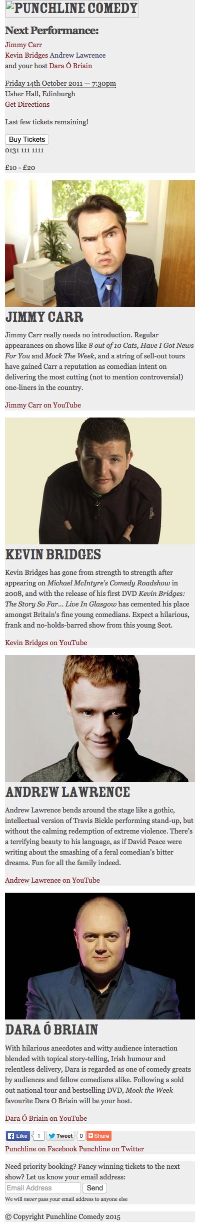
A New Approach (Pt II) 27 Jun 2011 3:00 PM (13 years ago)
Following on from getting the project proposal and contract signed off during Part I, I’ve procured the content and brand assets so now it’s onto planning and design concepts.
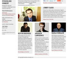
Wait, “procured the content”? That sounded easy! Listen, I know. Planning for, authoring and managing content is hard. We wouldn’t be building entire web apps or writing whole books on it if it was easy. But this project is not an exercise in content strategy; it’s a small, single-page site with a very specific purpose: promoting a bi-annual comedy show. The content consists of:
- Site title and description
- Details of next show (Date/time/venue, booking methods)
- Name, photo, profile (55 words), testimonial quote and link to YouTube videos for each of the 4 acts
- Mailing list signup form
- Links to Facebook and Twitter accounts, and sharing links
Getting started
Gathering snippets of visual inspiration and marking up the content in HTML have been the first two steps. I find marking up content early a great way to familiarise myself with the subject matter, at the same time as actually getting the work done. The difference this time has been my “mobile first” mindset.
Knowing that, at the most basic level, visitors will experience a single-column layout has helped me better focus on content hierarchy: most important at the top, least important at the bottom. No decisions influenced by a more “designed” layout. Traditional wireframes have always felt too influential in this regard. When beginning design concepts, I’ve often felt trapped by the wireframe layout that the client has already signed off, when in many cases all the wireframe needed to do was define simple hierarchy.
Branding work was completed by a separate company prior to kick-off on the website, with a creative direction intended to be reminiscent of 19th century circuses. I’ve received logo variations and a colour palette, but little more. This has been a bit of a blessing, as I can help shape an appropriate web presence for such a young brand without overbearing print guidelines.
Building a prototype
With the content all marked up in gooey, semantically rich HTML, I’ve defined styling for typographic and basic layout elements in global.css. Choosing 14px as my ideal text size, my measurements for type and imagery are based on the 2:3 ‘Musical Fifth’ ratio, and resulting modular scale. While I’ll be further integrating this scale into the design as the site progresses, I didn’t want to get too caught up in it at this stage, as I had quick and dirty layouts to prototype.
There is no existing Punchline website from which to deduce statistics on visitor resolutions or devices, so I’ve chosen to use the display areas of common devices as breakpoints for my media queries. These media queries, declared in a separate screen.css file, only get served up to devices with a minimum display area of 480px (iPhone in landscape mode). Devices with display areas of less than 480px, like “feature phones” or common smartphones in portrait mode, simply get served up global.css. From there it’s been a case of choosing the most suitable grids for the given content and display area.
Breakpoints and layouts
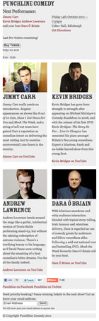
Note: The acts featured in my prototype and design are not the real acts appearing in the show. They’re simply examples I’ve picked for the purpose of this write-up, to protect the integrity of the real show.
Devices with a display area of up to 479px will see a single-column layout; each content block stacked on top of another. Devices with display areas of between 480px and 599px see a two-column layout; each act assuming a column (with two acts stacked on top of the other two) and the show summary, mailing list signup, social links and footer all spanning the width of both columns. Display areas of between 600px and 767px retain the two-column layout, but receive a couple of extra snippets of content that weren’t absolutely necessary at smaller sizes.
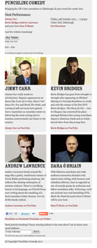
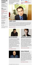
This is where it starts to get a bit more interesting. Display areas of 768px and larger see the header pulled out to the left-hand side, looking more like a sidebar. This element is given position: fixed; to retain it’s position as the document scrolls (it’s kind of important, seeing as it contains the booking information). The mailing list signup and social links are absolutely positioned above the acts to take the place of the header. The headline act assumes the full width of the main content area, with the middle slot and opening act still split into two columns underneath it. The compere appears underneath these two acts, spanning both main columns.
This three-column layout then morphs into a four-column layout for display areas of 1024px or larger, with the compere coming up to join the two other acts in columns underneath the headline act. There is no change for display areas of more than 1200px yet, but I’ll likely progressively increase type sizes to maintain readable measures and eventually set a max-width on the site container.

Because each layout is liquid, all that’s really happening from one breakpoint to another is the addition (or subtraction) of floats, percentage widths and margins. As a result, it’s been super quick to knock up the prototype.
It’s sure as hell not pretty, but take a look. Resize your browser to see the breakpoints in action.
Static visual mockup
I found my base typographic sweet spot in the process of creating the prototype: 14px Georgia with a 1.5em line-height. I also chose Rosewood Std Fill for both h1 and h2 headings, as it made sense historically; Adobe based it on an 1874 design, which fits nicely into our 19th century bracket. But other than basic typography and layouts, I’d done no visual design work at all.
Though the brand assets riffed off old 19th century circus artwork, I was told specifically that the site should have “a hint of circus”. Take from that what you will, but I heard: don’t design a page that’s meant to look as if it’s inside some god-awful circus tent or staring down a lion’s throat, just drop enough hints and people will get it.

I’ve based my static visual mockup on the 1024px-and-up layout, employing an eight-column grid (960px wide). It’s hardly the greatest thing I’ve ever designed, but as a first-pass concept, it feels developed enough to send off for some feedback. I deliberately didn’t work into it too much; it’ll develop in due course.
Why 1024? It’s the easiest reference point for the client. They’re used to browsing websites of around this width on their desktop anyway, and this layout is, I suspect, likely to be the one visitors see most.
I emailed the client a link to the visual mockup set in a browser, accompanied by a video. In both the email and video, I emphasise the fact that this mockup is an “artist’s impression” of what the final site may look like. In the video (a screencast), I simply take a few minutes to explain my reasoning behind the responsive approach and demonstrate the breakpoints in action. This should help the client understand what is otherwise a potentially lofty concept, or at least a relatively new one. Particularly if they’re not a complete nerd.
Potential issues
Getting to this point has been an interesting (and at times downright fun) process, and though it feels like I’m making good progress, I’m left with more questions than answers…
Q: How will I get around loading large inline and background images across potentially weak data connections (not to infer strength of data connection from device resolution, of course)?
A: Only load large background images past certain breakpoints? For inline images, load smaller versions by default and feed large versions to more capable devices with Filament’s script?
Q: Will browsers, like IE6, 7 and 8, that don’t understand media queries simply get served up the basic linear layout?
A: Without JavaScript enabled, yes, though there is the option of using css3-mediaqueries.js to mimic the work media queries are doing. The idea of having an entirely JS-dependant layout does feel wrong to me, but I’m not ruling it out for these cases. Alternatively, simply serve up the 1024+ layout to IE7 and 8, as they would otherwise get were the site not responsive at all. IE6 will likely get a basic, linear layout.
Q: Will lettering.js and fittext.js work well enough, and how will I avoid all this JS load for small screen users who won’t even get to see the results?
A: My plan is to set the complicated type using lettering.js and FitText. I’m a bit apprehensive, as I’ve never properly integrated them into a site build. As for avoiding JS bloat on devices that can’t even make use of it, people much smarter than me allude to the fact that it isn’t easy. So, yay.
A New Approach (Pt I) 16 Jun 2011 3:00 PM (13 years ago)
Two streams of thinking I’ve found fascinating to see develop over the past year or two are “responsive” (or “adaptive”) web design and a “mobile first” approach. Perhaps because I’m never really involved in mobile-specific projects, it feels like responsive web design has generated more discussion and prompted more writing amongst those I know. But however separately these topics have been discussed, it feels as though they share the same ethos: we can create better experiences by embracing the inherent flexibility, power and dynamism of the web.
Hearing Jeremy Keith speak at DIBI last week helped clarify a lot of the thoughts I’ve been having surrounding the topics. To begin creating better experiences, the first step we need to take as designers is to start relinquishing this delusional idea of control we have over our designs as concrete visual pieces. Every time we fire up [insert your graphics editor of choice] and punch in canvas dimensions at the beginning of a project, we’re simply perpetuating this fallacy that the web is some kind of fixed canvas we can design for. It isn’t. It never was.
640×480? 800×600? 1024×768? Basing the width of a website on the resolution of a desktop computer monitor, particularly when we have no idea what the viewport width might be, has never been the right thing to do. But now, finally, the reality of the exploding mobile landscape has brought the inadequacy of our approach into sharp focus.
Design for the web demands an approach further divorced from the visual communication practices of the past. This is not to say we should disregard any of the undeniably crucial work of designers over the course of history; we should must learn from them and carry that awareness with us always. I don’t think it’s possible to reach our full potential as designers of the web without doing so. But the web is a unique medium unto itself, and designing for it should be approached appropriately.
Why all the babbling?
Being a designer for a product, I rarely create websites these days. But I’ve taken on a small project that, in the process of completing, will hopefully help answer some of the questions I have about responsive web design and design for small screen (by doing, as opposed to just reading about).
I’m not claiming that what I’ll be doing is in any way groundbreaking. I personally know people employing the same, or at least similar, techniques in their work right now, and have been for some time. But I know more still who aren’t, so I’m keen to open up my own experience in the hope it might act as some sort of reference. Through comments, it’d be great to build some discussion around the approaches I’m taking as I work through the project.
The project
The website is for a new company hosting bi-annual comedy shows in Edinburgh. It’s purpose is simple: to be the primary source of information for upcoming shows, providing visitors with methods of booking tickets, and encouraging them to sign up to the mailing list.
With the project proposal and contract signed, the first step has been to procure the content.
Part II next week. Part II is here.