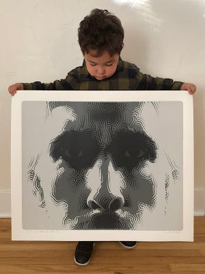
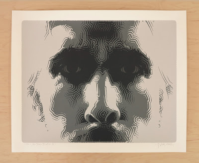
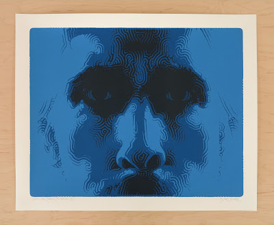
New EL MAC prints: 'Gravity and Grace' 8 Dec 2024 12:38 PM (4 months ago)


Print details:
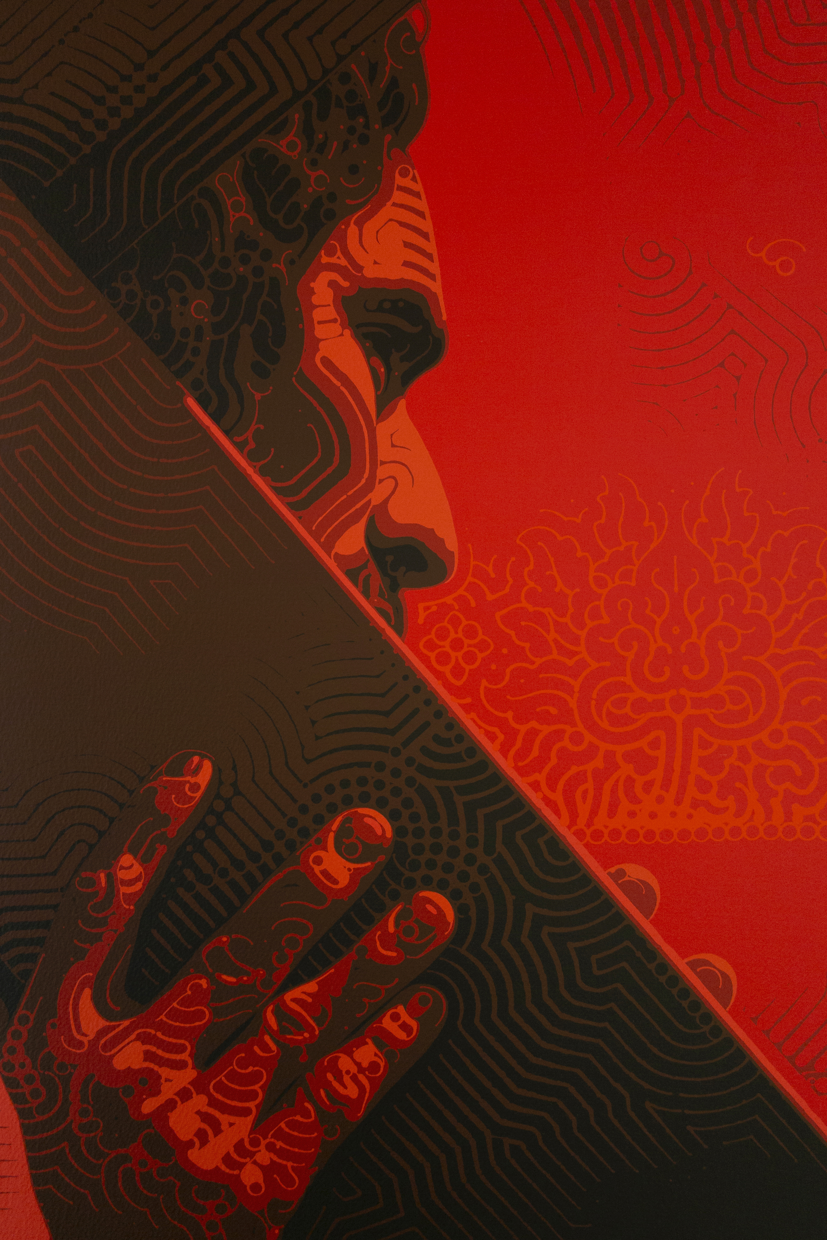
"Gravity and Grace"
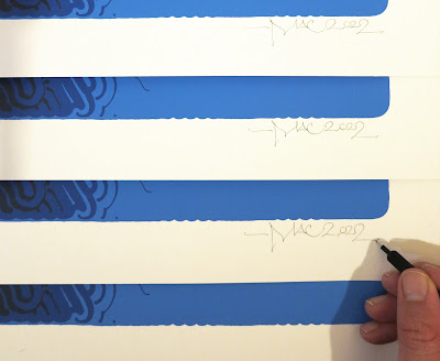
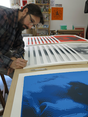
Signed, titled, and numbered by the artist.
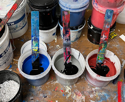
Hand-pulled screenprints made with Tony Clough at Serio Press in
Pasadena, California.
Printed on acid-free, 100% cotton, 320 gsm, USA-made Coventry paper.
33in x 34.5in paper size
(28.75in x 30in printed area)
There are four main color editions of this print (plus three extra super limited variants):
edition of 57
gray
$575
"Gravity and Grace II":
edition of 25
blue
$650
"Gravity and Grace III":
edition of 19
red
$725
edition of 13
teal
$775
Artist's statement about the work:
There's some overlap between Weil's outlook and my mother's, with a similar balance of realism, mysticism and devotion to God and beauty. Weil and my mother both strongly believed that beauty can be an expression of goodness: 'The subject of art is sensible and contingent beauty discerned through the network of chance and evil. The beautiful in nature is a union of the sensible impression and of the sense of necessity. Things must be like that (in the first place), and, precisely, they are like that. Beauty captivates the flesh in order to obtain permission to pass right to the soul.... In everything which gives us the pure authentic feeling of beauty there really is the presence of God. There is as it were an incarnation of God in the world and it is indicated by beauty. The beautiful is the experimental proof that the incarnation is possible. Hence all art of the highest order is religious in essence.'
In these times of distress, war, and confusion, then surely beauty, love, and grace are needed more than ever. In my own small way, through art and with seriousness and sincerity, I've tried to do my part."


New EL MAC mural with Augustine Kofie + Aise Born in Los Angeles: "Monument of Love: Mother and Child" 21 Nov 2024 12:42 PM (5 months ago)


Many thanks to Kofie and Aise for their beautiful work + friendship. Thanks to the entire Destination Crenshaw team for making this all possible, with special gratitude to Joy Simmons, Ron Finley, and Marqueece Harris-Dawson. Thanks to mi amor Kimberly for the patience + project management. Thanks to Tahoe and the exceptional models for this mural, Lliam + Shontel. Thanks to the fine folks at the Good Shepherd Manor, and to everyone who supported or showed love in any way. Thanks to David Joseph Pérez, Eric Heights, and Zane Meyer of Chop 'Em Down for the documentation.
New EL MAC prints: 'Mystical Rose' 15 Aug 2023 11:14 AM (last year)


Print details:
"Mystical Rose"
Signed, titled, and numbered by the artist.
Hand-pulled screenprints made with Andres Zavala in Boyle Heights, California. Serigraphs printed using seven colors, with a few thin layers of clear ink over some of the linework.
21in x 27in paper size
(18.5in x 23.5in printed area)
There are five completely different color editions of this print:
edition of 40
reds and blues
$475
"Mystical Rose II":
edition of 34
oranges and greens
$525
"Mystical Rose III":
edition of 25
grays on cream paper
$575
edition of 25
blues on light blue paper
$575
edition of 17
gold (oranges and yellows)
$650
Artist's statement about the work:
The rose, symbolic of love and beauty, as well as the transience of life and the material world, has long been considered the 'queen of flowers'. 'Mystical Rose' is also a poetic title for the Blessed Mother. Painting this image earlier this year was an expression of love and gratitude, and a way of processing the passing of my own beloved mother, who helped shape my approach to life, love and beauty.
New EL MAC prints: 'El Obrero' 24 Feb 2023 1:41 PM (2 years ago)


Print details:
"El Obrero"
Signed, titled, and numbered by the artist.
Hand-pulled screenprints made with Tony Clough at Serio Press in
Pasadena, California. Serigraphs printed using 11 colors.
Printed on acid-free, 100% cotton, 330 gsm, Italian-made Revere paper.
33in x 26in paper size
(30in x 22.5in printed area)
There are three different color editions of this print:
"El Obrero":
edition of 62
warm colors over black base
$500
"El Obrero II":
edition of 26
warm colors over dark blue base
$600
"El Obrero III":
edition of 6
warm colors over light blue base
$750
These prints are adapted from an acrylic painting that I worked on over the last two years. The image was inspired by a protestor I saw at an immigrant and worker rights march many years ago. It follows a long tradition of Via Crucis/Path of Sorrows imagery in devotional western art, but I also saw it as a meditation on labor and mutuality.
I was raised with a sort of philosophy of work, where art making and creative labor can be a kind of prayer, where there can be beauty in striving to become better at whatever we do and in the giving of oneself in service to others. Love, beauty, and work—all can be connected.
We are, nearly all of us, workers in some form or another, but that commonality gets overshadowed so often by cultural, racial, or various identity issues. Despite all our increasing digital connectedness we seem to be further separated and isolated in many ways. When we look at the world today and see that despite all the advancements much of our global family still suffers to some degree or another from poverty, exploitation, marginalization. Power and wealth continue to concentrate among a tiny few, while working people as a group steadily fall further into precarity. This is a trend that does not help build a world where it is easier for people to live or to love each other.
Just before Martin Luther King Jr. was assassinated he was helping striking sanitation workers, and in his last speeches he spoke of the dignity of labor and the importance of solidarity with other working people, of a kind of "dangerous unselfishness" described in the parable of the Good Samaritan. And what is dangerous unselfishness if not self-sacrificing love?
"To work to increase our love for God and for our fellow man (and the two must go hand in hand), this is a lifetime job. We are never going to be finished. Love and ever more love is the only solution to every problem that comes up. If we love each other enough, we will bear each other's faults and burdens. If we love enough, we are going to light that fire in the hearts of others.”
-Dorothy Day
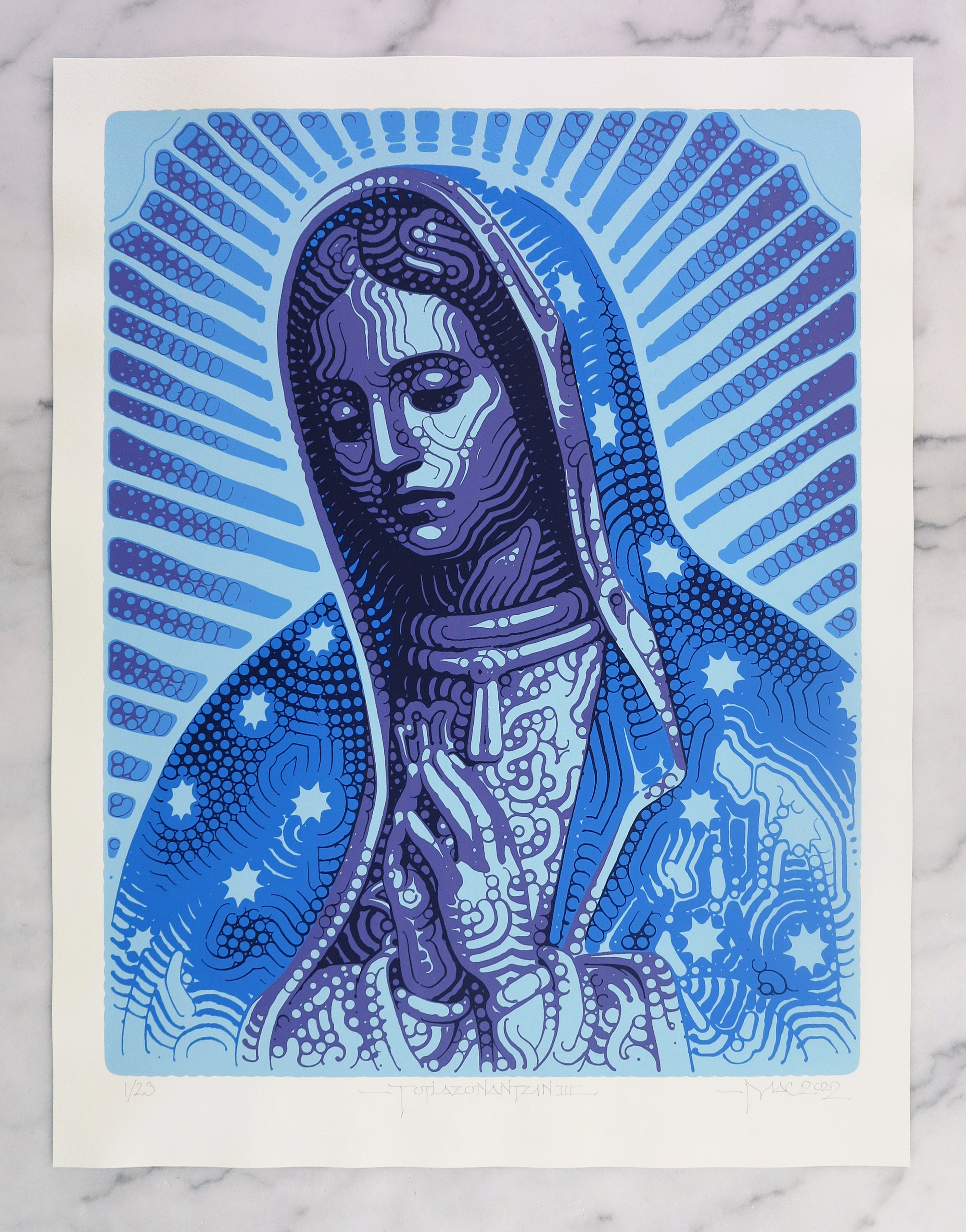
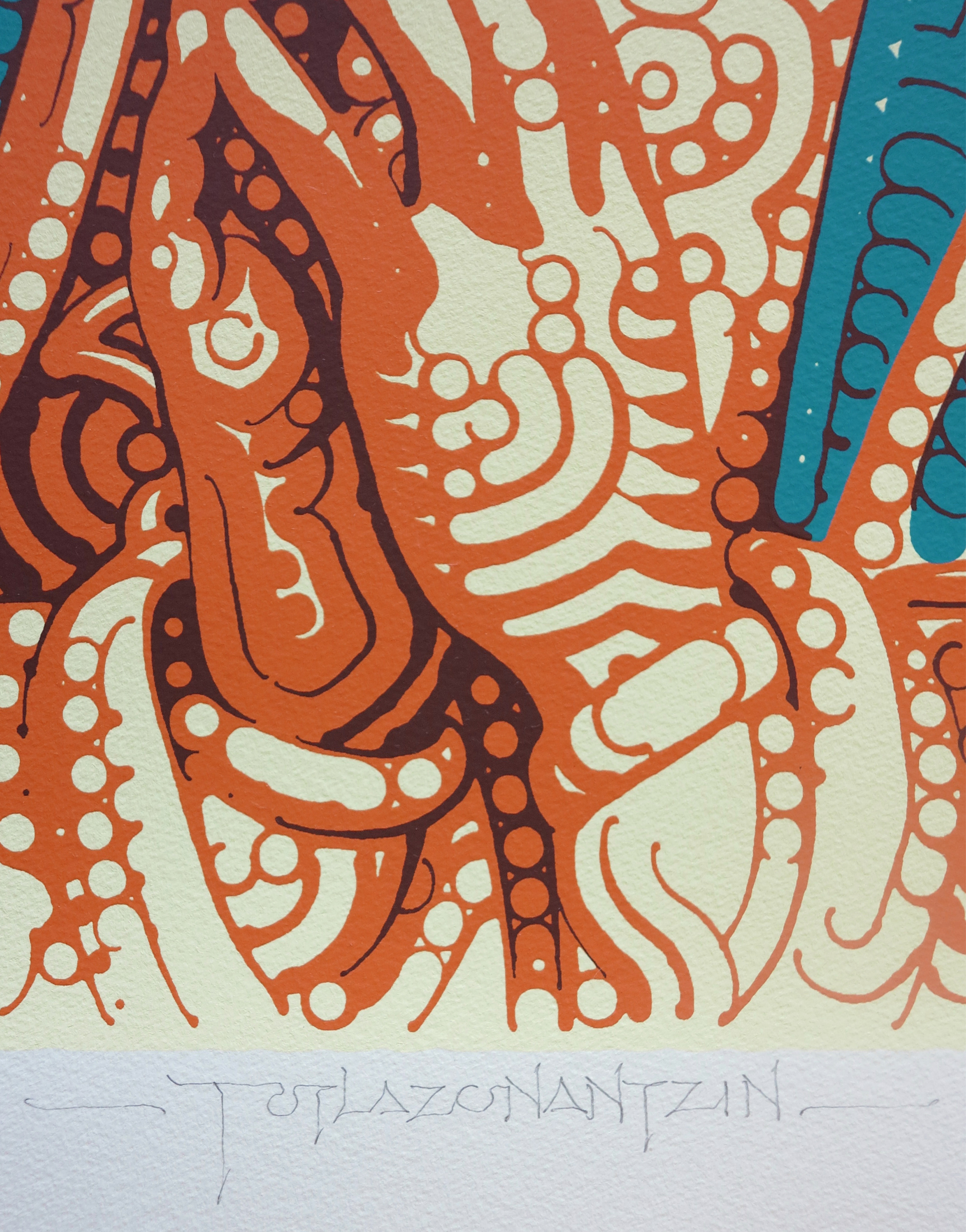
New EL MAC prints: 'Totlazonantzin' 20 Oct 2022 6:00 PM (2 years ago)


Print details:
"Totlazonantzin"
Signed, titled, and numbered by the artist.
Hand-pulled screenprints made with Andres Zavala in Boyle Heights, California. Serigraphs printed using five colors, with a few thin layers of clear ink over some of the linework.
Editions I-V printed on soft, acid-free, 100% cotton, 300 gsm, German-made Hahnemühle paper.
21in x 27in paper size
(18.5in x 23.5in printed area)
There are seven different color editions of this print:
"Totlazonantzin":
edition of 40
orange and turquoise
$450
"Totlazonantzin II":
edition of 34
grayscale
$500
"Totlazonantzin III":
edition of 23
purple and blue
$550
"Totlazonantzin IV":
edition of 19
grayscale (inverted)
$600
"Totlazonantzin V":
edition of 12
dark blue and peach (inverted)
$750
edition of 12
orange, light turquoise and indigo
"Totlazonantzin VII":
edition of 12
all blue tones
$750
Totlazonantzin translates to "our beloved mother" in Nahuatl, and can be seen in the Nican Mopohua ("Here It Is Told"), the first recorded account of the appearance of Our Lady of Guadalupe, written in the mid-1500s and first published in 1649.
In my own experience growing up in the southwestern US, the image of Our Lady of Guadalupe was very familiar and seemingly ever-present. She could be seen at home and in the homes of friends, inside churches and on the outside of liquor stores, sometimes accompanied by tough-looking Old English letters or flowery script on clothing, blankets, lowriders, etc. One of my favorite t-shirts I wore in the late '90s had an image of Our Lady carrying an injured or dying cholo underneath the phrase "mi vida está en tus manos(my life is in your hands)". Almost a century earlier she'd adorned the banners of Zapata's revolutionary peasant armies, and a century before that was on Hidalgo's banners fighting for independence from Spain. In the words of Octavio Paz, she is "the consolation of the poor, the shield of the weak, the help of the oppressed". The icon of La Guadalupana can represent, among other things, the idea of a celestial and loving maternal figure, a comforting presence both human and cosmic, natural and supernatural. As a feminine counterbalance to the patriarchal emphasis of much of Western religion, she is our heavenly Mother, la Madre del Cielo.
I think of the depth of the love between myself and my own mom, and the love between my son and his mama, and I see the imagery of Nuestra Madre/Our Mother as carrying some sense of that kind of love. As an artist I do believe that 'beauty will save the world', and there's great beauty and poetry in this enduring, popular celebration of divine motherhood. I painted this humble interpretation of the iconic image with reverence and sincerity, and a desire for it to transmit some of the love that went into it and the motherly love it symbolizes.
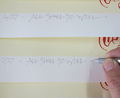
New EL MAC prints: 'All Shall Be Well' 21 Feb 2022 9:15 PM (3 years ago)


Signed, titled, and numbered by the artist.
Hand-pulled screenprints made with Andres Zavala in Boyle Heights, California. Serigraphs printed using four colors, with four thin layers of clear ink over the darkest linework.
Printed on acid-free, 100% cotton, 320 gsm, USA-made Coventry Rag paper.
27in x 22in paper size
(24in x 19in printed area)
There are four different color editions of this print:
"All Shall Be Well":
"All Shall Be Well II":
"The title of these prints, All Shall Be Well, comes from English mystic and theologian Julian of Norwich, who at the age of thirty in May of 1373 had a series of visions while seriously ill and seemingly close to death that she took to be revelations from God. After recovering she wrote about the experience, while devoting the rest of her life to spiritual contemplation as an anchoress willingly confined to a small room adjoined to a church, and providing spiritual counsel to the public from that room through a small window. Her text, Revelations of Divine Love, is the earliest known writing in English by a woman.
This book includes a number of celestial reassurances that 'all shall be well' through an all-encompassing and everlasting universal love. Some of these parts could sound like cheerful platitudes if taken out of context, but it's important to consider that Julian lived through a violent time of wars and suffering, when over a third of Europe's population died from the plague. So things were far from being well back then, but this remarkable theologian and mystic sought to share her profound conviction that there is a force of love surrounding us greater than any suffering and despair, that love is the meaning of life, and through this love, all shall be well.
I hope that in some small way my art, and recollection of this message, might also carry a little bit of that love.
'And thus our good Lord answered all the questions and doubts I could put forward, saying most comfortingly, ‘I may make all things well, I can make all things well and I will make all things well and I shall make all things well; and you shall see for yourself that all manner of things shall be well.’
-Julian of Norwich(1343-1416)
Revelations of Divine Love, chapter 31(long text)"
New EL MAC prints: 'Rebirth' 21 Apr 2021 12:11 PM (4 years ago)


Signed, titled, and numbered by the artist.
Hand-pulled screenprints made with master printer Tony Clough at Serio Press in Pasadena, California. Serigraphs printed using two to three colors with five thin layers of clear ink over the linework.
Printed on acid-free, 100% cotton, 330 gsm, Italian-made Revere paper.
39in x 32in paper size (plus natural deckled edge along bottom)
(36in x 28.5in printed area)
There are four different color editions of this print:
"Rebirth":
edition of 43
"Rebirth II":
edition of 16
This image is adapted from a large acrylic brushwork on wood panel painting that I worked on at various times from 2013 until 2019, progressing slowly line by line, pattern by pattern.
New EL MAC mural with AISE BORN in Ohio: "AXIS MUNDI" 15 Apr 2021 7:26 AM (4 years ago)


We began painting in late September and worked day and night on the mural for about two months. I was excited and proud to involve and collaborate with my younger crewmate AISE on this—I think this is some of the best public work he's had the opportunity to create so far. During a year characterized by division and fear, of COVID-19 social isolation and racial injustice protests, this mural project was a chance for us to create something positive and beautiful, something that hopefully conveys friendship, mutuality, and youthful innocence. It really felt like we were doing something special and important, channeling a little bit of celestial divinity onto this old brick wall in Ohio. Of course it's impossible to make public art that everyone will connect with or appreciate, but I know we put a massive amount of love and soul into this work and it's bound to retain and transmit at least some of that. I hope that this mural of these two children at play with the cosmos might offer some lasting light, hope, and inspiration.
Many thanks to everyone who helped make this project possible—my wife and son, AISE and his family, Howard Parr and the team at the Akron Civic Theatre, special thanks to Rick and Alita Rogers, extra thanks to Liz Gage, Courtney Cable, Curated Storefront, my brother HOXXOH, Louis Jensen, Matt Jennings, The Akron Civic Theatre Board of Trustees and the 'Staging The Future' capital campaign committee, the Akron Community Foundation, the Knight Foundation, the GAR Foundation, Laila, Monte Vales and Andrea Smith, as well as all the other families who allowed us to photograph them, LAND Studio, Janus Small, Mike Screwes, The Urban League, John Fiume, January Paint & Wallpaper, Mac Love, Beers, Mustard Seed Market, and all the other people of Akron and Ohio who showed support or kindness.
New EL MAC prints: 'Sun and Clouds' 29 Sep 2020 10:34 AM (4 years ago)


Relief print, hand-pulled, edition of 60
Signed, titled and numbered by the artist.
Four-pull relief print from photopolymer and reduction linocut with split fountain blend roll, on archival French-made Johannot paper, with natural deckled edge along bottom.
Printed by master printer Brent Bond at Santo Press in Phoenix, Arizona, using a 1961 Vandercook printing press.
14 3/4" x 19" paper size
(11 5/8" x 15 1/2" printed area)
"Sun and Clouds II" (blue)
Relief print, hand-pulled, edition of 20
Signed, titled and numbered by the artist.
Two-pull relief print from photopolymer and reduction linocut, on archival German-made Hahnemühle Copperplate paper.
Printed by master printer Brent Bond at Santo Press in Phoenix, Arizona, using a 1961 Vandercook printing press.
14 3/4" x 19" paper size
(11 5/8" x 15 1/2" printed area)
This image hopefully carries along, in some small way, a little bit of that light.
“Clearly this music doesn’t sound too much like what’s going on today—war, riots, the stock market getting busted up. And the reason it doesn’t, I realized, is that I’m optimistic. I believe in hope and peace and love. It’s not that I’m blind to what’s going on, but I feel this music is a forward look into what could be a bright future. The philosophy represented in this number, and to a large extent in the album as a whole, is child-like. But not childish. By that I mean there are certain elements of childhood we lose and wish we could have back—purity, spontaneity. When they do return to us, we're at our best. So what I'm telling the world is: 'Speak like a child. Think and feel in terms of hope and the possibilities of making ourselves less impure.' “
-Herbie Hancock, 1968
(Liner notes for “Speak Like a Child”)
New mural in Tucson: 'Desert Soul' 2 Aug 2020 7:55 PM (4 years ago)


Tucson has been a special place for me ever since my first visit as a little kid when I caught a sunrise with my parents at Mission San Xavier Del Bac–the same place where I would eventually marry my wife and baptize our son decades later.
In the late 90s and early 00s I painted some murals with NG crew in downtown Tucson including behind the old Chicago Music Store. I remember there was a mural downtown from the early 90s by visiting NYC graffiti OG's Futura, Lady Pink, Lee, Stash, and Chico collaborating with locals Fyce, Such and Tackz, which symbolized to me back then just how hip this sleepy, dusty desert city was.
I associate Tucson with a certain warm spirit of love and creativity, a tranquil Sonoran vitality, and I hope this mural can capture or transmit some of that desert soul.
Thanks to Ari + the Bracamonte family, and the Cobra Tucson crew for helping make this mural possible, thanks to Kim + Máximo for putting up with me, and thanks to the good people of Tucson.
(Photos 2, 3, 4: Fernando kAZual)
New EL MAC murals in Miami: 'A Love Supreme (Wynwood Saints)' 18 May 2020 1:35 PM (4 years ago)


Returning to Miami for this project was a pretty big deal after having last painted murals in Wynwood with Retna during Art Basel in 2007, 2008, and 2009 as part of Primary Flight. I was very proud of those murals but, after seeing how saturated the area was becoming with what was starting to be labeled "street art", it seemed time for a break. Ten years passed and then this opportunity came along to paint some of the best and most visible walls of my career in this place that had, for better or worse, become a world famous epicenter for public art. I was a little hesitant to take on such a massive task around the same time I was becoming a father, but I couldn't say no to such an epic platform. Although there were already a number of art spaces in the Wynwood area when I first painted there in 2007, it was still mostly a blue collar, working class area so I was blown away to see how much had changed. I take my responsibility to the communities I make art for seriously and approach every project with conscientiousness, especially so with this project considering the scale, location and context. I wanted to paint something representative of this place, its history, and its people, while conveying strength, dignity, balance, solidarity, and love. To begin, through the assistance of some local friends and contacts including YoungArts, I met and photographed a number of awesome local young folks for references. I eventually ended up painting three: the figure to the left was modeled by a young woman named Mandolina who helps run a nearby community garden, the figure in the middle was modeled by a young ballet dancer named Jamaii, while the figure on the right was modeled by a local Seminole boy named Kyle. While the paintings do carry the likenesses of those three, they've also been generalized in such a way as to resemble many other young people as well. These figures might be seen as either imploring or offering, funereal or uplifting, mournful or hopeful. If nothing else, they portray monumental, everyday saints—prayerful, resilient, and representative of upliftment, beauty, and loving kindness.
I faced a great deal of stress and difficulties working on this project, including delays that sometimes lasted for weeks due to lift equipment problems, unexpected expenses, persistent rain, heat, and wind, and worst of all long periods of separation from my infant son during his first year of life. There were many challenges, but for the most part I was able to maintain my patience, focus, and joy in my work. I’m thankful for the opportunity, and extremely proud of this project and the tremendous amount of energy, persistence, and sacrifice that went into it.
I strongly feel that the creation of art can be, at its best, a spiritual vocation, a means of responding to the world in service of truth, beauty, and goodness. The artist can be, in the words of John Coltrane, a force which is truly for good. Another great jazz musician, Mary Lou Williams, famously said that she was praying with her fingers when she played, and I approach the act of painting in a similar way—I hope the prayerfulness that went into the creation of these murals shows through in the results.
Many thanks to the teams at Related Group + Primary Projects for helping make this possible. Thanks to mis amores Kim + Máximo, and my right hand man Eric Heights, for hanging in there... Further thanks + shouts to el mero mero JP Pérez, Patti, J. Yormak, East End Capital, Cristina, Books, Sheila, Tamz, Hoxxoh, Veny Zorrilla, Jessica Goldman, Troy Kelley + Wynwood Walls, Mandolina, Jamaii, Kyle, Evan + Chadoe Grant, Breeze, Louis Coupal, Dejha Carrington + YoungArts, Reggie O'Neal, Axel Void, Alexis Diaz, Reinier Gamboa + Linda, Alan Ket + the Museum of Graffiti, Carlos Mare, Rage Johnson, Atomik, Komik, Typoe, MSG, TCP, InkHeads, Dos Alas, Futura, Muta, Odobo, Michael Vasquez, Jason Joshua + Mango Hill Records, the buena gente at La Fama Cafeteria, Los Bobos, and Zak the Baker, Squirrely Fleetwood, Joseph Treaster, Rose Cromwell, and any others I'm forgetting here.. Much love to all the artists and supporters of art in the great city of Miami. Respectful remembrance of Ray Brown, RIP
"What is a saint? A saint is someone who has achieved a remote human possibility. It is impossible to say what that possibility is. I think it has something to do with the energy of love. Contact with this energy results in the exercise of a kind of balance in the chaos of existence. A saint does not dissolve the chaos; if he did the world would have changed long ago. I do not think that a saint dissolves the chaos even for himself, for there is something arrogant and warlike in the notion of a man setting the universe in order. It is a kind of balance that is his glory... Something in him so loves the world that he gives himself to the laws of gravity and chance. Far from flying with the angels, he traces with the fidelity of a seismograph needle the state of the solid bloody landscape."
-Leonard Cohen, Beautiful Losers (1965)
New Murals in Los Angeles: 'Shared Roots (Unity Threatens Inequity)' 24 Jan 2019 3:20 PM (6 years ago)


The initial inspiration for the agricultural theme of these murals came from a neighboring community farm run by the All Peoples Community Center, Roots For Peace and the American Friends Service Committee.
Farming or gardening imagery can carry an extra significance in this context considering how much of South Central Los Angeles (like many low-income urban areas) lacks easy access to healthy fresh food.
The figure on the left was modeled by Rigoberto Jimenez Oropeza, and the figure on the right was modeled by Ron Finley. Both are Los Angeles residents and both grow food from the soil.
Rigo began his workers' rights activism long ago with the United Farm Workers after being hospitalized for exposure to pesticides while working in California orange fields. Now in his eighties, he is still stubbornly working the land when not helping out with his son's art gallery.
Ron has become a prominent and inspiring community leader and advocate for social justice, food justice, and urban farming. He has also been a friend ever since Retna and I met him and his two sons while painting a mural in his South Central neighborhood over a decade ago. I'm grateful for my friendship with Ron and his sons, Kohshin and Delfin, who are both extremely talented young artists, and it's been an inspiration to witness their development over the years.
The choice of subjects came about partly in response to our current national (if not global) social and political climate, as well as a more local history of poverty and black-brown conflict in South Central Los Angeles. In these confusing times of demagoguery, racist scapegoating and social division, as wealth has been increasingly redistributed upward while the working poor are further disenfranchised, and organized labor has been largely weakened after decades of assault, I feel even more urgency to create conscientious and relatable public art that elevates common working people and promotes ideals of compassion, unity, equity, and interracial solidarity.
I would like to think of these murals as contributing to a proud tradition of humanism and social realist art that promotes the importance and dignity of all ordinary working people.
This project ended up taking a great deal more time than anticipated, with many late nights working into morning, but I enjoyed the process and am proud of the results. Though at a glance these murals may appear simple and straightforward, a tremendous amount of thought and care went into them. As usual for me, painting these walls was a meditative and devotional labor of love.
Many thanks to Cheyanne, Liz, and Art Share L.A. + Chris, Frannie, and Meta Housing for making these murals possible, thanks to Ron and Rigo for modeling, thanks to Eric Heights for all his help and late night grilling skills, Josh Rhodes for the gifts, and thanks to everyone else who supported in one way or another.
(1st photo courtesy of Tim Jentsch, 3rd + 4th photos by Eric Heights)
New mural on the US/México border: 'Abuelita of Presidio (Desert Rose)' 27 Jul 2018 7:51 PM (6 years ago)


Along with two other excellent articles about this project, from John MacCormack for the San Antonio Express-News + Bayla Metzger for Marfa Public Radio, this article written by Sasha von Oldershausen for the Texas Observer describes the project much better than I could:
In Presidio, a New Public Art Project Crosses Borders
The new mural is a small binational gesture reminding those who reside in the margins that they are not forgotten.
On the northern outskirts of Presidio, a series of modest dirt hills offers a view of the small border town delineated by the meandering Rio Grande. Just beyond, the Mexican sister city of Ojinaga — many times bigger than the Texas town — sprawls along the foothills of the Sierrita de Santa Cruz.
On one side of these crumbling hills is a gridwork of housing for Border Patrol officers, surrounded by chain-link fencing and topped with barbed wire. On the other side of the hills is the city’s water tower, a lone white tank that juts above an otherwise unassuming and dusty landscape. It is the only apparent landmark in a town whose inhabitants have figured out ways to fit their lives discreetly into the rugged desert landscape.
A month ago, a face began to appear on the water tank. She emerged over the course of two weeks: a Latina woman, clutching the stem of a red rose in her thick hands. Her brow and cheeks are lined with age. Her gaze, deep but benevolent, looks out beyond the Rio Grande into Mexico.
The sudden appearance of this face felt out of sync with the pace of the town, where not much changes fast. The change was monumental enough to warrant a field trip by Presidio’s elementary school. Each day for a week, teachers paraded their students up the hill to see the face and asked them, “¿Qué piensa? What do you think?”
The mural is a gift from Mexico to the site of its smallest consulate. Amid the hyper-politicized rhetoric that surrounds the border, it was a small binational gesture reminding those who reside in the margins that they are not forgotten.
The Mexican government commissioned Los Angeles muralist Miles Mac, known as “El Mac,” whose work has appeared in the border cities of Juárez and El Paso, as well as myriad other places across the globe, from New York City to Agdz, Morocco.
El Mac had never worked on a federally sponsored project, and if he had concerns about it feeling propagandist, those fears were immediately assuaged. “It was the kind of project I would do for myself anyway,” said El Mac, who often paints with an implicit social message in mind. “No part of it ever felt uncomfortable to me and I think it was clear that everyone behind it had good intentions. This is a general gesture of goodwill.”
He added, “I think they were making a point that even the smallest and most remote town is still important and still considered, still relevant.”
El Mac’s large-scale murals — composed of circles and lines that register as realist portraits from a distance — often feature everyday people. In El Paso and Juárez, he painted the faces of those who had lost family members to violence. “I paint regular people, normal people, and that’s something that I’ve been doing for a long time,” El Mac said.“The work isn’t super explicit. I’m not painting works with the intention of hitting people over the head with some ideology.”
Some residents recognized the face on the water tower as that of Linda Lujan, a 62-year-old Presidio resident who owns and operates a small secondhand shop just a stone’s throw from the International Port of Entry. Originally from Mexico, she emigrated to the United States more than 30 years ago to work and put her children through college. In many ways, her face was meant to be more broadly representative of the average person who resides in this border region. “It’s definitely based on her,” El Mac said, “but it’s a composite.”
Others have come up with their own interpretations of the image. “I see my wife’s mother, I see one of my aunts, I see one of my old teachers,” said city administrator Joe Portillo. “More than anything, I see a mother. They are the glue and they are the love.”
“It’s a beauty kind of like the desert itself,” said the town’s mayor, John Ferguson. “This shows somebody who probably worked hard her whole life, had kids, raised a family.”
El Mac spent two weeks in Presidio, interviewing and photographing possible subjects. He might have chosen a more politicized subject, and for a moment he considered painting two female relatives of Esequiel Hernández Jr., the 18-year-old who was mistakenly gunned down in 1997 by Marines stationed near the border as part of a drug reconnaissance mission. Ultimately, he chose Lujan, whose warmth offered relief from the caustic desert. “She had these warm cheeks,” he said. “She looked like she’s used to smiling.”
El Mac would experience the kind of kindness Lujan seemed to represent throughout his stay in Presidio. On days he spent painting for 10 or 12 hours at a time, perched some 100 feet off the ground in a mechanical lift that quaked against the howling spring winds, staff from Don Jose Panaderia, the local bakery, delivered pumpkin empanadas in a basket rigged with a pulley system. “That mural was fueled by those pumpkin empanadas,” he said.
The face on the water tank is visible from both sides of the border, a reminder of what many in the town already know to be self-evident: that Presidio is inextricably tied to its Mexican neighbor, and that its well-being is rooted in their mutual goodwill."
Many thanks to the Mexican Secretariat of Foreign Affairs (SRE) and Mónica Cortina Mariscal for making this project happen, and many additional thanks to Guido Mascherpa, Eduardo Romero, and Eric Heights for all the assistance and good times. They helped rig a protective structure for the lift basket out of cardboard, duct tape, pvc pipes and canvas--a small Mexi/Italo/Salvi/US engineering project that was crucial in helping to block the constant strong winds there and ultimately made the painting possible (it also included a pulley system that allowed burritos and empanadas to be hoisted up to me during my long, sometimes 14-hour painting shifts). Extra thanks and shout-outs to the Mexican consulate in Presidio, Mariana Da Silva, Austin Saya & their team, Don Jose Panaderia, the Bean Cafe, Oasis Restaurant, Three Palms Inn, Enrique Madrid & the family of Esequiel Hernandez Jr., Brad Newton, Terry Bishop, John Ferguson, Trisha Runyan, Linda Luján, and to everyone else in Presidio who showed support or kindness. Presidio/Ojinaga, in all its remoteness and smallness, felt important, familiar and alive--I'm grateful for my experience there, and the opportunity to share my art with its people.
New mural in Belgium: 'Mural for My Father' 17 Jul 2018 4:51 PM (6 years ago)


New mural for the San Jose Museum of Art: 'Sophie Holding the World Together' 22 Mar 2018 5:30 PM (7 years ago)


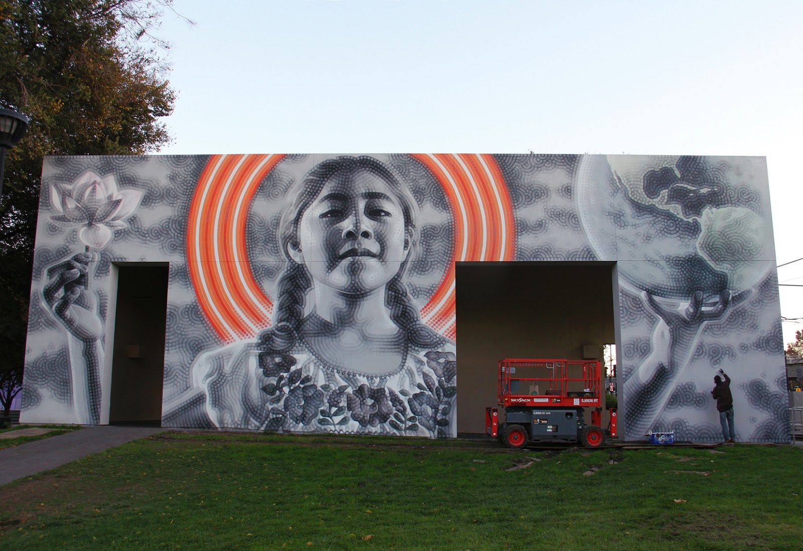
Mural commissioned by the San Jose Museum of Art, in collaboration with The Propeller Group.
In these times when fear, inequity and divisiveness are so prevalent, this mural is intended to convey hope and empathy. The figure is based on an inspiring young activist named Sophie Cruz, who represents mixed-status families and advocates for immigration reform in the US.
When I met Sophie to shoot reference photos of her I asked if there was anything she wanted to hold for the photographs, and she came back holding a globe. This seemed perfect, while the lotus was added to symbolize the beauty that can grow from humble origins. .
I’d like to thank everyone who helped make this mural happen, and everyone who came by offering positive feedback. The response from the people in San Jose was some of the most encouraging and supportive I’ve received anywhere, I’m very grateful.
Many thanks to Tuan Andrew Nguyen, Matt Lucero, The Propeller Group, Lauren Dickens and the San José Museum of Art, Empire Seven Studios, Will Moran, the Children’s Discovery Museum, The Knight Foundation, University Art, Tad Freese and Brook Hartzell, Beverly and Peter Lipman, Lubliner, Dipti and Rakesh Mathur, Ian Reinhard, and SGSR. Additional thanks to Sophie + su familia, Eric Heights, Yosi Sergant, Define American, Yosimar Reyes, Bích Cao, and everyone else who helped or showed love.
“No Te Rindas
Esta es la Hora y el Mejor Momento/
Don't Give Up
This is the Hour and the Best Moment/
Đừng Bỏ Cuộc
Bây giờ là phút giây và khoảnh khắc tuyệt vời nhất”
(-M. Benedetti)
New EL MAC prints: "Purgatory" 22 Jan 2018 4:42 PM (7 years ago)


Print details:
Purgatory
Signed, titled, and numbered by the artist.
Hand-pulled serigraph by master printer Tony Clough at Serio Press in Pasadena, California. Printed in five colors/layers.
Printed on acid-free, 100% cotton, 290 gsm, Coventry Rag paper.
18.25in x 20.25in paper size
(16.25in x 17in printed area)
This print has the same exact dimensions as the 'Los Campesinos' prints from 2015.
There are two slightly different color editions of this print:
Purgatory:
edition of 47, darkest brushwork layer printed in black
Purgatory II:
edition of 25, darkest brushwork layer printed in dark teal blue
Artist's statement about the work:
'Across ancient cultures from around the world there are concepts of a period of postmortem atonement, with associated traditions of prayers and offerings made for the souls of the deceased so as to relieve their expiatory suffering. This artwork is also, in its own way, a similar kind of prayer or offering.
In these times of fear, confusion, nativism, and worsening inequity as more and more wealth is distributed from the many to a few, I painted this piece partly as a meditative gesture of support for the marginalized and scapegoated amongst us who live and work in a metaphorical state of purgatory.
"As brothers in the fight for equality... Our separate struggles are really one -- a struggle for freedom, for dignity and for humanity. You and your valiant fellow workers have demonstrated your commitment to righting grievous wrongs forced upon exploited people. We are together with you in spirit and in determination that our dreams for a better tomorrow will be realized." - Martin Luther King, Jr., in a 1966 telegram sent to UFW leader Cesar Chavez
%3Cbr%20/%3E%0AThis%20print%20has%20the%20same%20exact%20dimensions%20as%20the%20'%3Ca%20href%3D%22http://mac-arte.blogspot.com/2015/08/new-print-los-campesinos.html%22%20target%3D%22_blank%22%3ELos%20Campesinos%3C/a%3E'%20prints%20from%202015.%3Cbr%20/%3E%0A%3Cbr%20/%3E%0AThere%20are%20two%20slightly%20different%20color%20editions%20of%20this%20print:%3Cbr%20/%3E%0A%3Cbr%20/%3E%0APurgatory:%3Cbr%20/%3E%0Aedition%20of%2047,%20darkest%20brushwork%20layer%20printed%20in%20black%3Cbr%20/%3E%0A%3Cbr%20/%3E%0APurgatory%20II:%3Cbr%20/%3E%0Aedition%20of%2025,%20darkest%20brushwork%20layer%20printed%20in%20dark%20teal%20blue%20%3Cbr%20/%3E%0A%3Cbr%20/%3E%0AArtist's%20statement%20about%20the%20work:%3Cbr%20/%3E%0A'Across%20ancient%20cultures%20from%20around%20the%20world%20there%20are%20concepts%20%0Aof%20a%20period%20of%20postmortem%20atonement,%20with%20associated%20traditions%20of%20prayers%20and%20offerings%20made%20for%20the%20souls%20of%20the%20deceased%20so%20as%20to%20%0Arelieve%20their%20expiatory%20suffering.%20This%20artwork%20is%20also,%20in%20its%20own%20way,%20a%20similar%20kind%20of%20prayer%20or%20offering.%3Cbr%20/%3E%0AIn%20these%20times%20of%20fear,%20confusion,%20nativism,%20and%20worsening%20inequity%20as%20more%20and%20more%20wealth%20is%20distributed%20from%20the%20many%20to%20a%20few,%20I%20painted%20this%20piece%20partly%20as%20a%20meditative%20gesture%20of%20support%20for%20the%20marginalized%20and%20scapegoated%20amongst%20us%20who%20live%20and%20work%20in%20a%20metaphorical%20state%20of%20purgatory.%3Cbr%20/%3E%0A%22As%20brothers%20in%20the%20fight%20for%20equality...%20Our%20separate%20struggles%20are%20really%20one%20--%20a%20struggle%20for%20freedom,%20for%20dignity%20and%20for%20humanity.%20You%20and%20your%20valiant%20fellow%20workers%20have%20demonstrated%20your%20commitment%20to%20righting%20grievous%20wrongs%20forced%20upon%20exploited%20people.%20We%20are%20together%20with%20you%20in%20spirit%20and%20in%20determination%20that%20our%20dreams%20for%20a%20better%20tomorrow%20will%20be%20realized.%22%20-%20Martin%20Luther%20King,%20Jr.,%20in%20a%201966%20telegram%20sent%20to%20UFW%20leader%20Cesar%20Chavez)
"Tower of Songs" - Leonard Cohen mural for the City of Montreal 30 Dec 2017 9:01 AM (7 years ago)


-Leonard Cohen, ‘Book of Mercy’
New mural in Los Angeles: 'The Mother Creator II' 12 Nov 2017 2:49 PM (7 years ago)


New EL MAC prints: 'Winter in America' 19 Jul 2017 12:37 PM (7 years ago)

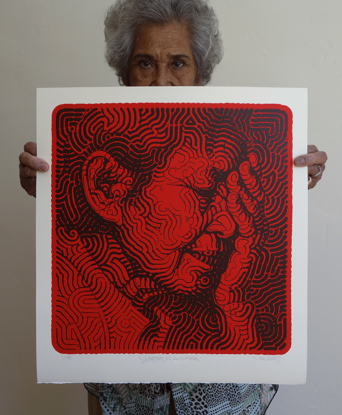


Print details:
Winter in America
Signed, titled, and numbered by the artist.
Hand-pulled serigraph by master printer Tony Clough at Serio Press in Pasadena, California. Printed in two colors, the linework was printed in four layers to create a slight embossed effect.
Printed on acid-free, 100% cotton, 330 gsm, Italian Magnani Revere paper with one natural deckled edge along the bottom of the print.
18.25in x 20.25in paper size
(16.25in x 17in printed area)
Winter in America:
edition of 48, dark red on bright red/vermilion
Winter in America II:
edition of 8, dark blue on bright red/vermilion
Winter in America III:
edition of 8, black on cobalt blue
Artist's statement about the work:
'It seems that much of this country, if not the world, has been experiencing a growing climate of fear and confusion. Daily tragedies overwhelm and desensitize as we grow accustomed to hearing constant reports of killings by terrorists, criminals, and police. We face obscene and ever-worsening economic inequality alongside countless social and environmental problems. A dismal and surreal political atmosphere have contributed to a collective feeling of frustration and powerlessness.
I started working on this portrait of a woman in despair late last year as a response. This piece is also an homage to the great German social realist Käthe Kollwitz, who was known for her melancholy drawings and prints depicting the struggles and suffering of the working class from poverty and war. She was born 150 years ago in July of 1867, and her work is still just as powerful and relevant today. The figure was modeled after my wife's grandmother, and like most of my paintings it was not intended as a specific portrait of just one person but rather a representation of many people. It is a simple, direct expression of grief and fatigue in troubled times.'
"It is mid-winter in America; a man-made season of shattered dreams and shocked citizens, fumbling and frustrated beneath the crush of greed of corporate monsters and economic manipulators gone wild (...)
We must all do what we can for each other to weather this blizzard. Now more than ever all the family must be together; to comfort, to protect, to guide, to survive..."
-Gil Scott-Heron (1975)
"La Mère Créatrice/The Mother Creator" : New mural for the City of Montreal 6 Jan 2017 1:40 PM (8 years ago)


While procreativity is generally seen as a feminine characteristic, creativity is often perceived as intrinsically masculine, and one doesn't need to be an art historian to recognize male domination of the visual arts throughout history. However, thanks to the early influence of my exceptionally talented and inspirational artist mother, I've always taken for granted the tremendous dual capacity in women for both creativity and maternity. Thus, from my own perspective, woman is truly the greatest creator of all and this piece speaks to that.
This project was initiated by Artgang Galerie and made possible by the public art program of the Ville de Montréal, l'Arrondissement Rosemont-La-Petite-Patrie, la Société de Développement Commercial de la Plaza St-Hubert, and Le Medley Simple Malt. Many thanks to my good friend Louis of Artgang Galerie for a decade so far of friendship and support. Thanks to Erica for modeling. Additional thanks to Valérie, Kwest, Louis-V, and all the locals who offered so much positive feedback and encouragement. Additional thanks to poutine for sustaining me on a few long cold nights..
Short video below by Eric Heights.
Music: 'Pacification' by La Nouvelle Frontière, recorded in Montreal in 1970

New EL MAC Prints: 'Peyote Blossoms' 30 Nov 2016 1:05 PM (8 years ago)


Peyote Blossoms is a six-color relief print from photopolymer plate and multi-block linocut. Produced in an edition of 45, it is printed on 17.5" x 13.5" Arches Johannot 240 gsm paper. Signed, titled, and numbered by the artist. $300 with free domestic shipping.
Peyote Blossoms II is a single color relief print from photopolymer plate. Produced in an edition of 15, it is printed in dark black-brown on 16.5" x 13.5" Hahnemuhle Copperplate warm white 300 gsm paper. Signed, titled, and numbered by the artist. $150 with free domestic shipping.
Both editions are printed on soft papers to create a heavy embossing effect.
Call or email to place order: (480)242-1592 brent@santopress.com
http://santopress.com
242-1592%20brent@santopress.com%3Cbr%20/%3E%0A%3Ca%20href%3D%22http://santopress.com/%22%3Ehttp://santopress.com%3C/a%3E%3C/div%3E)
"Native Son (This Saint Floyd)" : Mural for the Manitou Art Center, Colorado 26 Oct 2016 2:06 PM (8 years ago)


Many thanks to FUSE & the Masters Family, Floyd & Flo, The Manitou Art Center, Natalie Johnson, Joy Armstrong, Don Goede and all the kind people of Colorado Springs & Manitou Springs who supported with such tremendous positivity. This was one of the most beautiful and welcoming places I've painted.
Thanks as well to the Bee Vradenburg Foundation, Gazette Charities, the City of Manitou Springs, Ben Harvey Financial Group, Manitou Springs Real Estate, Adventures Out West, City Paint, & SunWater Spa
%26quot;%20:%20Mural%20for%20the%20Manitou%20Art%20Center,%20Colorado%26bodytext%3D%3Cdiv%3E%0A%3Ca%20href%3D%22https://blogger.googleusercontent.com/img/b/R29vZ2xl/AVvXsEiPvtcD5YPJG9zTqOx0DIdNXcwaiPdxfa-eMpRl_Mn27nL-7YmttAkPxq2W2rXm3o2yRzKBb55m646e8rDPzEc8scNtkBLNX3x6YGxfe_wy9em3M_e6T11uc1jIjKk9VveSozIjENkW9Qme/s1600/Native+Son+This+Saint+Floyd+Larry+Masters+cropsm.jpg%22%20imageanchor%3D%221%22%3E%3Cimg%20border%3D%220%22%20height%3D%22286%22%20src%3D%22https://blogger.googleusercontent.com/img/b/R29vZ2xl/AVvXsEiPvtcD5YPJG9zTqOx0DIdNXcwaiPdxfa-eMpRl_Mn27nL-7YmttAkPxq2W2rXm3o2yRzKBb55m646e8rDPzEc8scNtkBLNX3x6YGxfe_wy9em3M_e6T11uc1jIjKk9VveSozIjENkW9Qme/s400/Native+Son+This+Saint+Floyd+Larry+Masters+cropsm.jpg%22%20width%3D%22400%22%20/%3E%3C/a%3E%3C/div%3E%0A%3Cdiv%3E%0A%3Ca%20href%3D%22https://blogger.googleusercontent.com/img/b/R29vZ2xl/AVvXsEifeR-NXycrZVr8WiInk5fTQiOQR5WKZztPZkTFimGFTx_bj5o4pvUTdQis7hfXa_l9yCF3cKv2uR5zlf_0vyYLeGiwFZdpoxoylYd1veAhfSrWhFvsnKYShwiwKiRT1cWwL6C9tB5nW4BX/s1600/_DSC1215c+crop+sm.jpg%22%20imageanchor%3D%221%22%3E%3Cimg%20border%3D%220%22%20height%3D%22310%22%20src%3D%22https://blogger.googleusercontent.com/img/b/R29vZ2xl/AVvXsEifeR-NXycrZVr8WiInk5fTQiOQR5WKZztPZkTFimGFTx_bj5o4pvUTdQis7hfXa_l9yCF3cKv2uR5zlf_0vyYLeGiwFZdpoxoylYd1veAhfSrWhFvsnKYShwiwKiRT1cWwL6C9tB5nW4BX/s400/_DSC1215c+crop+sm.jpg%22%20width%3D%22400%22%20/%3E%3C/a%3E%3C/div%3E%0A%3Cdiv%3E%0A%3Ca%20href%3D%22https://blogger.googleusercontent.com/img/b/R29vZ2xl/AVvXsEgiS2M1_lDLt8mb9eje958JQlB1MvlyHgvwiaWn9TQY1s_OTEkeYn-pAEEA4pxeF-JTFxZjsqQeezjVZ4De5nt2q93jXvT6JbY5kFZU17C7rhwBNR5Z7bK6Qg-MaaWsdin9Br8xUP4IZoR4/s1600/_DSC1167csm.jpg%22%20imageanchor%3D%221%22%3E%3Cimg%20border%3D%220%22%20height%3D%22251%22%20src%3D%22https://blogger.googleusercontent.com/img/b/R29vZ2xl/AVvXsEgiS2M1_lDLt8mb9eje958JQlB1MvlyHgvwiaWn9TQY1s_OTEkeYn-pAEEA4pxeF-JTFxZjsqQeezjVZ4De5nt2q93jXvT6JbY5kFZU17C7rhwBNR5Z7bK6Qg-MaaWsdin9Br8xUP4IZoR4/s400/_DSC1167csm.jpg%22%20width%3D%22400%22%20/%3E%3C/a%3E%3C/div%3E%0A%3Cdiv%3E%0A%3Ca%20href%3D%22https://blogger.googleusercontent.com/img/b/R29vZ2xl/AVvXsEhYMxFq8tP9Jne1PT65kVt34765ecDq8flj_zheQUGOYz612zA3tBBhEfaKxBylhBtlwz1zWpjSXGzMBILynC_nkgeBW888Nznse-RSV0OcaUlvtQIVosw2hRsK_cBQGjbFaoR22eYxLI0j/s1600/_DSC1154csm.jpg%22%20imageanchor%3D%221%22%3E%3Cimg%20border%3D%220%22%20height%3D%22266%22%20src%3D%22https://blogger.googleusercontent.com/img/b/R29vZ2xl/AVvXsEhYMxFq8tP9Jne1PT65kVt34765ecDq8flj_zheQUGOYz612zA3tBBhEfaKxBylhBtlwz1zWpjSXGzMBILynC_nkgeBW888Nznse-RSV0OcaUlvtQIVosw2hRsK_cBQGjbFaoR22eYxLI0j/s400/_DSC1154csm.jpg%22%20width%3D%22400%22%20/%3E%3C/a%3E%3C/div%3E%0A%3Cdiv%3E%0A%3Ca%20href%3D%22https://blogger.googleusercontent.com/img/b/R29vZ2xl/AVvXsEjCxLk1RDAk1tZypcMhA_vY_41xKfESTShwshCIUGaDpYC2Ta_0Hpdp6TODc6-1jOYUMO3GhjVpGvPu6sr_x2nm5xGVFLSLlDpOqbHfWmhnBxuO3YZX7FcoUk7mfjADZ_YfQBzjLHKGmTam/s1600/_DSC1219c+cropsm.jpg%22%20imageanchor%3D%221%22%3E%3Cimg%20border%3D%220%22%20height%3D%22281%22%20src%3D%22https://blogger.googleusercontent.com/img/b/R29vZ2xl/AVvXsEjCxLk1RDAk1tZypcMhA_vY_41xKfESTShwshCIUGaDpYC2Ta_0Hpdp6TODc6-1jOYUMO3GhjVpGvPu6sr_x2nm5xGVFLSLlDpOqbHfWmhnBxuO3YZX7FcoUk7mfjADZ_YfQBzjLHKGmTam/s400/_DSC1219c+cropsm.jpg%22%20width%3D%22400%22%20/%3E%3C/a%3E%3C/div%3E%0A%3Cdiv%3E%0A%3Ca%20href%3D%22https://blogger.googleusercontent.com/img/b/R29vZ2xl/AVvXsEjZKZaCtWwA-yXJsqfL8vDbuTGU6lgCqTq383p2crcXP5nP9KQ1SmlcA1WKkvDnYGDjc6hHP6csAcgrRAK18ifGcmskigO_TmOhfBtkNarc_izQQx8E7bznyrKA84ZEpZFUTsmIzokdm6vD/s1600/IMG_5182cropvert+larry+masters+sm.jpg%22%20imageanchor%3D%221%22%3E%3Cimg%20border%3D%220%22%20height%3D%22400%22%20src%3D%22https://blogger.googleusercontent.com/img/b/R29vZ2xl/AVvXsEjZKZaCtWwA-yXJsqfL8vDbuTGU6lgCqTq383p2crcXP5nP9KQ1SmlcA1WKkvDnYGDjc6hHP6csAcgrRAK18ifGcmskigO_TmOhfBtkNarc_izQQx8E7bznyrKA84ZEpZFUTsmIzokdm6vD/s400/IMG_5182cropvert+larry+masters+sm.jpg%22%20width%3D%22302%22%20/%3E%3C/a%3E%3C/div%3E%0A%3Cdiv%3E%0AThis%20is%20a%20mural%20I%20painted%20over%20the%20Summer,%20commissioned%20for%20The%20%3Ca%20href%3D%22http://www.manitouartcenter.org/%22%20target%3D%22_blank%22%3EManitou%20Art%20Center%3C/a%3E%20(The%20MAC)%20in%20Manitou%20Springs,%20Colorado.%20The%20mural%20is%20a%20collaboration%20with%20my%20good%20friend%20%3Ca%20href%3D%22https://www.instagram.com/fuse_won/%22%20target%3D%22_blank%22%3EFUSE%3C/a%3E,%20a%20Los%20Angeles%20graffiti%20veteran%20who%20began%20painting%20in%20the%201980s%20with%20AWR%20crew%20before%20relocating%20to%20Colorado%20in%20the%2090s.%26nbsp;%3C/div%3E%0AThe%20mural%20is%20based%20on%20my%20photos%20of%20legendary%20and%20reclusive%20local%20artist%20%3Ca%20href%3D%22http://www.tunsonart.com/%22%20target%3D%22_blank%22%3EFloyd%20Tunson%3C/a%3E%20(born%201947),%20who%20had%20a%20%3Ca%20href%3D%22http://www.denverpost.com/2012/12/07/floyd-tunsons-colorado-springs-retrospective-art-exhibit-offers-wild-ride-through-four-decades-of-troubled-history/%22%20target%3D%22_blank%22%3Eretrospective%20at%20the%20Colorado%20Springs%20Fine%20Arts%20Center%3C/a%3E%20in%202013,%20a%20couple%20years%20before%20my%20own%20%3Ca%20href%3D%22http://mac-arte.blogspot.com/2015/11/aerosol-exalted-museum-exhibition-in.html%22%20target%3D%22_blank%22%3Eexhibition%20there%20last%20year%3C/a%3E.%20Tunson%20is%20a%20Colorado%20native%20who%20has%20been%20creating%20art%20in%20his%20Manitou%20Springs%20studio%20for%20over%2030%20years.%20It%20was%20a%20pleasure%20getting%20to%20know%20him,%20and%20I%20would%20consider%20him%20one%20of%20the%20most%20inspiring%20and%20interesting%20people%20I've%20met.%20I%20recognize%20in%20him%20a%20deep%20love%20for%20creation,%20experimentation,%20and%20a%20certain%20shared%20philosophy%20that%20art%20and%20life%20are%20inseparable.%3Cbr%20/%3E%0A%3Cbr%20/%3E%0AMany%20thanks%20to%20FUSE%20%26amp;%20the%20Masters%20Family,%20Floyd%20%26amp;%20Flo,%20The%20Manitou%20Art%20Center,%20Natalie%20Johnson,%20Joy%20Armstrong,%20Don%20Goede%20and%20all%20the%20kind%20people%20of%20Colorado%20Springs%20%26amp;%20Manitou%20Springs%20who%20supported%20with%20such%20tremendous%20positivity.%20This%20was%20one%20of%20the%20most%20beautiful%20and%20welcoming%20places%20I've%20painted.%3Cbr%20/%3E%0AThanks%20as%20well%20to%20the%20%3Ca%20href%3D%22http://www.beevradenburgfoundation.org/%22%20target%3D%22_blank%22%3EBee%20Vradenburg%20Foundation%3C/a%3E,%20%3Ca%20href%3D%22http://www.gazettecharities.org/%22%20target%3D%22_blank%22%3EGazette%20Charities%3C/a%3E,%20the%20%3Ca%20href%3D%22http://www.manitouspringsgov.com/%22%20target%3D%22_blank%22%3ECity%20of%20Manitou%20Springs%3C/a%3E,%20%3Ca%20href%3D%22http://www.theharveyfinancialgroup.com/%22%20target%3D%22_blank%22%3EBen%20Harvey%20Financial%20Group%3C/a%3E,%20%3Ca%20href%3D%22http://manitousprings.com/%22%20target%3D%22_blank%22%3EManitou%20Springs%20Real%20Estate%3C/a%3E,%20%3Ca%20href%3D%22http://www.advoutwest.com/%22%20target%3D%22_blank%22%3EAdventures%20Out%20West%3C/a%3E,%20%3Ca%20href%3D%22http://www.cocitypaint.com/%22%20target%3D%22_blank%22%3ECity%20Paint%3C/a%3E,%20%26amp;%20%3Ca%20href%3D%22http://www.sunwaterspa.com/%22%20target%3D%22_blank%22%3ESunWater%20Spa%3C/a%3E)
"Spark of Divinity": New mural in Sedona for Whole Foods 4 Aug 2016 2:00 PM (8 years ago)


Thanks to my good friend and Arizona aerosol pioneer Mando Rascón for his help with the background designs.
Thanks to Whole Foods and Carlo Carbajal for making such a cool public art project possible.
Thanks to Saichai, Madeleine, Kim, Jorge Bracamonte, Peter Votichenko & the Votichenko family, Marisa Aragon, Fernando Ramos, Corey @ACE, Tamaliza, the good people of Sedona, and anyone else that provided encouragement or support.

EL MAC in Morocco 30 Jun 2016 11:45 AM (8 years ago)


I spent a couple weeks in Morocco recently to paint some small murals as part of the Igloo Hong project (along with an all star team of artists including David Choe, Andrew Hem, Aaron Horkey, Mars 1, Esao Andrews, & DVS1)
The first mural, painted in Agdz (southeastern Morocco), is outside the Casbah des Arts, and is a portrait of Mohamed Ait El Caid ( محمد ايت القيد ). He is a 92 year old man who lives next door to the mural. He is a respected local figure, who once had the first radio in Agdz and would also receive foreign newspapers so he could share the news with local residents. I was impressed with his willingness to be photographed and painted by a strange foreigner
The second mural, also in Agdz, is based on images of my cat, and is painted on a centuries-old mudbrick kasbah. One can clearly see a great appreciation for cats throughout Morocco. There is a story about the Prophet Muhammad having such affection for cats that he once cut off the sleeve of his robe so as to not disturb his cat, Muezza, who was sleeping on it. Agdz also means 'resting place', so painting a sleeping cat seemed appropriate.
The third wall is further east in Merzouga, at the edge of the Sahara, near the border with Algeria. Andrew Hem painted the background designs for this one. It is based on my photos of Hssain Ahnana ( حساين اهنانا ) who comes from a lineage of Sahrawi nomads and now owns the camping ground (Secret du Sahara) where the mural was painted. He is painted wearing his 'cheche', which is a traditional indigo-dyed head wrap worn by indigenous North African Amazigh/Tuareg/Berber people for protection from the harsh sun and sand. The Tuareg have been known as the 'blue men of the desert' for this.
Having grown up primarily in another desert (Sonoran) on the other side of the planet, it was fascinating to come to the Saharan Desert and see some of the environmental and cultural parallels, along with the local adaptations for desert life. I hope to make it back someday.
Many thanks to the good people of Morocco, the David Young Choe Foundation + the Igloo Hong team: Dave, Matt, Jy-Ah, Karim, Jason, Paco, Steve, Soufian, and everyone/anyone else that helped out.
Photos by me except:
2,10-12 by Matt Revelli
6,16 by Dave Choe
9 by Jy-Ah Min
13,15,21 by Paco Raterta
"Desert Rose (Nuevas Generaciones)": New mural for Mesa Contemporary Arts Museum 25 Apr 2016 11:52 AM (9 years ago)


