Modeling the COVID-19 / Coronavirus pandemic – 4.Modeling with at time variable infection rate. 17 Apr 2020 10:31 AM (6 years ago)
A more realistic assumption than the approximation above is to allow the infection rate to be time dependent. This time dependency was derived in the first post, by using the results of Cereda et al. 2020 who used a $\Gamma$-distribution to fit the interval between the appearance of symptoms in infectors and infectees. After removing the widening by the incubation period, we derived the serial interval of infections, which is the normalized infection probability, namely
\begin{equation}
\beta(t) = R_0 {b^a t^{a-1} \exp(-b t) \over \Gamma(a)},
\end{equation}
with $a = 3.1 \pm 0.8 $ and $b = 0.47 \pm 0.12$ days$^{-1}$.
Given this infection rate, can we derive the relation between the exponential growth rate $r$ and the basic reproduction number $R_0 = \int_0^\infty \beta(t) dt$? Can we predict by how much the growth will slow down if we quarantine at a given rate, or decrease the infection rate (e.g., through social distancing)?
To get the $r$, we assume that the number infected at a given time is $I = I_0 \exp(rt)$. This means that the rate at which people are infected is its derivative $\dot{I} \equiv dI/dt = r I_0 \exp(rt)$. The basic equation for the infection rate is the following. At each instant $t$, there are people who were infected at a previous time $t-\tau$ who now infect at a rate $\beta(\tau)$. We therefore have the equation
\begin{equation}
\dot{I}(t) = \int_{0}^\infty \beta(\tau) \dot{I}(t-\tau) d\tau .
\end{equation}
We now insert our ``guess" which is the exponential growth and find that
\begin{equation}
r I_0 \exp(rt) = \int_{0}^\infty \beta(\tau) r I_0 \exp\left(r(t-\tau)\right) d\tau ,
\end{equation}
which after cancellation of $r I_0\exp(rt)$ gives
\begin{equation}
1 = \int_{0}^\infty \beta(\tau) \exp \left( -r \tau \right) d\tau .
\end{equation}
This is the basic equation relating the growth rate $r$ to the infection rate function $\beta(t)$, which itself depends on the basic reproduction number $R_0$.
For the $\Gamma$ distribution given above, the equation becomes:
\begin{equation}
{1\over R_0} = \int_{0}^\infty {b^a \tau^{a-1} \exp\left(-(b+r) \tau \right) \over \Gamma(a)} d\tau = {b^{a} \over (b+r)^a}.
\label{eq:R0timedependent}
\end{equation}
With the above values of $a$ and $b$, this implies that the basic reproduction number is high and equal to $R_0 = 4.6 \pm 2.7$.
If we take the growth observed in Japan, we find $R_{0,J} = 1.6 \pm 0.3$.
Since the errors on $R_0$ and $R_{0,J}$ are correlated, it is also worth while looking directly at the ratio:
\begin{equation}
{R_{0,J} \over R_0} = \left(b+r_{0,J} \over b+r_0\right)^a = 0.34 \pm 0.15
\end{equation}
Namely, the Japanese social norms implies that they are about 3 times less infectious than typical societies.
The effect of quarantining and "social distancing" can also be included in the calculation by modifying the infection rate. For example, suppose that there is a quarantining rate $\kappa$, and that we reduce the reproduction number to a fraction $\epsilon$, namely that $R = \epsilon R_0$. We then get a modified infection rate of
\begin{equation}
\beta_\mathrm{mod}(t) = \epsilon R_0 {b^a t^{a-1} \exp \left(-b t\right) \over \Gamma(a)} \exp(-\kappa t).
\end{equation}
Since a $\Gamma$-distribution times an exponent is another (but not normalized) $\Gamma$-distribution, we can easily integrate and find that
\begin{equation}
{1\over \epsilon R_0} = {b^{a} \over (b+r +\kappa)^a}.
\end{equation}
The solution is
\begin{equation}
r = b \left[ (\epsilon R_0)^{1/a} -1\right] -\kappa = (r_0 + b) \epsilon^{1/a} - b - \kappa.
\end{equation}
For the second equality we plugged in the solution for $R_0$ from the observed $r_0$ - the growth under natural conditions.
Clearly, for no social distancing ($\epsilon=1$), we need $\kappa$ as fast as the $r_0$ of the base case (without any social modifications). Namely, we need to quarantine people as fast as $1/r_0 = 3.3 \pm 0.7$ days. A place like Iran or Bnei Brak requires quarantining as fast as $2.25 \pm 0.25$ days from the day of infection, while Japan or Sweden, more like $13.5 \pm 5$ days.
We can look at it differently. Without quarantining we need to reduce the social interactions to a fraction $\epsilon = (b/(r_0+b)^a = 1/R_0$, which is the above result.
In fig. 1 we plot the growth rate as a function of the quarantining time $1/\kappa$ and social distancing factor $1/\epsilon$.
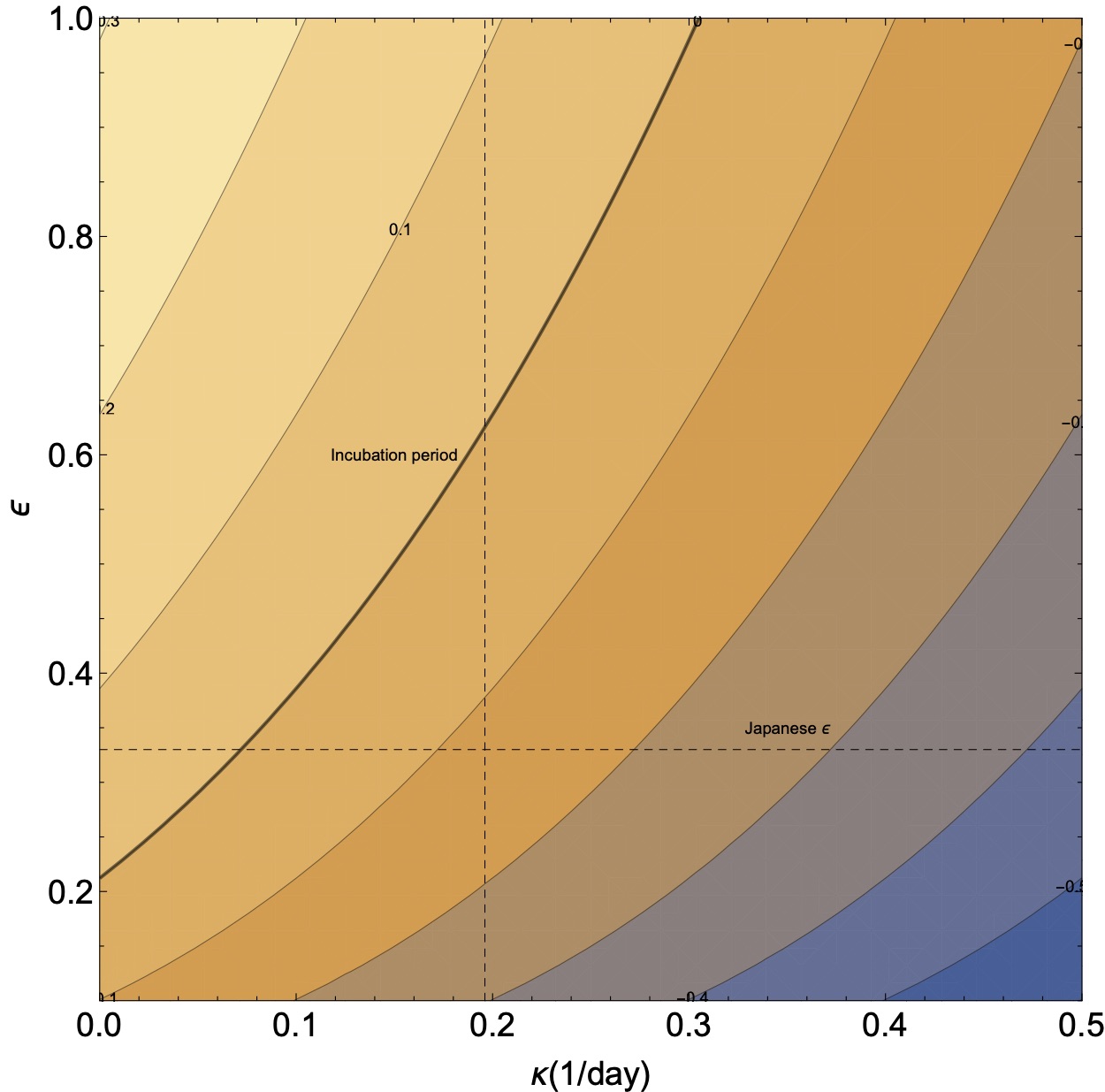
One apparent conclusion is that under normal conditions (i.e., for $R=R_0$), asking anyone who has any coronavirus like symptoms to quarantine himself is insufficient to stop outbreaks. This is because the typical incubation period is 5 days, which is larger than the necessary quarantining time. The exception might be a society like Japan in which the quarantining time is longer than the incubation time. However, this is still without having taken the asymptomatic coronavirus carriers.
Effect of asymptomatic carriers If we have asymptomatic carriers, then we will not be able to detect and quarantine them (unless they are discovered by a more sophisticated protocol, such as checking all those who were in contact with a sick person). This means that the quarantining fraction does not decay as $\exp(-\kappa t)$ but as $f + (1-f) \exp(-\kappa t)$. Once we plug this factor to $\beta_\mathrm{mod}(t)$ and integrate over, we obtain \begin{equation} {1\over \epsilon R_0} = f {b^{a} \over (b+r)^a} + (1-f){b^{a} \over (b+r +\kappa)^a}. \end{equation} This equation does not have an analytical solution for $r$. We can however solve for $r=0$, and find the quarantining rate necessary to stop the outbreak. It is \begin{eqnarray} \nonumber \kappa_\mathrm{crit} &=& \left[\left(\frac{(1-f) R_0 \epsilon }{1-f R_0 \epsilon }\right)^{{1}/{a}}-1\right] b \\ & = & \left[\left(\frac{(1-f) \epsilon (b+r_0)^a}{b^a - f \epsilon (b+r_0)^a}\right)^{{1}/{a}}-1\right] b. \end{eqnarray}
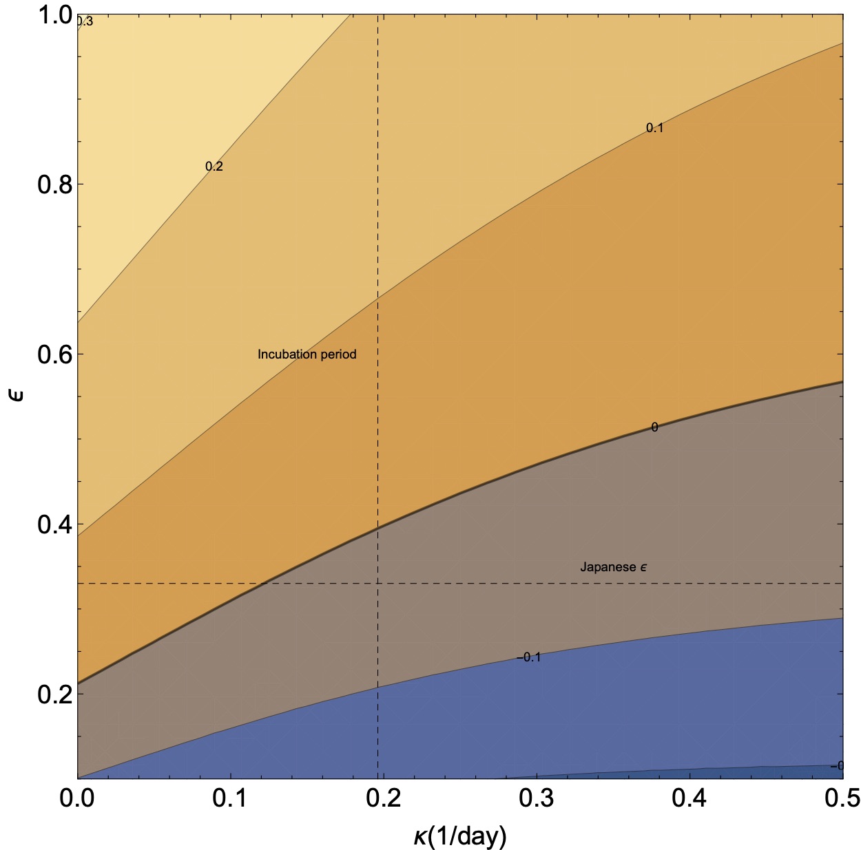
In fig. 2 we plot the rate $r$ as a function of the quarantining and social distancing. For our canonical value of the asymptomatic infected, we find that there is no $\kappa$ that will give $r=0$. Namely, the growth just from the asymptomatic is sufficient to cause an epidemic if the social interaction stays the same. If we use the rate observed in Japan, $r_J$, we find that $\kappa_\mathrm{crit} = 0.13 \pm 0.06$, which gives a typical critical time of 8 days to quarantine.
Let us now switch gears and simulate the pandemic numerically. This will allow us to easily incorporate more complex scenarios, such as different conditions for quarantining.
Additional posts in the series include
- Background data
- Simple Modeling
- Effects of several populations with a variable infection rate
- Modeling with at time variable infection rate (this page)
- Numerical Model (coming soon!)
- Discussion and Conclusions (coming soon!)


Modeling the COVID-19 / Coronavirus pandemic – 3.The effects of several populations 12 Apr 2020 11:39 PM (6 years ago)
The next interesting question to ask is what is the effect of a mixed population which has different infection rates. That is, that some individuals are more infectious than others (e.g., a cashier in the supermarket vs. a farmer). For simplicity, we return back to the simpler case where there is no latent period. Let us supposed we have $n$ population that can interact between (i.e., infect) themselves. The equations describing their temporal behavior will then be
\begin{eqnarray}
{d I_1 \over dt} &=& \beta_{11} I_1 + \beta_{12} I_2 + \ldots + \beta_{1n} I_n - \gamma I_1 \nonumber \\
{d I_2 \over dt} &=& \beta_{21} I_1 + \beta_{22} I_2 + \ldots + \beta_{2n} I_n- \gamma I_2 \nonumber \\
&\vdots & \nonumber \\
{d I_n \over dt} &=& \beta_{n1} I_1 + \beta_{n2} I_2 + \ldots + \beta_{nn} I_n- \gamma I_n
\end{eqnarray}
If we now guess exponential behavior for the solution, namely, $I_i \propto \exp(r t)$, we get
\begin{equation}
\newcommand{\matr}[1]{\mathbf{#1}}
(\gamma - r) \matr{I} - \boldsymbol\beta = 0,
\end{equation}
which of course means that $r - \gamma$ are a the eigenvalues of the interaction (infection coefficient) matrix $\boldsymbol\beta$.
This boils down to what are the eigenvalues of random matrices. The easiest way to study their behavior is simply to run "experiments".
As a sanity check, the first case to consider is case for which the infection coefficients are constant. This implies taking the simple case we studied above and partition the population. This should not change anything. Suppose they are equally sized. In such a case, $\beta_{ij} = \beta_0 /n$. The eigenvalues one obtains numerically are $n-1$ zeros, and one $\beta_0$, as expected.
For the next cases, we can consider $\beta{ij}$'s that are random. Since the $\beta{ij}$ have to be positive (no one can "uninfect" an infected patient), we can look at a log normal distribution.
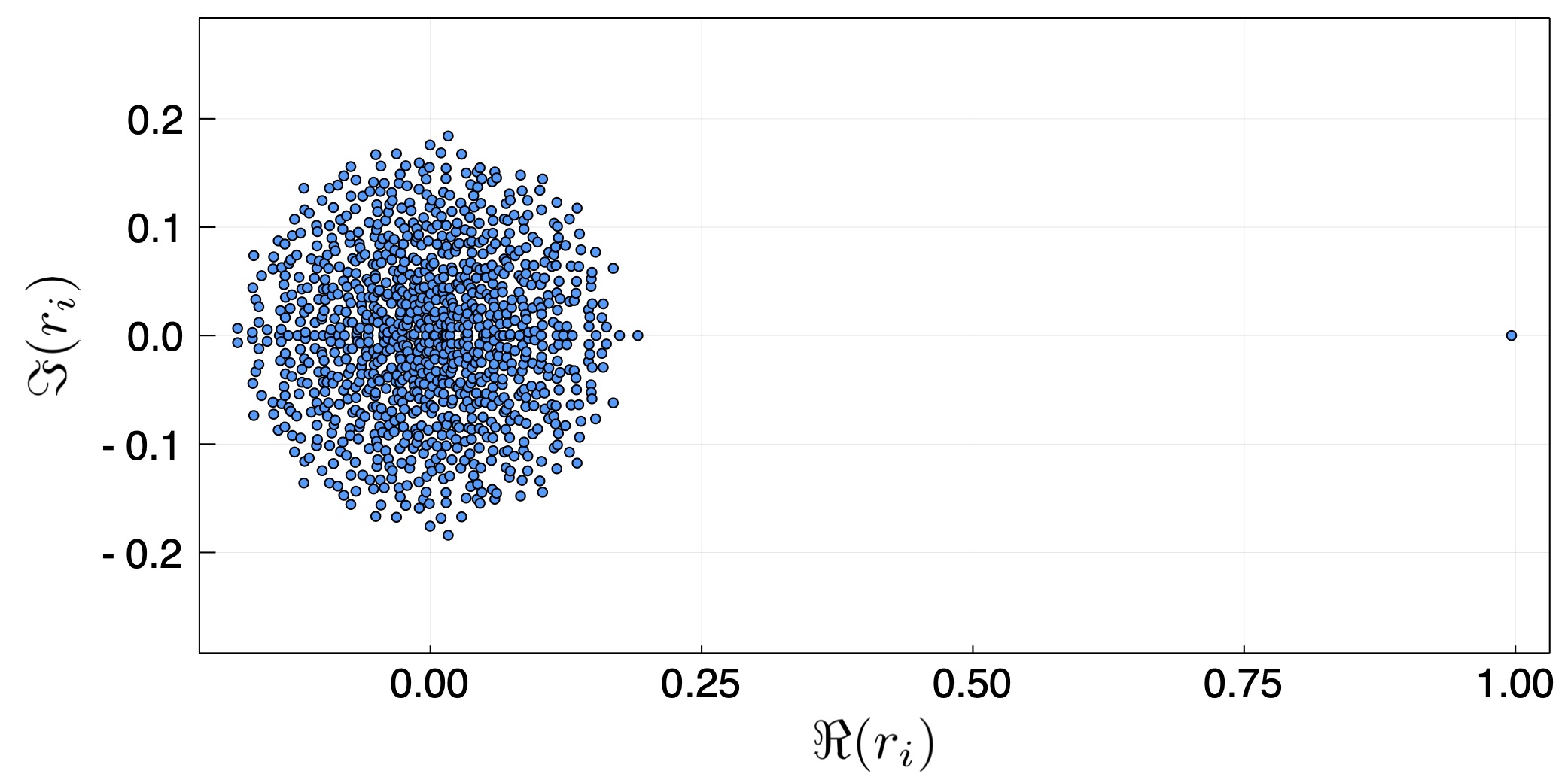
The first random case we take is of a general, non-symmetric matrix. In principle, there is no reason why the coefficients should be symmetric, that is, $\beta_{ij}=\beta_{ji}$. This is because when two people interact, the probability that one will infect the other is not necessarily the same, either because of different habits (one washes her hands while another doesn't), or because of asymmetric interaction (e.g., person providing food vs. a person eating it). Fig. 1 depicts the eigenvalues of a 1000 by 1000 interaction matrix $\boldsymbol\beta$. We see that all but one eigen value fill a circle around the origin, while one eigenvalue is unity. In fact, under some realizations, it can be larger than unity.
The first interesting take away point is that even if the interactions are random, the average interaction sets the maximal growth rate, and it will dominate the solution very early in the evolution. Namely, the initial conditions will cause an oscillatory behavior (because the eigenvalues have an imaginary component), however after a few e-folds at most, the largest eigenmode having an eigenvalue of unity (as the average was normalized), will dominate the growth. Without normalization, we will have $r_{max} = n \overline{\beta_{ij}}$
The second random case is considering a symmetric $\boldsymbol\beta$ which will give rise to real eigenvalues (in epidemiological terms, it means that there is symmetric probability that person A and B infect each other if one is sick.
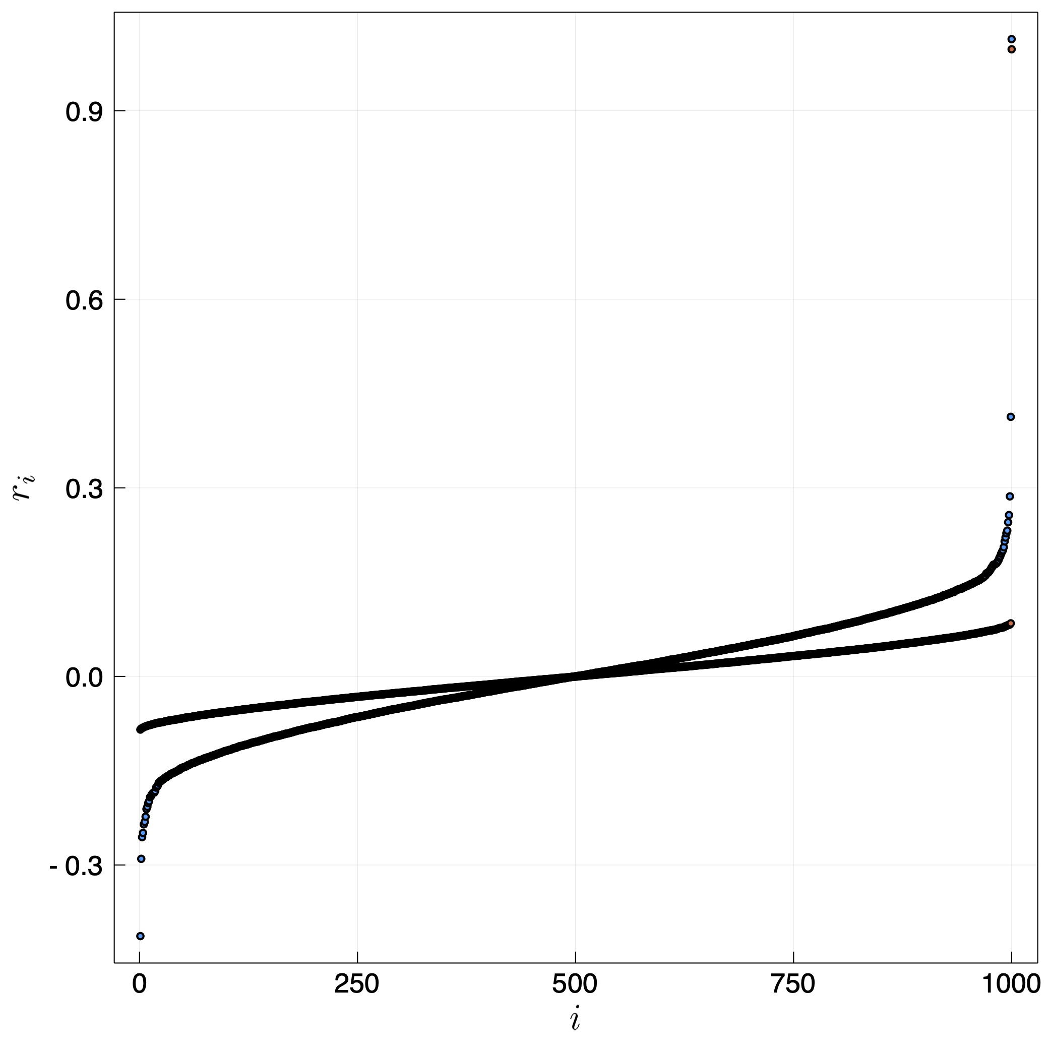
The most interesting aspect is that in some realizations we find that the largest eigenvalue can be larger than unity. We therefore plot in fig. 3 the largest eigenvalue in many random realizations. We find that if the largest element in $\beta_{ij}$ is larger than unity, then the largest eigenvalue is roughly the largest element. Otherwise, it is unity. Interestingly, the distribution width doesn't change this, it only changes the probability that there will be a realization with a very large $\beta_{ij}$.
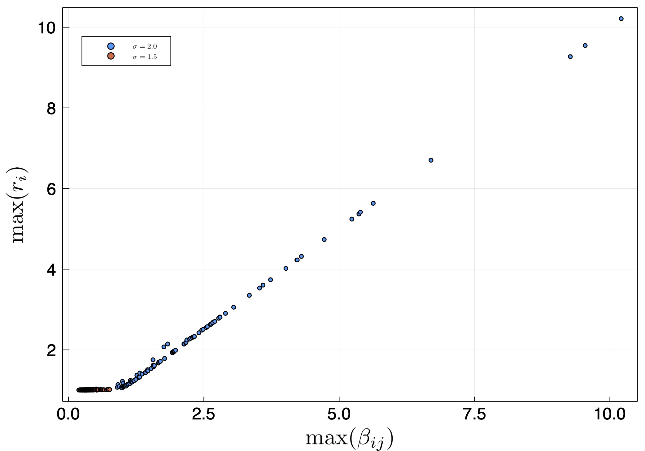
This result implies that the internal interaction is not critical unless there is a super-spreader, which is someone or some group that has a probability of infecting which is larger than the reciprocal of its size in the relevant population. For example. Suppose a town has 1000 people and 10 delivery guys. If the probability that a single delivery guy will infect someone is larger than the probability that a random person will infect another random person, by a factor which is larger than 100, then the growth exponent will be larger than the exponent that is obtained from the average infection coefficient. It will correspond to delivery guys infecting average people who infect other delivery guys, etc.
Additional posts in the series include
- Background data
- Simple Modeling
- Effects of several populations with a variable infection rate (this page)
- Modeling with at time variable infection rate
- Numerical Model (coming soon!)
- Discussion and Conclusions (coming soon!)
Modeling the COVID-19 / Coronavirus pandemic – 2.Simple Models 9 Apr 2020 10:47 AM (6 years ago)
Armed with the data on the coronavirus such as the serial interval, incubation period, and the base growth rate, we are now in a position to start modeling the pandemic. Note that as the title suggests, these are simple models. Any conclusions drawn from this specific page should be taken with a grain of salt. More realistic modeling will be carried out in subsequent posts.
SIR - A very simple model
Using the above numbers, we are pretty much ready to start modeling the pandemic. We start with the simplest model that can encapsulate the exponential growth.
The simplest model for the pandemic growth is the well known SIR model, which includes the number of uninfected people $S$, the total population $N$, the number of infected and contagious individuals $I$ and the number of recovered individuals $R$. The set of ordinary differential equations (ODEs) describing the behavior is:
\begin{eqnarray}
{dS \over dt} &=& - \beta \left(S \over N \right) I , \\
{dI \over dt} &=& + \beta \left(S \over N \right) I - \gamma I, \\
{dR \over dt} &=& + \gamma I .
\end{eqnarray}
Here $\beta$ is the transmitting coefficient, which depends on the social behavior and of course some inherent characteristics of the virus. $\gamma$ is the recovery rate or the rate at which the contagious person leaves the contagious state (e.g., gets hospitalized or quarantined), in units of one over time.
This equation is nonlinear because when a large fraction of the population gets infected, $S/N$ starts decreasing, quenching the epidemic. We want (at least at first) to better understand the behavior when only a small fraction of the population is infected.
Thus, the equation of interest, assuming $S/N \approx 1$, is
\begin{equation}
{dI \over dt} = + \beta I - \gamma I.
\end{equation}
If we guess an exponential behavior (since it is a homogeneous linear ODE) of the form $X \propto \exp(r t)$ (where $X$ is any variable), we find:
\begin{equation}
r I = (\beta - \gamma)I ~~~\rightarrow~~~ r = \beta - \gamma.
\end{equation}
This immediately tells us that the infection can grow and become an epidemic if $\beta$ is larger than $\gamma$.
In fact, we can relate $r$ to the basic reproduction number $R_0$, which is the initial number of people that will be infected by an infectious individual (before any measures are taken). It is
\begin{equation}
R_0 = \int_0^{\infty} \beta \exp(-\gamma t) dt = {\beta \over \gamma} = {r + \gamma
\over \gamma}.
\end{equation}
This is because the probability that an infected individual remains contagious at time $t$ is proportional to $\exp(-\gamma t)$.
If we compare our results to the nominal growth rate of 0.3 ± 0.07 day$^{-1}$ and take $\gamma$ to be the reciprocal of the serial interval, i.e., 1 / (6.6 ± 1.3) day$^{-1}$ (assuming the errors on the fit for the distribution are uncorrelated), we obtain that $R_0$ = 3.0 ± 0.6. This is the average number of infections from a contagious person. We also find $\beta$ = 0.46 ± 0.07 day$^{-1}$.
Based on this simple model, we see that in order to guarantee overcoming the pandemic growth, we need to reduce $\beta - \gamma$ and make it negative. This requires either reducing $R_0$ (i.e., $\beta$), by a factor of 3 or even 4, which is not really reasonable (effectively making the infected people less contagious) or increasing $\gamma$, which implies shortening the time that an infected person is contagious (by quarantining him), or a combination of both. Let us see how this changes if we introduce a latent period where the person is non-contagious.
Adding a non-contagious latent period
One generalization of the simplest model is to include a period when the infected person is noncontagious, namely, it is a latent period. (This isn't the clinical incubation period, which is the time until the onset of symptoms, as people can be contagious even before symptoms develop, if they develop). Thus, our model now includes the number of uninfected people $S$, the number of infected people $L$, in the "latent period", that are still noncontagious, the number $C$ of contagious infected people, and the number of recovered individuals $R$. The equations describing the behavior here will be
\begin{eqnarray}
{dS \over dt} &=& - \beta \left(S \over N \right) C , \\
{dL \over dt} &=& + \beta \left(S \over N \right) C - \lambda L, \\
{dC \over dt} &=& + \lambda L - \gamma C, \\
{dR \over dt} &=& + \gamma C .
\end{eqnarray}
Here, $\lambda$ is the rate at which infected people become contagious.
Also, we again guess exponential behavior for the linear case (for which $\left(S / N \right) \rightarrow 1$), and get
\begin{eqnarray}
r L &=& + \beta C - \lambda L, \\
r C &=& + \lambda L - \gamma C, \\
\end{eqnarray}
Because this is a homogeneous set of equations, it is an eigenvalue problem. The solution is obtained when the determinant vanishes:
\begin{equation}
\left | \begin{array}{c c}
\lambda + r & - \beta \\
- \lambda & \gamma +r \\
\end{array} \right| = 0
\end{equation}
This gives two solutions. The positive one (describing the pandemic) is:
\begin{equation}
r = {1\over 2} \left( -(\lambda + \gamma) + \sqrt{(\lambda - \gamma)^2 + 4 \lambda \beta } \right)
\end{equation}
We can invert this relation to find $\beta$ given the growth rate $r$ which we measure:
\begin{equation}
\beta = { (\lambda + r)(r+\gamma)\over \lambda}.
\end{equation}
For a very short latent period, the rate at which noncontagious become contagious, $\lambda$, is very large and we recover the equation from the previous section.
We can also see that we still obtain $r=0$ for $\lambda = \beta$. However, for other values of $\beta$ we get $|r(\gamma)| < |r(\lambda \rightarrow \infty)|$. This is because the latent period slows things down, without affecting the overall behavior of the system. Once a person becomes contagious it is a race between the infection rate $\beta C$ and the recovery rate $\gamma C$. For this reason, the basic reproduction number $R_0$ is still
\begin{equation}
R_0 = \int_0^{\infty} \beta \exp(-\gamma t) dt = {\beta \over \gamma}.
\end{equation}
If we consider the serial interval distribution we derived in the background data post, we see that taking $1/\lambda \sim 2 \pm 1$ day is reasonable. If we now take $\lambda + \gamma = 1/(6.6\pm 1.3)$ day$^{-1}$, we get
\begin{eqnarray}
\beta &=& 0.75 \pm 0.22 \mathrm{~day}^{-1}\\
R_0 & = & 4.6 \pm 1.6.
\end{eqnarray}
Namely, we obtain a higher basic reproduction number. This is because the introduction of a latent period (of order 2 days) implies that for the same infection rate and recovery rate, the overall growth rate is slower. In order to compensate for it, the infection rate and basic reproduction numbers have to be higher in order to have the same growth rate $r$. In the next post we will consider having a distribution of infection coefficient $\beta$, and in the subsequent, we will also calculate the infection with a more appropriate time dependent infection rate.
Adding Quarantining
The next step is to add the effects of quarantining of sick people. If we want to stay within the framework of the linear equations, the easiest way to incorporate quarantining is to add an additional rate $\kappa$ which describes the rate at which an infectious person is quarantined. In fact, this number can be different in the latent period (when the person hasn't developed symptoms) and in the contagious period, when he could have. Thus, we introduce $\kappa_{L}$, $\kappa_{C}$ and now consider the equations:
\begin{eqnarray}
{dL \over dt} &=& - \lambda L - \kappa_{L} L + \beta C , \\
{dC \over dt} &=& + \lambda L - \gamma C - \kappa_{C} C.
\end{eqnarray}
If we now guess ${L,C \propto \exp(r t)}$, we again find ourselves with an eigenvalue problem, of which the solution is:
\begin{eqnarray}
r&=&{1\over 2}\left(-(\lambda + \kappa_{L}) - (\gamma +\kappa_{C})\right) \\ \nonumber && +
\sqrt{\left(+(\lambda+\kappa_{L}) - (\gamma +\kappa_{C})\right)^2 + 4 \lambda \alpha}.
\end{eqnarray}
This gives $r=0$ for
\begin{equation}
\beta_{crit} = {(\lambda + \kappa_{L}) (\gamma + \kappa_{C}) \over \lambda}.
\end{equation}
If for example, we cannot detect people in the latent phase ($\kappa_L = 0$), and it takes 2 days to discover that people might be infected with the coronavirus, then $\kappa_C = 1/2$ day$^{-1}$. We also have $1/\lambda = 2 \pm 1$ day and $1/\lambda + 1/\gamma = 6.6 \pm 1.3 $ days which leads to $\beta_{crit} = 0.664 \pm 0.036$. However the value of $\beta$ without social distancing and other such measures is $\beta \approx 0.75$ (in the simple model with a latent / contagious period). In other words, quarantining 2 days after a person becomes infectious, which is 4 days after he is infected is barely sufficient to increase the $\beta_{crit}$ to the base value, and probably not enough to stop the pandemic without additional means (e.g. social distancing). We will return to this calculation once we have a better description of the $\beta$, allowing it to be a function of time since the infection.
- Background data
- Simple Modeling (this page)
- Effects of a population with a variable infection rate
- Modeling with at time variable infection rate
- Numerical Model (coming soon!)
- Discussion and Conclusions (coming soon!)
Modeling the COVID-19 / Coronavirus pandemic – 1.Background Data 7 Apr 2020 1:40 PM (6 years ago)
This is the first in a series of posts in which I study the COVID-19 (coronavirus) pandemic. My original goal was to understand the behavior of the pandemic. As a scientists my curiosity forces me to not to leave such problems untouched. I wanted to know what are the possible outcome scenarios possible and what are the steps required to reach them. Is there a reasonable solution in which we avoid the collapse of health systems and/or the economies? I am sure (well, I hope) that professional epidemiologists know all of this, I decided to share with whomever is interested in my insights. A note of caution. First year college education in harder sciences or engineering is needed to appreciate everything.
Just as a background. I am a professor of physics at the Hebrew University. My bread and butter are problems in astrophysics (massive stars, cosmic rays) as well as understanding how the sun has a large effect on climate (though modulation of the cosmic ray flux) and its repercussions on our understanding of 20th century climate change, and climate in general.
As I write this text (Early April), the pandemic is raging. It infected over 1.5 million people world wide and killed over 80000. In many places it is still growing exponentially. In Israel (where I live), the situation appears to be getting under control, with around 10000 infected, of order a few % daily infection rate (and decreasing), and 70 or so dead, i.e., just over half percent, which is actually good compared with other countries, as can be seen here for example).
Anyway, the goal of the notes is to model the pandemic, understand it, and hopefully reach positive constructive conclusions. These are especially important if we are to understand how we leave the lockdowns most of us are now in. In order to so, we need some useful data. So, the rest of this post is dedicated to summarize various useful results I found in various preprints, as well as the pandemic growth data from different countries that I plotted using available data. The subsequent posts will be dedicated to understanding the pandemic with models of various complexity.
Number of Infected and its growth rate in different countries.
Data on the infection at different countries is collected by the John Hopkins University Center for Systems Science and Engineering, and kept in a data repository on Github. This data can then be used to plot the number of infected as a function of time. This is done in fig. 1 below. The majority of western countries appear to have grown from 100 to 1000 infected in 7.5 ± 2 days, or a rate of about 0.305 ± 0.065 e-folds per day.
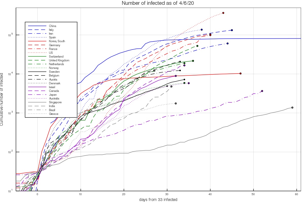
There are several interesting exceptions. First, there are countries in which the growth was notably faster. In Iran this can be explained given the dense environment and significant interaction at religious places. The infection growth started in the city of Qom which is an important Shia center. In South Korea it started with a super spreader at the city of Daegu (in a Christian center). In Italy and Spain fast initial growth is attributed to the Champion league match between Atalanta of Bergamo and Valencia, taking place in Milan.
On the other hand, there are several countries with slower growth. This includes Israel which already had quarantine measures taking place before the first community infections took place, as well as Australia and Canada. It could be slower in the latter countries either because the weather is notably hotter/colder, or perhaps the typical interaction in those societies is lower. The lower infection in Japan and Singapore can probably be attributed to the social standards requiring for example facial masks by anyone who has any cold or flu like symptoms. In Japan, without any quarantining or lockdowns, the growth rate was around 0.075 ± 0.025 e-folds per day.
Another way of depicting the growth is to calculate the growth rate at each day, based on the preceding 5 days. This results in figs. 2 and 3, which depict the growth rate and the number of infected per day based on the 5 day fit (and thus average out some of the day to day variations). During the time of the pandemic, the figures are updated almost everyday and published on twitter under my handle @nirshaviv.
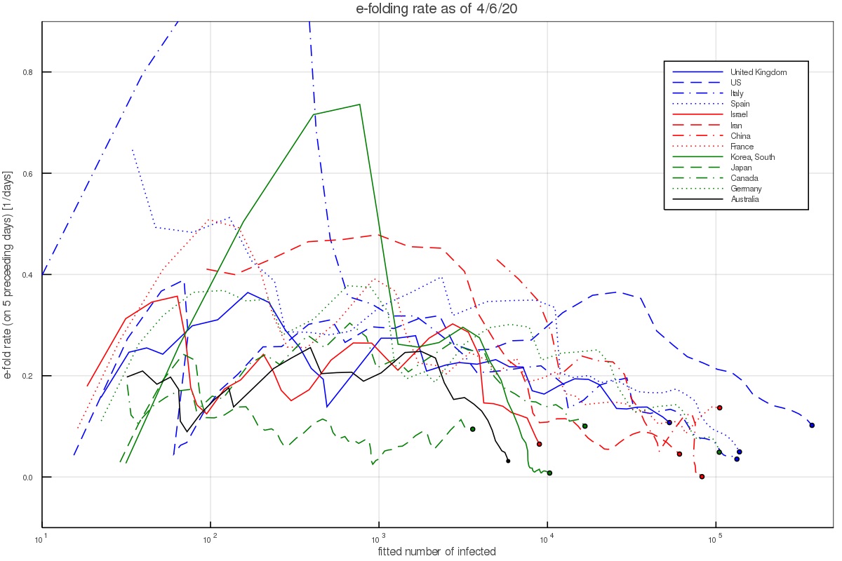
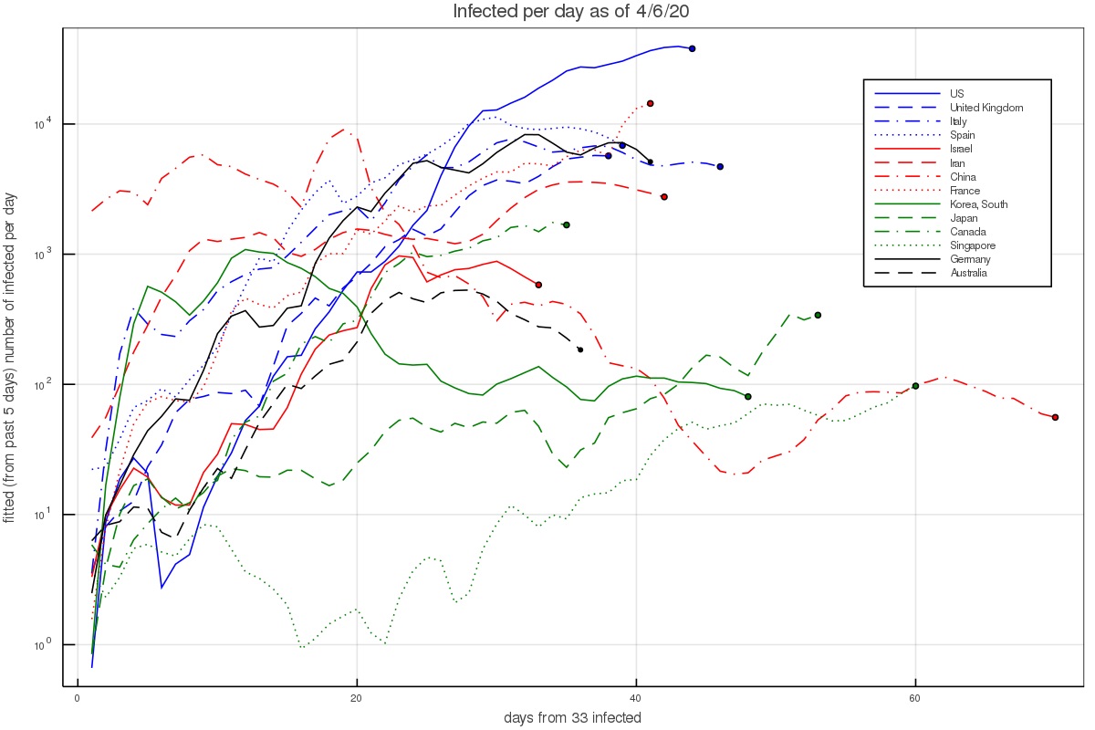
Fig. 2 shows that when there are a few hundred to a few thousand people, which is after the pandemic took hold in a country but before countries took measures or have them affect the growth, the aforementioned rate consistently describes the data (except for the outlier countries mentioned above).
Incubation period
The incubation period is the time between exposure and infection by an infected person and the appearance of the first symptoms. Given that self isolation can take place after the first symptoms show up, the incubation period is crucial for estimating whether a corona outbreak can be reined in naturally.
For the incubation period we take the probability distribution function fitted for by Lauer et al. 2020. They fitted several functional forms which give similar fits. We shall work with the Γ-distribution for consistency with the serial interval fits we use below. Their best fit is a gamma distribution with a shape parameter of 5.807 (95% CI of 3.585-13.865) and a scale parameter of 0.948 days (95% CI of 0.368-1.696 days). This gives a mean of 5.1 days.
These results are consistent with Li et al. 2020 who find an incubation period (mean time between primary infection and appearance of symptoms ) of 5.2 days (with 95% confidence between 4.1 to 7.0 days).
Serial Interval and infection as a function of time}
Another extremely important piece of information in how infectious are people with the corona virus, and how it depends on time.
By limiting themselves to reliable infection lines, Nishiura et al. 2020 find a serial interval of 4.6 days (with a 95% CI of 3.5 to 5.9). This is somewhat shorter than Li et al. 2020, who find a serial interval (mean time between primary and secondary infection) of 7.5 days (with 95% confidence between 5.3 to 19.0 days).
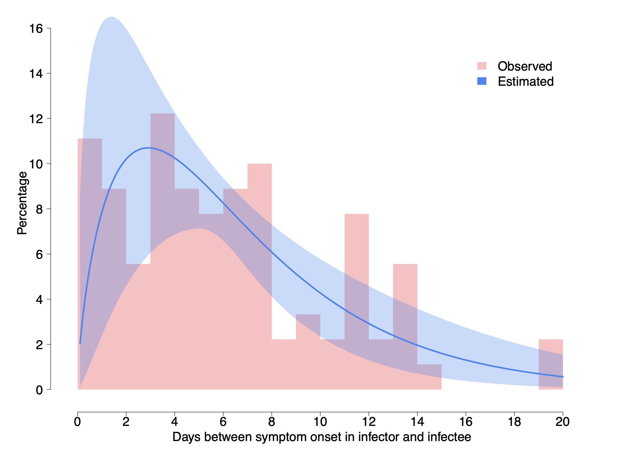
Cereda et al. 2020 carry an analysis of over 5000 cases from the early outbreak in Lombardy Italy from which they derive 90 pairs of cases with known infector-infectee relationship, which is much larger than above. They derive a distribution of cases and fit it with a Γ distribution having a shape parameter of 1.87 ± 0.26 and a rate of 0.28 ± 0.04 day$^{-1}$. This gives a mean of 6.7 days and a median of 5.5 days. In what follows, we work with these distribution and values.
We do note however that although the authors claim it is the serial interval, it is the interval between the appearance of symptoms and not the between the infections. Although the two have the same mean, the interval between the appearance of symptoms should have a somewhat wider distribution because the incubation periods in the infector and infectee are not the same. Using the data on the incubation we can actually correct for this.
The variance of a Γ distribution describing the interval between appearance of symptoms, with the above shape is 23.9 day$^2$, while that of the incubation period is 6.46 day$^2$. The variance of the serial interval should be $\sigma_{serial-int}^2 \approx \sigma_{sympt-int}^2 - (1~\mathrm{to}~2)~\sigma_{incub}^2 = 11.0~\mathrm{to}~ 17.4$ day$^2$. The factor 1 or 2 depends on whether there is a correlation between the infected being infectious and developing symptoms, (1) or whether there is no correlation (2). Thus, we take middle ground, which is a variance of around 14.2 ± 3.2 day$^2$. If we keep the mean to be 6.7 days, we need a shape parameter of 3.1 ± 0.8 and a rate of 0.47 ± 0.12 day$^{-1}$.
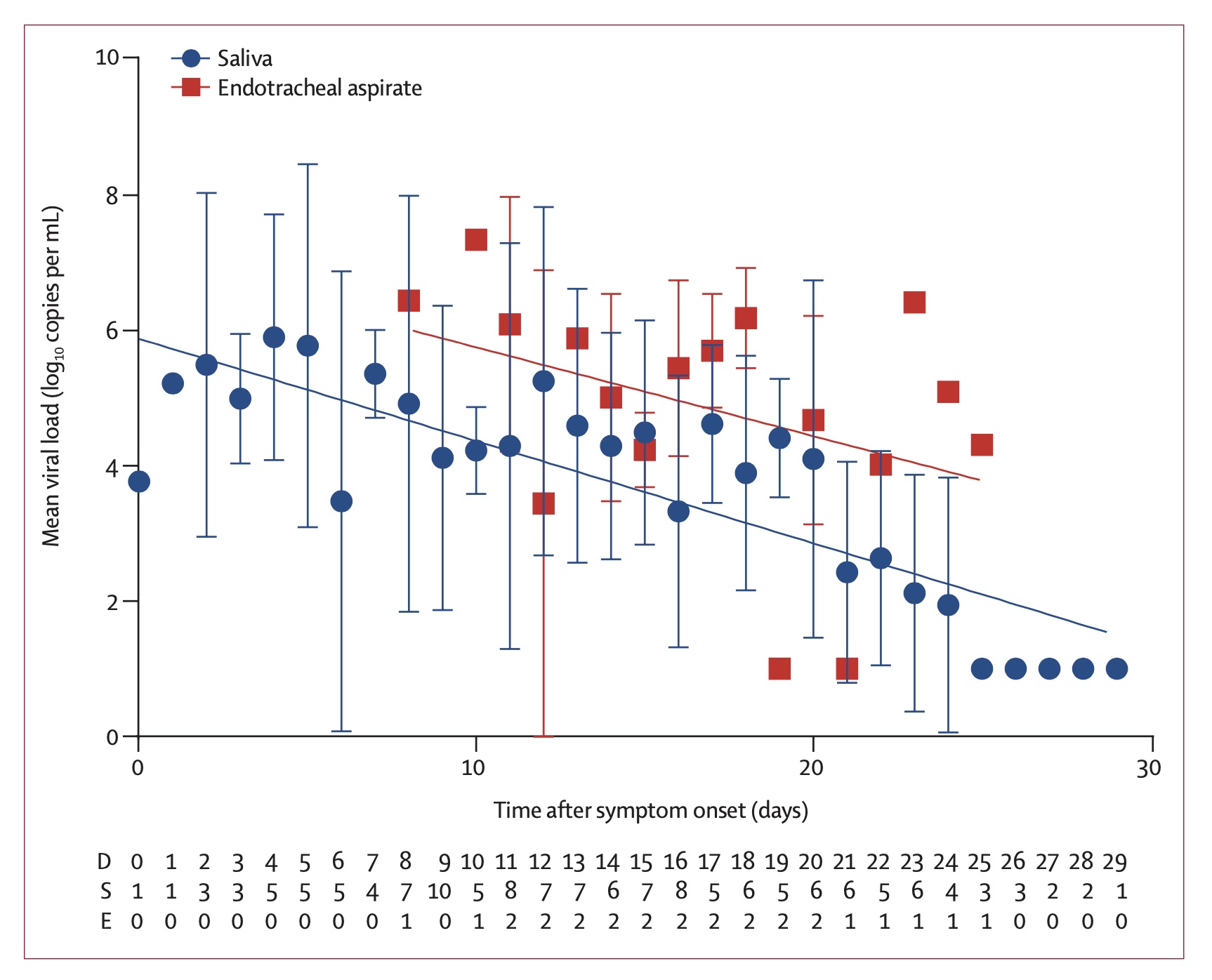
As a consistency check, this rate which describes the exponential decay of how the infected is contagious can be compared with the decay of the viral load measured in infected people To et al. 2020. It was found to be 0.15 ± 0.02 decades per day, which corresponds to a rate of 0.345 ± 0.046 e-folds per day. Note however that the fit here is to a simple exponential decay. If we wish to compare the above fit to the viral load decay, namely, fit an exponential decay to the Γ distribution (say between day 7 and 24, the range over which the viral load decay was measured and fitted), we find an offset of about 0.11. That is, the Γ distribution appears like an exponential with a rate of 0.36 ± 0.12 day$^{-1}$ over this period. It is therefore consistent with the decay of the viral load.
Fraction of asymptomatic infections
Another characteristic of the coronavirus infection which is crucial for the modeling of the pandemic growth is the fraction of asymptomatic infections, as these are individuals which can spread the infection without realizing that they are doing so.
The Royal Princess quarantined in Japan offers the possibility of analyzing a relatively complete sample for the appearance of symptoms in infected individuals. Although it requires some modeling (to model those infected who would develop symptoms after taken off board given the incubation period), the value that they found was 17.5% (95% confidence of 15.5–20.2%, Mizumoto et al. 2020). Although relatively complete and with a small uncertainty, the problem here is that the age distribution of the infected people is highly top weighted. It is not unreasonable that younger populations (of which fewer become critically ill) are also more likely to be asymptomatic. Namely, this number could be suffering from a large systematic bias.
Another less biased estimate is based on the Japanese citizens evacuated from Wuhan gives a fraction of 41.6% (95% Confidence interval 16.7-66.7%, Nishiura et al 2020). This estimate has however a relatively large uncertainty.
Although not officially published, it has recently been circulating that the Chinese authorities estimate that one quarter don't develop symptoms. According to the head of the CDC, Dr. Robert Redfield, this number has been "pretty much confirmed" (e.g., see quote on NPR).
In what follows, we take the the fraction of asymptomatic coronavirus infections is f = 0.3 ± 0.1.
Additional posts in the series include
- Background data (this page)
- Simple Modeling
- Effects of a population with a variable infection rate
- Modeling with at time variable infection rate
- Numerical Model (coming soon!)
- Discussion and Conclusions (coming soon!)
References
- Cereda, D., Tirani, M., Rovida, F., et al. 2020, The early phase of the COVID-19 outbreak in Lombardy, Italy. https://arxiv.org/abs/2003.09320
- Lauer, S. A., Grantz, K. H., Bi, Q., et al. 2020, Annals of Internal Medicine, doi:10.1056/NEJMoa2001316
- Li, Q., Guan, X., Wu, P., et al. 2020, New England Journalof Medicine, 382, 1199, doi: 10.1056/NEJMoa2001316
- Mizumoto, K., Kagaya, K., Zarebski, A., & Chowell, G.2020, Eurosurveillance, 25, doi: 10.2807/1560-7917.es.2020.25.10.2000180
- Nishiura, H., Linton, N. M., & Akhmetzhanov, A. R.2020a, International Journal of Infectious Diseases, 93,284, doi: 10.1016/j.ijid.2020.02.060
- Nishiura, H., Kobayashi, T., Miyama, T., et al. 2020b, doi: 10.1101/2020.02.03.20020248
- To, K. K.-W., Tsang, O. T.-Y., Leung, W.-S., et al. 2020, The Lancet Infectious Diseases, doi: 10.1016/s1473-3099(20)30196-1
How Climate Change Pseudoscience Became Publicly Accepted 24 Sep 2019 12:07 PM (6 years ago)
The I recently wrote an OpEd for the Epoch Times which tries to succinctly capture my main grievances with the global warming scare. Here is brought again with a few comments (and references) added at its end.
––––––––––
The climate week that is being held in New York City has urged significant action to fight global warming. Given the high costs of the suggested solutions, could it be that the suggested cure is worse than the disease?
As a liberal who grew up in a solar house, I have always been energy conscious and inclined towards activist solutions to environmental issues. I was therefore extremely surprised when my research as an astrophysicist led me to the conclusion that climate change is more complicated than we are led to believe. The disease is much more benign; and a simple palliative solution lies in front of our eyes.
To begin with, the story we hear in the media, that most of the 20th century warming is anthropogenic, that the climate is very sensitive to changes in CO2, and that future warming will therefore be large and will happen very soon, is simply not supported by any direct evidence, only a shaky line of circular reasoning. We “know” that humans must have caused some warming, we see warming, we don’t know of anything else that could have caused the warming, so it adds up.
However, there is no calculation based on first principles that leads to a large warming by CO2, none. Mind you, the IPCC (Intergovernmental Panel on Climate Change) reports state that doubling CO2 will increase the temperatures by anywhere from 1.5 to 4.5°C, a huge range of uncertainty that dates back to the Charney committee from 1979.
In fact, there is no evidence on any time scale showing that CO2 variations or other changes to the energy budget cause large temperature variations. There is however evidence to the contrary. 10-fold variations in the CO2 over the past half billion years have no correlation whatsoever with temperature; likewise, the climate response to large volcanic eruptions such as Krakatoa.
Both examples lead to the inescapable upper limit of 1.5°C per CO2 doubling—much more modest than the sensitive IPCC climate models predict. However, the large sensitivity of the latter is required in order to explain 20th century warming, or so it is erroneously thought.
In 2008 I showed, using various data sets that span as much as a century, that the amount of heat going into the oceans in sync with the 11-year solar cycle is an order of magnitude larger than the relatively small effect expected from just changes in the total solar output. Namely, solar activity variations translate into large changes in the so called radiative forcing on the climate.
Since solar activity significantly increased over the 20th century, a significant fraction of the warming should be then attributed to the sun, and because the overall change in the radiative forcing due to CO2 and solar activity is much larger, climate sensitivity should be on the low side (about 1 to 1.5°C per CO2 doubling).
In the decade following the publication of the above, not only was the paper uncontested, more data, this time from satellites, confirmed the large variations associated with solar activity. In light of this hard data, it should be evident by now that a large part of the warming is not human, and that future warming from any given emission scenario will be much smaller.
Alas, because the climate community developed a blind spot to any evidence that should raise a red flag, such as the aforementioned examples or the much smaller tropospheric warming over the past two decades than models predicted, the rest of the public sees a very distorted view of climate change — a shaky scientific picture that is full of inconsistencies became one of certain calamity.
With this public mindset, phenomena such as that of child activist Greta Thunberg are no surprise. Most bothersome however is that this mindset has compromised the ability to convey the science to the public.
One example from the past month is an interview I gave Forbes. A few hours after the article was posted online, it was removed by the editors “for failing to meet our editorial standards”. The fact that it has become politically incorrect to have any scientific discussion has led the public to accept the pseudo-argumentation supporting the catastrophic scenarios.
Evidence for warming doesn’t tell us what caused the warming, and any time someone has to appeal to the so called 97 percent consensus he or she is doing so because his or her scientific arguments are not strong enough. Science is not a democracy.
Whether or not the Western world will overcome this ongoing hysteria in the near future, it is clear that on a time scale of a decade or two it would be a thing of the past. Not only will there be growing inconsistencies between model and data, a much stronger force will change the rules of the game.
Once China realizes it cannot rely on coal anymore it will start investing heavily in nuclear power to supply its remarkably increasing energy needs, at which point the West will not fall behind. We will then have cheap and clean energy producing carbon neutral fuel, and even cheap fertilizers that will make the recently troubling slash and burn agriculture redundant.
The West would then realize that global warming never was and never will be a serious problem. In the meantime, the extra CO2 in the atmosphere would even increase agriculture yields, as it has been found to do in arid regions in particular. It is plant food after all.
Comments and links:
- More about the problems with the standard picture in my summary for a debate held at the Cambridge Union.
- Specifically, more about climate sensitivity on this blog, as well as comments on the IPCC range of sensitivity.
- On Forbes removing an interview with me.
- More on the 2008 paper on how the oceans can be used to quantify the solar forcing and prove that it is large, as well as a recent discussion on its implications.
- This is an example presentation of the dual fluid reactor, a 4th generation concept of nuclear power plant producing cheap, clean and safe energy, which I learned about from Dr. Götz Ruprecht when I visted the Bundestag last year.
Critique of “Discrepancy in scientific authority and media visibility of climate change scientists and contrarians” 17 Aug 2019 1:21 PM (6 years ago)
A paper that recently received some media attention is the “Discrepancy in scientific authority and media visibility of climate change scientists and contrarians” by Alexander Michael Petersen, Emmanuel M. Vincent & Anthony LeRoy Westerling, Nature Communications, volume 10, Article number: 3502 (2019). Here is what I think of it.
The critique of this paper is going to be very short, because it has a MAJOR flaw that renders all the results totally meaningless (even as an anecdotal curiosity). The underlying problem with the whole analysis is the way that the lists were composed. Here is how they composed each list:
“Selection of contrarians (CCC). We compiled a list of 386 contrarians by merging three overlapping name lists obtained from three public sources. The first source is the list of former speakers at The Heartland Institute ICCC conference (http://climateconferences.heartland.org/speakers/) over the period 2008–present, providing a representative sample across time; the second source is the list of individuals profiled by the DeSmogblog project; and the third source is drawn from the list of lead authors of the most recent 2015 NIPCC report (the principal summary of CC denial argumentation produced in conjunction with The Heartland Institute, http://climatechangereconsidered.org/).”
“Selection of scientists (CCS). We ranked individuals’ publication profiles according to the net citations $C_i = \sum_{i \in p} c_p$ calculated by summing individual article citation totals ($c_p$) for only the individual articles (indexed by p) included within our WOS CC dataset. In this way, the CCS group is comprised of the 386 most-cited CC scientists, based solely on their CC research.”
As you can see, the selection criteria is completely different. While the list of alarmists, acryonymed CCS (climate change shouters, I think) is selected by the the citations, the list of anti-alarmists, acronymed CCC (Climate Change Comforters, I think ;-) was selected by those who already have more exposure to the media. Then they compare the groups, and what do you know, the group that was selected according to bibliometric impact has a higher bibliometric impact and those selected through public exposure, namely, because they were active in the media, have more public exposure. Duh! (https://www.youtube.com/watch?v=nE7J5zLaefs). This is one of the most obvious selection biases I have seen in my scientific life. It's not a compliment.
Because of this distorted selection, the top CCC is Marc Morano. He isn’t a scientist nor does he pretend to be one, so why do the authors of this “research” compare his null scientific citation record to media appearance ratio with that of scientists? I don’t see that they put Al Gore in the top of the CCS list! He too has a very poor bibliometric impact.
A correct methodology would have been to comprise similar length lists of the top CCC and CCS based on citations alone, and then compare. But I guess it was a little too hard. Let me quote Mark Twain who said that there are “Lies, damned lies, and statistics”. In this case, it is statistics based on highly biased data.
I said before and I’ll say it again. Alarmists should use scientific arguments to bolster their case. The more they use chaff arguments, the more it reflects badly on their ability to defend their scientific case, perhaps because they can’t (e.g., see this).
Solar Debunking Arguments are Defunct 11 Aug 2019 5:58 AM (6 years ago)
An article interviewing me was removed yesterday from forbes. Instead, they published an article by Meteorologist Prof. Marshall Shepherd that claims that the sun has no effect on climate. That article, however, falls to the same pitfalls that pointed out on my blog yesterday.
Specifically, why is Shepherd’s arguments faulty? Although I addressed them yesterday, here they are brought again more explicitly and with figures.
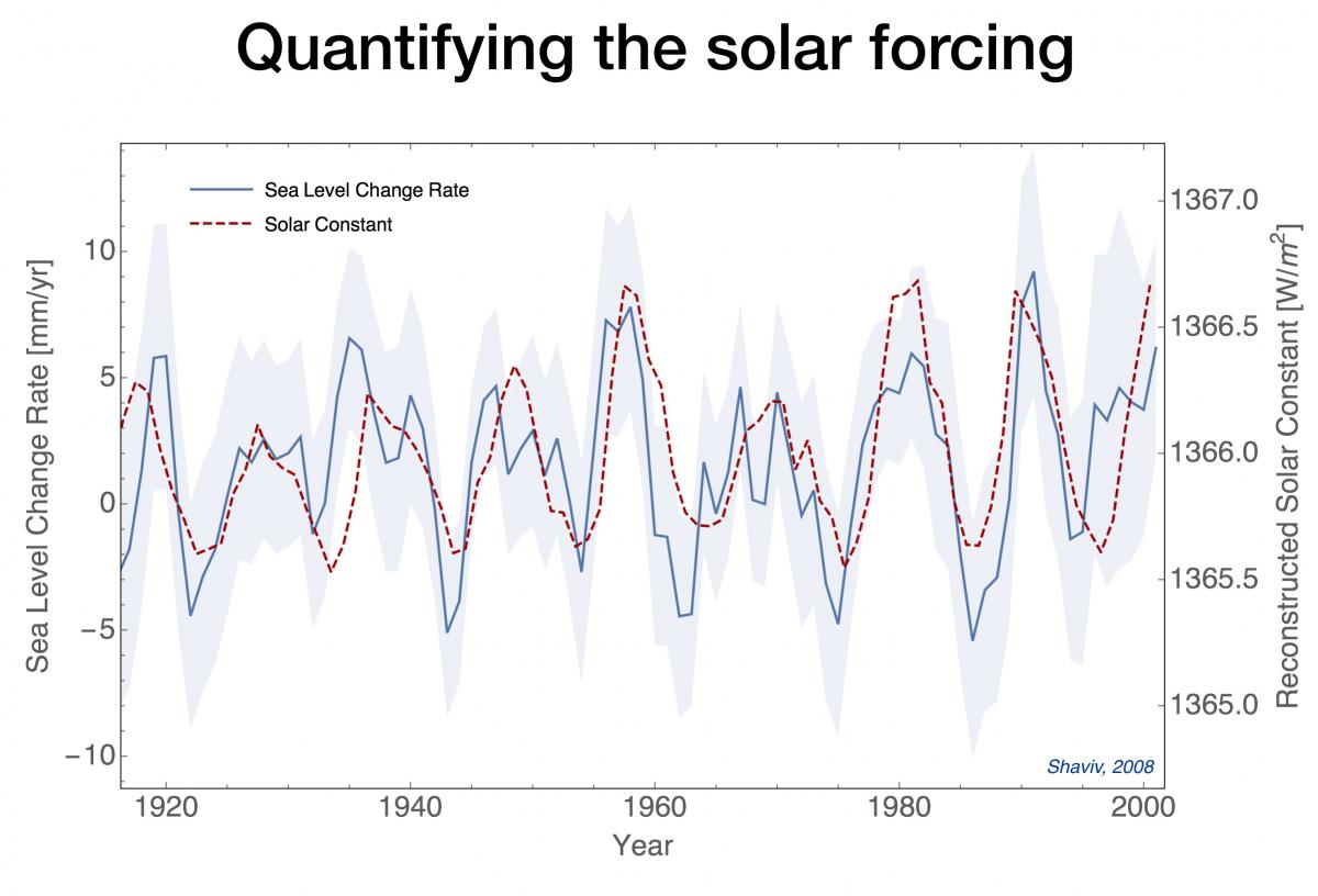
First, and foremost, Shepherd ignores the clear evidence that shows that the sun has a large effect on climate, and quantifies it. This graph is from the Shaviv 2008 (#1 in the reference below):
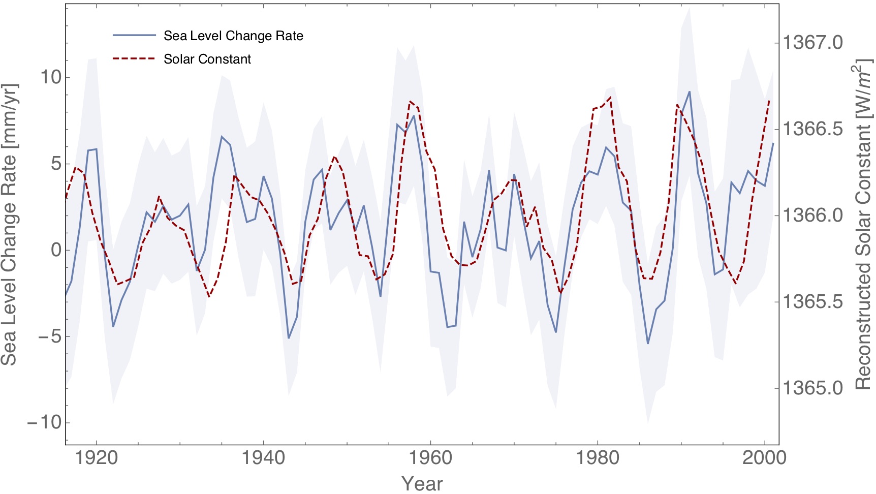
Figure 1: Reconstructed Solar constant (dashed red line) and sea level change rate based on Tide Gauge records as a function of time (solid blue line with 1 sigma error region in gray).
As you can see, there is a very clear correlation between solar activity and the rate of change of the sea level. On short time scales most of the sea level change is due to changes in the heat going into the oceans, such that we can quantify the solar radiative forcing this way. It is found to be an order of magnitude larger than changes in the irradiance, which is what the IPCC is claiming is to be the solar contribution.
After that work was published there was not a single paper that tried to refute it. Instead, additional satellite altimetry data covering two more solar cycles just revealed the same. In fact, the sun + el Niño Southern Oscillation can explain almost all the sea level variations minus the long term linear trend (caused by ice caps melting). This is from Howard et al. 2015 (see ref. #2 at the end):
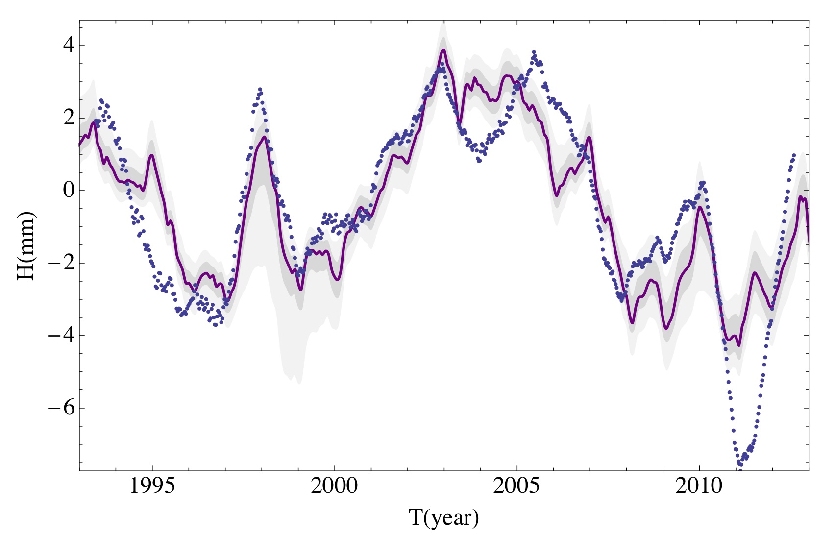
Figure 2: Satellite Altimetry based sea level (minus linear trend) in dashed blue points. Red is best fit model which includes solar cycle + el niño souther oscillation.
Clearly, the sun continues to have a clear effect on the climate. Note that it is impossible to explain the large variations through a feedback in the system because that would give the wrong phase in the heat content response.
What does that imply?
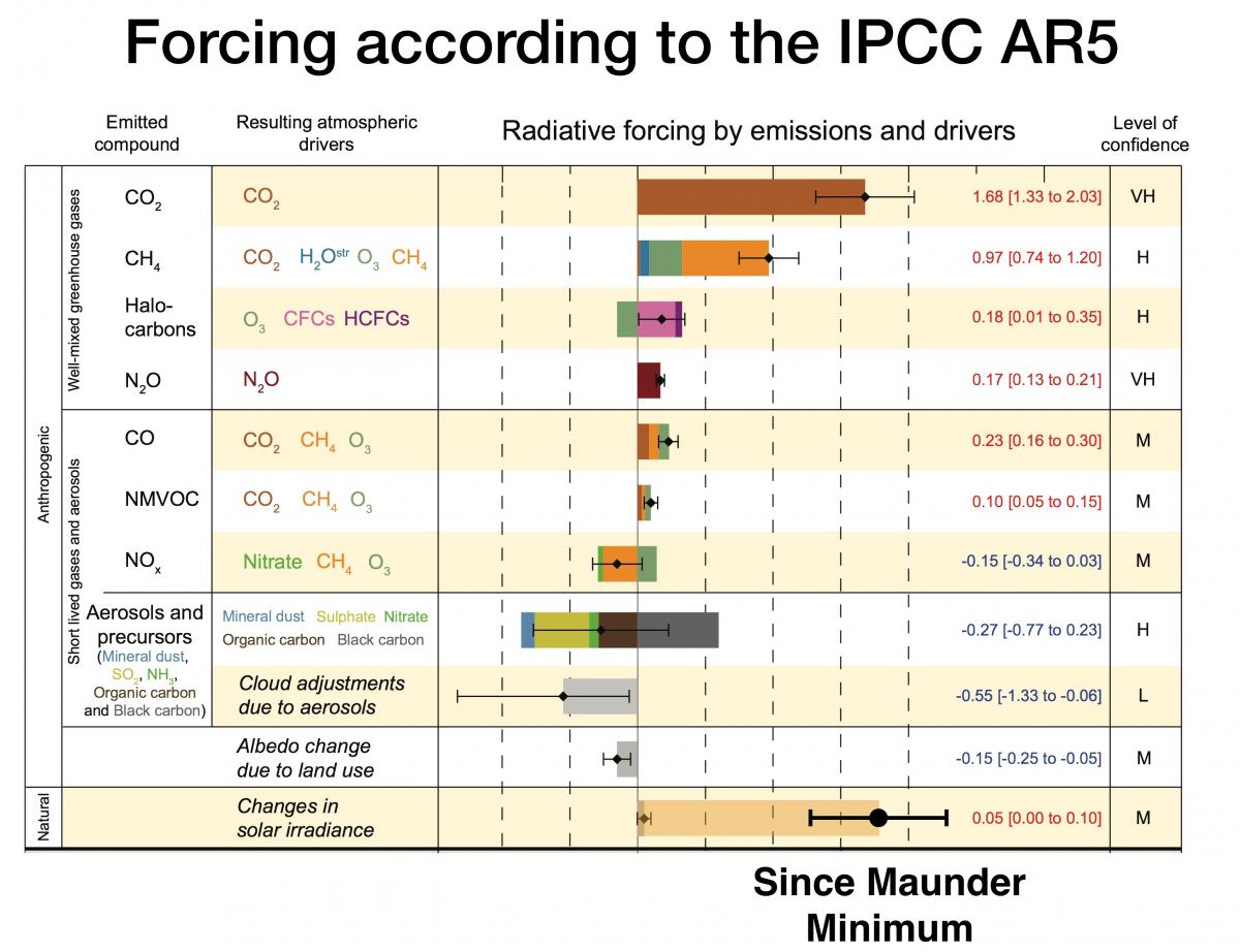
First, since solar activity increased over the 20th century, it should be taken into account. Shepherd’s radiative forcing graph should be modified to be:
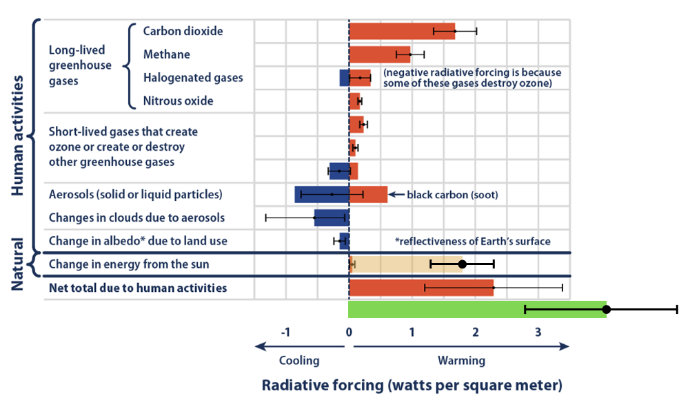
Figure 3: Radiative forcing contributions (graph from Shepherd's article) with the following added. The beige is the real solar contribution over the 20th century. The green is the total forcing (natural + anthropogenic) we get once we include the real solar effect.
The next point to note is that Shepherd claimed that because solar activity stopped increasing from the 1990’s it cannot explain any further warming. This is plain wrong. Consider this example in false logic. The sun cannot be warming us because between noon and 2pm (or so), solar flux decreases while the temperature increases. As a Professor of meteorology, Prof. Shepherd should know about the heat capacity of the oceans such that assuming that the global temperature is something times the CO2 forcing plus something else times the solar forcing is too much of a simplification.
Instead, one can and should simulate the 20th century, and beyond, and see that when taking the sun into account, it explains about 1/2 to 2/3s of the 20th century warming, and that the best climate sensitivity is around 1 to 1.5°C per CO2 doubling (compared with the 1.5 to 4.5°C of the IPCC). Two points to note here. First, although the best estimate of the solar radiative forcing is a bit less than the combined anthropogenic forcing, because it is spread more evenly over the 20th century, its contribution is larger than the anthropogenic contribution the bulk of which took place more recently. That's why the best fit gives that the solar contribution is 1/2 to 2/3s of the warming. Second, the reason that the best fit requires a smaller climate sensitivity is because the total net radiative forcing is about twice larger. This implies that a smaller sensitivity is required to fit the same observed temperature increase.
Here is my best fit to the 20th century. Solid line is model and dashed is the observed global temperate (See Ziskin & Shaviv, ref. #3 below).
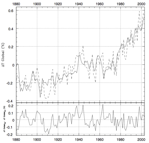
Figure 4: Best fit for a model which allows for a larger solar forcing and a smaller climate sensitivity than the IPCC is willing to admit is there. Top: Model = solid line, NCDC Observations = dashed line). The bottom is the different between the two.
As you can see, the residual of the fit is typically 0.1°C, which is twice smaller than typical fits by CMIP 5 models.
Once we fit the 20th century, we can integrate forward in time. Here I plot the expected warming for many realizations assuming a vanilla flavored emission scenario:
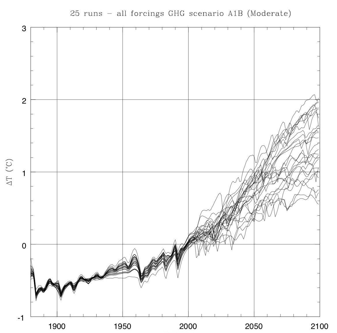
Figure 5: Using best fit models for the 20th century, we can integrate forward in time while making random realizations for volcanoes, solar activity etc.
The actual temperature increase witnessed is totally consistent with the observations. It is much smaller than the CMIP 5 models which the IPCC is using. See image capture from Roy Spencer’s ICCC13 talk:
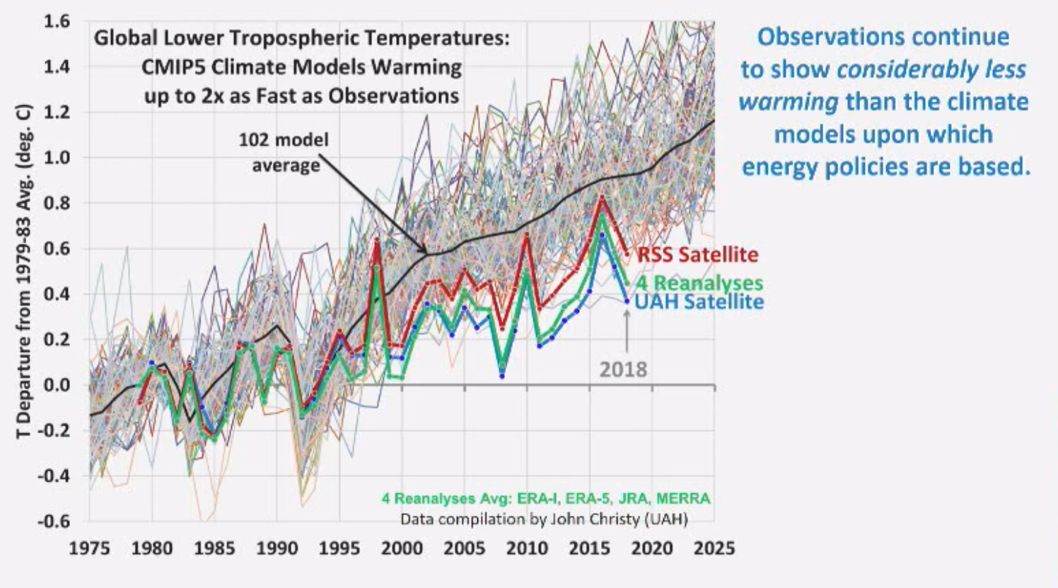
Figure 6: CMIP5 models vs. actual temperature change based on satellite (RSS/UAH) or reanalyses datasets.
And average warming slopes, together with my predictions:
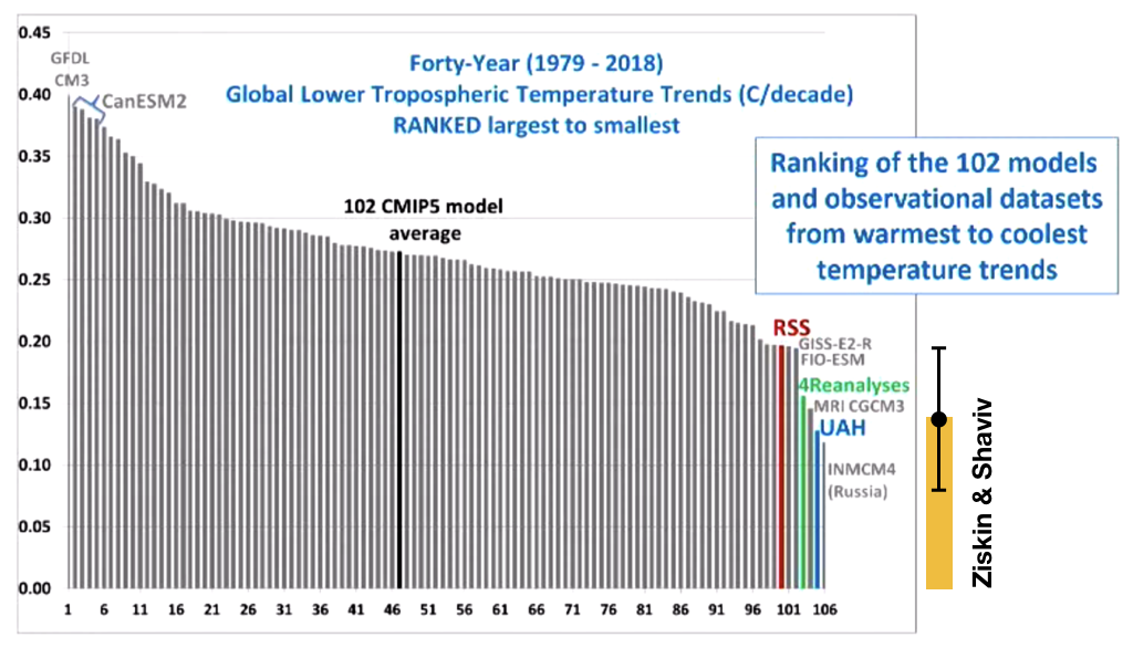
Figure 7: Warming trends in CMIP5 models vs. actual warming trends based on satellite (RSS/UAH) or reanalyses datasets. The orange bar is our predicted warming trend. Error is from the range of realizations.
Namely, our predictions are totally consistent with the satellite (RSS / UAH, whichever you prefer) and the Reanalyses datasets. Remember, this was obtained for a model which included the real solar contribution which requires a small climate sensitivity.
Shepherd also mentions that the link through cosmic ray flux variations has been debunked. I point the reader to a summary of why those attacks don’t hold any water, which I wrote yesterday.
To summarize, Shepherd did not debunk the solar forcing. His arguments are defunct. Unless he comes up with a very good explanation to the first graph above, he should instead advocate taking solar forcing into account. The fact that forbes hushes up any possibility for having a scientific debate should be considered truly bothersome by anyone who values free speech and scientific debate. Truth will prevail irrespectively.
References:
- Shaviv, N. J. Using the oceans as a calorimeter to quantify the solar radiative forcing. J. Geophys. Res. (Space Phys.) 113, 11101 (2008) local version (not paywalled)
- Howard, D., Shaviv, N. J., Svensmark, H., The solar and Southern Oscillation components in the satellite altimetry data, J. Geophys. Res. Space Physics, 120, 3297–3306 (2015)
- Ziskin, S., Shaviv, N. J., Quantifying the role of solar radiative forcing over the 20th century, Advances in Space Research 50, 762–776, (2012). local version (not paywalled)
Forbes censored an interview with me 10 Aug 2019 8:13 AM (6 years ago)
A few days ago I was interviewed by Doron Levin, for an article to appear online on forbes.com. After having seen a draft (to make sure that I am quoted correctly), I told him good luck with getting it published, as I doubted it will. Why? Because a year ago I was interviewed by a reporter working for Bloomberg, while the cities of San Francisco and Oakland were deliberating a climate change lawsuit against Exxon-Mobil (which the latter won!), only to find out that their editorial board decided that it is inappropriate to publish an interview with a heretic like me. Doron’s reply was to assure me that Forbes’ current model of the publication online allows relative freedom with “relatively little interference from editors”. Yeah Sure.
After the article went online yesterday and Doron e-mailed so, I saw how much relative exposure it received. It had already more than 40000 impressions in a matter of a couple of hours. Impressive. All that took place while I was relaxing with my family on a Tel-Aviv beach. But this didn’t last long. Although I continued to relax at the beach, the article was taken down for “failing to meet our editorial standards”, which apparently means conforming to whatever is considered politically correct about climate change.
The piece itself is (or was, or will be?) found here. A copy was posted here.
In any case, the main goal of this post is to provide the scientific backing for the main points I raised in the interview. Here it comes.
First and foremost, I claim that the sun has a large effect on climate and that the IPCC is ignoring this effect. This I showed when I studied the heat going into the oceans using 3 independent datasets - ocean heat content, sea surface temperature, and most impressively, tide gauge records (see reference #1 below), and found the same thing in a subsequent study based on another data set, that of satellite altimetry (see reference #2 below). Note that both are refereed publications in the journal of geophysical research, which is the bread and butter journal of geophysics. So no one can claim it was published in obscure journals, yet, even though the first paper has been published already in 2008, it has been totally ignored by the climate community. In fact, there is no paper (right or wrong) that tried to invalidate it. Clearly then, the community has to take it into consideration. Moreover, when one considers that the sun has a large effect on climate, the 20th century warming is much better explained (with a much smaller residual). See reference #3 below, again refereed).
I should add that there are a few claims that the sun cannot affect the climate because of various reasons, none holds water. Here is why:
- The first claims is that “the sun cannot have a large effect on climate because changes in the irradiance are too small to do so, and we don’t know of a mechanism that can”. This is irrelevant because given that the oceans prove that the sun has a large effect on climate, we must consider it even if we don’t know how it comes about. Often in science we are forced to accept a theory we don’t fully understand because the empirical evidence suggests so. Mendelian genetics explained reality pretty well (though we now know it is a bit more complicated) a century before Watson and Crick showed what the underlying mechanism is. Does it mean that we should have discarded Mendelian genetics for a century without knowing the mechanism? Pauli postulated the existence of the neutrino a quarter of a century before it was actually detected. Similarly, almost all cosmologists and particle physicists assume that dark matter exists, because an overwhelming amount of evidence suggests so, and because alternatives simply don’t work (mainly MOND, e.g., as a post-doc and I have shown in a paper as well as many others). However, we don’t really know what dark matter really is (there are many suggestions), but its existance has to be considered. Having said that, we actually do see very clear empirical evidence pointing to the link, as I describe below.
- The second claim is that “solar activity decreased from the 1990’s but the temperature continued to increase. So the sun cannot be the reason for the heating”. It is wrong at several levels. First, one has to realize that the temperature anomaly at a given time is not some fixed factor times the forcing at the time. This is because the system has a finite heat capacity and various interesting feedbacks. Without properly modeling it, erroneous conclusions can be reached. A simple example is ruling out the solar flux as the major source of heat because between noon time and say 2pm, the solar flux is decreasing but the temperature is increasing! (Similarly, the average solar flux is decreasing during the month of July in the northern hemisphere, but the temperature is increasing). Solar activity has been high over the latter half of the 20th century such that even after solar activity started to decreases, the temperature should continue increasing for a decade or so, albeit at a lower pace. Second, the above argument is extremely simplistic. Proper modeling has to consider that human have contributed as well to the net positive forcing. And indeed, when one considers both the large effect that the sun has, and the anthropogenic forcing, one can explain 20th century climate change if climate sensitivity is on the low side, much better than the IPCC models that exclude the large effect that the sun has, but assume a large climate sensitivity instead. See reference #3 below, as well as Roy Spencer’s short talk showing that climate models generally give a much larger temperature increase than has been observed over the past 2 decades.
- The third claim is that when 20th temperature changes are compared with solar activity and anthropogenic forcing, one doesn’t see the 11 year solar cycle in the temperature data, which can be used to place an upper limit on the solar effect. This faulty argument is related to the previous one. It too assumes that the temperature should be proportional to the radiative forcing at any instant, and because the temperature variations over the 11 year solar cycle are only of order 0.1°C, the contribution to 20th century warming should be similar since the secular increase in the solar forcing is comparable to the variations over the 11 year solar cycle. However, the large heat capacity of the oceans damps any temperature variations on short time scales. Proper modeling reveals that an 0.1°C variation over the solar cycle should actually correspond to a variation much larger on the centennial time scale, in fact, about half to two thirds of the warming (see reference #3 below and my comments about the BEST analysis from Berkeley who “proved” that the sun cannot have a large climate effect based on the above argument).
[Edit: See my more detailed rebuttal of the attack on solar forcing that appeared a day later on Forbes]
As I said above, we now know from significant empirical data where the solar climate link comes from. It is through solar wind modulation of the galactic cosmic ray flux which governs the amount of atmospheric ionization, and which in turn affects the formation of cloud condensation nuclei and therefore cloud properties (e.g., lifetime and reflectivity). How do we know that?
- When the sun has gusts in the solar wind, it causes several day long reductions in the flux of cosmic rays reaching Earth, called Forbush decreases. We see as a response changes in the aerosols and in cloud properties, just as expected. See references 4 & 5 below.
- There are large cosmic ray flux variations over geological time scales that are not related to solar activity but instead to our location in the Milky Way and the changing galactic environment. You can reconstruct the cosmic ray flux using meteorites and find that the 7 ice-age epochs over the past 1 billion years all appeared when the cosmic ray flux was high (see references 6 & 7 below). On a bit shorter time scales, the vertical motion of the solar system clearly manifests itself as a 32 million year oscillations in the temperature (15 periods over the past half billion years! See reference 8 below). Namely, there are very clear indications that independent variations in the cosmic ray flux affect the climate.
- Cloud cover varies over the 11 year solar cycle (e.g., reference 9 below). This by itself is not proof that the link is through cosmic rays, since there are several things that change with the solar cycle. However, one particularly interesting aspect is that the cloud cover variation are asymmetrical between odd and even cycles, just as cosmic rays are, and unlike other solar related variables that are blind to the fact that the real cycle is 22 years (Polarity returns back to the same state after two switches, hence, 22 years. The asymmetry arises from the fact that cosmic rays are primarily positive particles, and the sun is rotating such that there is a clear helicity to the field configuration).
- There are several experimental results showing that ions increase the nucleation and formation of a few nm sized aerosols and increase the survival of those aerosols as they grow to become 50 nm sized cloud condensation nuclei. A few examples are given in references 10-13.
One should be aware that we are still missing the last piece of the puzzle, which is to take the various mechanisms, plug them into a global aerosol model and see that there is a sufficiently large variation in the cloud condensation nuclei. This takes time, but compared with the aforementioned examples of genetics, neutrinos or dark matter, it will definitely take us much less to provide this last piece, but in any case, the evidence should have forced the community to seriously consider it already.
Nonetheless, even with the above large body of empirical evidence, the link has been attacked left and right. A really small number has been valid and interesting, but not to the extent to invalidate the existence of a cosmic ray climate link, just to modify our understanding of it. The rest has been mostly bad science, as I exemplify below.
- One of the main critiques arises when people look for the cosmic ray climate link but find none. In all those cases were no effect is seen, the authors didn’t estimate the size of the effect they expected and compare it with the noise level in the data. For example, if one considers only a small patch of the atmosphere above oceans, then the day to day fluctuations in the cloud cover are large compared with the Forbush decrease signal. Similarly, not seeing an effect over 10’s of thousands of years because of Earth’s magnetic field changes, is not surprising because switching off Earth’s magnetic field altogether is expected to give rise to a 1°C effect, which is notably smaller than the climate variations seen over these time scales (presumably because of the Milankovich cycles).
- The cosmic ray climate link over geological time scales was attacked by several papers. Only one raised a valid scientific point, which is that the original analysis of Jan Veizer and I didn’t consider the effect that the ocean pH (affected by atmospheric CO2) has on the Oxygen 18 data. When that was taken into account, we modified our best estimate for climate sensitivity to be 1 to 1.5°C per CO2 doubling. Other analyses are blatantly wrong, such as faulty statistical analysis or data handling (see summaries here and here), or even simple arithmetic mistakes! (see here).
- The last set of critiques are actually part of a healthy scientific discourse about the mechanism that is responsible for linking atmospheric ionization with cloud condensation nuclei. Papers like this discuss the possibility that ion induced nucleation could be the physical mechanism linking ionization changes with variations in the cloud condensation nuclei number density. However, even if we don’t fully understand the underlaying mechanism, ruling out a particular suggested mechanism doesn’t mean that other possibilities do not exist (in fact, they do, see ref #13 below). When Pauling and Corey suggested the triple helix model for DNA in 1953, they were off, but it wasn’t a reason to discard the whole idea of genetics.
References:
- Shaviv, N. J. Using the oceans as a calorimeter to quantify the solar radiative forcing. J. Geophys. Res. (Space Phys.) 113, 11101 (2008) local version (not paywalled)
- Howard, D., Shaviv, N. J., Svensmark, H., The solar and Southern Oscillation components in the satellite altimetry data, J. Geophys. Res. Space Physics, 120, 3297–3306 (2015)
- Ziskin, S., Shaviv, N. J., Quantifying the role of solar radiative forcing over the 20th century, Advances in Space Research 50, 762–776, (2012). local version (not paywalled)
- Svensmark, H., Bondo, T. & Svensmark, J. Cosmic ray decreases affect atmospheric aerosols and clouds. Geophys. Res. Lett. 36, 15101–1510 (2009)
- Svensmark, J., Enghoff, M. B., Shaviv, N. J. & Svensmark, H. The response of clouds and aerosols to cosmic ray decreases. J. Geophys. Res.: Space Phys. 121, 8152–8181 (2016).
- Shaviv, N. J. Cosmic ray diffusion from the galactic spiral arms, iron meteorites, and a possible climatic connection. Phys. Rev. Lett. 89, 051102–05110 (2002)
- Shaviv, N. J. The spiral structure of the Milky Way, cosmic rays, and ice age epochs on Earth. New Astron. 8, 39–77 (2003)
- Shaviv, N. J., Prokoph, A., Veizer, J., Is the Solar System's Galactic Motion Imprinted in the Phanerozoic Climate? Scientific Reports volume 4, Article number: 6150 (2014)
- Svensmark, H. & Friis-Christensen, E. Variation of cosmic ray flux and global cloud coverage—a missing link in solar-climate relationships. J. Atmos. Sol. -Terr. Phys. 59, 1225–1232 (1997).
- Svensmark, H., Pedersen, J. O. P., Marsh, N. D., Enghoff, M. B. & Uggerhøj, U. I. Experimental evidence for the role of ions in particle nucleation under atmospheric conditions. Proc. R. Soc. A 463, 385–396 (2007)
- Kirkby, J. et al. Role of sulphuric acid, ammonia and galactic cosmic rays in atmospheric aerosol nucleation. Nature 476, 429–433 (2011).
- Svensmark, H., Enghoff, M. B. & Pedersen, J. O. P. Response of cloud condensation nuclei (>50 nm) to changes in ion-nucleation. Phys. Lett. A 377, 2343–2347 (2013).
- Svensmark, H., Enghoff, M. B., Shaviv, N. J., Svensmark J., Increased ionization supports growth of aerosols into cloud condensation nuclei, Nature Communications 8, Article number: 2199 (2017)
22 minute talk summarizing my views on global warming 4 Aug 2019 12:46 PM (6 years ago)
My experience at the German Bundestag's Environment Committee in a pre-COP24 discussion 7 Dec 2018 5:17 AM (7 years ago)
Last week I had the opportunity to talk in front of the Environment committee of the German Bundestag. It was quite an interesting experience, and frankly, something I would have considered unlikely before receiving the invitation. It was in fact the first time a climate "skeptic" like myself appeared behind those doors in many years.
As I understand, the committee was used to inviting Prof. Schellnhuber, formerly the director of the Potsdam Institute for Climate Impact Research. However, as he recently retired, there were voices that the committee should freshen up and invite someone else, and the name that came up was that of Prof. Anders Levermann, also from the same PIK. That however triggered some of the parties to request other people as well, and the committee ended up inviting 6 specialists. Two were bona fide scientists (including myself and Levermann) while the four other were experts on other topics. My name popped up by the right wing AfD party who's climate agenda is consistent with my climate findings—that global warming is a highly exaggerated scare.
The earliest flight from Israel that day would have brought me to the Bundestag awfully close to the beginning of the discussion. So I flew in the day before. I landed in a freezing cold Berlin (-3°C) but sunny! Actually exhilarating weather I quite like.

The next day I showed up at the committee. I was interviewed by someone form a local news outlet that I was told has the tendency to distort the interviews with people like myself (if anyone knows about it, I'm curious, so leave a comment about it if you have seen it).
As I entered the committee room and sat down, Levermann past by and told me in hebrew, אתה יודע שאתה טועה (You know that you're wrong). Which of course caught me in a bit of surprise. It turns out that Levermann did his PhD with Prof. Itamar Procaccia at the Weizmann institute, a world expert in turbulence, nonlinear phenomena and statistical mechanics. Anyway, my German can be described as somewhere between nonexistent and really awful (I studied for a year when I was in high school in the US but forgot most), but enough to say, Ich glaube ich bin recht (I believe I am right).

The discussion started with each one of the experts allowed to talk for 3 minutes. It is actually quite a problem. People have been brain washed to think about global warming as mostly anthropogenic and almost unavoidably catastrophic. How do you prove to people that they are all wrong (or more precisely, that they were told highly exaggerated tales) in such a short time? To make things worse, I was told at the last minute that their TV is broken. Thus, the powerpoint slides I prepared were actually printed out and given to the committee members.
Given that, I had I think no choice but to concentrate on what I think is the biggest error you find in the IPCC, and which clearly overturns the standard polemic, and that is that the sun has a large effect on climate.
Here is what I prepared (what I said was pretty close but not all verbatim):
Three minutes is not a lot of time, so let me be brief. I’ll start with something that might shock you. There is no evidence that CO2 has a large effect on climate. The two arguments used by the IPCC to so called “prove” that humans are the main cause of global warming, and which implies that climate sensitivity is high, are that: a) 20th century warming is unprecedented, and b) there is nothing else to explain the warming.
These arguments are faulty. Why you ask?
We know from the climate-gate e-mails that the hockey stick was an example of shady science. The medieval warm period and little ice ages were in fact global and real. And, although the IPCC will not admit so, we know that the sun has a large effect on climate, and on the 20th century warming in particular.
In the first slide we see one of the most important graphs that the IPCC is simply ignoring. Published already in 2008, you can see a very clear correlation between sea level change rate from tide gauges, and solar activity. This proves beyond any doubt that the sun has a large effect on climate. But it is ignored.
To see what it implies, we should look at figure 2.
This is the contribution to the radiative forcing from different components, as summarized in the IPCC AR5. As you can see, it is claimed that the solar contribution is minute (tiny gray bar). In reality, we can use the oceans to quantify the solar forcing, and see that it was probably larger than the CO2 contribution (large light brown bar).
Any attempt to explain the 20th century warming should therefore include this large forcing. When doing so, one finds that the sun contributed more than half of the warming, and climate has to be relatively insensitive. How much? Only 1 to 1.5°C per CO2 doubling, as opposed to the IPCC range of 1.5 to 4.5. This implies that without doing anything special, future warming will be around another 1 degree over the 21st century, meeting the Copenhagen and Paris goals.
The fact that the temperature over the past 20 years has risen significantly less than IPCC models, should raise a red flag that something is wrong with the standard picture.
I should also add that science is not a democracy. The majority is not necessarily right! You should also be careful and make the distinction between evidence for warming and evidence for warming by humans. There is in fact no evidence for the latter. Last, people may frighten you with secondary climate effects associated with global warming, on the sea level, cryosphere, droughts floods or economic effects. However, if the underlying climate model is fundamentally wrong, all the ensuing predictions are irrelevant.
The fear of global warming, and with it the denouncement of any other voice, is now part of our Zeitgeist. However instead of blindly flowing with the flow, we should stop for a minute and think before we waste so much of our precious public resources. Maybe we will find out the that the emperor has new clothes.
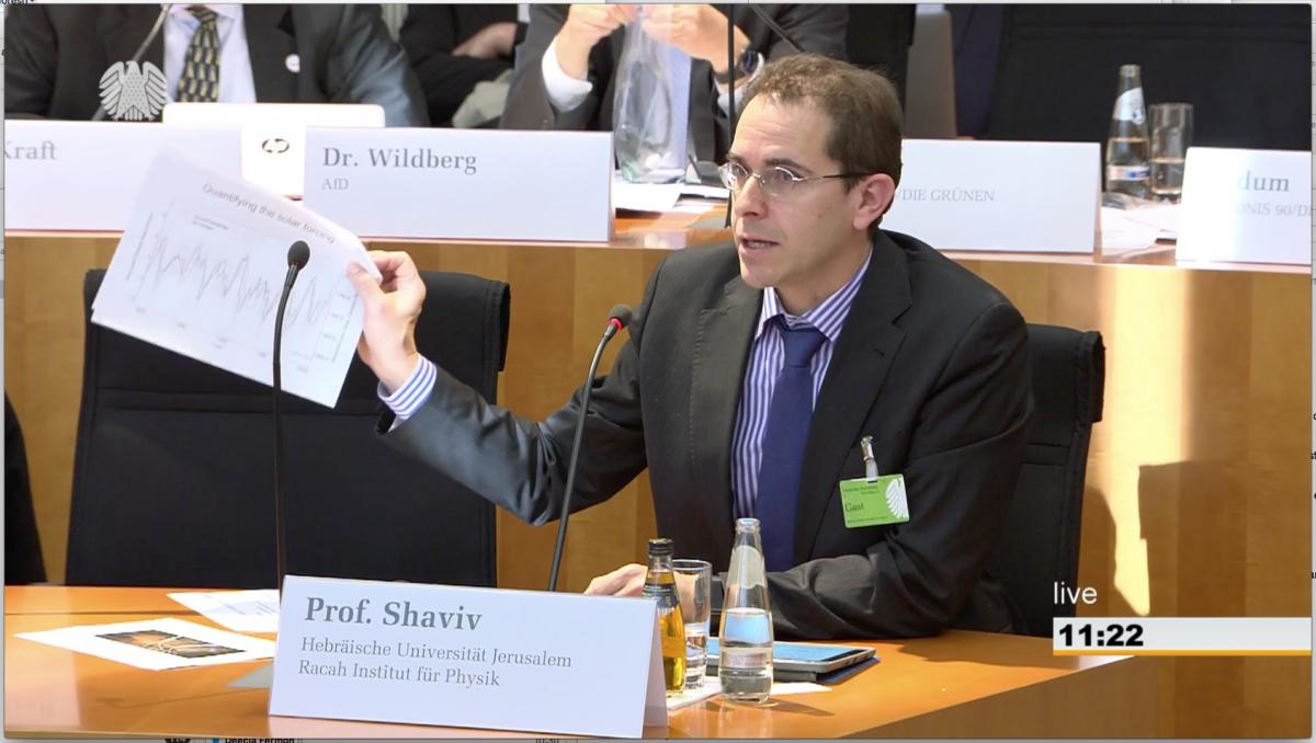
When invited, I was also told that I can submit a written statement, which is what I did. It is a few times longer and has a bit more information. You can find it on the Bundestag's website, with a German translation.
Then came the questions, which were mostly guiding questions - each party asked the expert close to its heart to basically continue saying whatever they wanted to hear. One of the questions I was asked was about the determination of the global temperature, but frankly I didn't understand it. I should add that I had to rely on simultaneous translatation (there were two translators brought in especially for me, I think), and the translated question I heard in English sounded like somethig a bit convoluted and hard to address.
Anyway, during the whole discussion I was directly criticized by Levermann and by Lorenz Beutin, MdB (Bundestag member from Die Linke - the "The Left").

The first such critique was prompted by a request to Levermann, to address why I was wrong in my speech. I should say that Levermann seems nice at the personal level. I have nothing against him, but I his response at this round was totally unscientific. He said that everything I said is rubbish (at least that was the English translation I heard), which of course is not a scientific argument.
The second round came from Beutin. He actually raised two interesting specific points which Levermann pickup on as well, which is great, because this is what science is all about. Argue about specific scientific facts and the conclusions that can be drawn from them.

So what were the points that were raised by Beutin and Levermann?
1) The average sea level change rate (in the solar / sea level change rate graph) is above zero, proving that there was long term sea level rise.
2) From about 1990, solar activity has decreased but the temperature increased. So the sun cannot cause the warming.
3) It is all just correlations (and therefore proving nothing).
Why are these arguments either irrelevant or wrong?

1) Indeed as Beutin noted, the average of the sea level rise is above zero. This is of course true. I should say that I am actually really happy that a politician takes notice of such a subtle point. Sea level has increased over the 20th century (because of warming, melting, and glacial rebound), but the sea level rise is not the signal I am looking at. It is an interesting consequence of the global warming. However, I am looking for the drivers of the warming, not the consequences at this point! And the fact that sea level is rising does not contradict the fact that you see the sun’s 11-year signature clearly, with which you can quantify the solar radiative forcing. Clearly then, this argument is irrelevant. The logical leap from a rising sea level to the fact that the sun is not a major climate driver is baseless.
2) Rising temperatures with falling solar activity from the 1990's. The argument here is of course that the negative correlation over this period tells us that the sun cannot be the major climate driver. This too is wrong.
First, even if the sun was the only climate driver (which I never said is the case), this anti-correlation would not have contradicted it. Following this simple logic, we could have ruled out that the sun is warming us during the day because between noon and say 2pm, when it is typically warmest, the amount of solar radiation decreases while the temperature increases. Similarly, one could rule out the sun as our source of warmth because maximum radiation is obtained in June while July and August are typically warmer. Over the period of a month or more, solar radiation decreases but the temperature increases! The reason behind this behavior is of course the finite heat capacity of the climate system. If you heat the system for a given duration, it takes time for the system to reach equilibrium. If the heating starts to decrease while the temperature is still below equilibrium, then the temperature will continue rising as the forcing starts to decrease. Interestingly, since the late 1990’s (specifically the 1997 el Niño) the temperature has been increasing at a rate much lower than predicted by the models appearing in the IPCC reports (the so called “global warming hiatus”).
Having said that, it is possible to actually model the climate system while including the heat capacity, namely diffusion of heat into and out of the oceans, and include the solar and anthropogenic forcings and find out that by introducing the the solar forcing, one can get a much better fit to the 20th century warming, in which the climate sensitivity is much smaller. (Typically 1°C per CO2 doubling compared with the IPCC's canonical range of 1.5 to 4.5°C per CO2 doubling).
You can read about it here: Ziskin, S. & Shaviv, N. J., Quantifying the role of solar radiative forcing over the 20th century, Advances in Space Research 50 (2012) 762–776
The low climate sensitivity one obtains this way is actually consistent with other empirical determinations, for example, the lack of any correlation between CO2 variations over the past half billion years and temperature variations. See in particular fig. 6 of a sensitivity analysis I published in 2005.
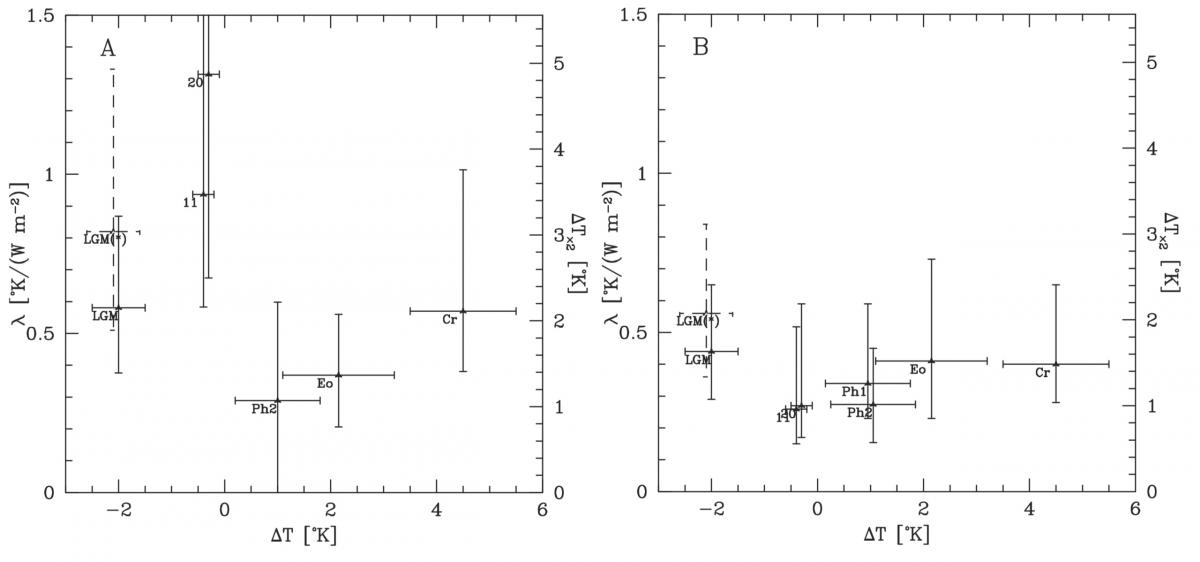
Fig. 6 from Shaviv (2005) in which I carried out a senisitivity analysis assuming that the sun has a large effect on climate through cosmic ray modulation (right) or that it doesn't (left). Each error bar is the 1σ sensitiviy range obtain from radiative forcing variations over different periods as a function of the average tempeature relative to today.
3) The third point raised is that the allegedly large solar climate link is just based on correlations. This is wrong as well.
To begin with, if the correlations where just spurious, then there would have been no reason for them to continue, but since the analysis that gave the above graph was published, a new one based on 2 more solar cycles worth of satellite altimetry was published as well. If the first correlation was a mere fluke, then there should be no reason for the correlation to continue, but they very clearly do. See Howard, D., Shaviv, N. J., & Svensmark, H. (2015). The Solar and Southern Oscillation Components in the Satellite Altimetry Data. Journal of Geophysical Research: Space Physics, 120, 3297-3306.
In fact, the sun + ENSO explain 71% of the variance in the linearly detrended sea level change. You could think that it doesn't get any better than that! But it does.
This correlation has the correct amplitude and phase that you would expect from (a) the low altitude cloud cover variations seen in sync with the solar cycle which were estimate to cause drive a 1W/m2 variation and with (b) the change in the sea surface temperature of 0.1°C over the solar cycle (e.g., see the above paper on climate sensitivity over different time scales where the cloud forcing and sea surface temperatures are discussed). You could again think that it doesn't get any better than that, but it does yet again! We have a mechanism to explain it all. It is through modulation of the cloud cover.
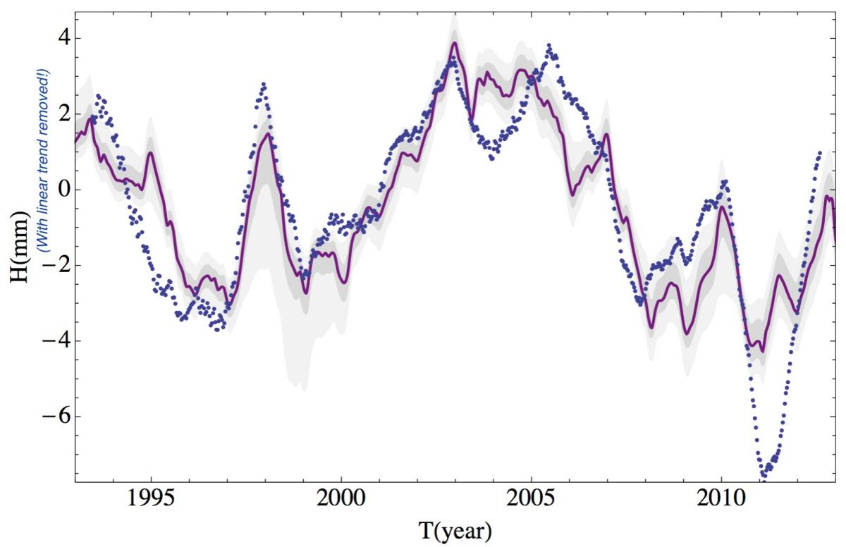
Linearly de-trended altimetry based Sea level (blue dots) and a fit which includes only the solar cycle and el Ñino (from Howard et al. 2015). One can clearly see that the solar cycle has a prominant contribution. It is in fact consistent in phase and in amplitude to the Shaviv (2008) result (local copy).
You can read more about the big picture in a summary I wrote a couple of years ago when on sabbatical at the Inistute for Advanced Studies in Princeton. So it isn't correlations. It is part of a wider consistent picture with endless empirical results and physical mechanisms to explain it.
To sum up, one cannot avoid the conclusion that the sun has a much larger effect on climate than the IPCC is willing to admit. It is not rubbish, or just correlations, nor is it inconsistent with observations on temperature or sea level.
After the committee, I was taken for a tour of the Bundestag by the nuclear physicist Dr. Götz Ruprecht, which of course includes the Reichstag building. Besides seeing interesting architecture, the most interesting thing was a discussion with Ruprecht on the Dual Fluid reactor concept that he and his colleagues are working on. It is a fast reactor that can use natural Uranium and Thorium, it can treat high-level waste (i.e., ensure there is no waste with a half life longer than a few centuries), it is inherently safe because it has such a strong negative temperature dependence of the reaction rates (as opposed for example to Graphite reactors like Chernobyl's) and because it includes passive heat based safety valves as well. Because of its high operating temperature, it can be used for additional things such as generation of hydrogen for clean fuel. And, electricity production should be less than 1 cent per kWhr (even cheaper than the typical 3 cents for present day nuclear, and compared with the 30 euro-cents per kWhr that one pays in Germany because of all the effective subsidies of ineffective alternative energy sources, or the 11 euro-cents per kWhr I pay in Israel, where there are much less of these subsidies). Of course, there is no chance that something like that will be developed in Europe with the current atmosphere in Europe and Germany in particular, where nuclear is phasing out (and soon coal... at least until the first catastrophic power outage that they will sure have). If you're a billionaire that wants to invest in a project that will lead the future energy production, contact me :-)

Another interesting thing that happened to me last week is that I lost my hearing in one ear (possibly from swimming a few days earlier, or the flights I had), and regained it after 5 days or so, quite a strange experience I'll write soon about. It included the very strange effect of diplacusis in which I heard a different pitch in each ear (up to a 1.5 semitone difference). I'll write about this strange experience in my next post.
Climate debate at the Cambridge Union - The Video 6 Jan 2018 8:22 AM (8 years ago)
I should add that the debate was a real eye opener. By living in Israel, I have had the luxury of experiencing a mostly diverse society, open to a wide range of scientific (and other) opinions. This has allowed me to carry out research without having to care about what other people think. It stands however in stark contrast to the body of Cambridge students I addressed. They are well intentioned but unfortunately completely brainwashed. They cite the 97% polemic about most scientists believing in anthropogenic global warming without stopping for a second to think about it, or the evidence that supposedly supports it. They want to think of themselves as liberals, but in fact, they have the most conservative mindset unable to even attempt objective thinking.
The only exception, which stood out as remarkable contrast to the rest, was the remark made by a historian named Josh from Christ college (at 1h 21m 21s).
Finally! The missing link between exploding stars, clouds and climate on Earth 19 Dec 2017 3:30 AM (8 years ago)
By Henrik Svensmark and Nir shaviv
Our new results published today in nature communications provide the last piece of a long studied puzzle. We finally found the actual physical mechanism linking between atmospheric ionization and the formation of cloud condensation nuclei. Thus, we now understand the complete physical picture linking solar activity and our galactic environment (which govern the flux of cosmic rays ionizing the atmosphere) to climate here on Earth though changes in the cloud characteristics. In short, as small aerosols grow to become cloud condensation nuclei, they grow faster under higher background ionization rates. Consequently, they have a higher chance of surviving the growth without being eaten by larger aerosols. This effect was calculated theoretically and measured in a specially designed experiment conducted at the Danish Space Research Institute at the Danish Technical University, together with our colleagues Martin Andreas Bødker Enghoff and Jacob Svensmark.
Background:
It has long been known that solar variations appear to have a large effect on climate. This was already suggested by William Herschel over 200 years ago. Over the past several decades, more empirical evidence have unequivocally demonstrated the existence of such a link, as exemplified in the examples in the box below.
The fact that the ocean sea level changes with solar activity (see Box 1 above) clearly demonstrates that there is a link between solar activity climate, but it can be used to quantify the solar climate link and show that it is very large. In fact, this “calorimetric” measurement of the solar radiative forcing is about 1 to 1.5 W/m2 over the solar cycle, compared with the 0.1-0.2 W/m2 change expected from just changes in the solar irradiance. This means that a mechanism amplifying solar activity should be operating—the sun has a much larger effect on climate than can be naively expected from just changes in the solar output.
Over the years, a couple of mechanisms were suggested to explain the large solar climate link. However, one particular mechanism has accumulated a significant amount of evidence in its support. The mechanism is that of solar wind modulation of the cosmic rays, which govern the amount of atmospheric ionization, and which in turn affect the formation of cloud condensation nuclei and therefore how much light do the clouds reflect back to space, as we now explain.
Cosmic Rays are high energy particles originating from supernova remnants. These particles diffuse through the Milky Way. When they reach the solar system they can diffuse into the inner parts (where Earth is) but lose some energy along the way as they interact with the solar wind. Here on Earth they are responsible for most of the ionization in the Troposphere (the lower 10-20 km of the atmosphere where most of the “weather” takes place). We now know that this ionization plays a role in the formation of cloud condensation nuclei (CCNs). The latter are small (typically 50nm or larger) aerosols upon which water vapor can condense when saturation (i.e., 100% humidity) is reached in the atmosphere. Since the properties of clouds, such as their lifetime and reflectivity, depends on the number of CCNs, changing the CCNs formation rate will impact Earth’s energy balance.
The full link is therefore as follows: A more active sun implies a lower CR flux reaching Earth and with it, lower ionization. This in turn implies that fewer cloud condensation nuclei are produced such that the clouds that later form live shorter lives and are less white, thereby allowing more solar radiation to pass through and warm our planet.

Figure 5: The link between solar activity and climate: A more active sun reduces the amount of cosmic rays coming from supernovae around us in the galaxy. The cosmic rays are the dominant source of atmospheric ionization. It turns out that these ions play an important role in (a) increasing the nucleation of small condensation nuclei (a few nm) and (b) increasing the growth rate of the condensation nuclei (which is the effect just published). The larger growth rates imply that they are less likely to stick to pre-existing aerosols and thus have a larger chance of reaching the sizes of cloud condensation nuclei (CCNs, typically > 50 nm in diameter). Thus, a more active sun decreases the formation of CCNs, making the clouds less white, reflecting less sunlight and therefore warming Earth.
Until today we had just empirical results which demonstrate that this link is indeed taking place. The main results are summarized in Box 2 below. In particular, we have seen correlations between solar activity and cloud cover variations, as well as between cosmic ray flux variations arising from changes in our galactic environment and long term climate change using geological data.
The first suggestion for an actual physical mechanism was that ions increase the nucleation of small (2-3 nm sized) aerosols called condensation nuclei (CNs). The idea is that small clusters of sulfuric acid and water (the main building blocks of small aerosols) are much more stable if they are charged. That is, the charge allows the aerosols to grow from a very small (few molecule) cluster to a small stable CN without breaking apart in the process. This effect was first seen in our lab (Svensmark 2006). The effect was seen again in the CLOUD experiment running at CERN (Kirkby 2011). Later experiments have shown that ions accelerate also other nucleation routes in which the small clusters are stabilized by a third molecule (such as Ammonia). That is, ions play a dominant role in accelerating almost all nucleation routes (as long as the total nucleation rate is lower than the ion formation rate).

Figure 7: The Ion induced nucleation effect measured in the lab. Left: The first demonstration in our SKY experiment showing that increased ionization increases the nucleation of small aerosols (typically 3 nm in size). Right: Corroboration of the results in the CLOUD experiment at CERN.
In the meantime, a number of research groups aimed at testing the idea that cosmic ray ionization could help the formation of cloud condensation nuclei (CCN). This was done by using large global circulation models coupled with aerosol physics. The idea was to see if an added number of small aerosols would grow into more CCNs. All of the numerical models gave the result that the small aerosols were lost before they could become large enough, leading to the conclusion that the effect of cosmic rays on the number of CCN over a solar cycle was insignificant (e.g., Pirece and Adams 2009). This could also be explained analytically (Smith et al. 2016). It was therefore proclaimed that the theory was dead.
Given the empirical evidence, it was clear to us that a link must be present, even if the ion induced nucleation mechanism itself is insufficient to explain the link. Thus, our response was to address the same question without using models but instead to test it experimentally. Therefore, in 2012 we tested if small nucleated aerosols could grow into CCN in our laboratory and discovered that without ions present, the response to increased nucleation was severely damped, just like the above-mentioned models; however with ions present, all the extra nucleated particles grew to CCN sizes, in contrast to the numerical model results (Svensmark et al. 2013). So, experiments contradicted the models. The logical conclusion was that some unknown ion-mechanism is operating, helping the growth.

Figure 8: Left: When injecting small aerosols, the relative increase decreases with aerosol size because as aerosols grow they tend to coagulate with larger aerosols. Right: However, when increasing the ionization in the chamber, not only are more aerosols nucleated, the relative increase survives to larger sizes implying that some mechanism is increasing the survivability of the aerosols as they grow.
Following the experimental results showing that increased ionization does indeed increase the number of large CCNs, the natural question to ask was whether these results were caused by the particular experimental conditions—perhaps this mechanism does not work in the real atmosphere. It is therefore fortunate that our Sun carries out natural experiments with the whole Earth.
On rare occasions, “explosions” on the Sun called coronal mass ejections result in a plasma cloud passing the Earth, with the effect that the cosmic rays flux decreases suddenly and remains low for about a week. Such events, with a significant reduction in the cosmic ray flux, are called Forbush decreases, and are ideal to test the link between cosmic rays and clouds. Finding the strongest Forbush decreases and using three independent cloud satellite datasets and one dataset for aerosols, we clearly found a response to Forbush decreases. These results validated the whole chain from solar activity, to cosmic rays, to aerosols (CCN), and finally to clouds, in Earth’s atmosphere (Svensmark et al 2009, Svensmark et al. 2016).

Figure 9: The average effect of the 5 strongest Forbush decreases in the 1987-2007 period on cloud properties. Plotted in red is the reduction in the cosmic ray flux following “gusts” in the solar wind (from Coronal Mass Ejections). In black we see the reduction in aerosols over the oceans and three different cloud parameters from three different datasets (Svensmark et al 2009). These results provide an in situ demonstration of the effect of cosmic rays on aerosols and cloud properties.
With the accumulating empirical and experimental evidence, it was clear that atmospheric ionization is playing a role in the generation of the aerosols needed for cloud formation, however, the exact mechanism proved to be elusive. For this reason, we decided to setup another laboratory experiment mimicking conditions found in the real atmosphere and study how atmospheric ions may be affecting the production of CCNs. This also led us to look for alternative mechanisms which will increase the survivability of the CNs as they growth. Indeed, after several years of research, one was found.
The discovery
A little more than 2 years ago, we made the realization that charge will play a role in accelerating the growth rate of small aerosols. When more ions are present in the atmosphere, more of them end up sitting on sulfuric acid clusters of a few molecules. Moreover, the charge makes the sulfuric acid clusters stick to the growing aerosols much faster, as we explain in the box below. Since faster growing aerosols have lower chances of coagulating with larger aerosols, more of the growing aerosols can then survive to reach larger sizes. In other words, when the ionization rate is higher, more CCNs can are formed.
After realizing that this effect should be taking place we did two things. First, we calculated how large it should be and found that for the typical conditions present in the pristine air above oceans, in which the typical sulfuric acid density is a few 106 molecules/cm3, the ions accelerate the growth by typically 1 to 4%. However, because the number of aerosols surviving the growth is exponentially small (typically several e-folds), the relative change in the CCN density is a few times larger still (by the number of e-folds in the exponential damping to be precise). Thus, over the solar cycle (which changes the tropospheric ionization by typically 20%), we expect a several percent variation in the CCN density and with it, the cloud properties, as is observed.
The second thing we did was go to the lab and design an experiment in which we can see this effect taking place (and also validate our theoretical calculations). This is not trivial because the effect is larger for lower sulfuric acid levels (as a larger percentage of the molecules would be charged). However we cannot measure at very low sulfuric acid levels because the aerosols then grow very slowly such that they stick to the chamber walls before their growth can be reliably measured. This forced us to measure at high sulfuric acid levels for which the effect is smaller. This posed a formidable technological challenge. To overcome this, we designed an experiment which can keep relatively stable conditions over long periods (up to several weeks at a time) during which we could automatically increase or decrease the ionization rate at the chamber. This allowed us to collect a large amount of data and get high quality signals (e.g., see fig. 11 in the box below).
We found that aerosols indeed grow faster when the ionization rate is higher, totally consistent with the theoretical predictions (as can be seen in fig. 12 in the box below). This allows them to survive the growth period without coagulating with larger aerosols.
So, what do the results imply? Until now we had significant amount of empirical evidence which demonstrated that cosmic rays affect climate, but we didn't have the actual underlying physical mechanism pinned down. Now we have. It means that we not only see the existence of a link, we now understand it. Thus, if the solar activity climate link was until now ignored under the pretext that it cannot be real, this will have to change. But perhaps more interestingly, it also explains how long term variations in our galactic environment end up affecting our climate over geological time scales.
Climate debate at the Cambridge Union - a 10 minute summary of the main problems with the standard alarmist polemic 2 Nov 2017 1:35 PM (8 years ago)
Last week I participated in an interesting debate that was held at the Cambridge Union, the oldest debating club in the world (dating back to 1815. The invite was to be on the side opposing the proposition “This house would rather cool the planet than warm the economy”.
Although I think the phrasing of the question is problematic to begin with, since it assumes that “warming the economy” necessary would cool the climate, I should applaud the Cambridge Union for supporting free speech and allowing people on both side to voice their arguments, especially given how many on the alarmist side refuse to do so, claiming that there is nothing to debate anymore.
I should also add that I was quite shocked to see how the audience was so one sided (though far less than the ridiculous 97:3 ratio we hear about!) and unwilling to listen to scientific arguments. I am actually quite lucky to be living in Israel where free speech and free thought are really more than lip service. Having honest debates in Israeli academia or in the media is actually the norm.
Below you will find the summary I wrote myself before the debate. Since it is rather concise I thought it would be a good idea to bring it here as well.
Have fun
— Nir
Let me begin by asking you a question. What is the evidence that people, like the proponents here, use to prove that we humans are responsible for global warming and that future warming will be catastrophic if we don’t get our act together?
The fact is that this idea is a misconception and the so called evidence we constantly hear is simply based on fallacious arguments.
To begin with, any one who appeals to authority or to a majority to substantiate his or her claim is proving nothing. Science is not a democracy and the fact that many believe one thing does not make them right. If people have good arguments to convince you, let them use the scientific arguments, not logical fallacies. Repeating it ad nauseam does not make it right!
Other irrelevant arguments may appear scientific, but they are not. Evidence for warming is not evidence for warming by humans. Seeing a poor polar bear floating on an iceberg does not mean that humans caused warming. (Actually, the bear population is now probably at its highest in modern times!). The same goes to receding glaciers. Sure, there was warming and glaciers are receding, but the logical leap that this warming is because of humans is simply an unsubstantiated claim, even more so when considering that you can find Roman remains under receded glaciers in the Alps or Viking graves in thawed permafrost in Greenland.
Other fallacious arguments include using qualitative arguments and the appeal to gut feelings. The fact that humanity is approaching 10 billion people does not prove that we caused a 0.8°C temperature increase. We could have just as much caused an 8°C increase or an 0.08°C. If all of humanity spits into the ocean, will sea level rise appreciably?
In fact, there is no single piece of evidence that proves that a given amount of CO2 increase should cause a large increase in temperature. You may say, “just a second, we saw Al Gore’s movie, in which he presented a clear correlation between CO2 and temperature from Antarctic ice cores”. Well, what he didn’t tell you is that one generally sees in the ice cores that CO2 lags the temperature by typically a few hundred years, not vice versa! The simple truth is that Al Gore simply showed us how the amount of CO2 dissolved as carbonic acid in the oceans changes with temperature. As a matter of fact, over geological time scales, there were huge variations in the CO2 (a factor of 10) and they have no correlation whatsoever with the temperature. 450 million years ago there was 10 times as much CO2 in the atmosphere but more extensive glaciations.
When you throw away the chaff of all the fallacious arguments and try to distill the climate science advocated by the IPCC and alike, you find that there are actually two arguments which appear as legitimate scientific arguments, but unfortunately don’t hold water. Actually, fortunately! The first is that the warming over the 20th century is unprecedented, and if so, it must be human. This is the whole point of the hockey so extensively featured in the third assessment report of the IPCC in 2001. However if you would google “climategate” you would find that this is a result of shady scientific analysis - the tree ring data showing that there was little temperature variation over the past millennium showed a decline after 1960, so, they cut it off and stitched thermometer data. The simple truth is that in the height of the middle ages it was probably just as warm as the latter half of the 20th century. You can even see it directly with temperature measurements in boreholes.

The second argument is that there is nothing else to explain the warming, and if there is nothing else it must be the only thing that can, which is the anthropogenic contribution. However, as I mention below, there is something as clear as daylight… and that is the sun.
Before explaining why the sun completely overturns the way we should see global warming and climate change in general. It is worth while to say a few words on climate sensitivity and why it is impossible to predict ab initio the anthropogenic contribution.
The most important question in climate science is climate sensitivity, by how much will the average global temperature increase if you say double the amount of CO2. Oddly enough, the range quoted by the IPCC, which is 1.5 to 4.5°C per CO2 doubling was set, are you ready for this, in a federal committee in 1979! (Google the Charney report). All the IPCC scientific reports from 1990 to 2013 state that the range is the same. The only exception is the penultimate report which stated it is 2 to 4.5. The reason they returned to the 1.5 to 4.5 range is because there was virtually no global warming since 2000 (the so called “hiatus”), which is embarrassingly inconsistent with a large climate sensitivity. What’s more embarrassing is that over almost 4 decades of research and billions of dollars (and pounds) invested in climate research we don’t know the answer to the most important question any better? This is simply amazing I think.
The body of evidence however clearly shows that the climate sensitivity is on the low side, about 1 to 1.5 degree increase per CO2 doubling. People in the climate community are scratching their heads trying to understand the so called hiatus in the warming. Where is the heat hiding? While in reality it simply points to a low sensitivity. The “missing” heat has actually escaped Earth already! If you look at the average global response to large volcanic eruptions, from Krakatoa to Pinatubo, you would see that the global temperature decreased by only about 0.1°C while the hypersensitive climate models give 0.3 to 0.5°C, not seen in reality. Over geological time scales, the lack of correlation between CO2 and temperature places a clear upper limit of a 1.5°C per CO2 doubling sensitivity. Last, once we take the solar contribution into account, a much more consistent picture for the 20th century climate changes arises, one in which the climate drivers (humans AND solar) are notably larger, and the sensitivity notably smaller.
So, how do we know that the sun has a large effect on climate? If you search on google images “oceans as a calorimeter”, you would find one of the most important graphs to the understanding of climate change which is simply ignored by the IPCC and alarmists. You can see that over more than 80 years of tide gauge records there is an extremely clear correlation between solar activity and sea level rise - active sun, the oceans rise. Inactive sun - the oceans fall. On short time scales it is predominantly heat going to the oceans and thermal expansion of the water. This can then be used to quantify the radiative forcing of the sun, and see that it is about 10 times larger than what the IPCC is willing to admit is there. They only take into account changes in the irradiance, while this (and other such data) unequivocally demonstrate that there is an amplifying mechanism linking solar activity and climate.
The details of this mechanism are extremely interesting. I can tell you that it is related to the ions in the atmosphere which are governed by solar activity and in fact, there are three microphysical mechanisms linking these ions to the nucleation and growth of cloud condensation nuclei. Basically, when the sun is more active, we have less clouds that are generally less white.
So, the main conclusion is that climate is not sensitive to changes in the radiative forcing.
This means that we are not required to “cool the economy” in order to cool earth. In Paris and Copenhagen the leaders of the world said that we should make sure that the total global warming will be less than 2°C. It will be less than 2°C even if we do nothing. There are several red flags that people do their best to ignore. The lack of warming in the past 2 decades is a clear sign that sensitivity is low, but people ignore it.
Last point. People say that we should at least curb the emissions as a precautionary step. However, resources are not infinite. Most people in developed nations can pay twice for their energy, but for third world nations? It would mean more expensive food, hunger and poverty, and many in the developed world actually freezing in winter. So in fact, taking unnecessary precautionary steps when we know they are unnecessary is immoral. It is even committing statistical murder.
Now the really last point, I am also optimist that humanity will switch to alternative energy sources in less than 2-3 decades just because they will become cheap enough, and just for the reason that people want to save money. Just like the price of computers has plummeted exponentially (Moore’s law— number of transistors doubles every 18 months) so does the cost of energy from photovoltaic cells (cost halves every 10 years). Once they will be really cost effective, without subsidies, suddenly we won’t be burning fossil fuels because it would be the expensive thing to do!
Let us use our limited resources to treat real problems.
Vacuum QED effects detected around Neutron Stars? 10 Dec 2016 1:43 AM (9 years ago)
Just over a week ago I received an interesting call from a reporter from science magazine. He asked me what do I think about the recent discovery of the Quantum Electrodynamic (QED) produced vacuum birefringence around neutron stars. It was an interesting surprise as my colleague Jeremey Heyl at the University of British Columbia and I had what seemed to be a bizarre prediction back in around 1998, a prediction which seems to have been verified almost 2 decades later. So, what is the effect and what was measured?
In 1936, Heisenberg, Euler and separately Weisskopf realized that light rays can interact with the virtual electrons in the vacuum if there is a very strong magnetic field. This interaction causes the electrons to oscillate and produce an electromagnetic wave such that the sum is an electromagnetic wave appearing to move slower than the speed of light. This is very similar to what happens with real electrons in everyday media (e.g., in your glasses where light moves slower than the speed of light), except that in everyday situations the interaction is not with the vacuum's virtual electrons.
As a consequence of this interaction, the index of refraction is different from unity. However, the cool thing is that the two indices of refraction of the two polarization states (in the direction perpendicular to the magnetic field and perpendicular to the latter) are different. This is because electrons oscillating in the direction of the magnetic field are not affected by it (well, almost), while electrons oscillation perpendicular to the magnetic field are. Thus, not only is the index of refraction different from unity, it is different for the two polarization models of the light, namely, depending on how the light ray's electric field is oriented with respect to the magnetic field. This effect is called birefringence (and it is wavelength independent for the vacuum birefringence).
In everyday life, birefringence can be seen in different polymeric materials in which the polymers have a preferred direction (e.g., by stretching cellophane). It can also be found in some natural crystals, the common of which is calcite.
To understand what happens, let us look at a light ray that has both polarization states. When the ray passes from vacuum (or similarly air) into the birefringent medium, the two modes are refracted differently and separated into the two polarization states this can be seen in the two images below. Figure 1 shows the different refraction of the two modes, while figure 2 shows how this then gives rise to having the "calcite" text seen twice.
Fig. 1: When a light ray passes from vacuum or air into a birefringent medium, the two polarization modes refract differently. Each one propagates in a different direction.

Fig. 2: Calcite is a natural example of birefringence. Because the two polarization states refract differently, the underlying "calcite" text is seen twice at different directions.
If the original state is linearly polarized in a direction intermediate between the two states, it will therefore be separated into the two polarizations defined by the principle axes of the birefringent medium. Thus, if you have two birefringent media touching each other, but oriented differently, then a light ray that passes from one medium will necessarily split into two rays as it passes into the second medium (since the original polarization in the 1st medium is in a direction different from the separate polarization states in the 2nd medium).
What happens however if there is a gradual change in the primary polarization directions between the two media? It turns out that if the change is sufficiently slow, then the polarization rotates together with the change in the primary axes. This "adiabatic" evolution takes place only if the modes are sufficiently distinct over the typical distance over which the direction of the principle polarization directions change. (In more technical terms, the difference in the polarization mode's wavevectors has to be larger than the inverse of the distance scale for changes in the direction).
For vacuum birefringence around neutron stars, adiabatic evolution means that each polarization state follows the direction of the magnetic field as it propagates away from the star. Moreover, since the birefringence is wavelength independent, but the wavevectors (and therefore their difference) is larger for higher frequencies, adiabatic evolution is more effective at higher frequencies for which the re-coupling of the modes takes place further away. This can be seen in the animation I created back in 1998(!), which required some digging in old hard-disks to be found. The animation was created for radio waves where plasma birefringence is important, i.e., interaction with real electrons. Here the effect is larger for longer wavelengths, as can be seen in the animation.
Fig. 3: As electromagnetic ways propagate away from the neutron star, adiabatic evolution arising from birefringence implies that the polarization directions follow the magnetic field. For radio waves, plasma birefringence implies that longer wavelength waves a coupled up to larger distances (as seen in the animation). For optical and shorter wavelengths, vacuum birefringence implies that the effect is opposite, shorter wave are coupled up to larger distances.
This adiabatic evolution has a very interesting effect. The local magnetic field at the surface of the neutron star has a different direction. Therefore, polarized light leaving the surface would be polarized in different directions. The total polarization measured by a distant observer would therefore mostly cancel out. However, the effect of the adiabatic evolution is to let the polarization states follow the direction of the magnetic field. If the recouping of the modes takes place far enough, then the rays coming from different locations of the surface would now add up as the polarization direction would now be very similar for the different light rays. This can be seen in fig. 4.
Fig. 4: The direction of the polarization at the surface will depend on the local magnetic field. If adiabatic evolution takes place, then once the rays recouple, the polarization directions will tend to align giving a much large net polarization. Here we have assumed that the light leaving the surface is 100% polarized at a frequency of about 10^17 Hz (and a dipole moment of 10^30 G cm^3). From ref. 2.
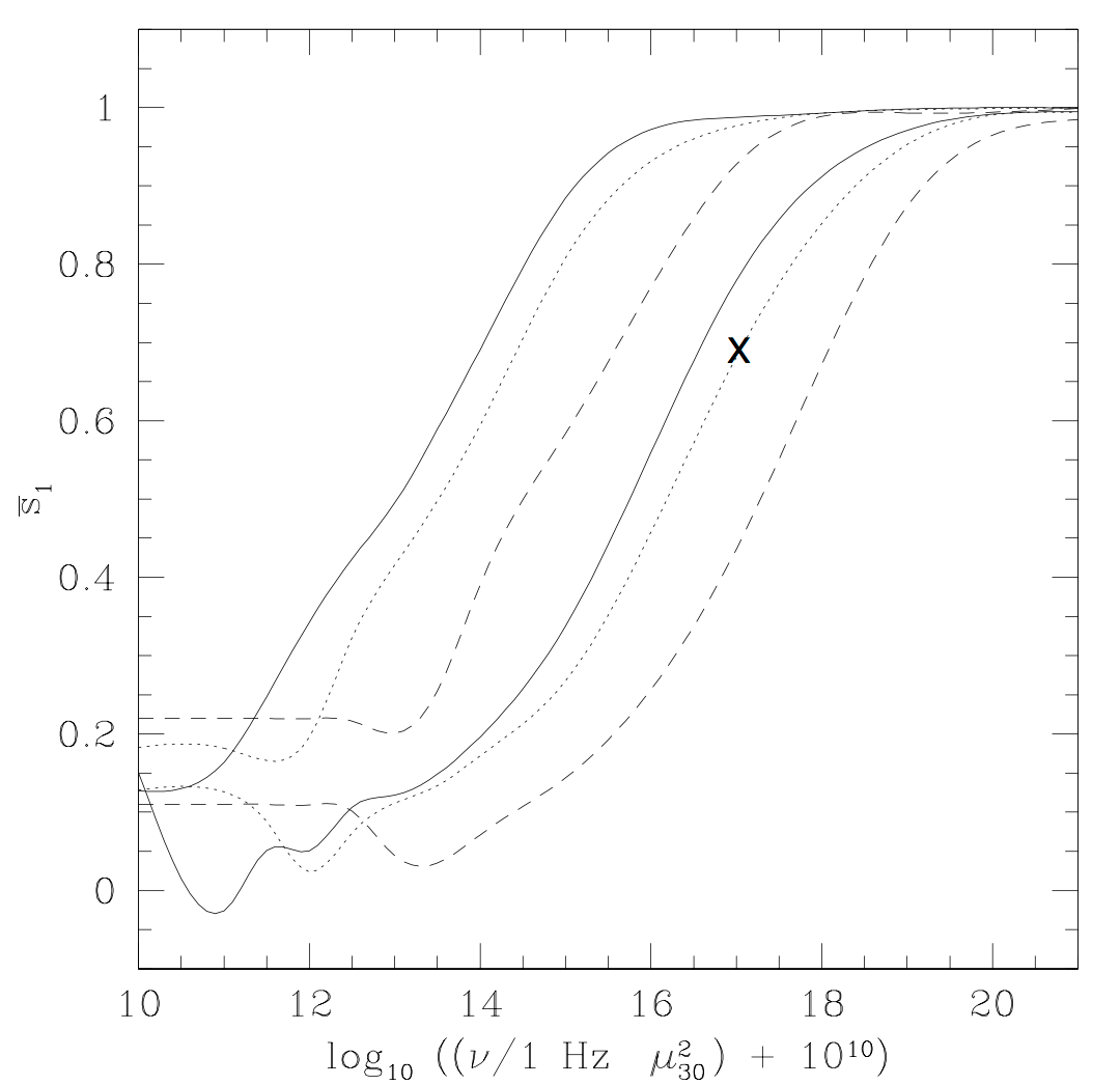
Fig. 5: The net polarization to be observed as a function of frequency for three different NS radii solid line—6 km; dotted line—10 km; dashed line—18 km and two observer magnetic co-latitudes: upper three curves—60° ; lower three curves—30°). The graphs assume that the surface has a uniform temperature and the emissivity is spherically symmetric. The case depicted in the previous figure is marked by an ‘‘X.’’ It should be compared with the low frequency limit of the curve, for which QED is unimportant.
Thus, the prediction that Jeremey Heyl and I made back in a paper published in 2000 (see ref. 1 below) is that thermal radiation coming out from neutron stars will have a much higher polarization than can be expected otherwise. It should be noted that we expect the thermal radiation to be polarized because the transparency of the surface layers is different in the two polarization modes such that it is much easier for one polarization mode to be radiated than it is with the other. However, as mentioned above without adiabatic evolution it would be averaged away.
The recent observation (ref. 3) is a detection in visible light of a relatively large polarization of the thermal radiation emanating from a neutral star that is 400 light years away. It is extremely faint, so it is a very hard measurement to do, but still, the authors (Mignani et al., ref 3) managed to detect the polarization. They have also shown that all the nearby stars are not polarized, implying that it is not a galactic medium effect.
However, even so, they haven't proved that what they have seen is indeed vacuum birefringence and not for example plasma birefringence. At low frequencies, the plasma around a pulsar is birefringent giving rise to similar effects (this time from interaction with real electrons). To prove that, they need to carry out another polarization measurement at a higher frequency and show that it is indeed larger.
Once confirmed, it will show how non-trivial QED effects take place in nature. It will also be used as another tool to study neutron stars and their magnetic fields more directly (than neutron spin down for example). Now you can read the article in science.
References:
1. J. S. Heyl & N. J. Shaviv, Polarization evolution in strong magnetic fields, Monthly Notices of the Royal Astronomical Society, 311, 555 (2000). [The original paper were we discuss the effect of vacuum birefringence on the evolution of the polarization]
2. J. S. Heyl & N. J. Shaviv, QED and the high polarization of the thermal radiation from neutron stars, Phys. Rev. D, 66, 023002 (2002). [The paper were we calculate more realistically the expected polarization from the thermal radiation of neutron stars].
3. González Caniulef et al., Polarized thermal emission from X-ray dim isolated neutron stars: the case of RX J1856.5-3754, Monthly Notices of the Royal Astronomical Society, 459, 3585 (2016). [The recent observational paper describing the detection of high polarization from a neutron star in visible light]
4. A. Cho, Astronomers spot signs of weird quantum distortion in space, Science, Nov 30 (2016). [A short editorial about the detection in science magazine]
Reply to Eschenbach 15 Aug 2015 12:18 AM (10 years ago)
Willis Eschenbach had a post on wattsupwiththat.com attacking my post on this blog, which explains why the new sunspot reconstruction may be irrelevant to the solar climate link and also discusses the recent paper I have co-written. I am not writing it as comments on whatupwiththat is for several reasons, but the main one is because Eschenbach's comments were condescending and pejorative. I am not going to degrade myself and have a discussion with him at his level on his web page.
Now to the point. It is hard for me to find even one correct statement in Eschenbach's piece, which leaves so many wrong ones to address.
Let me start with his main crux. Eschenbach claims that in the paper by Howard, Svensmark and I, we have approximated the solar cycle as a sine with arbitrary phase instead of using a direct proxy. He then continues to fit the satellite altimetry data to the ENSO, and then fit the residual to the sunspot number. When he finds no correlation, he resorts to all sorts of negative remarks to describe our work, and in particular writes that "The journal, the peer reviewers, and the authors all share responsibility for this deception".
To begin with, as Brandon Shollenberger commented in the comments section of that article, the use of harmonic analysis cannot be deception as we have specifically wrote in the paper what we are carrying out this analysis and why. A deception would be carrying out one analysis and writing that we did another.
But more importantly, to reach his conclusions, Eschenbach assumes that if solar forcing has a large effect on climate, the sea level should vary in sync with it. This assumes that the sea level adjusts itself immediately to changes in the forcing. This ignores the simple physical fact that the heat capacity of the oceans is very large such that the oceans are kept far from equilibrium. Instead, it is the amount of heat, and therefore the sea level through thermal expansion that is expected to be proportional to the solar forcing. In other words, instead of comparing the sea level to the sunspot number, which is what Eschenbach did, he should have compared the sea level change rate to the sunspot number. If we look at his figure, and differentiate the sea level by eye, we see that this is exactly the case!
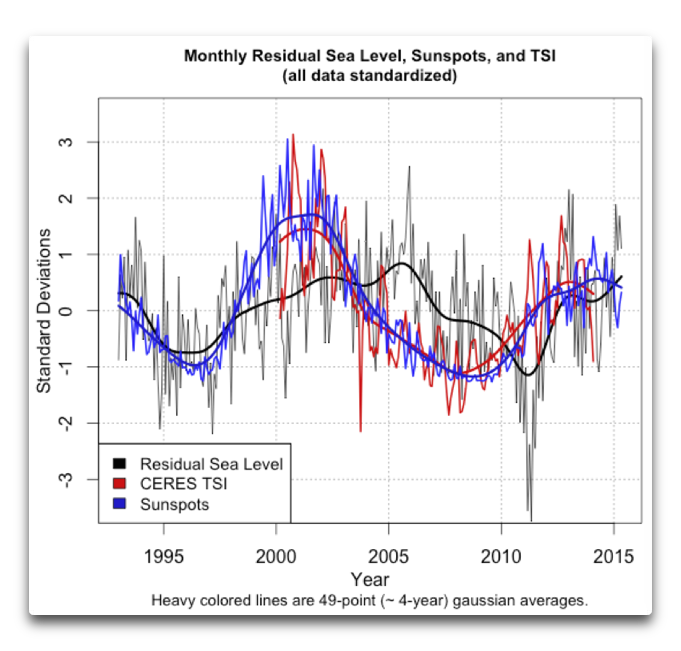
It is quite upsetting that Eschenbach did this mistake even though it was clearly explained in our paper, and it is also explained in my previous paper from 2008, where one can clearly see that the sea level change rate varies in sync with solar activity over more than 80 years.
We also explain in the present paper why the altimetry data is important to pin point the exact phase, if there is a phase "mismatch" between the solar forcing and the sea level change rate. This is because any deviations from the "zero order" model in which sea level is just the integral of the absorbed heat (for which the sea level rate is in sync with the forcing) will teach us about additional processes, such as feedback of the climate system and the trapping of water on surface reservoirs.
Studying this phase mismatch is simpler and clearer in a harmonic analysis, which is why we used it, but it is also possible to do it with a more direct solar proxy. I know this, because we also carried out the full analysis, but during the refereeing processes decided to leave it out as it didn't add any more physics while making the results more opaque. If anyone is bored, he or she can read this "supplementary material" describing this analysis here.
Eschenbach also complains that we have a seven parameter model and goes on to cite von Neumann's story about fitting Elephants. So first, because the fit is not empirical but physically based, one has to use all those relevant to describe the physics. For example, if we wish to describe the length of a rod as a function of temperature and force exerted on it, we will need the average length as well as both the thermal expansion coefficient and at least one elastic modulus. Can you describe this model with less than 3 parameters? Similarly, if you want to describe the solar forcing on sea level you need more than one parameter because solar forcing can primarily change the sea level through thermal expansion or though trapping of water on the surface. Since to first approximation the thermal expansion is the integral of the forcing and while the trapped water is the second integral of the forcing, at least 2 numbers are required to describe the effect of the solar forcing on sea level (two sines, or a sine with some phase), which is exactly what we have. Eschenbach writes that we used 3 numbers to fit the solar forcing, but the period wasn't a free parameter. It was set by observing the last solar cycle. A second trivial mistake is the claim that I have never heard of von Neumann's elephant quote. In fact, not only have I heard about it, I mentioned it in a 2007 blog post that has elephants in its title! Trivially wrong and mixed with libelous claims.
Next, in the beginning of his analysis, Eschenbach complains that "The 10Be beryllium [sic] isotope truly sucks as a solar proxy when used as it was in their study". This is wrong for several reasons.
First, we didn't use it in "our study". I just mentioned Beryllium 10 as an example of a solar activity proxy showing that activity increased over the 20th century.
Second, although the Beryllium 10 records have their problems, due to for example, a variable precipitation rate onto the ice sheets, if one compares them to Carbon 14 which are recorded in a completely different type of record, that of tree rings, one finds a generally good agreement between the two independent records, indicating that both reflect the same variability in cosmic ray spallation. For example, see this figure.
Third, Beryllium 10 clearly show that solar activity increased over the 20th century. Anthony Watts himself wrote about it in his blog, when he discussed Usoskin's paper studying this.
Fourth, Eschenbach compares the Beryllium 10 to the sunspot number and finds a lousy correlation. He deduces from that, that Beryllium 10 "sucks as a solar proxy". However, this misses two important points that I made on my blog post:
- Solar activity can have various facets, and nobody promises us that long term variations in the solar wind will be the same as the long term variations in the sunspot number, so one is not necessarily lousier than the other, they just reflect different parts of the solar activity.
- Moreover, if the Beryllium 10 record does not reflect what the sunspots do, then given the mounting evidence that cosmic rays are the direct link between solar activity (through modulation by the solar wind), the Beryllium record should be a much better indicator of the sun's affect on climate than sunspots.
Let me summarize Eschenbach's mistakes. Some are trivially wrong, some much worse.
- Eschenbach assumed in his analysis that if the sun has a strong solar forcing, the sea level should be in phase with it. This is plain wrong. Because of the high heat capacity of the ocean system, one roughly expects the sea level charge rate (and not the sea level itself) to be proportional to the solar forcing. If one looks at the slope of the sea level, it does indeed correlate nicely with solar activity.
- Given that we explained how and why we carried out the fit using a harmonic analysis, we did not deceive anyone. Writing that we did is libelous.
- The reason we used a harmonic analysis is because it makes the analysis more transparent. If one uses a solar forcing proxy (such as the cosmic ray flux), one finds a similar fit. Namely, writing that by using actual solar proxies one obtains a bad fit is simply wrong. (Again, one has to remember the heat capacity of the oceans!)
- The model has 6 and not 7 parameters. Having all of them is necessary to compare the sea level to the physical model. To ridicule us that we used many parameters is totally irrelevant and inappropriate.
- Eschenbach wrote that I haven't heard of von Neumann's Elephant quote. I did many years ago, and even mentioned it in a 2007 blog post on my blog. Trivially wrong, but reflects the low standards of that article.
I should also add another point which is directed primarily to Anthony Watts. The Wattsupwiththat website used to keep very high standards. It also served as a very important outlet where discussions about various climate views, including those which do not conform to the dogmatic mainstream could be heard. However, the low standards borne from Eschenbach's article, both in science and in style should be avoided. Anthony Watts should not expose himself to libelous type of writing, which is exactly what Eschenbach has done. Writing false statements is one thing, it is Eschenbach's right for free speech, but writing that my colleagues and have "deceived" as well as other derogatory remarks that intend to tarnish our scientific integrity has no place in any scientific discussion.
The Sunspots 2.0? Irrelevant. The Sun, still is. 10 Aug 2015 5:40 AM (10 years ago)
First, what’s the story? A group led by Frédéric Clette had a presentation at the IAU assembly in Hawaii. In it, they argued that the sunspot number suffers from various systematic errors as it is a subjective measurement. Because those systematic errors vary with time (with the different observers and observational methods), the SN reconstruction can exhibit a fictitious long term trend. They also attempted to calibrate the data, and obtain a more homogeneous dataset. This is described at length in their arXiv preprint.
The most interesting aspect about their new sunspot reconstruction is that there is significantly less variation in the sunspot number between the different solar maxima since the Maunder minimum. This implies, according to them, that there wasn't a significant increase in solar activity over the 20th century (no "20th century Grand Maximum"), and therefore the sun should not have contributed anything towards increased temperatures. This point was of course captured by the media (e.g., here).
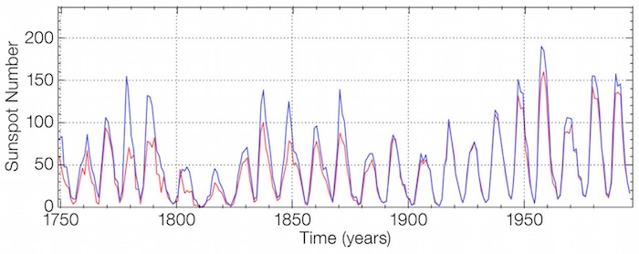
So, what do I think about it? First, I have no idea whether the calibration is correct. They do make a good argument that the SN reconstruction is problematic. Namely, some corrections are probably necessary and there is no reason a priori to think that what they did is invalid. However, their claim about solar activity in general not varying much since the sun came out from the Mounder minimum is wrong. There are other more objective ways to reconstruct solar activity than subjective sunspot counting, and they do show us that solar activity increased over the 20th century. So at most, one can claim that solar activity has various facets, and that the maximum sunspot number is not a good indicator of all of them. This is not unreasonable since the number of sunspots would more directly reflect the amount of closed magnetic field lines, but not the open ones blowing in the solar wind.
The two important objective proxies for solar activity are cosmogenic isotopes (14C and 10Be), and the geomagnetic AA index. The AA index (measured since the middle of the 19th century) clearly shows that the latter part of the 20th century was more active than the latter half of the 19th century. The longer 10Be data set reveals that the latter half of the 20th century was more active than any preceding time since the Maunder minimum. (The 14C is a bit problematic because human nuclear bombs from the 1940's onwards generated a lot of atmospheric 14C so it cannot be used to reconstruct solar activity in the latter part of the 20th century).
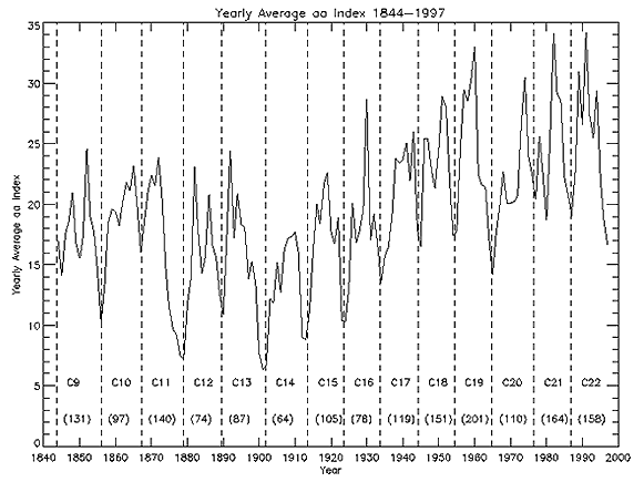
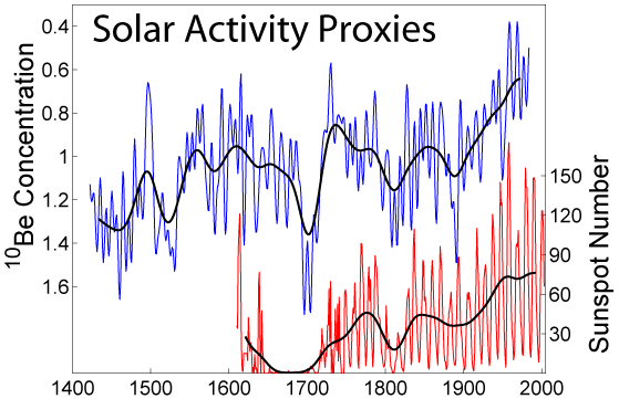
What does it tell us? Given that long term variations in Earth's climate do correlate with long term solar activity (e.g., see the first part of this) and given that some solar activity indicators (presumably?) don't show an increase from the Maunder minimum, but some do, it means that climate is sensitivite to those aspects of the solar activity that increased (e.g., solar wind), but not those more directly associated with the number of sunspots (e.g., UV or total solar irradiance). Thus, this result on the sunspots maxima (again, if true), only strengthens the idea that the solar climate link is through something related to the open magnetic field lines, such as the strength of the solar wind or the cosmic ray flux which it modulates.
The second point I wanted to write about is a recently published analysis showing that the sun has a large effect on climate, and quantifying it. In an earlier work, I showed that you can use the oceans as a calorimeter to see that the solar radiative forcing over the solar cycle is very large, by looking at various oceanic data sets (heat content, sea surface temperature and tide gauges). How large? About 6-7 times large than one can naively expect from changes in the solar irradiance.
More recently, Daniel Howard, Henrik Svesmark and I looked at the satellite altimetry data. It is similar to the tide gauge records in that it measures how much heat goes into the ocean by measuring the sea level change (most of the sea level on short time scales is due to thermal expansion). Unsurprisingly, we found that the satellite altimetry showed the same solar-cycle synchronized sea level change as the tide gauge records. However, because the satellite data is of such high quality, it is has a higher temporal resolution than the tide gauge records which allows singling out the thermal expansion component from other terms (e.g., associated with trapping of water on land). This allows for an even better estimate of the solar forcing, which is 1.33±0.34 W/m2 over the last solar cycle. You can see in fig. 4 how much the sun and el-Niño can explain a large fraction of the sea level change over yearly to decadal time scales.
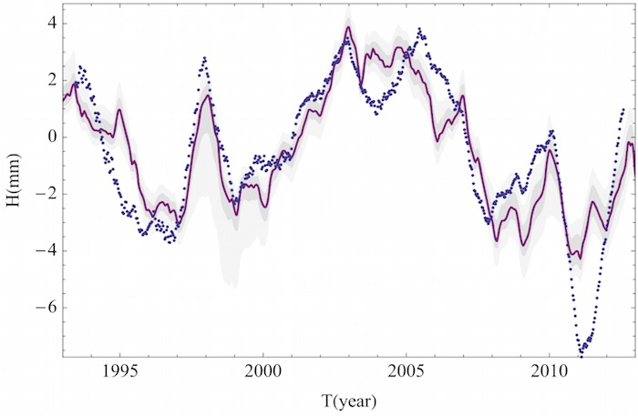
The bottom line is that the sun appears to have a large effect on the climate on various time scales. Whether or not the sunspots reflect the increase in solar activity since the Maunder minimum (as reflected in other datasets) is not very important. At most, if they don't reflect, it only strengthen's the idea that something associated with the solar wind does (such as the cosmic rays which they modulate).
He who controls the past controls the future! On the vanishing global warming hiatus 16 Jun 2015 6:30 AM (10 years ago)
Two weeks ago a
science paper appeared claiming that once various systematic errors in the sea surface temperature are corrected for, the global warming “hiatus” is gone. Yep, vanished as if it was never there. According to the study, temperatures over the past 18 years or so have in fact continued rising as they did in the preceding decades. This meddling and adjustments of datasets was discussed elsewhere (e.g., on watts up with that). Here’s my two pennies worth opinion of it.
The first thing to note is that half a dozen other global surface temperature reconstructions do show a “hiatus”. Although it doesn’t invalidate the analysis (science is not a democracy!) it does raise an eyebrow, and should therefore be considered very cautiously.
The second thing to note is that this result wasn’t obtained because they considered any new data, instead, they adjusted systematic corrections to different datasets and their respective weights. This is very dangerous. Even if it isn’t deliberate, there is a tendency for people to look (and force) corrections that might push results towards preferable directions, in this case to eliminate the “hiatus” and ignore corrections that could do the opposite. I am not saying this is the case, but I wouldn’t be surprised if it is. In any case, when adding inhomogeneous datasets (different buoys and ship intakes) that fact that different weights gives a different behavior (i.e., the existence or lack of a “hiatus”) is an indicator that the datasets are not added together properly! It is a sign that something is suspicious.
Irrespective of the above (which should be regarded as caution signs), perhaps the most important discrepancy between the new surface temperature reconstruction and any dataset is with the satellite measurements. This is because the satellite measurements (which measure the atmospheric temperature and not directly the surface) have shown very little warming. So, if we are to accept the lack of any hiatus as real, we have to accept that the surface warmed much more than the atmosphere did. However, this is counter to any predictions of greenhouse warming.
Greenhouse warming works by making the atmosphere more opaque to the infrared radiation. This implies that the effective layer from which radiation can escape back to infinity will reside higher in the atmosphere when more greenhouse gases are present, and since the atmosphere needs a typical temperature gradient to advect the energy from the surface to that emitting layer, the temperature all along the atmosphere has to increase. You can read more about it in Douglass et al. 2007 and see the figure below. Thus, increasing the surface temperature even more but removing the “hiatus” only aggravates the discrepancy! In other words, to really remove the “hiatus”, the NOAA people have to fiddle with the satellite data, not with sea surface data.
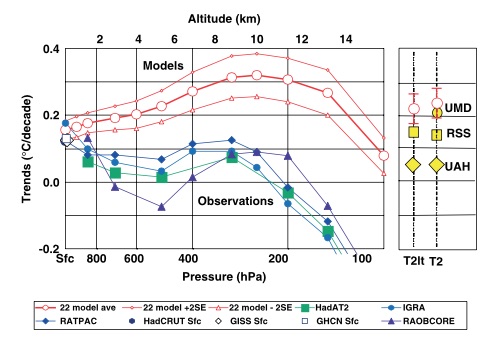
Last, hiatus or not, the whole discussion diverts everyone from the real problem that alarmists have. Even with the hiatus removed, the “larger” warming of about 0.1°C per decade is still much smaller than the range of predictions standard models make, implying that the models significantly overestimate climate sensitivity and therefore significantly overestimate future warming. For example, as you can see here, a warming of 0.1°C/decade (i.e., 0.35°C over the 35 years of the graph) barely reaches the lower slope of the IPCC predictions.
In any case, the whole story reminded me of the hockey stick. One day we woke up in the morning and suddenly there was no medieval warm period and therefore no little ice age. The IPCC had a field day over it. It was the star of the third assessment report. We all know what happened afterwards with the climategate e-mails. I don’t know how this present story will unfold, but my suspicion is that the community and hopefully the public will be more cautious this time, but who knows.
Let me end with a befitting quote:
“He who controls the past controls the future. He who controls the present controls the past.”Don't let them control your future or your past!
― George Orwell, 1984
Bill Nye, the not-so-good-science guy 5 Jun 2015 9:29 PM (10 years ago)
First, what did he actually say? During his appearance on CNN, Bill Nye compared the link between denying a link between climate change and anthropogenic activity to denying a link between smoking and cancer:
Here’s the actual video:
These short comments and comparison he made are inappropriate for several major reasons.
To begin with, he follows the usual alarmist assertion that every calamity is necessarily due to global warming (now known as “climate change” so that they can cover more ground) and that all the climate change is necessarily anthropogenic. Since bizarre weather patterns can happen all the time with some probability, and since part of the climate change is also natural, these implicit “logical” steps would not make sense, at least in any other scientific discipline. I won’t dwell on this since others already did.
Second, the global warming debate is mostly a quantitative one. While the IPCC claims that climate sensitivity can be very large (e.g., a 4.5°C increase per CO2 doubling which would be catastrophic), I claim that such high values are ruled as they are inconsistent with a lot of empirical data (e.g., see this). In other words, skeptics like myself don’t argue that CO2 has no effect on climate, only that the IPCC story is highly exaggerated. On the other hand, whether smoking contributes 90% or 10% of the cases of lung cancer would be good enough reason for any rational person to quit smoking (well, rational and able to overcome his or her addiction). On the other hand, if a given emission scenario over the 21st century will cause a 1°C or 4°C could make a huge difference. This means that denying that smoking causes cancer is a yes/no question while most skeptics don’t “deny anthropogenic global warming”, instead, they only claim it is minor.
The third point is the main one I want to make. The reasoning behind the attribution of lung cancer to smoke and behind attributing global warming to anthropogenic activity is conceptually different, so different, that putting both on the same pedestal is simply wrong. The evidence linking lung cancer to smoking is in the form highly statistically significant increase in the incidence rate of lung cancer when comparing smoking to non-smoking groups. So, either smoking or something very closely related to it is clearly carcinogenic. The assertion that climate sensitivity is large, that most of the 20th century warming is necessarily anthropogenic and that temperature increase over the 21st century will be large are the result of model predictions, not on empirical evidence. In fact, empirical evidence such as the small response to volcanic eruptions (e.g., Lindzen and Giannitsis 1998, see also note on climate effects of volcanoes here), or the lack of correlation between the order of magnitude CO2 variations over geological time scales and the global temperature (e.g., this discussion on cosmic rays and climate), or of course, the lack of warming over the past nearly two decades, counter to all the model predictions (e.g., see this discussion of the hiatus long before the term was used).
If we use the cancer analogy it would be as if we had a model that can predict, at the biochemical level that some of the chemicals in cigarettes are carcinogenic, and that smoking should cause cancer, but, while the model would say that the incidence rate should be high and should explain most of the lung cancer cases, comparing the actual incidence rate would show that only some modest fraction of the lung cancer cases are attributed to smoking, but the rest are not. Yet, even with the evidence showing only a small difference in the incidence rate between the smoker and non-smoker group, the model will still be believed and it would be used to make predictions to other types of cancers, e.g., saying that they happen at a huge rate while they don’t. Sounds ridiculous? Well, this is what’s happening in climate science.
Anyway, the last time I had any thought about the “science guy”, was when I heard he was to give the commencement speech at my wife’s graduation from Caltech (roughly when the global warming hiatus began!). Back then I thought of how uninspiring it is. I am not saying that publicizing science to the public is not important (which is what Bill Nye did so well), but I didn’t think that this is the kind of figure that will push the young cadet of scientists and engineers into new frontiers. Its isn’t as if he is doing rocket science. In retrospect, I now think it was even less appropriate to have him.
Euthanizing Overholt et al.: How bad can a bad paper be? 25 Apr 2015 9:31 PM (11 years ago)

Before I get into the technical details (which will cause many of the readers to click their way out of here), I do want to say something general about the refereeing process and how it can easily break down, as it did here.
Given that there are many more people who are eager to shoot down the cosmic ray climate link than people researching it, very often I find that the criteria used to accept papers which refute the link are way more lenient than the criteria needed to accept papers that supposedly refute it. This is because the refuters don't have an incentive to find errors in refuting papers (e.g., as I demonstrated with the Shakun et al. paper supposedly finding that CO2 leads the average global temperature). This is because any paper has a much higher probability of getting refereed by the refuter camp than the proponents camp. Simple statistics.
The second comment is that I wrote them politely, it ended up with an erratum, but to save face they continued claiming the that their paper supports the erroneous claim that my original conclusions are unsubstantiated. One can show that even those leftover criticisms are plagued with errors.
Main Problem
In the their paper, Overholt et al. try to estimate previous passages through the galactic spiral arms, and compare those passages to the appearance of ice-age epochs on Earth, over the past billion years. The gravest error is that the analysis was carried out using a spiral arm pattern speed that was totally different from the range of pattern speed they actually wrote they used!They wrote that they take 10.1 to 13.7 (km/s)/kpc as the possible range for the relative motion of the spiral arm pattern speed with respect to the solar angular velocity (i.e., a nominal value of about 11.9 (km/s)/kpc). However, if one looks at the average spiral arm crossing as obtained in their analysis, it is about 100 Myr (the first of their group of 4 arm passages is at roughly at 275 Myr and their second group is at roughly 670 Myr). This implies an average spiral arm passage every (670 Myr - 275 Myr)/4 ~ 100 Myr, which is inconsistent with the above pattern speed. In fact, an average spiral arm passage every 100 Myr implies a relative pattern speed of about: $$ \Omega_\odot - \Omega_\mathrm{arm} \approx 15.4 (km/s)/kpc, $$ I am pretty sure that the source of error is the fact that they accidentally took the absolute pattern speed when calculating the spiral arm passages. For their nominal 217 km/s solar velocity at 8 kpc, one gets $\Omega_\odot = 27.1 (km/s)/kpc$, such that the absolute pattern speed obtained for the nominal 11.9 (km/sec)/kpc relative speed, is: $$\Omega_\mathrm{arm} = \Omega_\odot - (\Omega_\odot-\Omega_\mathrm{arm}) = 27.1 − 11.9 = 15.2 (km/s)/kpc$$ i.e., roughly the value I read by eye from their graph describing the spiral arm passages.
Because they accidentally took the absolute pattern speed, they obtained spiral arm crossings which are much more frequent that the climatic data or meteoritic data. If they would have taken the 10.1 to 13.7 range instead, the spiral arm passages would have been 112 to 152 Myr, which includes the ice-age epoch occurrences and the cosmic ray flux variations based on iron meteorites. The phase would have agreed as well.
I then suggested that they publish an erratum to that paper, which they did. However, to save face, they claimed that their re-calculated spiral passages are still inconsistent with the meteoritic data or with the climate record, which brings me to the additional problems still present in their analysis.
Additional Problems
A few more problems relate to the way Overholt et al. derive the spiral arm crossing (which is why even with their erratum, their manuscript is pointless).First, they take the spiral arm model of Englmaier et al. 2009, but they trace the spiral arms by eye, and as a consequence get a distorted result which gives highly unlikely “tight” clusters of 4 consecutive passages each rotation. In fact, it is so distorted that 2 consecutive arm crossings are of the same arm, which even with the radial epicyclic motion of the solar system is ridiculous.
Second, they assume that their highly asymmetric (and unlikely) spiral arm configuration should remain as such for many spiral arm passages, but because the arms are dynamic, without more information, a more reasonable assumption would have been that the arms would have tended to be separated by 90 degrees instead of the “tight” clusters of 4 consecutive passages.
Third, they didn’t consider the fact that supernovae are biased to take place about 10 to 20 million years after the spiral arm passage because of the finite lifetime of the stars that end their lives as supernova explosions.
Fourth, they don’t actually carry out any statistical analysis how likely or unlikely is it to find all the ice-age epochs as close to the estimated spiral arm passages, not that a statistical analysis would have helped any given their problematic determination of the arm passages.
Last, and perhaps most important. The cosmic ray flux can be shown using Iron meteorites to be periodic with a roughly constant 145 Myr period, and in phase with the appearance of ice-age epochs, which means that any distorted reconstruction such as that of Overholt et al. is inconsistent with the data, which they have totally ignored.
Summary
Overhaul et al. analysis of the spiral arm passages is bad at so many levels it is not really worth ever considering again. However, will people still quote it and claim that it refutes the galactic spiral arm explanation for the appearance of spiral arm passages? Probably, but now you know better.
Bits of Science / Roundup #1 26 Mar 2015 8:27 PM (11 years ago)
Space and Planetary news bits
You have all heard of (or seen?) the solar eclipse. What you may have missed is that that a few very lucky people actually experienced a double eclipse, partial by the moon and an “annular” eclipse by the international space station. See this image by Thierry Legault.
A friend was surprised that the space station appears so large, but is it?
The space station is at about 400 km (anything lower and its orbit will decay too fast, and anything higher will cost many more of the green stuff). If it has a span of about 100m, it will have an apparent angular size of about $0.1~\mathrm{km}~/~400~{\mathrm km} \approx 1/4000~rad \approx 1’$ (about 1 arc minute, see google units). Given that the diameter of the moon or sun is about 30’, the sizes in the image are reasonable.
• Oceans on Ganymede
The magnetic field around Ganymede has two components, one is its own generated (or probably relic) magnetic field, which is fixed to its rest frame. The second component is Jupiter’s magnetic field, however, unlike the first component, this one varies in a frame of reference fixed to Ganymede. Moreover, the location of the auroral ovals depend on the total field. However, because the total field varies, the aurorae are predicted to shift by 5.8° ± 1.3°. In reality, however, the measured variations had an extent of 2.2°±1.3°, Saur et al. used this to infer the existence of an ocean. How come?
Well, a liquid ocean would be conductive (all it requires is just a small amount of salts), which would make the moon a big inductor if present. However, when you try to increase the magnetic field through an inductor, according to Lenz’s law, it will generate a magnetic field that will try to counteract the original magnetic field. The result is a smaller net magnetic field, and hence, the much smaller variation in the auroral oval!
Interestingly, Lentz’s law also implies that the interaction between the induced currents and the generated field produce a force countering the motion. A neat example is this video:
It means that Ganymede has a VERY small “magnetic drag force” operating on it.
Astrophysics news bits:
This is already about a month old, but I learned about it only last week, which is why I’m sharing. It appears that in the region of the Orion Nebula (on the “sword of Orion”), there is evidence for a very strange explosive event that took place about 500 years ago. The observations show dozens of what appears to be dense gas blobs moving super-sonically, withe their backwards trajectory emanating from a single point at a single instant. Their typical velocity is 300 km/sec (which is the typical escape speed from stars). This is very high velocity shrapnel!
It really seems strange that it is possible to accelerate such dense gas blobs to such high velocities without disrupting them. But apparently it is possible. The image on the right shows the actual appearance of a few such blobs with the supersonic wake behind them. The inset picture is the result of a simulation, showing that typical Mach numbers of a 1000 are needed to reproduce the observations. You can read more about the observations and the simulations here.
• Supernova kaleidoscope
We can estimate the typical time delay between the images. Since the redshift of the lens is 0.54, it means that the typical distance to it is about half the age of the universe times the speed of light, or about $d = 5 \times 10^{9}$ light years. The perpendicular direction is of order the distance times the angle in radians. Since the separation between the lens and image it of order 1 arc-second, the real distance is about $r = 5 \times 10^{9} / 57/3600 \approx 25000$ light years (57 is the ratio between 1 radian and 1 deg, while 3600 is the ratio between one degree and one arc second).
The time delay from the extra path is roughly $$ \sqrt{d^2 + r^2} -d \approx { r^2 \over 2 d} \approx 0.06 \mathrm{~light~years~}\approx 3 \mathrm{~light~weeks}. $$ Thus, we expect the typical shifts to be a few weeks. Since SNe last longer than that, it is not surprising that one can see several images at the same time.